Overview
Buildform presents itself as an AI-powered form builder with a visual language optimized for clarity and conversion. The design system balances bold, attention-grabbing display typography with restrained, functional interface elements. The overall impression is of a modern SaaS product that prioritizes readability and actionability: large headlines establish hierarchy immediately, while purple accent buttons provide consistent calls-to-action across every surface. The system employs a near-white canvas with subtle gray surfaces for structural differentiation, avoiding heavy ornamentation in favor of clean lines and purposeful spacing. Component patterns are repetitive and predictable—pricing cards, FAQ accordions, and comparison tables all share common border treatments, radius values, and padding rhythms—making the interface feel cohesive and professionally engineered. The visual identity leans into confidence through scale and contrast rather than complexity, with display type set in a geometric sans-serif at sizes that dominate the viewport, while body copy remains comfortably readable at standard sizes.
Colors
The color system is intentionally constrained, relying on a high-contrast foundation of near-black ink against white canvas, with a single vivid purple serving as the primary action and brand accent. Supporting colors for status and feedback are drawn from conventional semantic palettes but applied with restraint.
| token | value | use |
|---|---|---|
| action | #a020f0 | Primary buttons, active toggle states, key highlights, “Most Popular” badges |
| action-hover | #8a1bd4 | Button hover states, interactive accent deepening |
| canvas | #ffffff | Page background, card surfaces, input fields |
| surface | #f8f9fa | Alternating table rows, subtle section backgrounds, footer base |
| surface-elevated | #ffffff | Cards, panels, accordion items with visible borders |
| ink | #1a1a2e | Primary headings, body text, table headers, navigation |
| ink-secondary | #4a4a5a | Secondary descriptions, pricing period text, footer links |
| ink-muted | #6b7280 | Placeholder text, disabled states, tertiary information |
| border | #e5e7eb | Card outlines, table dividers, accordion borders, input borders |
| border-subtle | #f3f4f6 | Section separators, hairline divisions |
| success | #22c55e | Feature checkmarks, positive indicators, operational status |
| warning | #eab308 | Caution icons, limited-feature callouts in comparison cells |
| error | #ef4444 | Negative indicators, crossed-out features, validation errors |
The purple action color functions as the singular brand accent, appearing in every high-priority interactive element. It is saturated enough to draw attention without clashing against the neutral foundation. The system maintains strict discipline: purple is reserved for actions and highlights, while semantic colors (green, yellow, red) are confined to status and comparison contexts. Dark text on light backgrounds is the dominant reading mode; no dark mode surfaces are visible in the captured pages.
Typography
The type system pairs a bold, geometric display face for headlines with a neutral, highly legible sans-serif for body and interface text. This creates clear functional separation: display type commands attention and establishes brand voice, while body type prioritizes extended reading and UI density.
| token | family | size | weight | leading | tracking | use |
|---|---|---|---|---|---|---|
| hero-display | Plus Jakarta Sans | 4rem | 800 | 1.1 | -0.03em | Homepage hero, major section headlines, closing CTA |
| section-display | Plus Jakarta Sans | 3rem | 700 | 1.15 | -0.02em | Section headings, FAQ title, comparison header |
| price-display | Plus Jakarta Sans | 2.5rem | 700 | 1 | -0.02em | Plan prices in pricing cards |
| body-large | Be Vietnam Pro | 1.25rem | 400 | 1.6 | 0 | Hero subheadings, section descriptions |
| body | Be Vietnam Pro | 1rem | 400 | 1.6 | 0 | Paragraph text, feature descriptions, accordion content |
| body-small | Be Vietnam Pro | 0.875rem | 400 | 1.5 | 0 | Feature list items, table cell text, footer links |
| label | Be Vietnam Pro | 0.75rem | 600 | 1.4 | 0.02em | Button text, badges, tags, status indicators |
| navigation | Be Vietnam Pro | 0.875rem | 500 | 1.5 | 0 | Header nav items, dropdown labels |
Plus Jakarta Sans, designed by Gumpita Rahayu and available from Tokotype, provides the display voice with its confident geometric construction and tight apertures. Be Vietnam Pro serves as the workhorse for all body and interface text, offering neutral, open forms that maintain clarity at small sizes. Lexend, designed by Bonnie Shaver-Troup and Thomas Jockin, is available as an additional family but does not appear in the visible headline or body roles. Nunito, by Vernon Adams, is present in the source but not visibly deployed in the captured surfaces. Phudu Light and Lqdessentials are registered families without visible typographic application in the captured images; Lqdessentials functions as an icon font. Verify licensing for these families before production use.
Layout
The layout system follows a centered, max-width container model with generous vertical breathing room between sections. Content is constrained to a readable measure, avoiding the full-bleed chaos common to marketing sites in favor of disciplined alignment and predictable rhythm.
The global header spans the full viewport width with a floating, pill-shaped navigation bar containing logo, primary links, and action buttons. This bar appears to sit above the content with subtle shadow or border treatment, maintaining position without dominating the visual hierarchy.
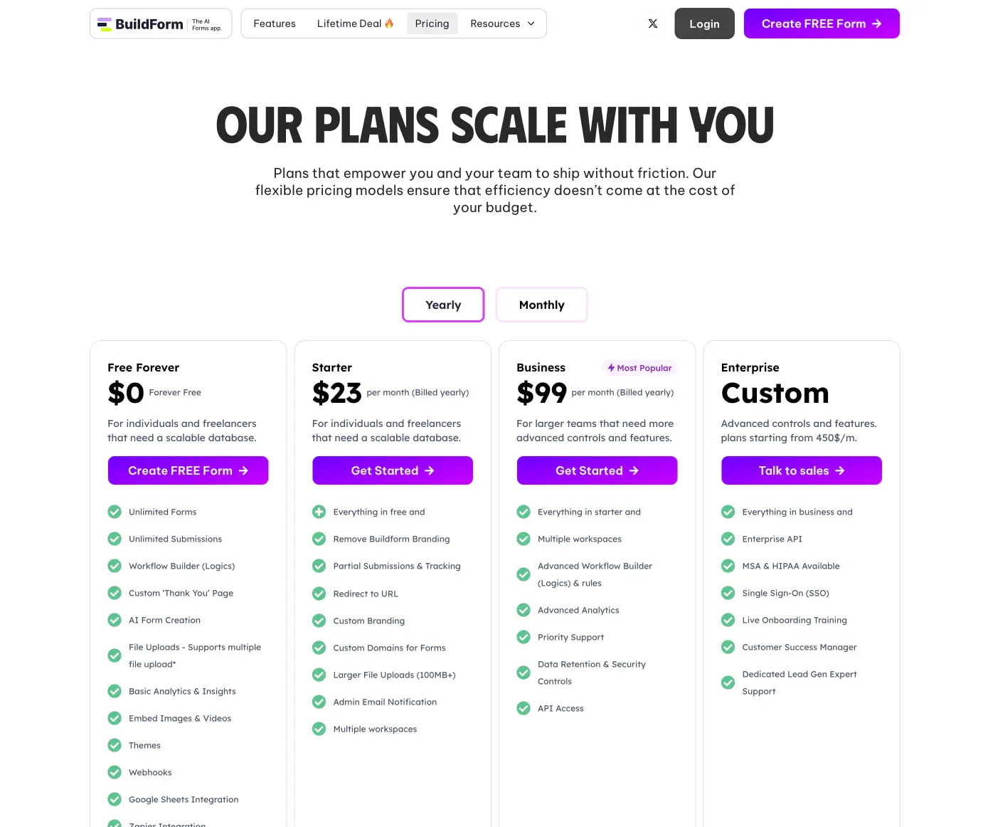
Section spacing follows a major-minor rhythm: large gaps of approximately 5rem separate major content blocks, while tighter 1.5rem gaps group related elements like pricing cards or FAQ items. The pricing page demonstrates a four-column grid at desktop widths, with equal-width cards that share internal alignment—price top, description below, CTA button centered, feature list stacked with consistent icon-text pairing.
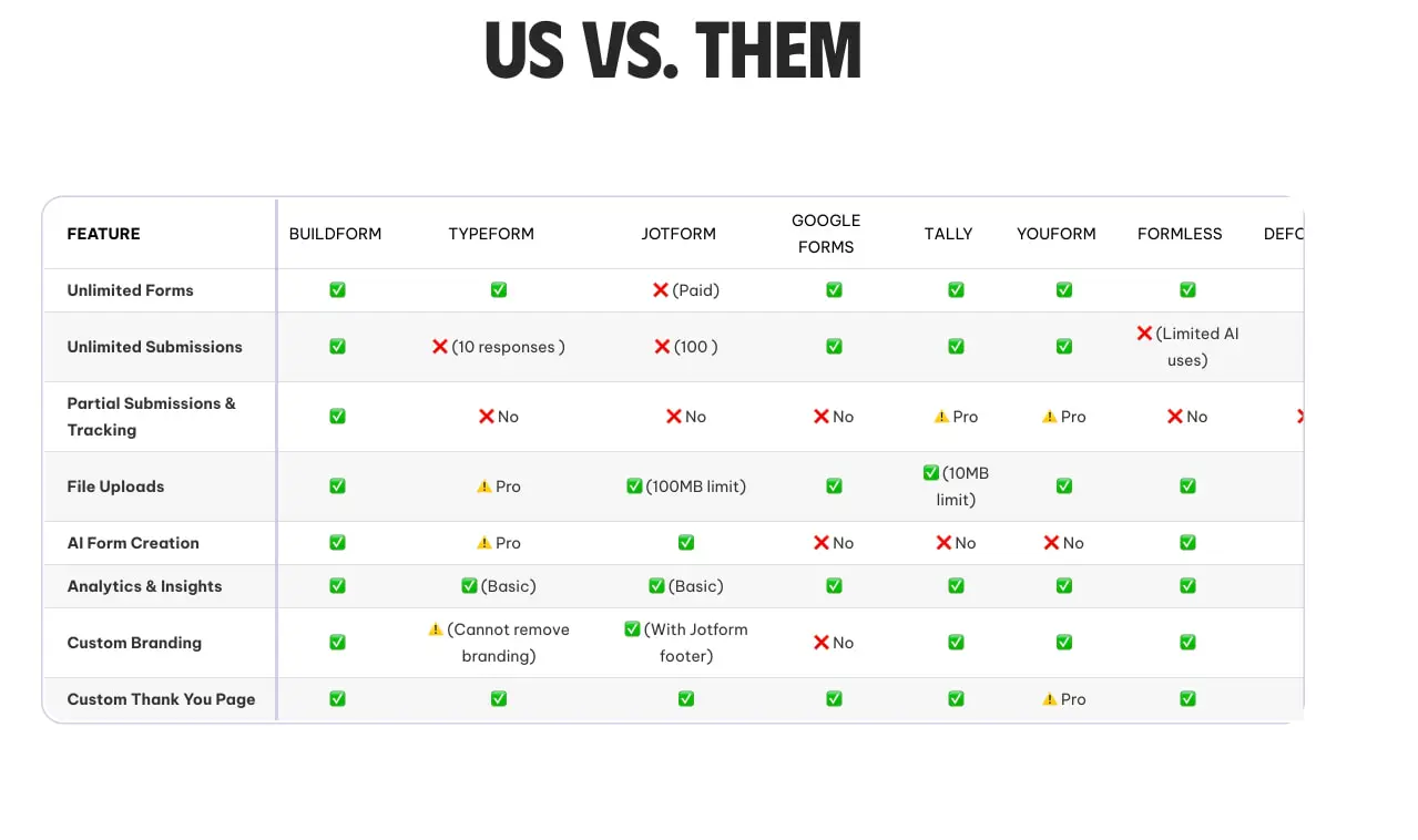
The comparison table uses a full-width, horizontally scrollable grid on narrower viewports, with fixed first column for feature names and fluid competitor columns. Row alternation between white and subtle gray aids scanning across wide datasets.
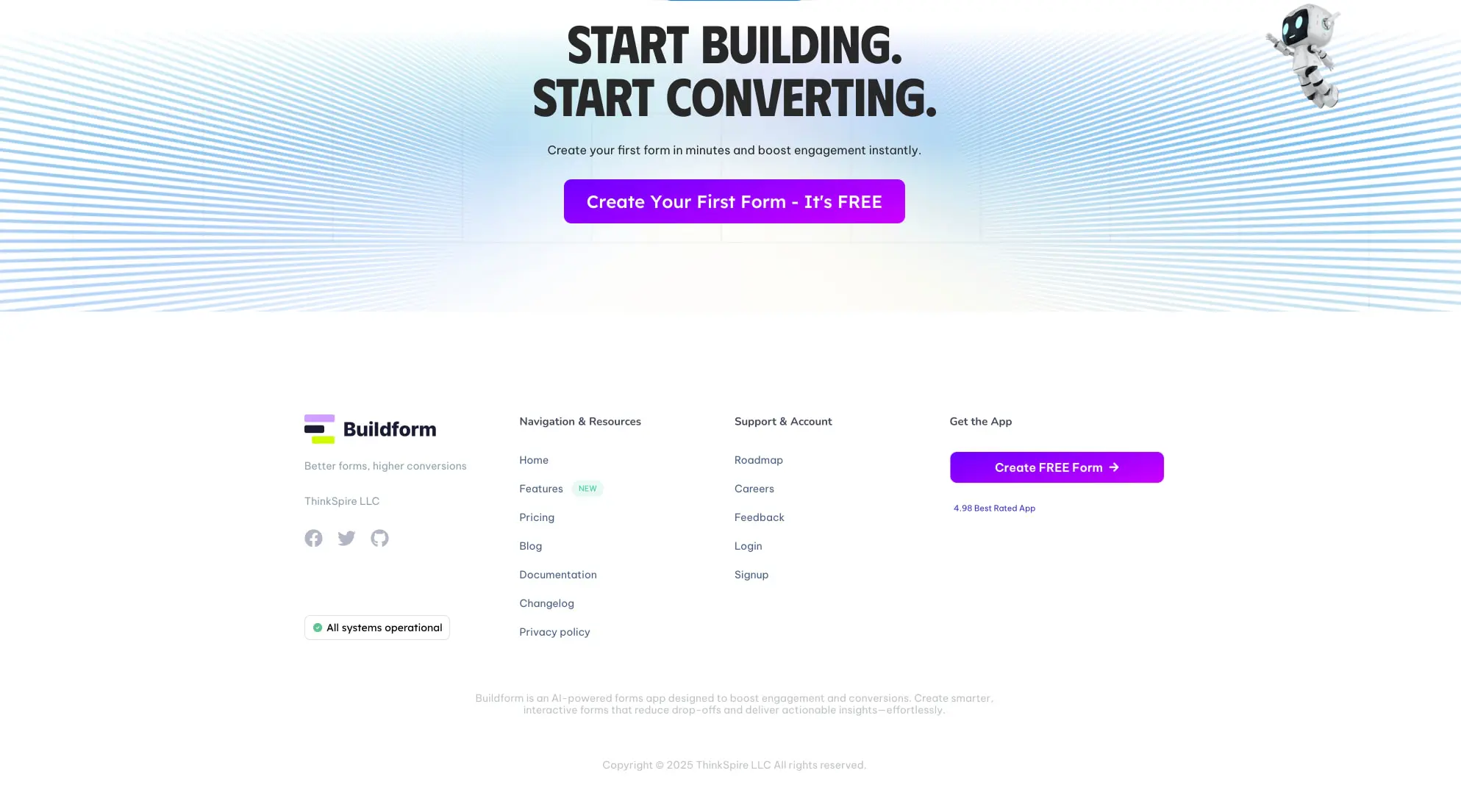
The footer employs a four-column layout: brand and social presence on the left, navigation links in two middle columns, and a conversion-focused CTA column on the right. This structure balances information density with continued conversion opportunity, avoiding the dead-end feel of purely informational footers.
Visual language
The visual character of Buildform is defined by confident simplicity and conversion-oriented clarity. Decorative elements are minimal but purposeful: the closing CTA section features a radiating line pattern in soft blue that creates energy and forward motion without competing with the headline and button. This pattern suggests technological capability and dynamism while remaining abstract enough to avoid dated metaphor.
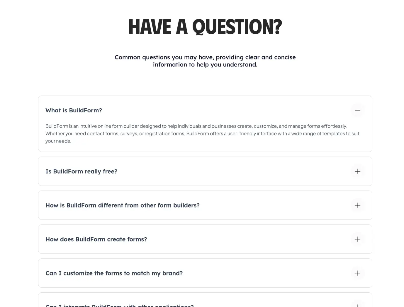
Iconography follows a functional, flat style. Feature lists use simple green circles with white checkmarks—universally legible positive indicators. The FAQ accordion employs minimal plus and minus icons in circular containers, providing clear affordance without visual weight. Status indicators like the operational badge use small colored dots with compact label text.
Photography and illustration appear limited in the captured pages; the 3D robot figure in the closing section is an exception, adding personality and reinforcing the AI positioning. This element is treated as a floating accent rather than a narrative illustration, positioned to draw the eye toward the CTA without obstructing readability.
The system avoids gradients, heavy shadows, and glassmorphism in favor of flat surfaces with subtle borders. Elevation is communicated through white cards against white backgrounds via 1px border strokes rather than drop shadows, creating a clean, modern aesthetic that feels lightweight and fast.
Components
Primary button
- Anatomy: Text label with optional right-arrow icon, contained within a solid filled rectangle
- Surface: Background
{colors.action}, text{colors.canvas} - Typography:
{typography.label}with weight 600, sized at 0.75rem - Shape: Border radius
{rounded.button}(0.5rem), no visible border - Spacing: Padding approximately 0.875rem vertical, 1.5rem horizontal
- Composition: Icon positioned to the right of text with small gap, creating directional momentum
- Variants: Full-width in pricing cards; auto-width in navigation and footer contexts
Secondary button / Toggle
- Anatomy: Text-only label within bordered container
- Surface: Background
{colors.canvas}, border{colors.border}, text{colors.ink} - Typography:
{typography.label} - Shape: Border radius
{rounded.button}, 1px border stroke - States: Active state switches to
{colors.action}background with{colors.canvas}text, removing border
Pricing card
- Anatomy: Plan name, price display with period annotation, description paragraph, primary CTA button, stacked feature list with icon-text pairs
- Surface: Background
{colors.surface-elevated}, border{colors.border} - Typography: Plan name uses
{typography.body}at weight 600; price uses{typography.price-display}; features use{typography.body-small} - Shape: Border radius
{rounded.panel}(0.75rem), 1px border - Spacing: Internal padding 2rem; feature list items spaced approximately 0.75rem apart
- Composition: Vertical stack with consistent left alignment; CTA button spans full card width
- Variants: “Most Popular” badge appears as small pill label in
{colors.action}background, positioned upper-right of card
FAQ accordion
- Anatomy: Question text as trigger, expandable answer panel, circular toggle icon with plus/minus state
- Surface: Background
{colors.surface-elevated}, border{colors.border} - Typography: Question uses
{typography.body}at weight 600; answer uses{typography.body}at regular weight - Shape: Border radius
{rounded.panel}, 1px border - Spacing: Internal padding 1.5rem; gap between items approximately 1rem
- Composition: Full-width items stacked vertically; toggle icon positioned absolute right, vertically centered
- States: Expanded state reveals answer text below question with maintained left alignment; icon transitions from plus to minus
Comparison table
- Anatomy: Header row with product names, feature column with left alignment, status cells with centered icons
- Surface: Background
{colors.surface-elevated}, alternating row backgrounds{colors.surface}and{colors.canvas} - Typography: Feature names use
{typography.body-small}at weight 600; product names use{typography.label}at uppercase or weight 600 - Shape: 1px border
{colors.border}around table and between rows; no visible column borders except subtle vertical dividers - Spacing: Cell padding approximately 1rem vertical, 1.25rem horizontal
- Composition: First column fixed width for feature names; remaining columns equal width; status icons centered with optional text annotation below
Footer
- Anatomy: Logo and tagline, social icon row, status badge, three link columns, CTA button, copyright bar
- Surface: Background
{colors.surface}or{colors.canvas}with top border{colors.border-subtle} - Typography: Column headers use
{typography.label}at weight 600; links use{typography.body-small}in{colors.ink-secondary} - Composition: Four-column grid at desktop; logo column wider than link columns; CTA column right-aligned with button and rating text
Responsive behavior
The captured images show desktop-width layouts exclusively. Based on the component structures visible, the following responsive adaptations are recommended:
The four-column pricing grid should collapse to two columns at medium widths and single column on narrow viewports, with cards maintaining internal structure but switching to full-width buttons. The comparison table requires horizontal scroll on narrow screens, with the feature name column pinned left and remaining columns scrollable beneath; consider a card-based alternative for mobile where each competitor becomes a swipeable card with feature list.
The header navigation likely collapses to a hamburger menu on narrow screens, with the “Create FREE Form” CTA remaining visible as a compact button. Footer columns should stack vertically, with the brand column full-width and link columns arranged in a two-by-two grid or single column.
The hero and section display typography should scale down proportionally: hero-display to approximately 2.5rem on mobile, section-display to 2rem, maintaining the tight line-height and negative letter-spacing for brand consistency.
Practical implementation guidance
Preserve
- The disciplined single-accent color system: purple for actions only, semantic colors for status only
- The tight pairing of bold display type with neutral body type
- The consistent 1px border treatment for all elevated surfaces
- The full-width CTA buttons within pricing cards
- The left-aligned feature lists with icon-leading pattern
- The radiating line decorative pattern as a signature background element for closing CTAs
Avoid
- Adding gradient fills or drop shadows to cards—the flat bordered aesthetic is intentional
- Using the action purple for non-interactive elements like headings or decorative icons
- Introducing additional accent colors that compete with the purple brand signal
- Making the comparison table wider than the viewport without scroll affordance
- Reducing the display type sizes below 2rem, which would undermine the confident brand voice
Recommended build order
- Establish the color tokens and type scale with CSS custom properties
- Implement the header navigation with floating pill container
- Build the button components with primary and secondary variants
- Create the pricing card as the primary content pattern
- Develop the FAQ accordion with JavaScript toggle behavior
- Construct the comparison table with accessible markup and responsive scroll
- Assemble the footer with grid layout and final CTA
- Add the decorative radiating line pattern as a reusable background component
Accessibility
- Ensure the purple action buttons meet WCAG AA contrast against white backgrounds; the vivid purple may require testing for small text compliance
- Provide visible focus states for all interactive elements, likely using a 2px outline offset from the button or card boundary
- Implement keyboard navigation for the FAQ accordion, with Enter and Space toggling expansion and arrow keys moving between items
- Mark the comparison table with proper scope attributes and consider a screen-reader-friendly alternative presentation
- Maintain the semantic heading hierarchy: h1 for hero, h2 for sections, h3 for card titles and accordion questions
Scope note
This guide covers the marketing site surfaces visible in the captured images: homepage sections, pricing page, FAQ accordion, competitive comparison table, and global footer. The form builder application interface, authentication flows, dashboard, and mobile navigation are not represented. Measurements are practical adaptation targets derived from visual inspection at a 4px relative unit. Motion, hover states, loading indicators, and dark mode are not documented.
Sites change, so a screenshot can differ from the guide.
Loading…Similar designs

This guide describes the public website and isn't an official buildform.ai design system. Not affiliated with buildform.ai.