Overview
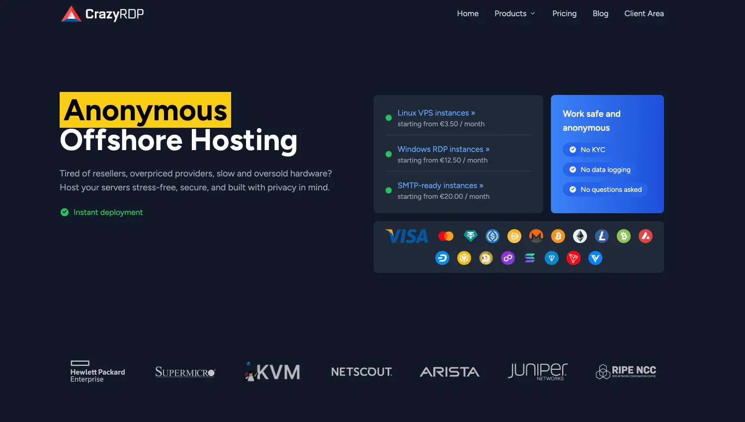
CrazyRDP presents a dark, technical aesthetic built for a privacy-conscious hosting audience. The interface immerses users in deep navy canvas tones that reduce eye strain while establishing a serious, infrastructure-grade tone. White typography punches through with high contrast, while a warm orange accent color draws attention to prices, calls-to-action, and critical status information. The design balances density with clarity: pricing tables expose granular server specifications without overwhelming the viewer, and feature cards break complex service offerings into scannable units. A yellow highlight treatment on the homepage hero adds unexpected energy to an otherwise restrained palette, signaling the brand’s bold positioning in anonymous hosting. The overall system favors flat surfaces over dimensional effects, using subtle border definitions and spacing rather than shadows to separate content layers.
Colors
The color system operates on a dark-mode foundation with selective warm accents. Every token serves a functional role in guiding attention and establishing hierarchy.
| token | value | use |
|---|---|---|
| canvas | #0f111a |
Primary page background; deep navy-black establishing the dark environment |
| surface | #1a1d2e |
Card backgrounds, table rows, and elevated content containers |
| surface-elevated | #252a3c |
Hover states, active selections, and emphasis panels within cards |
| ink | #ffffff |
Primary headings, navigation, and high-priority text |
| ink-muted | #a0a8b8 |
Body copy, descriptions, secondary specifications, and table headers |
| action | #f97316 |
Prices, primary CTAs, and critical attention markers |
| action-hover | #fb923c |
Lighter orange for interactive hover feedback |
| success | #22c55e |
In-stock indicators and positive confirmations |
| danger | #ef4444 |
Out-of-stock warnings and error states |
| border | #2e3446 |
Subtle dividers between table rows and card edges |
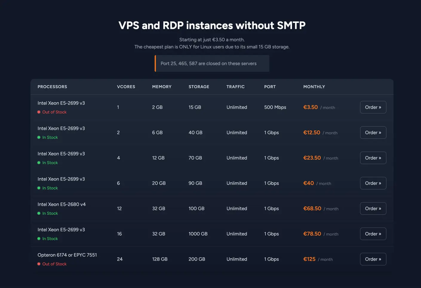
The dark canvas creates a continuous field that allows content to float forward. Orange appears sparingly but decisively—always for monetary values or interactive emphasis—preventing fatigue while maintaining scanability. The success and danger colors follow conventional semantic mapping, with green dots and red dots providing immediate inventory comprehension in the pricing table. Muted ink tones recede appropriately for supporting text without becoming illegible against the dark surfaces.
Typography
The interface uses Figtree, a geometric sans-serif designed by Erik Kennedy, available from Erik Kennedy. Verify licensing for these families before production use. The type scale emphasizes clarity at all sizes, with tight leading on display text and generous breathing room in body contexts.
| token | family | size | weight | leading | tracking | use |
|---|---|---|---|---|---|---|
| hero-display | Figtree | 4rem | 700 | 1.1 | -0.02em | Homepage hero headlines with optional highlight background |
| section-display | Figtree | 3rem | 700 | 1.15 | -0.01em | Page-level headers such as pricing page title |
| card-title | Figtree | 1.25rem | 600 | 1.3 | 0 | Feature card headings and product category labels |
| body | Figtree | 1rem | 400 | 1.6 | 0 | Descriptive paragraphs and general content |
| body-small | Figtree | 0.875rem | 400 | 1.5 | 0 | Table data, specifications, and dense information |
| label | Figtree | 0.75rem | 500 | 1.4 | 0.05em | Uppercase table headers and micro-labels |
| navigation | Figtree | 0.875rem | 500 | 1 | 0 | Primary navigation links |
Display sizes use negative tracking for a tighter, more impactful presence appropriate to technical infrastructure branding. Body text maintains neutral tracking for readability. The label token’s slight positive tracking and medium weight create distinct hierarchy for column headers and category markers without requiring size reduction that would harm accessibility.
Layout
The layout follows a centered content model with generous horizontal margins. Maximum content width appears to cap around 1200px, creating focused reading lanes that prevent the wide-table problem common in hosting interfaces.
The homepage hero splits into an asymmetric two-column arrangement: the left column carries the headline, subhead, and trust marker, while the right column stacks product category cards and a feature highlight box. This creates visual tension and directs the eye toward conversion paths without symmetrical predictability.
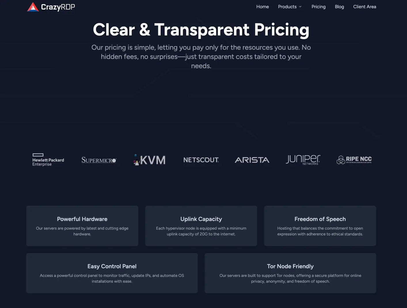
The pricing page transitions to a more linear, single-column flow: header text centers above the viewport, followed by a full-width partner logo bar, then a grid of feature cards arranged in a 3-over-2 pattern. The pricing table itself spans nearly the full content width, using a seven-column grid that aligns processor names, specifications, and pricing with order actions.
Spacing between major sections measures approximately 6rem, establishing clear territorial boundaries. Internal card padding sits at 2rem, providing comfortable text breathing room without excessive waste on dark backgrounds. Content gaps between related elements measure 1.5rem, creating association without crowding.
The table component uses row-based separation with subtle horizontal borders rather than zebra striping, maintaining the flat aesthetic while preserving scanability across many specifications.
Visual language
The visual language communicates technical competence through restraint. Surfaces are flat; shadows are absent or extremely subtle. Depth emerges from overlapping color layers—canvas against surface against surface-elevated—rather than dimensional effects.
The yellow highlight treatment on the homepage hero word “Anonymous” introduces a disruptive, almost editorial energy into the otherwise controlled system. This rectangular color block behind black text creates a stamp-like quality that reinforces the brand’s provocative positioning. It appears to be a deliberate one-off rather than a systematic pattern, making it more impactful.
Iconography and status indicators use simple geometric forms: filled circles for stock status, checkmarks for feature verification. The payment method section displays a dense grid of cryptocurrency and traditional payment logos, treated as flat color icons against the dark background without container borders.
Partner logos in the trust bar receive monochrome or near-monochrome treatment, reducing visual competition with the primary content. This desaturation technique keeps the page from feeling cluttered despite the quantity of third-party marks.
The overall impression is of a control panel or dashboard aesthetic extended to marketing surfaces—appropriate for an audience evaluating infrastructure services.
Components
Navigation bar
- Anatomy: Logo mark with wordmark left-aligned; horizontal link list right-aligned
- Surface: Transparent over canvas, no visible background separation
- Typography:
{typography.navigation}in{colors.ink} - Composition: Flex row with space-between justification; links include “Home”, “Products” with dropdown indicator, “Pricing”, “Blog”, “Client Area”
Hero section
- Anatomy: Headline with inline highlight, subhead paragraph, trust badge, and optional side cards
- Surface: Canvas background
- Typography:
{typography.hero-display}with highlight variant;{typography.body}for subhead - Shape: Highlight uses rectangular background block behind text
- Spacing: Generous top padding before headline; 1.5rem between headline and subhead
Product category card
- Anatomy: Category name with chevron link indicator, starting price, and green status dot
- Surface:
{colors.surface}with{rounded.card}corners - Typography: Category name in
{typography.card-title}; price in{typography.body-small}with{colors.ink-muted} - Spacing: Internal padding approximately 1.5rem; stacked vertically with 1rem gaps
Feature highlight card
- Anatomy: Header text and checklist items with verification icons
- Surface:
{colors.surface-elevated}or slightly lighter variant; distinct from adjacent cards - Typography:
{typography.card-title}for header;{typography.body-small}for list items - Shape:
{rounded.card}
Feature card (grid)
- Anatomy: Centered title and descriptive paragraph
- Surface:
{colors.surface}with{rounded.card} - Typography:
{typography.card-title}centered;{typography.body-small}centered with{colors.ink-muted} - Spacing:
{spacing.card-padding}internal; 1.5rem gap in grid
Pricing table
- Anatomy: Column headers row followed by data rows with processor, specifications, price, and action
- Surface: Header uses slightly elevated tone; rows alternate subtly or use border separation
- Typography: Headers in
{typography.label}uppercase; data in{typography.body-small}; prices in{typography.body}with{colors.action}and bold weight - Shape: Full-width container with
{rounded.card}on outer bounds - Composition: Seven-column grid; processor column widest; action column contains button
- Variants: Stock status shows green dot with “In Stock” or red dot with “Out of Stock”
Order button
- Anatomy: Text label with double-chevron icon
- Surface: Transparent background with
{colors.border}border - Typography:
{typography.label}in{colors.ink} - Shape:
{rounded.button} - Spacing: Compact padding, approximately 0.75rem horizontal
Responsive behavior
The design should maintain its dark character across all breakpoints. The pricing table, being the most information-dense component, requires careful handling: horizontal scroll with sticky first column, or progressive disclosure of specifications, would preserve usability on narrow viewports. The homepage hero’s asymmetric two-column layout should stack vertically on mobile, with the product cards preceding or following the headline based on conversion priority. Feature card grids should collapse from 3-over-2 to single column. Navigation should condense to a hamburger menu or simplified link set when horizontal space becomes constrained. Font sizes may scale down by approximately 15-20% on mobile while maintaining the established type hierarchy.
Practical implementation guidance
Preserve
- The deep navy canvas as the dominant background; light-mode inversion would fundamentally alter brand perception
- Orange accent exclusivity for prices and primary actions—do not dilute by applying to decorative elements
- The flat, shadowless surface model; rely on color value steps for depth
- High contrast between ink and canvas for accessibility compliance
Avoid
- Adding gradients or glassmorphism effects that contradict the technical flatness
- Using the yellow highlight treatment beyond the hero context; its power comes from singularity
- Lightening the canvas significantly; the dark environment is core to the brand
- Crowding the pricing table with additional decorative elements
Recommended build order
- Establish canvas and surface color tokens with proper contrast ratios
- Implement Figtree font loading with the complete weight range (400, 500, 600, 700)
- Build the navigation and hero section with responsive stacking
- Create the card component system with consistent padding and radius
- Develop the pricing table with proper column alignment and status indicators
- Add micro-interactions: button hovers, card elevation on hover, status dot animations
Accessibility
- Ensure all orange-on-dark text meets WCAG AA contrast; the action color against surface may need verification
- Add
aria-labelto order buttons that include only icon indicators - Make the pricing table keyboard-navigable with proper row and column header associations
- Provide visible focus states that complement the flat aesthetic, perhaps using outline or subtle background shift rather than default browser rings
Scope note
This guide covers the homepage and pricing page surfaces visible in the captured images. Footer content, interior product pages, checkout flows, account dashboards, and mobile-specific layouts are not represented. Motion, loading states, and form interactions are not documented. Measurements are practical adaptation targets derived from visual inspection.
Sites change, so a screenshot can differ from the guide.
Loading…Similar designs
This guide describes the public website and isn't an official crazyrdp.com design system. Not affiliated with crazyrdp.com.