Overview
DISCO’s visual identity is built for the music industry: loud, confident, and immediately legible. The system alternates between immersive, full-bleed gradient hero surfaces and stark white or saturated color blocks. Condensed display typography dominates every section, set in Plakat Grotesk with tight leading and minimal tracking, giving headlines a poster-like presence that fills the viewport width. The supporting type, Pp Neue Montreal, provides clean, modern readability for body copy, labels, and navigation without competing with the display voice.
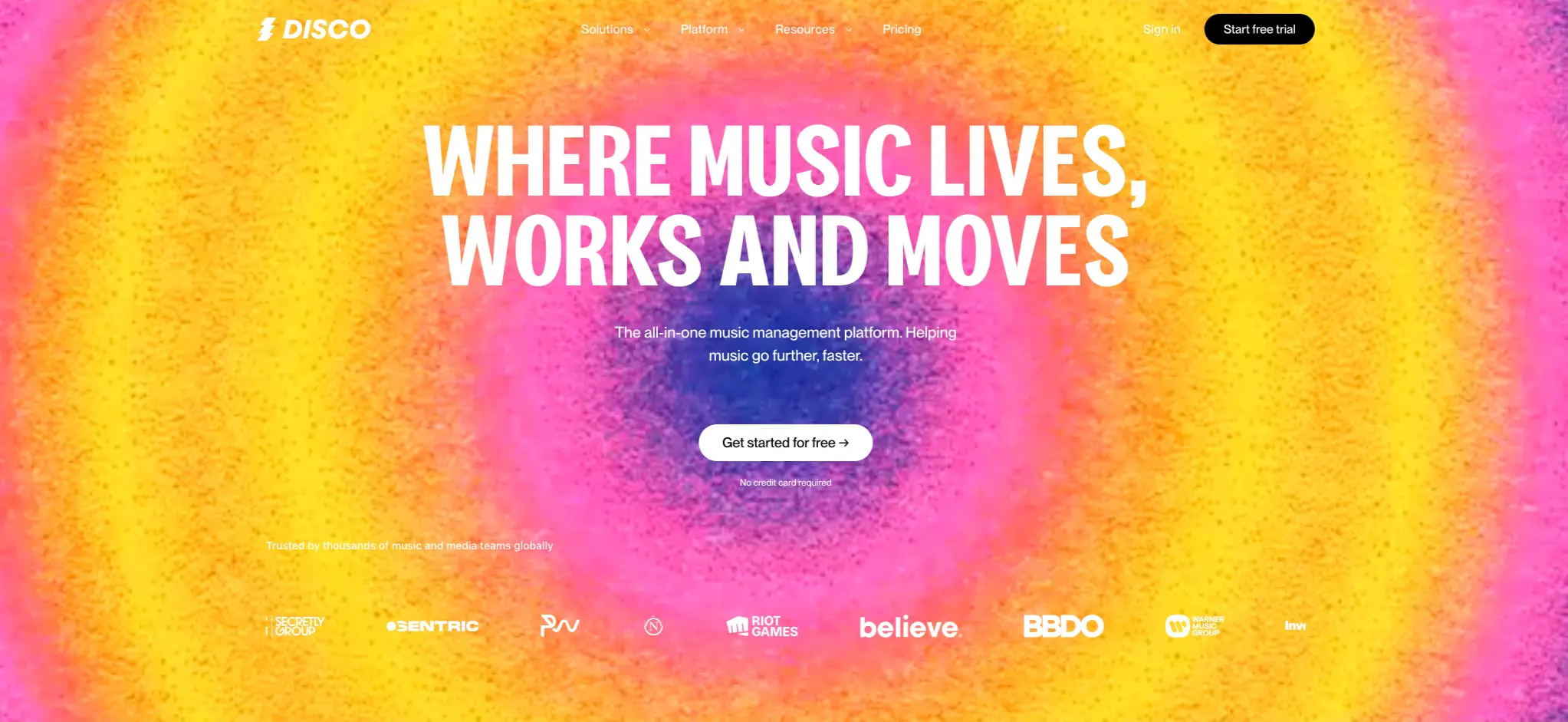
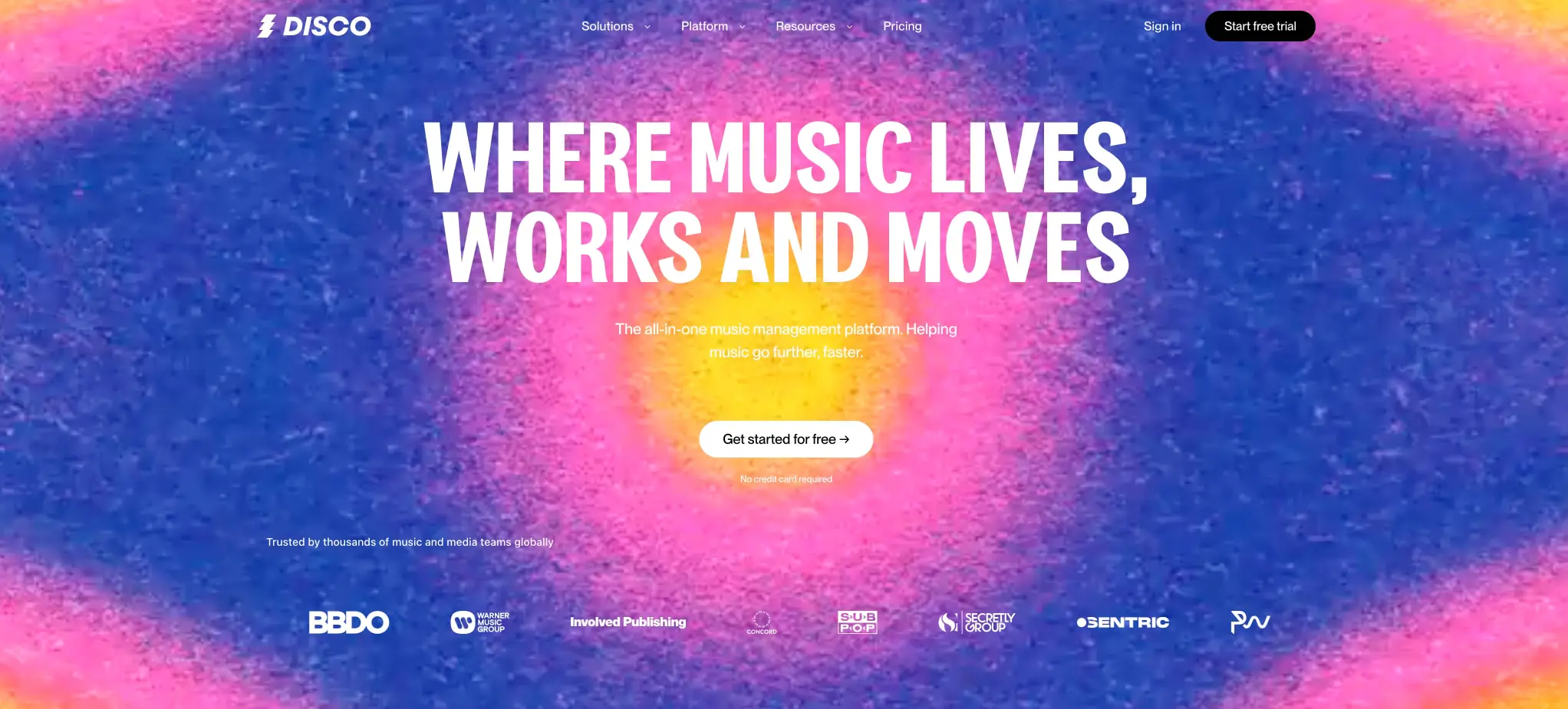
The design moves between two temperature modes: cool gradients of deep blue bleeding through magenta to warm yellow, and warm gradients of orange and yellow radiating outward. Against these immersive backgrounds, white text and black pill buttons create maximum contrast. In feature sections, the palette inverts to flat saturated yellow with black type, letting product screenshots and interface mockups become the focal point. Testimonials break the rhythm with solid color portrait cards on white grounds, adding human presence without softening the system’s graphic punch.
Colors
| token | value | use |
|---|---|---|
| ink | #000000 | Primary text on light surfaces, borders, icon strokes |
| canvas | #FFFFFF | Page background, hero text, pill button fill on dark |
| action | #000000 | Primary button background, active navigation |
| action-text | #FFFFFF | Text on primary buttons, navigation on dark |
| surface-yellow | #FFF44F | Feature section backgrounds, high-energy flat panels |
| surface-blue | #4A90E2 | Testimonial card backgrounds, accent panels |
| gradient-warm-start | #FF6B9D | Warm gradient origin, magenta-pink core |
| gradient-warm-end | #FFC93C | Warm gradient destination, saffron edge |
| gradient-cool-start | #667EEA | Cool gradient origin, deep indigo |
| gradient-cool-mid | #764BA2 | Cool gradient midpoint, violet transition |
| muted-ink | #333333 | Secondary body text, captions, metadata |
The color strategy centers on temperature-shifting gradients that evoke stage lighting and vinyl artwork. The cool gradient moves from deep indigo through violet to hot pink, while the warm variant radiates from magenta core to saffron edges. These are not subtle accents—they fill entire viewport backgrounds behind white display type. The flat yellow and blue surfaces in content sections provide rest points and functional hierarchy: yellow signals feature exploration and product demonstration, blue carries social proof and testimonials. Black and white remain the only text colors, ensuring the gradients never compromise legibility. No gray neutrals appear; the system achieves hierarchy through size, weight, and background contrast alone.
Typography
| token | family | size | weight | leading | tracking | use |
|---|---|---|---|---|---|---|
| hero-display | Plakat Grotesk | 5rem | 700 | 0.95 | -0.02em | Homepage hero headlines, full-width statements |
| section-display | Plakat Grotesk | 3.5rem | 700 | 1 | -0.01em | Section headings, feature titles |
| body | Pp Neue Montreal | 1rem | 400 | 1.5 | 0 | Descriptions, paragraphs, UI labels |
| body-bold | Pp Neue Montreal | 1rem | 700 | 1.5 | 0 | Emphasized inline text, active tab labels |
| label | Pp Neue Montreal | 0.875rem | 500 | 1.25 | 0.01em | Buttons, captions, metadata |
| navigation | Pp Neue Montreal | 0.875rem | 500 | 1 | 0 | Header links, dropdown triggers |
Plakat Grotesk serves as the unmistakable voice of the brand: a condensed grotesque with vertical stress, tight apertures, and maximum impact at large sizes. It appears exclusively in bold weight, always uppercase or title case, and is never used below 3.5rem. Pp Neue Montreal, designed by Mathieu Desjardins and available from Pangram Pangram Foundry, handles all functional typography with two weights: Medium for navigation and labels, Bold for emphasis and active states. The type scale is coarse and deliberate—there are no intermediate sizes between display and body, reinforcing the system’s graphic poster aesthetic. Verify licensing for these families before production use.
Layout
The page structure follows a full-bleed, section-based rhythm. Each major section occupies at least one full viewport height, with content centered horizontally and vertically within generous padding. The hero section stacks a navigation bar, massive two-line headline, supporting description, centered call-to-action, and partner logo row in strict vertical sequence. No sidebar or secondary column intrudes on this central axis.
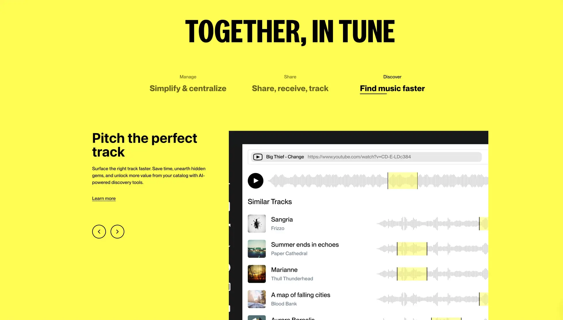
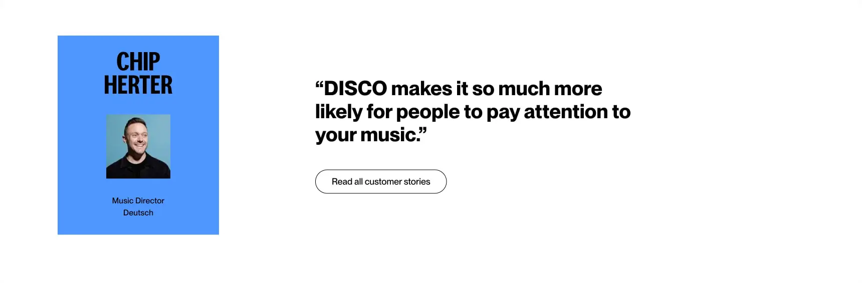
Below the hero, feature sections adopt an asymmetric two-column layout: a text block with section heading, description, text link, and directional arrows occupies the left third, while a product screenshot or interface mockup fills the right two-thirds. This ratio holds consistently, with the visual content bleeding toward the right edge. Testimonials invert the pattern, placing a solid-color portrait card on the left and a large quotation with secondary action on the right, both against white.
The grid is loose and editorial rather than rigid. Elements align to a soft centerline rather than a dense column system. Spacing between sections is substantial—typically 6rem or more—letting each color field breathe independently. Internal content gaps are tighter at 1.5rem, creating clustered reading groups within the open sections.
Visual language
The visual language draws from music packaging and event posters: bold type as image, saturated color as atmosphere, and minimal chrome. Rounded pill shapes appear exclusively for interactive elements—buttons, tags, and navigation highlights—while cards and panels use modest 0.5rem corners. No sharp 90-degree corners appear on interactive surfaces, softening the otherwise stark graphic system.
Photography is treated as flat graphic material. Portrait cards use solid color backgrounds behind square-cropped headshots, with the subject centered and the card floating on white. Product screenshots are presented at slight angles or with minimal shadow, emphasizing their interface content over dimensional presentation. The gradient backgrounds use a grainy, textured noise treatment that prevents banding and adds tactile warmth reminiscent of printed matter.
Iconography is minimal and functional: simple chevrons for carousel navigation, a play triangle for audio preview, and a right arrow for primary actions. These inherit the same stroke weight and geometric simplicity as the typography.
Components
Primary action button
- Anatomy: Text label with right arrow icon, centered within a pill container
- Surface: Black fill on light backgrounds, white fill on dark/gradient backgrounds
- Typography:
{typography.label}, weight 500 - Shape: Full pill with
9999pxradius - Spacing: 0.75rem vertical padding, 1.5rem horizontal padding
- Composition: Icon follows text with no gap, creating a single visual unit
- Variants: Dark variant for light sections; light variant for gradient heroes
Secondary action button
- Anatomy: Text label only, no icon
- Surface: Transparent with 1px black border
- Typography:
{typography.label}, weight 500 - Shape: Full pill with
9999pxradius - Spacing: 0.75rem vertical padding, 1.5rem horizontal padding
- Composition: Used for lower-priority actions like “Read all customer stories”
Navigation header
- Anatomy: Logo mark left, text links center, sign-in and trial buttons right
- Surface: Transparent over gradients, text in white
- Typography:
{typography.navigation}for links,{typography.label}for buttons - Composition: Horizontal flex with space-between, links grouped with dropdown chevrons
- Variants: Dark text variant for light section overlays
Feature tab group
- Anatomy: Three tab labels with active underline indicator
- Surface: Transparent, no background container
- Typography:
{typography.body}for inactive,{typography.body-bold}for active - Composition: Evenly distributed horizontal row above feature content
- States: Active tab shows black underline; inactive tabs show muted weight
Testimonial card
- Anatomy: Solid color background, centered portrait, name in display type, role and company in body type
- Surface:
{colors.surface-blue}background, black text - Typography: Name in
{typography.section-display}, role in{typography.body} - Shape: 0.5rem border radius
- Spacing: 2rem internal padding, portrait centered above text block
- Composition: Portrait square-cropped, text center-aligned below
Product screenshot frame
- Anatomy: Interface mockup showing audio waveforms, track lists, and playback controls
- Surface: Light gray interface chrome, white content areas, yellow waveform highlights
- Composition: Positioned right of text content, often with slight perspective or shadow
- Variants: Static screenshot or carousel with directional arrow controls
Responsive behavior
The design’s large type and generous spacing suggest a desktop-first approach that requires careful adaptation for smaller viewports. The hero headline, set at 5rem, should scale down to approximately 2.5rem on mobile to prevent overflow and maintain line breaks at natural phrase boundaries. The two-column feature layout should stack vertically, with the product screenshot preceding the text block to maintain visual interest above the fold.
Navigation collapses to a hamburger menu or simplified logo-plus-cta bar on narrow screens, preserving the “Start free trial” button as the persistent conversion element. Gradient backgrounds should remain full-bleed but may shift to a simpler two-stop gradient to reduce rendering load and visual complexity at small sizes.
The testimonial card, currently a left-floated element beside quotation text, should stack to full width with the card above the quote. Pill buttons maintain their shape but expand to full width on mobile for easier touch targets, with minimum 44px tap height.
Practical implementation guidance
Preserve
- The stark contrast between condensed display headlines and clean geometric sans-serif body text
- Full-bleed gradient sections with centered, stacked content
- Pill-shaped buttons as the sole interactive surface treatment
- The temperature alternation between cool and warm gradient modes
- Square-cropped portraits on solid color backgrounds for testimonials
Avoid
- Introducing additional border radii or corner styles beyond pills and modest panels
- Using Plakat Grotesk at small sizes or in body text roles
- Adding gray neutrals where black and white already achieve sufficient hierarchy
- Overlapping the gradient backgrounds with complex patterns or additional imagery
- Breaking the two-weight rule for Pp Neue Montreal
Recommended build order
- Establish the gradient background system with both temperature variants
- Implement Plakat Grotesk at hero and section display sizes with tight leading
- Build the pill button component with dark and light variants
- Create the navigation header with transparent-to-solid scroll behavior
- Develop the two-column feature section with tab navigation
- Add the testimonial card with solid color background and centered portrait
- Polish with partner logo row and directional arrow micro-interactions
Accessibility
- Ensure white text on gradient backgrounds maintains minimum 4.5:1 contrast; the deep blue and magenta areas may require text-shadow or localized darkening
- Provide
prefers-reduced-motionalternatives for any gradient animation or carousel transitions - Use semantic heading hierarchy despite the visual uniformity of display type
- Make pill buttons at least 44px tall for touch targets
- Include visible focus indicators that match the pill shape rather than default browser outlines
Scope note
This guide covers the DISCO homepage hero, feature sections, and testimonial surfaces visible in the captured images. Footer content, additional interior pages, mobile navigation behavior, and any motion or interaction patterns are not represented. Measurements are practical adaptation targets based on visible proportions. Verify licensing for Plakat Grotesk and Pp Neue Montreal before production use.
Sites change, so a screenshot can differ from the guide.
Loading…Similar designs
This guide describes the public website and isn't an official disco.ac design system. Not affiliated with disco.ac.