Overview
Fiverr’s marketplace interface presents a clean, utilitarian design system optimized for service discovery and transaction clarity. The visual language prioritizes information density through careful typographic hierarchy, restrained color usage, and consistent card-based organization. The system balances professional credibility with approachable simplicity, using a near-neutral palette that keeps attention on seller content and pricing information rather than decorative elements.
The interface structure follows a predictable pattern: navigation and search at the top, content organized in modular cards with clear boundaries, and action elements that stand out through high contrast rather than color saturation. Reviews, pricing tiers, and service details each occupy distinct visual containers with consistent internal spacing and alignment. This modular approach allows buyers to scan quickly across multiple sellers while maintaining context for each service offering.
Colors
The color system is intentionally restrained, built on a foundation of near-black ink tones against pure white canvas. Color serves functional roles rather than brand expression, with accents reserved for specific interactive states and success indicators.
| token | value | use |
|---|---|---|
| ink | #222325 | Primary headings, active tab labels, star ratings |
| ink-secondary | #404145 | Body text, seller names, primary content |
| ink-muted | #62646A | Secondary text, review metadata, inactive elements |
| ink-tertiary | #74767E | Tertiary labels, helper text, icon defaults |
| ink-quaternary | #95979D | Placeholder text, disabled states, subtle dividers |
| canvas | #FFFFFF | Primary backgrounds, card surfaces, input fields |
| surface | #FAFAFA | Subtle section backgrounds, alternating rows |
| surface-warm | #FFECD1 | Highlight backgrounds, promotional badges |
| surface-mint | #D0F7E6 | Success states, completion indicators |
| border | #DADBDD | Card borders, section dividers, tab underlines |
| border-light | #E4E5E7 | Input borders, subtle separators |
| action-primary | #000000 | Primary buttons, active states, strong emphasis |
| action-primary-text | #FFFFFF | Text on primary buttons |
| action-secondary | #00732E | Success indicators, savings badges, checkmarks |
| action-accent | #9B6928 | Premium indicators, special offers |
| star-filled | #222325 | Active rating stars |
| star-empty | #B5B6BA | Inactive rating stars, unchecked items |
The palette operates in a light mode exclusively across the visible surfaces. Warm and mint surfaces appear as contextual highlights rather than full background modes. The near-absence of saturated color keeps the interface feeling professional and trustworthy, appropriate for a marketplace where buyers evaluate professional services.
Typography
The typographic system relies primarily on Macan, deployed across a range of weights and sizes to establish hierarchy without introducing visual complexity. The system uses semantic sizing with clear distinctions between display, body, and functional text roles. Applesystem appears in the extracted data at 14px for div elements, indicating its use as a system-level fallback or specialized UI context. Times appears at 16px on the html root as a browser default baseline.
| token | family | size | weight | leading | tracking | use |
|---|---|---|---|---|---|---|
| hero-display | Macan | 1.75rem | 700 | 1.3 | normal | Page titles, major section headings |
| section-display | Macan | 1.25rem | 700 | 1.4 | normal | Card titles, pricing headers, review section labels |
| body | Macan | 1rem | 400 | 1.5 | normal | Primary content, descriptions, review text |
| body-small | Macan | 0.875rem | 400 | 1.5 | normal | Secondary content, metadata, feature lists |
| label | Macan | 1rem | 700 | 1.5 | normal | Form labels, active tab text, seller names |
| label-small | Macan | 0.875rem | 700 | 1.5 | normal | Compact labels, tier names, category tags |
| navigation | Macan | 0.875rem | 700 | 1.5 | normal | Header links, breadcrumb text |
| button-primary | Macan | 1rem | 600 | 1 | normal | Primary button text |
| price-display | Macan | 1.25rem | 400 | 1.2 | normal | Pricing amounts, cost indicators |
| legal-copy | Macan | 0.75rem | 400 | 1.5 | normal | Fine print, terms, copyright |
Weight distinctions carry significant semantic load: 700 for headings and active states, 600 for interactive elements and emphasis, 400 for body content. The system avoids italic styles entirely, maintaining a direct, businesslike tone. Line heights are generous for body text at 1.5, tightened for display text to 1.3, and compressed to 1 for buttons to maintain vertical centering.
Verify licensing for these families before production use.
Layout
The layout system uses a centered content model with generous horizontal margins that scale with viewport width. The spacing values indicate a container-based approach with internal padding rather than full-bleed layouts.
The base spacing unit is 0.125rem (2px), from which all measurements derive as whole-number multiples. Common layout values include 1rem for tight internal padding, 1.5rem for card padding, 2rem for section gaps, and 2.5rem for major content blocks. The largest spacing value of 200.5px (approximately 12.5rem) indicates substantial horizontal margins on wide viewports, creating a focused reading column.
Content cards use consistent internal spacing: 1.5rem top and bottom padding with 2rem left and right padding. This asymmetry—wider horizontal than vertical padding—accommodates text readability while keeping cards compact vertically. Review cards stack with 2.5rem vertical gaps between them, creating clear separation without excessive whitespace.
The pricing panel demonstrates a contained sidebar model with 1.5rem internal padding and a 1px border defining its boundary. Tab navigation within panels uses full-width distribution with centered text and a 1px bottom border indicating active state.
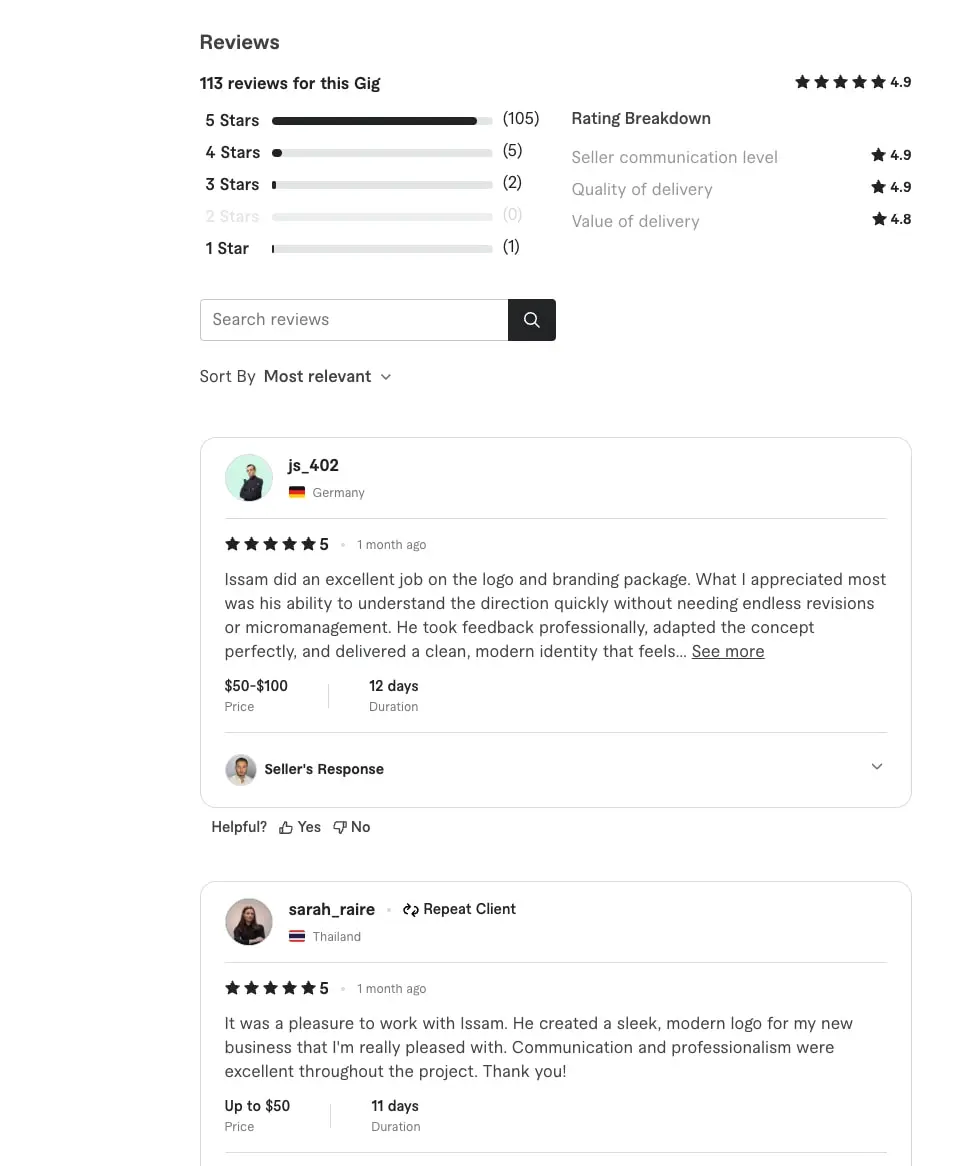
Grid relationships are implicit: content flows in single columns within cards, with flexbox-style row arrangements for metadata like ratings, pricing, and delivery time. The review section shows a two-column layout at the top level, with star distribution histograms on the left and rating breakdown on the right, separated by substantial horizontal space.
Visual language
The visual character is crisp and utilitarian, emphasizing clarity over decoration. Rounded corners are minimal and purposeful: 0.25rem for interactive elements like buttons and inputs, 1rem for content cards, and full circularity for avatars. This progression from sharp to soft creates a subtle hierarchy of friendliness, with human elements (avatars) receiving the most organic treatment while functional elements remain angular.
Borders function as structural elements rather than decorative accents. The 1px solid border in #DADBDD appears consistently around cards, panels, and tab containers. Input fields use a lighter #E4E5E7 border that intensifies on focus. The flat, bordered approach with no visible shadows creates a paper-like aesthetic that keeps attention on content.
Iconography appears as simple line icons or filled shapes, typically in #62646A or #74767E for inactive states, shifting to #222325 for active or emphasized states. Checkmarks in feature lists use #00732E for included items and #B5B6BA for excluded items, creating immediate visual scanning capability.
Avatars are consistently circular at 9999px radius, displayed at small sizes with tight integration to username text. Country flags appear as small inline images beside location metadata. Star ratings use filled and empty states in the same color family, with numeric scores appearing in bold beside icon arrays.
Components
Review Card
Review cards present buyer feedback in a contained, scannable format. Each card consists of a circular avatar, username in bold, country flag and location, star rating with numeric score, timestamp, review text with optional truncation and “See more” expansion, and metadata showing price range and project duration.
Anatomy: Avatar (circular, left-aligned), header row with username and location, rating row with stars and date, body text, metadata row with price and duration labels, optional seller response section with its own avatar and expandable content, and feedback buttons for helpfulness voting.
Surface and text color: White background with 1px #DADBDD border and 1rem border radius. Primary text in #404145, usernames in #222325 at 700 weight, metadata in #62646A at 400 weight.
Typography: Username uses label token, body text uses body token, metadata uses body-small token, seller response header uses label-small token.
Shape and border: 1rem border radius, 1px solid border, no shadow.
Spacing: 1.5rem top and bottom padding, 2rem horizontal padding. Internal gaps of 1rem between major sections. Avatar margin-right of 0.75rem.
Composition: Vertical stack with left-aligned avatar creating a hanging indent effect for content. Metadata row uses horizontal flex with 1.5rem gap between price and duration.
Variants: Expanded state shows full review text without truncation. Seller response section appears conditionally with its own border-top separator and 1rem vertical padding.
Pricing Tier Panel
The pricing panel presents service packages in a tabbed container with clear feature differentiation and a prominent call-to-action.
Anatomy: Tab row with three options (Basic, Standard, Premium), price display with savings badge, package description, delivery and revision metadata, expandable feature checklist, and full-width primary button.
Surface and text color: White background with 1px #DADBDD border. Active tab has #222325 text with 1px bottom border in #222325. Inactive tabs use #62646A. Price in #404145 at 1.25rem. Savings text in #00732E.
Typography: Tab labels use label token, price uses price-display token, description uses body token, feature list uses body-small token, button uses button-primary token.
Shape and border: Panel has no visible border-radius in the visible implementation. Tabs separated by 1px borders. Button has 0.25rem border radius.
Spacing: 1.5rem internal padding. Tab height approximately 3rem with centered text. Feature list items have 0.5rem vertical spacing. Button has 0.75rem vertical and 1.5rem horizontal padding.
Composition: Vertical stack with full-width elements. Tab row distributes three options equally. Button spans full width with right-aligned arrow icon.
Variants: Active tab indicated by bottom border and darker text. Feature items show included (green checkmark), excluded (gray checkmark), or unavailable (no icon) states.
Search Input
The review search field demonstrates the system’s input treatment with integrated action button.
Anatomy: Text input with placeholder, search icon button positioned at right edge.
Surface and text color: White background, #E4E5E7 border, #404145 text, #95979D placeholder. Search button has #222325 background with white icon.
Typography: Input text uses body token at 1rem.
Shape and border: 0.25rem border radius on input, right-side button has 0.25rem radius on right corners only creating a joined appearance.
Spacing: 0.5rem vertical padding, 0.75rem left padding, 2.5rem right padding to accommodate button. Button has 0.5rem padding.
Composition: Relative positioning with absolute button placement. Input and button share height and visual connection.
Primary Button
The system’s main call-to-action uses high contrast for maximum visibility.
Anatomy: Text label with optional right-aligned icon, full-width or content-width sizing.
Surface and text color: #000000 background, #FFFFFF text. Arrow icon in white.
Typography: button-primary token at 1rem, 600 weight.
Shape and border: 0.25rem border radius, no border.
Spacing: 0.75rem vertical padding, 1.5rem horizontal padding. Internal gap of 0.5rem between text and icon.
Composition: Flex row with centered alignment, space-between for full-width variant with icon.
Responsive behavior
The visible layouts indicate a desktop-primary design with substantial horizontal margins that compress on narrower viewports. The pricing panel, visible at a contained width, would stack below main content on mobile rather than appearing as a sidebar. Review cards maintain their internal structure across widths, with the two-column rating summary collapsing to a single column on smaller screens.
Tab navigation in the pricing panel would benefit from horizontal scroll or stacked presentation on very narrow viewports. The search input with integrated button should maintain its joined appearance, scaling to full width with maintained proportions.
Avatar and metadata rows within review cards should preserve their left-alignment and horizontal arrangement, though timestamp and rating information might stack vertically on mobile to prevent overflow. The “Helpful?” voting buttons with thumbs icons should remain tappable at minimum 44px touch targets regardless of their compact visual presentation.
Practical implementation guidance
Preserve
- The strict typographic hierarchy using weight rather than size for emphasis within similar scales
- High-contrast primary buttons with black backgrounds and white text
- Consistent 1px borders for card definition without shadows
- Circular avatars as the only fully rounded elements, maintaining the system’s subtle progression from functional to human
- Green checkmarks for included features with gray indicators for exclusions, creating immediate scannability
- The joined input-button pattern for search fields with corner-radius asymmetry
Avoid
- Introducing additional font families; the single-family system is integral to the clean aesthetic
- Using shadows for elevation; the flat, bordered approach defines the visual character
- Saturated accent colors beyond the functional green and warm highlight
- Rounding buttons or inputs beyond the minimal 0.25rem; excessive rounding would feel out of place
- Center-aligned text in cards; the left-aligned, hanging-indent structure aids scanning
Recommended Build Order
- Establish the typographic scale with Macan at root 16px, implementing all weight and size variants
- Define the color tokens, particularly the ink progression from #222325 to #95979D
- Build the card component with correct padding, border, and radius as the foundational content container
- Implement the pricing panel with tab behavior and feature checklist states
- Create the review card with avatar integration, expandable text, and metadata layout
- Add the search input with integrated button pattern
- Polish with spacing tokens and responsive margin adjustments
Accessibility
- Ensure star ratings have accessible labels beyond visual presentation, announcing “4.9 out of 5” rather than relying on icon counts alone
- The “See more” expansion control needs clear focus indication and keyboard activation
- Tab panels in pricing require proper ARIA roles and keyboard navigation between tiers
- Color alone should not indicate feature inclusion; the checkmark icon provides necessary non-color indicator
- Placeholder text in search inputs should not substitute for visible labels; consider persistent labeling for clarity
- Maintain sufficient contrast for #62646A text on white backgrounds, which meets WCAG AA for large text but may need verification for smaller sizes
Scope note
This guide covers the service listing and review surfaces of Fiverr’s marketplace, specifically the pricing tier panel and review card components. Mobile layouts, checkout flows, seller dashboards, animation behavior, and dark mode implementations are not represented in the visible material. The homepage discovery experience, category browsing, and search results pages fall outside the current scope. Applesystem and Times appear in the extracted font data but their specific visible roles are limited; verify licensing for all families before production use.
Sites change, so a screenshot can differ from the guide.
Loading…Similar designs
This guide describes the public website and isn't an official fiverr.com design system. Not affiliated with fiverr.com.