Overview
Fly.io’s visual system is quiet at first glance, then increasingly expressive as the page unfolds. The baseline is a white canvas with deep violet text, thin borders, and a small set of saturated purple actions. The main headlines are serif and literary, while the body copy stays compact, matter-of-fact, and unadorned. That contrast gives the site a confident technical voice without turning it into a dense dashboard.
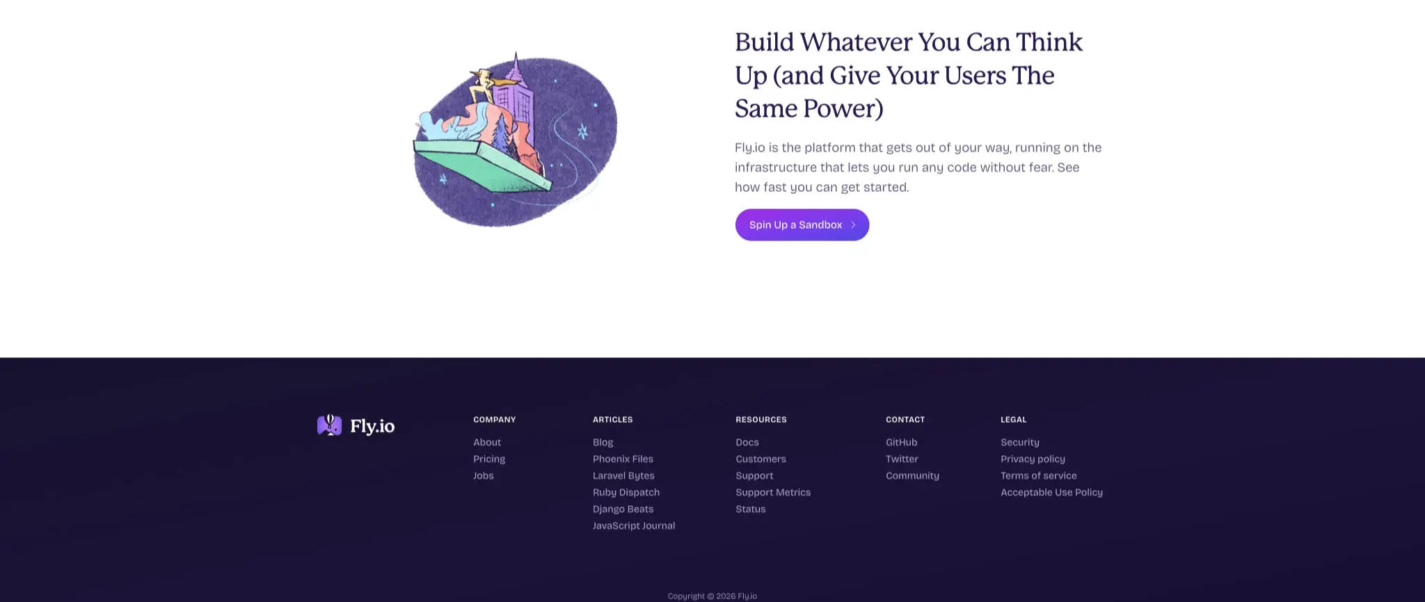
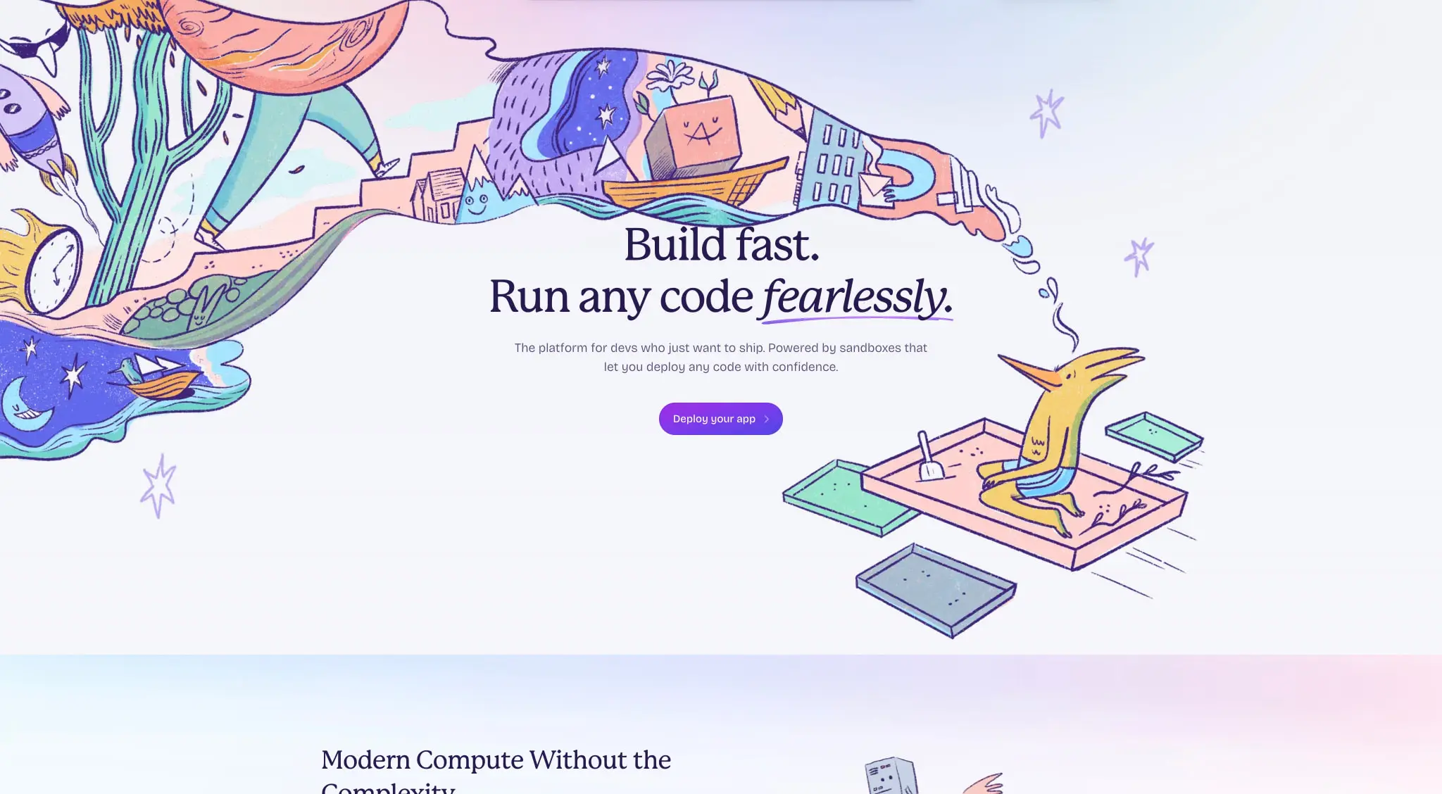
The page story is built from a few strong moves: a centered sign-in form, wide hero compositions with a hand-drawn illustration lane, a pale trust strip, a gradient-backed framework section, and a dark footer that closes the page with a clear hierarchy. The system feels calm because each section has one dominant job. It feels distinctive because the illustrations, gradient sheens, and serif headings keep returning in different combinations.
The parts to preserve are the white space, the violet action color, the serif headline scale, the rounded controls, and the shift from bright editorial layouts into a deep indigo footer. The brand does not rely on heavy chrome or dense cards; spacing and type carry most of the identity.
Colors
Core palette
| token | value | role |
|---|---|---|
action |
#A02BE4 |
Primary buttons, sign-in submit controls, and the strongest link color |
action-strong |
#7C3AED |
Deeper end of the action gradient and dark-mode emphasis |
ink |
#281950 |
Main text, headings, and dark footer surfaces |
muted-ink |
#373953 |
Supporting copy, labels, and quieter metadata |
canvas |
#FFFFFF |
Main page background and the lightest section surface |
border |
#A39AC1 |
Input edges, subtle cards, and light separators |
border-strong |
#9698B6 |
Stronger outline use on compact controls and footer-adjacent text treatments |
label |
#5D1985 |
Small uppercase or emphatic labels |
on-dark |
#FFFFFF |
Text and icons on dark indigo surfaces |
Support and accent colors
| token | value | role |
|---|---|---|
accent-cyan |
#7DD3FC |
Soft glow in pale gradient panels and trust-band atmosphere |
accent-mint |
#86EFAC |
Friendly status chips and illustrative highlights |
accent-green |
#10B981 |
Checklist ticks and success cues |
accent-gold |
#FEF08A |
Warm accent in illustration tiles |
accent-peach |
#FED7AA |
Secondary illustration fill and soft contrast color |
accent-orange |
#F97316 |
Small warm emphasis inside illustration clusters |
The page stays mostly monochrome in structure, then lets violet carry the brand weight. #A02BE4 and #7C3AED do the work of a primary action system, while #281950 handles text and the dark footer. The light sections use white as the dominant field and add atmosphere with a translucent blue sheen: linear-gradient(100deg, rgba(125, 211, 252, 0.1), rgba(255, 255, 255, 0)). That keeps the layout luminous without adding visible chrome.
The visual relationship between surfaces is simple. White sections keep the page open and airy. Pale gradient sections soften the transition into more technical content. The footer inverts the hierarchy by placing white text on the dark violet base. Accent greens, cyans, peaches, and golds should stay secondary; they support icons, check marks, and illustrations rather than becoming UI tokens.
Typography
Fly.io relies on two families with a clear division of labor. P 22 Mackinac Pro gives the page its editorial voice, especially in the biggest headings. Fricolage Grotesque Ext Bd 96 Pt carries the utility layer: body copy, buttons, labels, forms, and footer text. Licensing details are not recorded here; confirm reuse before production.
| token | family | size | weight | leading | tracking | use |
|---|---|---|---|---|---|---|
hero-display |
P 22 Mackinac Pro | 4rem | 500 | 1.15 | -0.045em | Main hero statements and the largest page headlines |
section-display |
P 22 Mackinac Pro | 2.25rem | 500 | 1.325 | -0.025em | Section openings, trust-band headings, and large feature calls |
panel-display |
P 22 Mackinac Pro | 1.5rem | 500 | 1.25 | -0.025em | Sign-in heading and compact panel titles |
body-large |
Fricolage Grotesque Ext Bd 96 Pt | 1.125rem | 325 | 1.5 | 0em | Supporting paragraphs beneath major headings |
body |
Fricolage Grotesque Ext Bd 96 Pt | 1rem | 325 | 1.5 | 0em | Form labels, checklist copy, and general explanatory text |
body-compact |
Fricolage Grotesque Ext Bd 96 Pt | 0.90625rem | 325 | 1.5 | 0em | Secondary descriptions, footer links, and lower-emphasis metadata |
button |
Fricolage Grotesque Ext Bd 96 Pt | 0.96875rem | 450 | 1.5 | 0em | Primary and secondary action labels |
label |
Fricolage Grotesque Ext Bd 96 Pt | 0.90625rem | 575 | 1.5 | 0.05em | Checklist tags, small section labels, and compact emphatic text |
legal |
Fricolage Grotesque Ext Bd 96 Pt | 0.90625rem | 325 | 1.6 | 0em | Footer copy and low-emphasis metadata |
The hierarchy comes from scale, family contrast, and tight leading rather than from many different styles. The serif headings lean slightly inward through negative tracking, which makes them feel intentional and composed. The grotesk family stays readable at small sizes and gives the forms, buttons, and footer a stable utility voice. The site never needs a third family; the tension between these two is enough.
Layout
The page uses very wide centered columns, but the content itself stays narrow. On the desktop hero, the text block sits in the middle of a large field, with a separate illustration or image lane to one side. That creates a floaty composition: the page feels spacious, but the important information still lands in a compact reading width. Large wrappers leave roughly 428px to 580px of side space on the broadest sections, and the section padding often steps up to 128px vertically with 32px horizontal gutters.
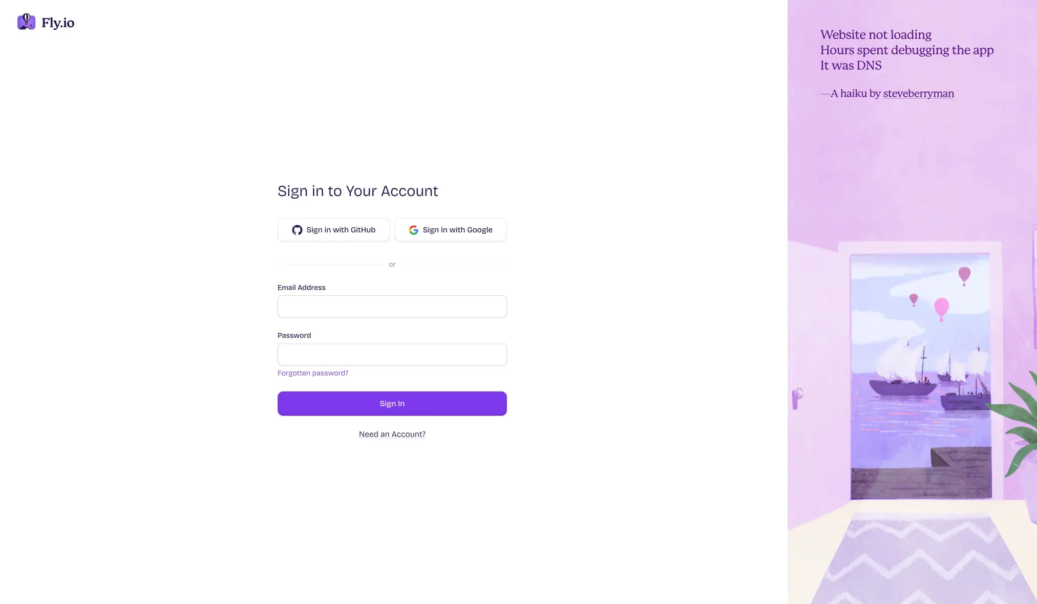
The sign-in page shows the same logic in a more structured form. A compact card sits in the center of a white field, with two provider buttons side by side above the email and password fields. The form reads as a self-contained module, while the right side becomes a tall illustrated panel with a soft purple room scene. The balance is asymmetrical, but not noisy.
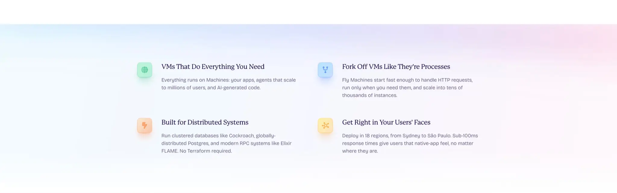
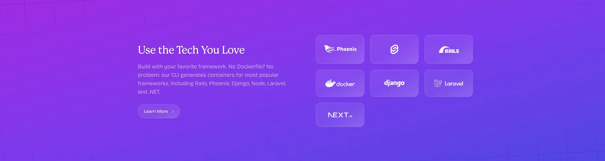
The trust section uses a lighter, more diagram-like arrangement. A logo row runs across the top, and the content below splits into checklist and explanation. Thin horizontal rules and green ticks give the checklist a controlled rhythm. The framework section turns the layout into a grid of rounded tiles, each tile acting like a small signpost for a toolchain or platform. The dark footer finishes with a rigid multi-column information architecture: brand at left, then tidy link columns, then the smallest legal copy at the bottom.
Across the page, large vertical gaps do more work than borders. Sections are separated by air, not by stacked chrome. That is why the page feels calm even when it contains many topics.
Visual language
Fly.io combines a technical subject with a playful surface language. The illustrations are hand-drawn, loose, and slightly whimsical, but they sit inside disciplined compositions. That makes the page feel friendly without losing credibility. The drawings use lilac, blue, mint, peach, and gold fills, often with soft outlines and sketch-like contours. They are not ornamental extras; they explain the product mood and keep the brand memorable.
The color treatment is equally restrained. Most UI surfaces stay white. When the page wants more energy, it introduces a violet gradient or a pale blue-lilac haze. The action color is consistently saturated, but it never spills everywhere. Small checks, buttons, and framework tiles carry the strongest chroma, while the rest of the interface holds back. This keeps the page from feeling overdesigned.
Shape matters, but only at a few scales. Inputs and buttons use modest rounding around 0.625rem to 0.6875rem. Larger calls to action feel pill-like. The footer and section blocks remain mostly rectangular, so the rounded controls stand out. There is little to no visible shadow system. Depth comes from contrast, spacing, and color shift instead of raised cards.
Components
Header and logo mark
- Anatomy: Small logo icon, wordmark, sparse top-level links, and an action at the far edge.
- Typography: Tiny Fricolage labels with medium or semibold weight.
- Surface: Usually transparent or white, never heavy.
- Composition: Keep the header low in height and let the hero carry the visual weight.
Sign-in card
- Anatomy: Centered title, third-party sign-in buttons, divider, stacked email and password fields, password recovery link, submit button, and a final account-creation link.
- Surface: White card on a white page, defined by borders and spacing more than by fill contrast.
- Shape: Inputs and buttons use soft corners around 0.625rem to 0.6875rem.
- Typography:
panel-displayfor the title,bodyfor labels,buttonfor controls. - Visible state: The form reads as clean, calm, and ready; the purple submit button is the strongest cue in the stack.
Primary action
- Fill: Violet gradient from
#A02BE4to#7C3AED. - Text: White, set in the Fricolage button style.
- Shape: Rounded pill or rounded rectangle depending on context.
- Role: This is the only interaction color that should feel assertive.
- Placement: One strong action per section is enough; the page never needs a cluster of competing buttons.
Trust checklist band
- Anatomy: Logo row, short heading, supporting paragraph, and a checklist with green ticks.
- Surface: Pale gradient field with a translucent blue sheen.
- Typography: Serif heading paired with compact grotesk body copy.
- Composition: Keep the checklist in a disciplined vertical rhythm with thin separators.
- Visible state: The ticks are small but bright, so they work as quick reassurance marks rather than decorative icons.
Framework tile section
- Anatomy: Section heading, explanatory paragraph, one action, and a grid of rounded square tiles.
- Surface: Violet-backed or violet-inflected area, with a stronger visual energy than the white sections.
- Shape: Each tile is softly rounded and evenly spaced, reading like a small system card.
- Typography: Serif for the lead message, grotesk for supporting copy and tile labels.
- Composition: Keep the tiles aligned in a clean grid so the section feels engineered, not playful chaos.
Footer
- Anatomy: Brand at left, multiple link columns, and tiny legal copy at the bottom center.
- Surface: Deep violet, almost indigo.
- Text color: White for the main footer content, with lower-contrast text for quieter lines.
- Typography: Fricolage throughout, with the lightest weight reserved for metadata.
- Hierarchy: Brand and navigation first, legal material last.
- Visible state: The footer should feel like a clear endpoint, not another promotional block.
Responsive behavior
The design should keep the same reading order on smaller screens: headline, supporting copy, action, then illustration or secondary content. The centered form should become a single-column stack with the provider buttons separated vertically before the email and password fields. The trust checklist and framework tiles should collapse into one-column or two-column stacks before they become too compressed. The footer should preserve its information hierarchy even when the link columns wrap. The main goal is to keep the serif headlines readable and the illustrations legible without turning every section into a dense card wall.
Practical implementation guidance
Preserve
- Keep the two-family contrast intact: Mackinac for statements, Fricolage for everything functional.
- Preserve the generous white field around the central content blocks.
- Keep the violet action gradient as the signature control treatment.
- Let illustrations stay large and loose rather than shrinking them into icons.
- Maintain the dark footer as a strong closing surface.
Avoid
- Avoid heavy shadows or glass effects; the page does not need faux depth.
- Avoid turning every section into a bordered card grid.
- Avoid adding a third type family or a second headline voice.
- Avoid saturating the page with the accent colors; they are support tones, not the brand core.
- Avoid dense microcopy blocks that fight the airy layout.
Recommended build order
- Set the serif and grotesk type scale first.
- Build the white canvas, section widths, and large vertical spacing.
- Add the primary violet action and the rounded form controls.
- Recreate the sign-in card and the hero composition.
- Build the pale trust strip with its checklist rhythm.
- Add the framework tile grid and the other illustrated feature sections.
- Finish with the deep violet footer and its column structure.
Accessibility
- Keep contrast high wherever white text sits on dark violet surfaces.
- Make sure the action gradient still reads clearly when text is centered inside it.
- Keep form labels tied closely to their fields and leave enough spacing between inputs.
- Give illustrations descriptive alternative text when they carry meaning.
- Preserve a visible focus treatment for links, buttons, and form controls.
- Do not rely on color alone for checklist status or navigation emphasis.
Scope note
This guide covers the desktop sign-in page, the white hero, the trust band, the framework section, the illustrated feature blocks, and the dark footer. One captured image file was blank and did not add visual guidance. Mobile behavior, motion, hover states, loading states, and unshown page areas are not defined here; type and spacing values use the shared 0.125rem step.

Sites change, so a screenshot can differ from the guide.
Loading…Similar designs
This guide describes the public website and isn't an official fly.io design system. Not affiliated with fly.io.