Overview
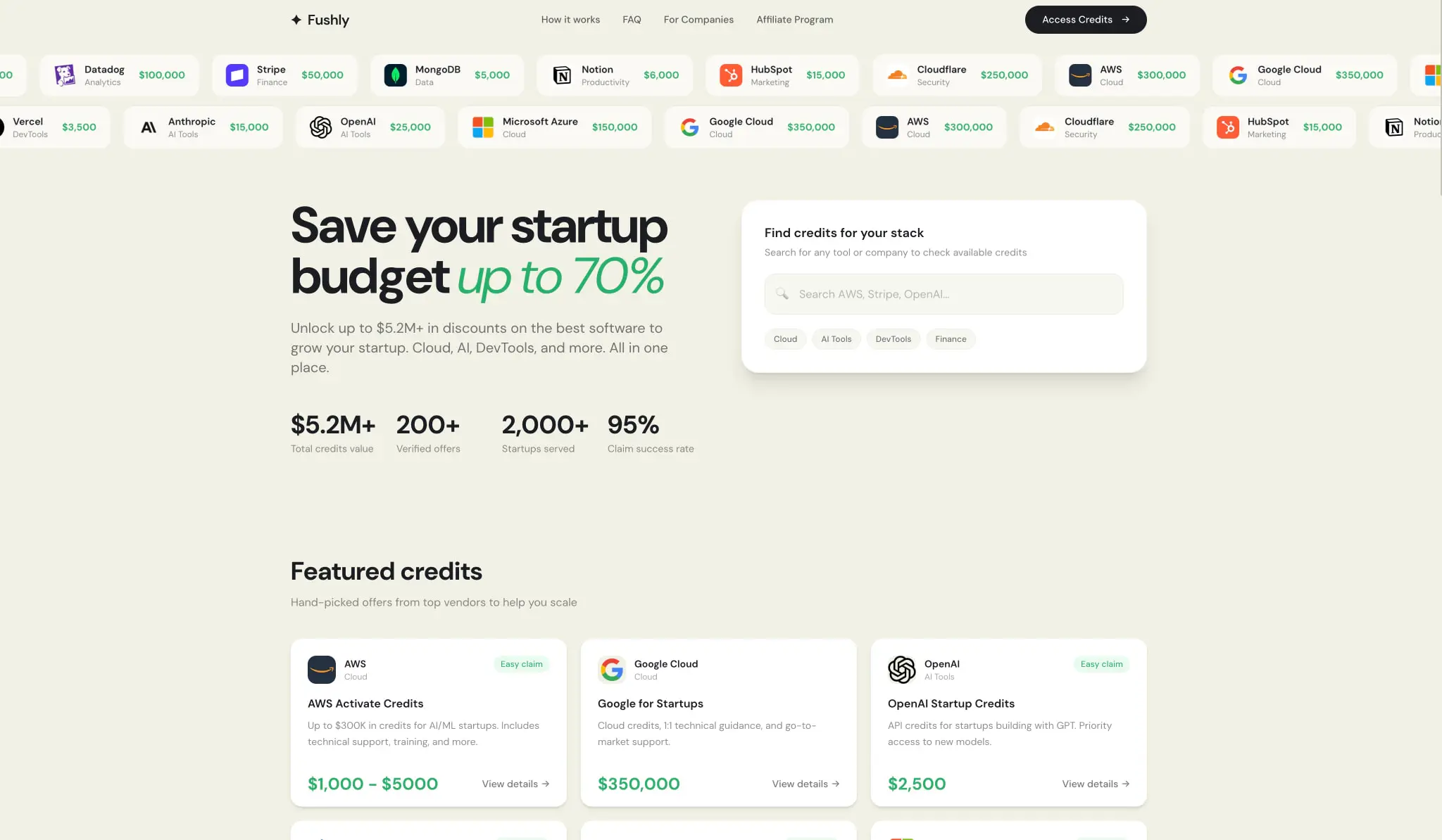
Fushly presents a startup credits marketplace through a design language that balances warmth with professional credibility. The system rests on a cream-toned canvas that avoids sterile white, using instead a subtle warm beige that feels approachable to founders navigating vendor discounts. Dark charcoal panels create dramatic contrast for promotional moments and authentication flows, while a vivid green accent color draws attention to value propositions and interactive elements. The typography relies entirely on DM Sans, with its italic variant deployed strategically for editorial emphasis on key phrases like “startup credits” and percentage claims. Components favor generous rounding—pills for actions, soft rectangles for cards—creating a friendly geometry that softens the financial nature of the content. The overall impression is of a curated, trustworthy platform that speaks founder-to-founder rather than corporate-to-customer.
Colors
The palette operates in two modes: a warm light mode for browsing and discovery, and a dark mode for impact sections and authentication. The light mode canvas is a distinctive cream that separates Fushly from generic SaaS aesthetics.
| token | hex | use |
|---|---|---|
| ink | #12141A | Primary text, dark panel backgrounds, primary button fill |
| ink-secondary | #1A1D23 | Slightly lifted dark surfaces, subtle variation in dark panels |
| canvas | #F2F1E6 | Page background, form surfaces, light mode base |
| surface | #FFFFFF | Input fields, cards, elevated containers on cream |
| surface-warm | #E8E7D9 | Card borders, dividers, subtle boundaries |
| accent | #25B06A | Value highlights, pricing text, selected states |
| accent-bright | #2DD17F | Primary CTA buttons, benefit checkmarks, emphasis moments |
| border | #E8E7D9 | Hairline borders on cards, input outlines |
The dark panels use ink and ink-secondary as layered backgrounds, with white text for headings and cream-tinted text for secondary content. The green accent family bridges both modes, appearing as text on light backgrounds and as filled buttons on dark surfaces. The cream canvas is never pure neutral—it carries a subtle warmth that unifies photography, white cards, and dark sections into a coherent environment.
Typography
The system uses DM Sans 9 Pt as its sole type family, with both Regular and Italic variants. The italic is reserved for editorial emphasis within display contexts, creating a humanistic counterpoint to the geometric sans-serif base. Verify licensing for these families before production use.
| token | family | size | weight | leading | tracking | use |
|---|---|---|---|---|---|---|
| hero-display | Dm Sans 9 Pt | 4.5rem | 700 | 1 | -0.025em | Homepage hero headlines with italic accent words |
| section-display | Dm Sans 9 Pt | 2.25rem | 700 | 1.25 | normal | Section headings, feature titles |
| body-large | Dm Sans 9 Pt | 1.25rem | 400 | 1.4 | normal | Hero descriptions, introductory paragraphs |
| body | Dm Sans 9 Pt | 1rem | 400 | 1.5 | normal | Form labels, card descriptions, general content |
| body-small | Dm Sans 9 Pt | 0.875rem | 400 | 1.43 | normal | Secondary text, metadata, legal copy |
| label | Dm Sans 9 Pt | 0.75rem | 400 | 1.33 | normal | Captions, fine print, terms references |
| accent-italic | Dm Sans 9 Pt-Italic | 4.5rem | 400 | 1 | -0.025em | Emphasized words within hero headlines |
| navigation | Dm Sans 9 Pt | 0.875rem | 500 | 1.43 | normal | Header links, tab labels |
Weight variations within the family create hierarchy without introducing additional fonts. Bold weights (700) anchor headlines and statistics. Semibold (600) appears in button text and emphasized labels. Medium (500) serves navigation and secondary actions. Regular (400) handles body content and the italic display moments.
Layout
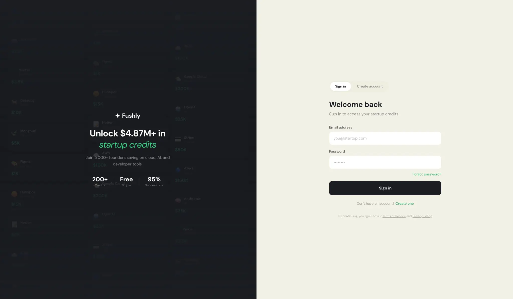
The layout follows a centered, contained approach with generous breathing room. The homepage uses a maximum content width with horizontal padding that scales with viewport size. Authentication pages split into asymmetric two-column layouts: a dark left panel carrying brand messaging and social proof, and a light right panel hosting the form.
The spacing system derives from a 2px base unit, expressed in rem for scalability. Key values include 0.5rem for tight internal gaps, 1rem for component padding, 1.5rem for card interiors, 2rem for section separations, and 3.5rem for major section breaks. The vendor marquee at the top of the homepage demonstrates horizontal rhythm with consistent gaps between logo-value pairs.
Grid behavior favors single-column stacks for mobile authentication, two-column splits for desktop auth, and multi-column card grids for featured credits. The search panel on the homepage floats as an elevated surface with internal padding of 1.5rem, creating a focal point without dominating the hero composition. Statistics rows use inline horizontal arrangement with generous gaps between number-label pairs, allowing quick scanning of social proof metrics.
Visual language
The visual identity centers on approachable professionalism. Rounded corners dominate—12px for inputs, 16px for cards, 24px for larger panels, and full pills for all buttons. This consistent curvature prevents any element from feeling sharp or adversarial, appropriate for a service helping startups save money.
Photography and iconography appear in the vendor marquee and credit cards, where company logos sit beside dollar-value claims. The logo treatment is clean and uniform, with each vendor presented as a small icon paired with category label and credit amount. Green accent color consistently signals value and action: credit amounts, “Easy claim” badges, selected plan borders, and primary CTAs.
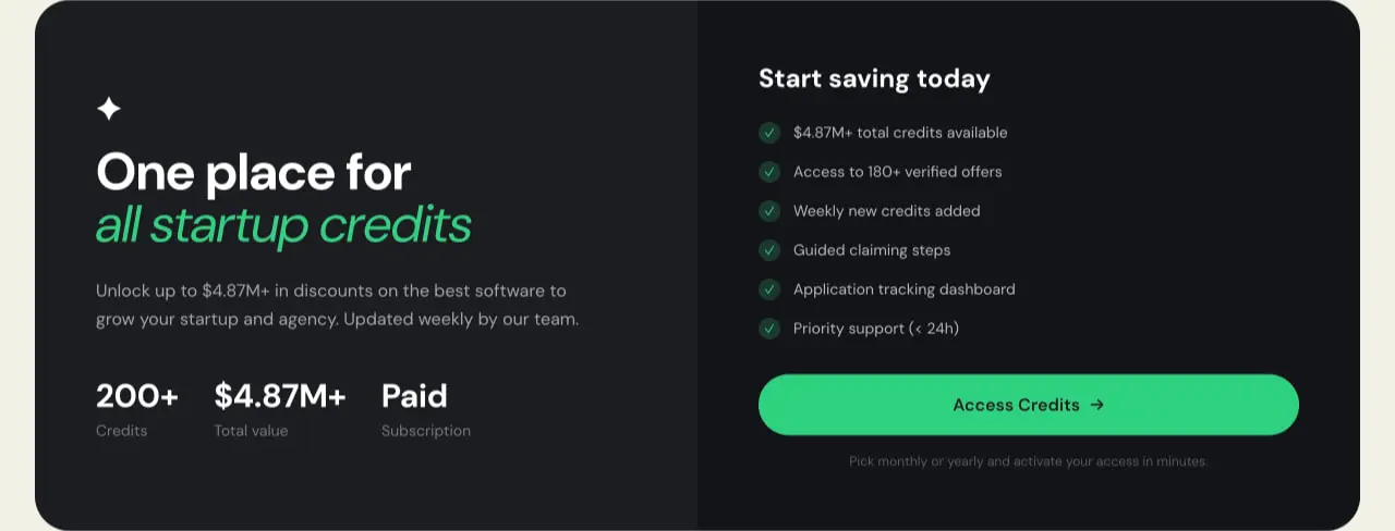
The dark panel treatment uses near-black (#12141A) with subtle depth from #1A1D23 variations. On these surfaces, white text maintains high contrast while green accents pop with greater saturation. The transition between light and dark modes happens at section boundaries, not through user toggle, creating deliberate dramatic moments in the page narrative.
Shadow usage is minimal and functional—a subtle 0px 1px 2px rgba(0,0,0,0.05) for slight elevation, and a deeper 0px 20px 25px -5px shadow for the floating search panel. No heavy drop shadows or glassmorphism effects appear.
Components
Primary button
- Anatomy: Text label centered within a full pill shape
- Surface: Ink (#12141A) background with white text, or accent-bright (#2DD17F) on dark panels
- Typography: Semibold 1rem, line-height 1.5
- Shape: Border-radius 9999px, full pill
- Spacing: 1rem vertical padding, full-width in forms or auto-width with horizontal padding in headers
- Composition: Often paired with arrow icon for directional CTAs like “Access Credits →”
Secondary button
- Anatomy: Smaller pill with reduced padding
- Surface: White or transparent background with ink text
- Typography: Medium 0.875rem
- Shape: Border-radius 9999px
- Spacing: 0.5rem vertical, 1.25rem horizontal
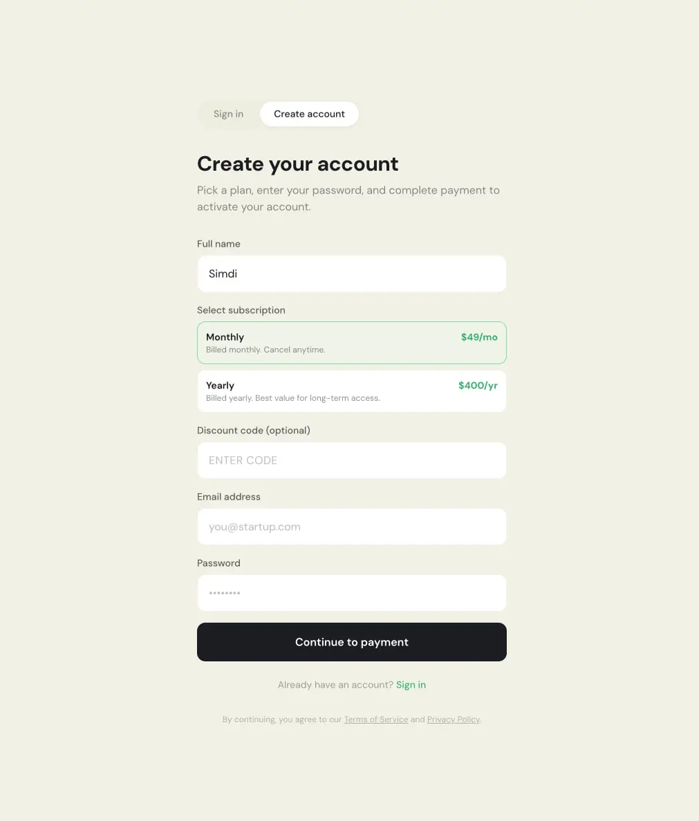
- Variants: Active state with ink background and white text for tab selection (Sign in / Create account toggle)
Input field
- Anatomy: Label above, single-line text entry below
- Surface: White (#FFFFFF) background on cream canvas
- Typography: Regular 1rem for input text, placeholder in muted tone
- Shape: 12px border-radius, no visible border or subtle border
- Spacing: 1rem internal padding, 1.5rem gap between label and input
- Composition: Stacked vertically with 1.5rem gaps between fields
Subscription plan selector
- Anatomy: Two selectable cards with plan name, description, and price
- Surface: White background, green left border or full green border for selected state
- Typography: Semibold 0.875rem plan name, regular 0.875rem description, semibold 0.875rem price in accent green
- Shape: 12px border-radius
- Spacing: 1rem internal padding
- Variants: Selected state shows green border and check indicator; unselected shows neutral border
Credit card
- Anatomy: Vendor icon, vendor name, category tag, “Easy claim” badge, title, description, credit value, details link
- Surface: White background with warm border (#E8E7D9), 16px radius
- Typography: Semibold 1rem title, regular 0.875rem description, bold 1.5rem value in accent green
- Shape: 16px border-radius
- Spacing: 1.5rem padding, internal gaps of 0.5rem to 1rem
- Composition: Three-column grid on desktop, stacked on mobile
Vendor marquee
- Anatomy: Horizontal scrolling row of vendor logo + name + category + value pairs
- Surface: Transparent on cream background
- Typography: Regular 0.875rem for names and categories, semibold 0.875rem for values in accent green
- Shape: Each item as a rounded pill or soft rectangle
- Composition: Infinite horizontal scroll, seamless loop
Dark feature panel
- Anatomy: Left text block with headline, description, statistics; right checklist with CTA
- Surface: Ink (#12141A) background
- Typography: White section-display and body-large on left; white body with green checkmarks on right
- Shape: 24px border-radius for the panel container
- Spacing: Generous internal padding, 3rem+ gaps between major elements
Responsive behavior
The system adapts through breakpoint-aware layout shifts rather than fluid scaling alone. The authentication split-screen collapses to single-column stacked layout on narrow viewports, with the dark brand panel moving above or below the form. Homepage hero content reflows from side-by-side headline and search panel to vertical stack. Credit card grids transition from three columns to two to one as viewport narrows.
Typography scales down at major breakpoints: hero-display reduces from 4.5rem to 3rem to 2.25rem. Body text maintains 1rem minimum for readability. Touch targets maintain 44px minimum height for buttons and inputs. The vendor marquee likely pauses or simplifies on mobile to prevent horizontal scroll fatigue.
Practical implementation guidance
Preserve
- The warm cream canvas (#F2F1E6) as the default page background—this is the system’s most distinctive choice
- Full pill buttons (9999px radius) for all primary and secondary actions
- Italic DM Sans for emphasized words within headlines only, not body text
- Green accent (#25B06A) for value displays and success states, brighter green (#2DD17F) for filled CTAs on dark
- Consistent 12px/16px/24px radius progression for inputs, cards, and panels
Avoid
- Sharp 0px corners on interactive elements—this breaks the friendly geometry
- Pure white (#FFFFFF) as page background—use cream or dark only
- Additional font families beyond DM Sans 9 Pt Regular and Italic
- Green text on light green backgrounds—maintain contrast ratios
- Box shadows heavier than the subtle functional lifts specified
Recommended build order
- Establish cream canvas and ink text as base tokens
- Implement DM Sans 9 Pt with full weight range (400–700)
- Build pill button component with all surface variants
- Create input field with 12px radius and proper label stacking
- Implement dark panel as section variant with inverted tokens
- Construct credit card with vendor icon, badge, and value display
- Add subscription plan selector with selected/unselected states
- Implement vendor marquee with horizontal scroll behavior
Accessibility
- Ensure 4.5:1 contrast for all body text; the ink-on-cream pairing exceeds this
- Dark panels use white text on near-black for strong contrast
- Green accent text (#25B06A) on cream should be verified for contrast compliance at smaller sizes
- Form labels must remain visible and persist beyond placeholder text
- Button text should not rely on color alone—weight and size provide additional differentiation
- Focus indicators should be visible on pill buttons and input fields, likely using ink outline or accent ring
Scope note
This guide covers the homepage and authentication surfaces visible in the captured images. Mobile layouts, hover and focus states, loading skeletons, error messaging, checkout flows beyond plan selection, and user dashboard interfaces are not represented. The vendor marquee scroll behavior and any animation timing remain unspecified. Measurements derive directly from the captured interface values.
Sites change, so a screenshot can differ from the guide.
Loading…Similar designs
This guide describes the public website and isn't an official fushly.com design system. Not affiliated with fushly.com.