Overview
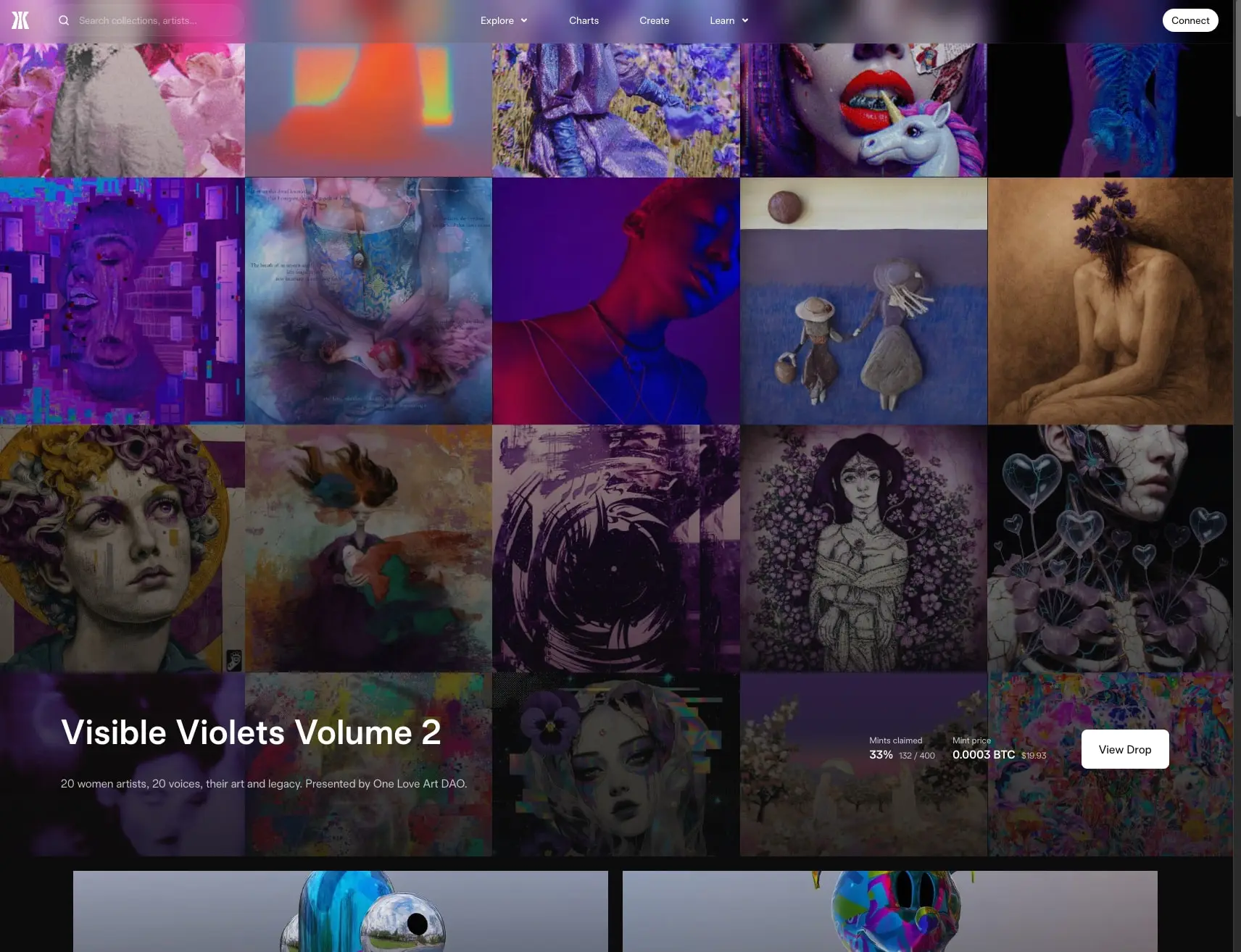
Gamma presents a dark, immersive marketplace for Bitcoin Ordinals and NFTs. The interface prioritizes full-bleed artwork presentation, letting colorful digital art dominate the viewport while UI elements recede into near-black surfaces. The design achieves visual warmth through selective use of a pink-to-rose gradient that appears in featured moments, contrasting with the otherwise restrained monochrome palette. A dual-type system pairs Universal Sans for commanding headlines with Gamma Sans for readable body text and interface labels. The overall impression is gallery-like and premium—content-forward with minimal chrome, where artwork always takes precedence over interface decoration.
Colors
The color system is intentionally narrow, relying on darkness and selective warmth to create hierarchy.
| token | value | use |
|---|---|---|
| canvas | #000000 |
Primary page background, deepest layer |
| surface | #0C0C0D |
Elevated panels, card backgrounds, navigation bar |
| surface-elevated | #1D1D1E |
Subtle secondary elevations, input fields |
| ink | #FFFFFF |
Primary text, headlines, primary button fill |
| muted-ink | #0C0C0D |
Secondary text, disabled states, subtle labels |
| gradient-start | #FFFFFF |
Gradient origin, brightest point |
| gradient-mid-warm | #FBF0ED |
Gradient warm transition |
| gradient-mid-rose | #E0A6B5 |
Gradient rose midpoint |
| gradient-end | #DC94D5 |
Gradient terminal, purple-pink destination |
The interface operates in a persistent dark mode. Black and near-black surfaces create infinite depth, allowing NFT artwork with saturated colors to appear to float forward. White text maintains crisp readability against these dark grounds. The muted-ink tone serves as a desaturated accent for secondary information, appearing in subtle labels and supporting text. The linear gradient—white through warm blush to rose to soft purple—appears as a contained accent, most notably in pill-shaped containers that hold team imagery or featured content. This gradient provides the only chromatic warmth in the UI and is reserved for moments of human connection or special feature callouts.
Typography
The type system combines two families: Universal Sans for display authority and Gamma Sans for interface clarity. Both were designed by Briton Smith and are available from Family Type. Verify licensing for these families before production use.
The captured font files include specific weight variants: Gamma Sans-360 (weight 300), Gamma Sans-400 (weight 400), and Universal Sans-540 (weight 600). These correspond to the Light, Regular, and Semibold weights used across the interface. Gamma Sans-360 supplies the lighter voice for body-large and caption treatments, while Gamma Sans-400 handles standard body text, labels, and navigation. Universal Sans-540 delivers the 600-weight display presence for hero and section headlines.
| token | family | size | weight | leading | tracking | use |
|---|---|---|---|---|---|---|
| hero-display | Universal Sans | 4.5rem | 600 | 1.15 | -0.005em | Major page headlines, featured drop titles |
| section-display | Universal Sans | 3rem | 600 | 1.17 | 0.02em | Section headings, collection names |
| body | Gamma Sans | 1rem | 400 | 1.5 | 0.02em | Primary body text, descriptions |
| body-large | Gamma Sans | 1.125rem | 300 | 1.5 | 0.02em | Introductory paragraphs, hero subtext |
| label | Gamma Sans | 0.875rem | 400 | 1.43 | 0.02em | Buttons, metadata, small labels |
| caption | Gamma Sans | 0.75rem | 300 | 1.33 | 0.01em | Fine print, timestamps, technical data |
| navigation | Gamma Sans | 1rem | 400 | 1.5 | 0.02em | Top-bar links, menu items |
Universal Sans at 600 weight delivers commanding presence for headlines, with tight leading that keeps display lines visually connected. The negative tracking on hero-display creates density appropriate for large sizes. Gamma Sans spans 300 to 400 weights, providing a lighter voice for supporting text and standard weight for interactive elements. The 16px body size with 24px line-height ensures comfortable reading density for marketplace descriptions and collection details.
Layout
The layout follows a content-maximizing strategy with controlled inset containers for text-heavy sections.
The global navigation occupies a fixed top bar with full-width distribution: the Gamma mark and search field anchor the left, primary navigation links center, and the Connect button sits right. Navigation links use standard body sizing with dropdown indicators.
For gallery sections, the layout abandons side margins entirely. NFT artwork tiles fill the viewport edge-to-edge in a dense grid with minimal or no gutters, creating a mosaic effect where individual pieces bleed together. This full-bleed approach treats the browser as a gallery wall.
Text-centric sections such as support and partner areas constrain content within a centered container. The maximum inline padding reaches approximately 11.5rem on each side at full width, creating a narrow reading column that contrasts with the expansive gallery. Section vertical spacing ranges from 5.5rem to 7rem, establishing clear territorial boundaries between functional areas.
The featured drop section overlays text directly on artwork using a subtle dark scrim, positioning the collection title, description, and mint statistics in the lower-left quadrant while action buttons anchor the right. This diagonal weight distribution balances information density with visual breathing room.
Visual language
The visual language emphasizes restraint and contrast. Surfaces are uniformly dark, creating a theatrical environment where colorful artwork becomes the sole light source. The design avoids decorative borders, shadows, and dimensional effects—flatness prevails throughout.
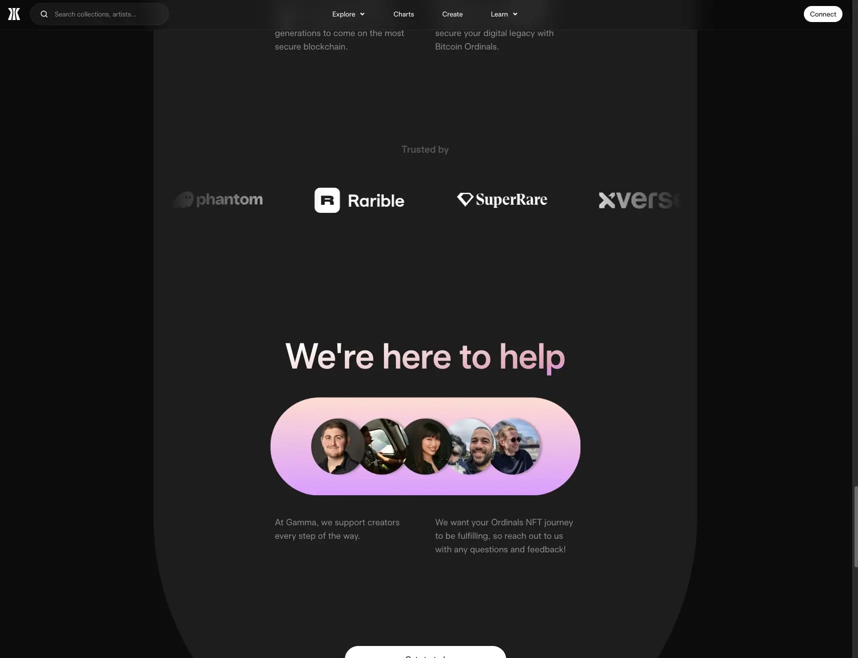
Shape language alternates between sharp and soft. Gallery cards use small 8px radii that read as nearly square at scale, maintaining the grid’s architectural rigor. Interactive elements and special containers employ full pill rounding, creating organic counterpoints to the rectilinear grid. The gradient pill containing team avatars exemplifies this softness, its continuous curve contrasting with the surrounding angular darkness.
Imagery treatment is direct and unfiltered. NFT artwork displays without frames, drop shadows, or hover lifts—the art exists as pure content. Avatar stacks within the gradient pill overlap slightly, each circular portrait clipped cleanly without borders.
The partner logo row demonstrates extreme reduction: white or light gray logotypes against black, with no containers, dividers, or background treatments. The spacing between marks is generous, allowing each brand to breathe independently.
Components
Primary button
- Anatomy: Text label centered within a fully rounded container
- Surface: White background with black text, or inverse for secondary treatment
- Typography:
{typography.label} - Shape: Full pill with
9999pxradius - Spacing: Compact horizontal padding of 12px, minimal vertical padding
- Composition: Inline with other actions, often right-aligned in headers
Secondary button
- Anatomy: Text label with optional icon
- Surface: Black background with white text
- Typography:
{typography.label} - Shape: 8px radius, more rectangular than primary
- Spacing: 24px horizontal padding for comfortable click target
- Composition: Used for outlined or lower-emphasis actions
Gradient pill
- Anatomy: Continuous rounded container holding overlapped circular avatars
- Surface: Linear gradient from white through warm blush to rose to soft purple
- Shape: Full pill, extremely horizontal proportion
- Spacing: Generous internal padding (230px vertical, 32px horizontal) creating ample breathing room around content
- Composition: Centered within section, often paired with headline above and explanatory text below
NFT gallery card
- Anatomy: Full-bleed artwork image, no visible frame or border
- Surface: Artwork itself provides all color; no card background visible
- Shape: 8px radius for subtle softening at corners
- Composition: Tight grid with minimal or no gutters, edge-to-edge viewport filling
Featured drop overlay
- Anatomy: Collection title, description, mint statistics, and action button layered over artwork
- Surface: Transparent-to-dark gradient scrim ensuring text legibility
- Typography:
{typography.hero-display}for title,{typography.body}for description - Composition: Text block left-aligned in lower portion, button right-aligned; statistics inline with small labels above values
Navigation bar
- Anatomy: Logo mark, search input, text links with dropdown chevrons, connect button
- Surface: Black or near-black background, no border or shadow
- Typography:
{typography.navigation}for links - Composition: Flex row with space-between distribution; search field with rounded container and magnifier icon
Responsive behavior
The gallery grid should reflow from five columns on large viewports to fewer as width decreases, maintaining square or near-square aspect ratios for artwork tiles. The featured drop overlay requires careful stacking on narrow viewports: title and description should move above the artwork with the action button below, rather than maintaining the side-by-side desktop arrangement.
The centered text container for support sections should reduce its maximum inline padding proportionally, reaching standard mobile margins at narrow widths. Navigation links collapse to a menu trigger when horizontal space is insufficient, preserving the Connect button as always-visible.
Typography scales down modestly: hero-display should reduce to section-display size on tablet and to body-large on mobile to prevent overwhelming narrow screens. The gradient pill’s extreme horizontal proportion may need to become more square or stack avatars vertically on very narrow viewports.
Practical implementation guidance
Preserve
- The near-black canvas as the unconditional default; never introduce light backgrounds
- Full-bleed artwork presentation without frames, borders, or shadows
- The dual-type hierarchy: Universal Sans for headlines only, Gamma Sans for everything else
- The warm gradient as a contained, special-moment accent rather than a pervasive theme
- Extreme simplicity in partner and logo presentations
Avoid
- Adding decorative shadows or dimensional effects to cards and buttons
- Introducing additional accent colors beyond the pink-to-rose gradient
- Heavy borders or dividers between gallery items
- Light mode variants that would undermine the gallery-theater effect
- Generic placeholder imagery in the avatar stack—specific human faces create the intended community signal
Recommended build order
- Establish the dark canvas and surface color tokens
- Implement the dual-type system with proper fallbacks
- Build the full-bleed gallery grid with correct aspect ratios
- Create the gradient pill component as a reusable accent container
- Implement navigation with search and connect pattern
- Add the featured drop overlay with scrim and statistics layout
- Polish button variants and responsive reflow behavior
Accessibility
- Ensure the gradient pill maintains sufficient contrast for any text placed upon it; the gradient’s light portions may require dark text
- Provide visible focus indicators for keyboard navigation that respect the dark theme—white or light outlines rather than default browser rings
- The dense gallery grid should support keyboard traversal and screen reader announcements for artwork metadata
- Mint statistics and pricing information should use semantic markup for numerical values
- Search field requires proper labeling and ARIA attributes for screen reader users
Scope note
This guide covers the Gamma homepage including the NFT gallery grid, featured drop presentation, partner section, and support area. Interior marketplace pages, wallet connection flows, transaction states, and mobile-specific layouts are not represented in the captured pages. The spacing values reflect the extracted interface measurements directly.
Sites change, so a screenshot can differ from the guide.
Loading…Similar designs
This guide describes the public website and isn't an official gamma.io design system. Not affiliated with gamma.io.