Overview
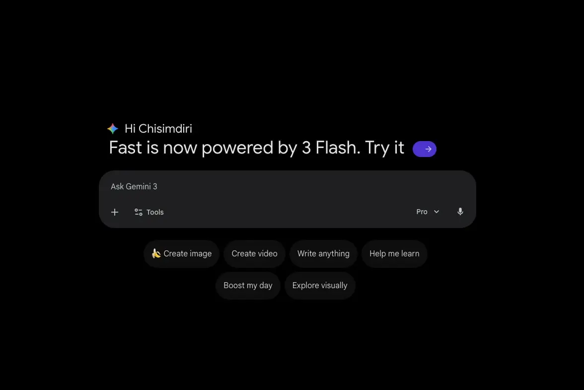
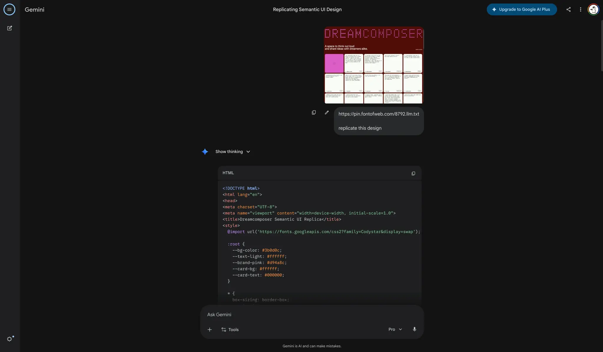
Google Gemini presents a conversational AI interface built on a near-black canvas with layered charcoal surfaces. The design prioritizes the chat content by pushing chrome to the edges and using a persistent bottom input bar as the primary interaction anchor. The visual system relies on subtle elevation changes rather than heavy borders to separate regions, with rounded corners appearing on code blocks, suggestion chips, and the main input field. Syntax highlighting introduces a controlled accent palette of blue, green, purple, and coral against dark code backgrounds. The overall impression is technical yet approachable, with generous spacing in the main chat area and compact, information-dense controls in the navigation and input regions.
Colors
The interface operates in a dedicated dark mode with no light variant visible. The palette is built from a true black base through deep charcoal surfaces, with cool-tinted grays for text and saturated but restrained accents for interactive elements and code syntax.
| token | value | use |
|---|---|---|
| canvas | #000000 | Page background, empty chat area |
| surface | #131314 | Code blocks, suggestion chips, secondary containers |
| surface-elevated | #1E1F20 | Input bar, elevated cards, active regions |
| ink | #E3E3E3 | Primary text, headings, user messages |
| ink-secondary | #C4C7C5 | Secondary text, timestamps, metadata |
| ink-muted | #9E9EFF | Muted labels, placeholder hints |
| action | #8AB4F8 | Links, active controls, primary interactive text |
| action-hover | #A8C7FA | Hover states on action elements |
| action-subtle | #C2E7FF | Subtle highlights, focus backgrounds |
| success | #81C995 | Positive indicators, code strings |
| warning | #FA903E | Caution states, code numbers |
| error | #F28B82 | Error states, code properties |
| code-keyword | #9E9EFF | Syntax: keywords, types |
| code-string | #81C995 | Syntax: strings, success values |
| code-function | #8AB4F8 | Syntax: functions, methods |
| code-comment | #C4C7C5 | Syntax: comments, inactive lines |
| code-number | #FA903E | Syntax: numeric values |
| code-property | #F28B82 | Syntax: object properties |
The color system separates interface colors from code syntax colors to allow independent theming. Interface accents lean blue (#8AB4F8) for familiarity and trust, while syntax highlighting distributes across the full accent range to maximize readability in code blocks. Text follows a three-level hierarchy from bright #E3E3E3 for primary content down to #C4C7C5 for supporting information.
Typography
The type system uses Google Sans as the primary interface family, with Google Sans Flex for longer body passages and Google Sans Code for all technical content. Weights are restrained, with Regular (400) for body and code, and Medium (500) for labels, buttons, and navigation. No Bold weight appears in interface text; the code family uses Bold (700) only for syntax emphasis.
| token | family | size | weight | leading | tracking | use |
|---|---|---|---|---|---|---|
| hero-display | Google Sans | 2.5rem | 500 | 1.2 | -0.01em | Greeting headlines, empty state titles |
| section-display | Google Sans | 1.75rem | 500 | 1.25 | -0.01em | Section headers, model announcements |
| body | Google Sans Flex | 1rem | 400 | 1.5 | 0em | Paragraphs, descriptions, long-form text |
| body-medium | Google Sans | 0.875rem | 500 | 1.25 | 0em | Buttons, chips, compact labels |
| label | Google Sans | 0.8125rem | 400 | 1.6875 | 0em | Secondary metadata, captions |
| code | Google Sans Code | 0.875rem | 400 | 1.5 | 0em | Code blocks, inline technical text |
| code-bold | Google Sans Code | 0.875rem | 700 | 1.5 | 0em | Emphasized syntax tokens |
| navigation | Google Sans | 1.25rem | 400 | 1.2 | 0em | Nav items, sidebar labels |
Google Sans and Google Sans Code are provided by Google LLC. Google Sans 18 Pt, Google Sans Flex, and Google Symbols Rounded appear in the source but serve specific roles without vendor attribution in the extracted data. Verify licensing for these families before production use. Times and Arial appear as fallback or system fonts in limited contexts and should not be used as primary design families.
Layout
The interface follows a centered single-column chat layout with edge-aligned navigation. The main content area occupies the center of the viewport with generous horizontal margins, while a slim sidebar on the left provides persistent navigation access. The bottom of the viewport is anchored by a fixed or sticky input bar that spans most of the content width.
The chat flow builds vertically from top to bottom with alternating message blocks. User messages appear as plain text on the canvas background, while assistant responses may include collapsed reasoning sections, code blocks with rounded corners, and follow-up action rows. Code blocks receive distinct surface backgrounds and asymmetric rounding—full corners on top, tighter rounding on bottom—to visually contain scrolling content.
Spacing follows a 2px base unit. Major sections separate by 80px (5rem), representing the gap between the top navigation and first content or between content groups. Internal component padding uses 12px to 16px for comfortable reading, while compact 6px to 8px spacing handles button internals and chip rows. The input bar uses 16px vertical padding with wider horizontal padding to create a pill-shaped container that feels substantial and tappable.
Visual language
The visual character is restrained and technical, with rounded geometry softening the otherwise stark dark palette. The input bar and suggestion chips use full pill rounding (9999px), creating friendly, approachable touch targets against the severe black background. Code blocks contrast this with their asymmetric rounding, signaling containment and scrollability.
Imagery appears inline in responses, presented with natural aspect ratios and subtle rounded corners. No heavy shadows or borders frame images; they sit directly on the canvas or surface background. The Gemini sparkle icon appears as a small colored diamond mark beside reasoning toggles and greeting text, providing brand presence without logo heaviness.
Syntax highlighting is the most colorful element in the interface, using six distinct token colors against the #131314 code background. This creates readable, scannable code with clear semantic differentiation. The rest of the interface maintains chromatic restraint, with blue as the sole interactive accent and grays handling all text hierarchy.
Components
Input bar
The primary interaction surface sits at the bottom of the viewport as a rounded pill container.
- Anatomy: Text placeholder, left action cluster (add button, tools button), right control cluster (model selector dropdown, microphone button)
- Surface: Background #1E1F20, full pill rounding
- Typography: Placeholder uses body token at #C4C7C5; active text uses ink color
- Shape: 9999px border radius, creating a stadium outline
- Spacing: 16px vertical padding, 24px horizontal padding; internal elements spaced 12px apart
- Composition: Flex row with space-between alignment; left and right clusters group related actions
Suggestion chip
Horizontal rows of contextual prompts appear below the input bar on the landing state.
- Anatomy: Optional leading icon or emoji, text label
- Surface: Background #131314, no border
- Typography: body-medium token, #E3E3E3 text
- Shape: 9999px full pill rounding
- Spacing: 8px vertical padding, 16px horizontal padding; 12px gap between chips
- Composition: Centered flex row that wraps to multiple lines if needed
Code block
Technical responses render in contained blocks with syntax highlighting.
- Anatomy: Language label header (HTML, CSS, etc.), copy button, scrollable code area
- Surface: Background #131314, asymmetric rounding 16px 16px 4px 4px
- Typography: code token for body, code-bold for emphasized tokens; line-height 1.5 for readability
- Shape: Top corners 16px, bottom corners 4px to suggest continuation
- Spacing: 16px internal padding; header row has 12px padding with flex space-between
- Composition: Stacked vertical with header bar above code content
Reasoning toggle
Collapsed thinking sections reveal step-by-step processing.
- Anatomy: Sparkle icon, “Show thinking” text, chevron indicator
- Surface: Transparent, sitting directly on canvas
- Typography: body-medium token, #8AB4F8 text
- Spacing: 8px gap between icon and text; 16px vertical margin from surrounding content
- Composition: Inline flex row, clickable to expand
Navigation sidebar
Slim persistent navigation on the left edge.
- Anatomy: Gemini wordmark, new chat button, history items
- Surface: Transparent or matching canvas
- Typography: navigation token for labels; body-medium for active items
- Spacing: 80px top padding to clear system chrome; 16px horizontal padding
- Composition: Vertical stack with consistent 8px item spacing
Top bar
Minimal header with contextual actions.
- Anatomy: Page title centered, upgrade button right-aligned, user avatar
- Surface: Transparent, blending with canvas
- Typography: label token for title; body-medium for upgrade button
- Composition: Flex row with center title and right action cluster
Responsive behavior
The interface is designed for desktop viewport widths with a centered content column. On narrower viewports, the content column should maintain comfortable margins while the sidebar collapses to a hamburger menu or icon rail. The input bar should remain fixed to the viewport bottom, expanding to full width minus safe margins on mobile.
The suggestion chip row should wrap naturally when horizontal space is insufficient, maintaining consistent chip height and gap spacing. Code blocks should scroll horizontally rather than reflowing, preserving line integrity for technical content.
Touch targets should maintain minimum 44px height even when typography scales down. The model selector dropdown and microphone button may consolidate into a single menu on very narrow screens.
Practical implementation guidance
Preserve
- The near-black canvas as the dominant background; do not introduce light sections
- Full pill rounding on the input bar and suggestion chips for brand recognition
- Asymmetric code block rounding to signal scrollable content
- The six-color syntax highlighting palette for code readability
- Generous vertical spacing (80px) between major content regions
- Google Sans family for all interface text, Google Sans Code for technical content
Avoid
- Heavy borders or shadows for elevation; rely on surface color changes
- Light mode variants without complete palette reworking
- Generic system fonts in place of Google Sans families
- Centered text in the input bar; keep left-aligned placeholder and input
- Rounded corners on small inline code spans; reserve rounding for blocks
Recommended build order
- Establish the canvas and surface color tokens with true black base
- Implement the input bar with pill rounding and internal flex layout
- Add typography scale with Google Sans and Google Sans Code
- Build code block component with asymmetric rounding and syntax colors
- Create suggestion chip row with wrapping behavior
- Add reasoning toggle and message flow components
- Implement sidebar navigation with proper spacing
Accessibility
- Ensure code syntax colors meet WCAG AA against #131314 background; adjust saturation if needed
- Provide visible focus indicators on the input bar and interactive chips
- Maintain keyboard navigation through the suggestion chip row
- Add aria-labels to icon-only buttons in the input bar (add, tools, microphone)
- Consider a high-contrast mode that lightens the ink-secondary and ink-muted tokens
Scope note
This guide covers the desktop chat interface and landing state of Google Gemini. Mobile layouts, animation transitions, voice input states, and the full settings or account surfaces are not represented in the captured pages. The upgrade flow and payment-related screens fall outside this documentation. Measurements reflect the extracted interface values where available.
Sites change, so a screenshot can differ from the guide.
Loading…Similar designs
This guide describes the public website and isn't an official gemini.google.com design system. Not affiliated with gemini.google.com.