Overview
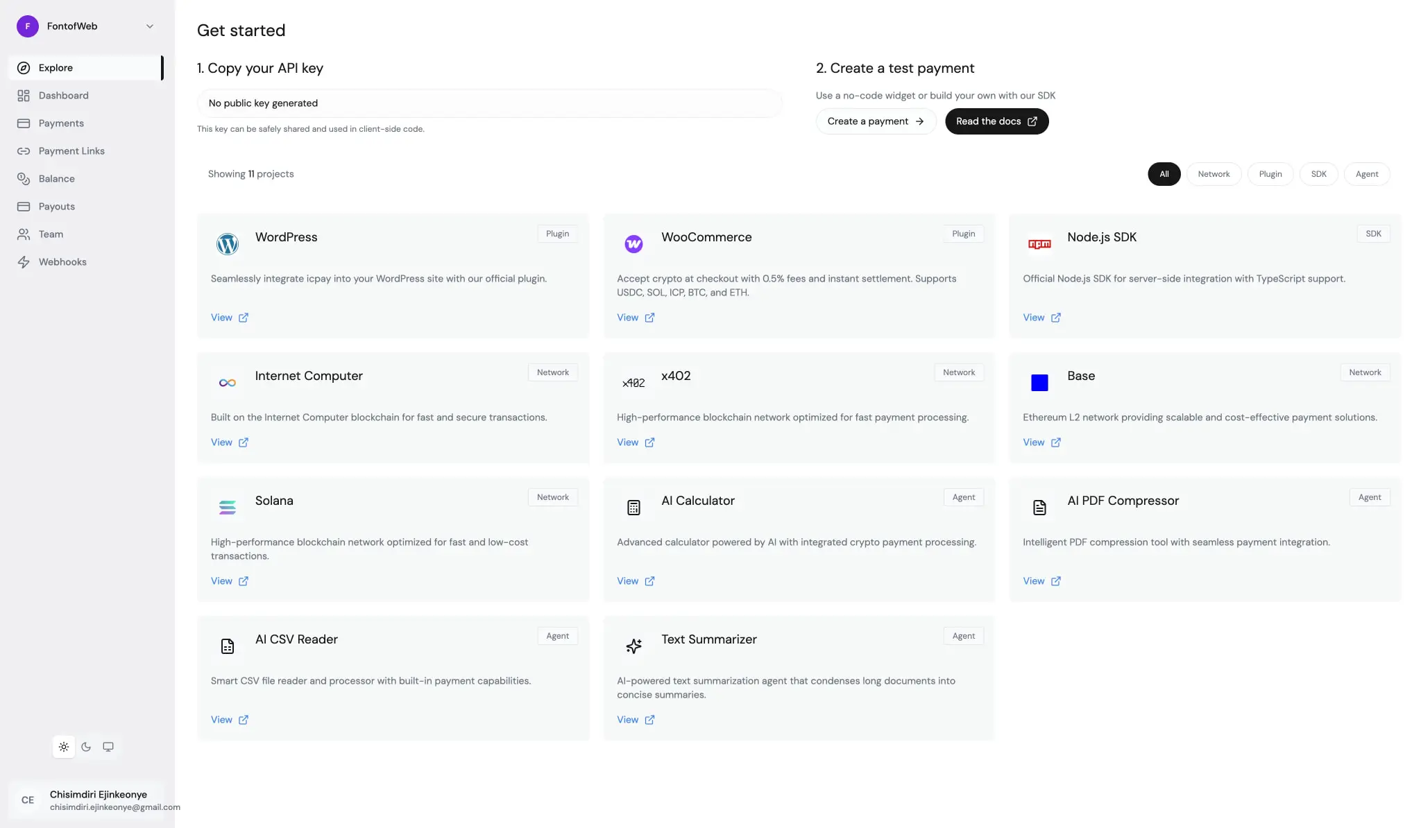
icpay presents a developer-centric crypto payment platform with a visual system built on restraint and clarity. The interface employs a near-monochrome palette where pure white canvases meet soft gray surfaces, creating clear elevation without heavy shadows. Typography is handled entirely by DM Sans, a geometric sans-serif that delivers technical precision with approachable proportions. The design prioritizes information density for technical users while maintaining breathable whitespace through consistent spacing rhythms. Component shapes alternate between sharp-cornered inputs and fully rounded pill buttons, creating a subtle tension between formality and friendliness. The overall impression is of a tool that respects developer time—direct, uncluttered, and systematically organized.
Colors
The color system is intentionally limited, relying on value contrast and surface hierarchy rather than chromatic variety. The near-black ink against white canvas provides primary readability, while a single muted gray handles secondary information. Functional accents appear in blue for links and interactive elements, with green and orange reserved for specific semantic states in code and status contexts.
| token | value | use |
|---|---|---|
| ink | #171717 | Primary text, headings, active navigation |
| muted-ink | #6B7280 | Secondary text, descriptions, labels, placeholders |
| canvas | #FFFFFF | Page backgrounds, input fields, elevated cards |
| surface | #F9FAFB | Sidebar background, option rows, subtle panels |
| surface-elevated | #F3F4F6 | Project cards, integration tiles, hover states |
| border | #E5E7EB | Dividers, input borders, card outlines |
| action | #000000 | Primary button fill, emphasis backgrounds |
| action-text | #FFFFFF | Text on primary buttons, inverted contexts |
| accent-blue | #3B82F6 | Links, external references, interactive highlights |
| accent-green | #00C950 | Success states, positive indicators in code |
| accent-orange | #FF6900 | Warnings, attention markers |
The system operates in a light mode exclusively across captured surfaces. Dark surfaces appear only as the action color for buttons, never as page backgrounds. The gray scale progresses from canvas through surface to surface-elevated with subtle 2-3% luminance steps, sufficient to distinguish hierarchy without visual noise. Accent colors are used sparingly—blue dominates interactive elements while green and orange appear primarily in code snippets and status badges. The border color is light enough to recede optically, functioning as structural glue rather than visual emphasis.
Typography
The type system uses DM Sans for all interface text and Fira Code for monospace contexts. Weights range from 300 to 600, with 400 serving as the default body weight. The scale is compact, topping at 60px for hero displays, with most interface text sitting at 16px or below. Letter spacing is generally normal, with slight tightening for larger headings.
| token | family | size | weight | leading | tracking | use |
|---|---|---|---|---|---|---|
| hero-display | Dm Sans 9 Pt | 3.75rem | 400 | 1 | -0.025em | Landing page headlines |
| section-display | Dm Sans 9 Pt | 1.625rem | 400 | 1.5 | -0.025em | Section headings, quiz questions |
| heading | Dm Sans 9 Pt | 1.5rem | 400 | 1.33 | normal | Card titles, modal headers |
| subheading | Dm Sans 9 Pt | 1.25rem | 400 | 1.4 | normal | Feature descriptions |
| body | Dm Sans 9 Pt | 1rem | 400 | 1.5 | normal | Primary interface text |
| body-small | Dm Sans 9 Pt | 0.875rem | 400 | 1.43 | normal | Descriptions, metadata |
| label | Dm Sans 9 Pt | 0.75rem | 500 | 1.33 | normal | Tags, badges, progress text |
| navigation | Dm Sans 9 Pt | 0.875rem | 500 | 1.43 | normal | Sidebar links, top nav |
| code | Fira Code | 0.625rem | 400 | 1.5 | normal | Syntax highlighting, tokens |
Fira Code is attributed to Carrois Corporate Edenspiekermann Ag Nikita Prokopov. DM Sans carries no listed attribution. Verify licensing for these families before production use.
Layout
The layout system centers content within generous horizontal margins. A max-width container of approximately 24.25rem centers authentication and onboarding flows, while dashboard views use full-width arrangements with sidebar navigation. The spacing scale derives from a 2px base unit, producing a practical set of increments: 4px, 8px, 12px, 16px, 20px, 24px, 32px, 48px, and 96px for section breaks.
Page sections use vertical padding of 6rem to 9rem for hero areas, compressing to 3rem for interior content. Horizontal padding is consistently 1.5rem on container edges. The sidebar occupies a fixed narrow column with 16px internal padding, while main content areas receive 24px to 32px padding depending on context.
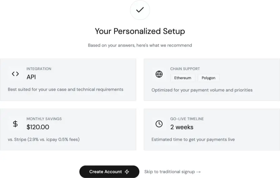
Grid arrangements appear in two primary patterns: a three-column project card grid with 24px gaps, and a two-column layout for onboarding results. Cards within grids maintain consistent internal padding of 24px, with icon-and-text compositions using 12px gaps between elements. The overall rhythm is loose enough to prevent crowding while tight enough to maintain information density appropriate for technical users.
Visual language
The visual character is defined by geometric cleanliness and functional minimalism. Rounded corners are used selectively: buttons are fully pill-shaped, cards and panels use modest 6px to 8px rounding, while inputs remain nearly square at 2px radius. This creates a hierarchy of friendliness—most approachable at the button level, most formal at data entry.
Shadows are extremely limited. A single deep shadow appears on elevated promotional cards, while most surfaces rely on border and background color shifts for depth. The border system uses 1px solid lines in the light gray border color, with occasional 2px borders for emphasis on active or featured elements.
Iconography is simple and functional, appearing as small SVG marks before text labels or as standalone indicators in status contexts. The code display uses colored tokens against dark backgrounds, with Fira Code providing clear distinction from prose text. Photography and illustration are absent; the interface relies on brand logos, simple icons, and color-coded tags for visual interest.
Components
Primary button
Anatomy: Text label with optional trailing icon, fully rounded pill shape.
Surface: Solid black fill with white text.
Typography: {typography.body}, weight 400.
Shape: 9999px border radius.
Spacing: 0.625rem 1rem padding.
Variants: Standard and icon-trailing versions for external links.
Secondary button
Anatomy: Text label, outlined appearance.
Surface: White fill with 1px gray border, black text.
Typography: {typography.body}.
Shape: 9999px border radius.
Spacing: 0.625rem 1rem padding.
Option card
Anatomy: Full-width row with text label, used in quiz interfaces.
Surface: Light gray background, no border.
Typography: {typography.body}.
Shape: 0.5rem border radius.
Spacing: 1rem 1.5rem padding.
Composition: Single line of text, left-aligned, full width within container.
Filter pill
Anatomy: Text label with optional border, used for category filtering.
Surface: White or transparent background, gray border when unselected.
Typography: {typography.body-small}.
Shape: 9999px border radius.
Spacing: 0.375rem 0.75rem padding.
Variants: Selected state uses black fill with white text.
Project card
Anatomy: Icon, title, description, category tag, and external link.
Surface: Light gray elevated background.
Typography: Title uses {typography.heading}, description uses {typography.body-small} in muted ink.
Shape: 0.5rem border radius.
Spacing: 1.5rem padding, internal elements spaced at 0.75rem.
Composition: Icon and title on top row, description below, tag and link at bottom.
Sidebar navigation
Anatomy: Icon and text label, vertical stack.
Surface: Transparent or light gray background on hover.
Typography: {typography.navigation}.
Spacing: 0.5rem 0.75rem padding per item.
Composition: Left-aligned icon with 12px gap to text label.
Text input
Anatomy: Label above, single-line field.
Surface: White fill with light gray border.
Typography: {typography.body} for input text, {typography.body-small} for label.
Shape: 0.125rem border radius.
Spacing: 0.625rem 0.875rem internal padding.
Responsive behavior
The layout appears optimized for desktop viewing with a fixed sidebar and main content area. The centered authentication forms suggest a single-column approach for narrow viewports, though specific breakpoints are not visible. The three-column project grid should collapse to two columns and then single column as viewport narrows. Sidebar navigation would likely transform to a horizontal top bar or hamburger menu on mobile. Touch targets should maintain minimum 44px height for option cards and buttons. Font sizes may scale down slightly for the hero display on small screens, though the compact base sizes already accommodate most devices.
Practical implementation guidance
Preserve
- The strict monochrome palette with single blue accent for all interactive elements
- Generous whitespace around centered forms and authentication flows
- Pill-shaped buttons as the primary call-to-action pattern
- Light gray surface hierarchy for card backgrounds
- DM Sans at 400 weight for body text to maintain the technical-clean aesthetic
Avoid
- Adding saturated colors beyond the defined accent set
- Heavy drop shadows on standard cards—rely on borders and background shifts
- Rounding inputs beyond 2px—preserve their formal, data-entry character
- Stacking multiple weights in single text blocks—keep hierarchy through size and color
Recommended build order
- Establish the spacing scale and container max-widths
- Implement typography tokens with DM Sans at all defined sizes
- Build the color system with gray surface hierarchy
- Create button variants with pill and sharp-cornered forms
- Construct card components with consistent internal spacing
- Add sidebar navigation with icon-text compositions
- Implement form inputs with near-square corners
- Add Fira Code for code display contexts
Accessibility
- Maintain 4.5:1 contrast minimum for all body text against backgrounds
- Ensure the black primary buttons have sufficient contrast with white text
- Add visible focus states to all interactive elements, likely using the blue accent
- Provide clear error states for form validation with color and icon indicators
- Ensure touch targets for option cards and buttons meet 44px minimum
- Use semantic heading hierarchy without skipping levels
Scope note
This guide covers the authenticated dashboard, onboarding quiz, signup flow, and explore surfaces visible in the captured images. Marketing pages, mobile layouts, dark mode, loading states, error pages, and animation behavior are not represented. Payment processing interfaces and transaction detail views are outside the current scope.
Sites change, so a screenshot can differ from the guide.
Loading…Similar designs

This guide describes the public website and isn't an official icpay.org design system. Not affiliated with icpay.org.