Overview
Inngest presents a developer platform with a dark, warm aesthetic that avoids cold blue-gray conventions. The interface rests on a near-black canvas with subtle brown undertones, creating an atmosphere that feels technical yet approachable. Large inktrap display type dominates hero and section headlines, while a clean geometric sans handles body text and UI labels. The visual system balances density and openness: marketing pages use generous vertical breathing room, while product surfaces like pricing tables pack information into tight, scannable grids. Geometric accent art—triangles, arcs, and diagonal lines—appears at section boundaries, adding personality without competing with content. A restrained accent palette of muted gold, forest green, and soft salmon appears sparingly for CTAs, status indicators, and keyword highlights.
Colors
The color system is built around warmth and restraint. Dark surfaces carry brown rather than blue undertones, preventing the clinical feel of pure grayscale dark modes.
| token | hex | use |
|---|---|---|
| canvas | #0C0A09 | Page background, deepest layer |
| surface | #1C1917 | Cards, panels, elevated containers |
| surface-elevated | #242424 | Hover states, active rows, code blocks |
| ink | #FAFAF9 | Primary text, headlines, icons |
| ink-muted | #A8A29E | Secondary descriptions, labels, captions |
| ink-dim | #78716C | Tertiary text, disabled states, metadata |
| accent-gold | #D8A657 | Primary CTAs, keyword highlights, enterprise badges |
| accent-green | #2C9B63 | Success states, checkmarks, positive indicators |
| accent-salmon | #EA6962 | Errors, warnings, destructive actions |
| border-subtle | #44403C | Card borders, dividers, inactive states |
| border-hairline | #57534E | Table row separators, fine rules |
The dark mode is not merely inverted but intentionally warm. Text hierarchy moves from near-white ink through muted warm gray to dim brown-gray. Accent colors appear at low saturation: the gold reads as mustard rather than yellow, the green as forest rather than neon. This palette supports long reading sessions without eye strain while maintaining sufficient contrast for accessibility.
Typography
The type system combines display and body families from two foundries. ABC Whyte Inktrap and ABC Whyte, designed by Johannes Breyer, Fabian Harb, and Erkin Karamemet for Dinamo, serve display and section headlines. By Laurenz Brunner handles body text, labels, and UI elements at weights including Regular (By Laurenz Brunner-9206590962487874998), Light (By Laurenz Brunner-2473265567715032644), Book (By Laurenz Brunner-1819525584441985430), Medium (By Laurenz Brunner-10405797975480712807), and Semibold. By Laurenz Brunner 20132019 and its specific variant By Laurenz Brunner 20132019-5094406491328746366 provide monospaced code rendering. Verify licensing for these families before production use.
| token | family | size | weight | leading | tracking | use |
|---|---|---|---|---|---|---|
| hero-display | ABC Whyte Inktrap | 3.75rem | 400 | 1.3 | normal | Hero headlines, footer CTA |
| section-display | ABC Whyte | 3rem | 300 | 1.11 | normal | Section titles, pricing headers |
| body | By Laurenz Brunner | 1rem | 400 | 1.5 | normal | Paragraphs, descriptions, UI text |
| body-light | By Laurenz Brunner | 1.125rem | 300 | 1.56 | normal | Lead paragraphs, feature descriptions |
| label | By Laurenz Brunner | 0.875rem | 500 | 1.43 | normal | Buttons, tags, table headers, navigation |
| code | By Laurenz Brunner 20132019 | 0.875rem | 400 | 1.625 | normal | Inline code, technical values |
Display sizes use tight leading to create solid blocks of color, while body text maintains generous line height for readability. The inktrap variant’s flared terminals add character at large sizes without compromising legibility.
Layout
The layout system uses a centered content column with generous horizontal padding and substantial vertical section spacing. Content max-widths vary by context: marketing narratives use narrower measures for readability, while tables and feature grids expand to wider bounds.
The base spacing unit is 0.125rem (2px). Key layout values:
- Section vertical padding: 6rem to 12rem, with hero sections reaching 12rem and standard sections at 6rem to 8rem
- Content horizontal padding: 2rem on each side, creating comfortable margins without excessive whitespace
- Content max-width: narrow 52.5rem for focused reading, standard 80rem for general content, wide 108rem for full-bleed tables and grids
- Component internal padding: 1.5rem to 2.5rem depending on density needs
- Grid gap: 1.5rem between cards and panels
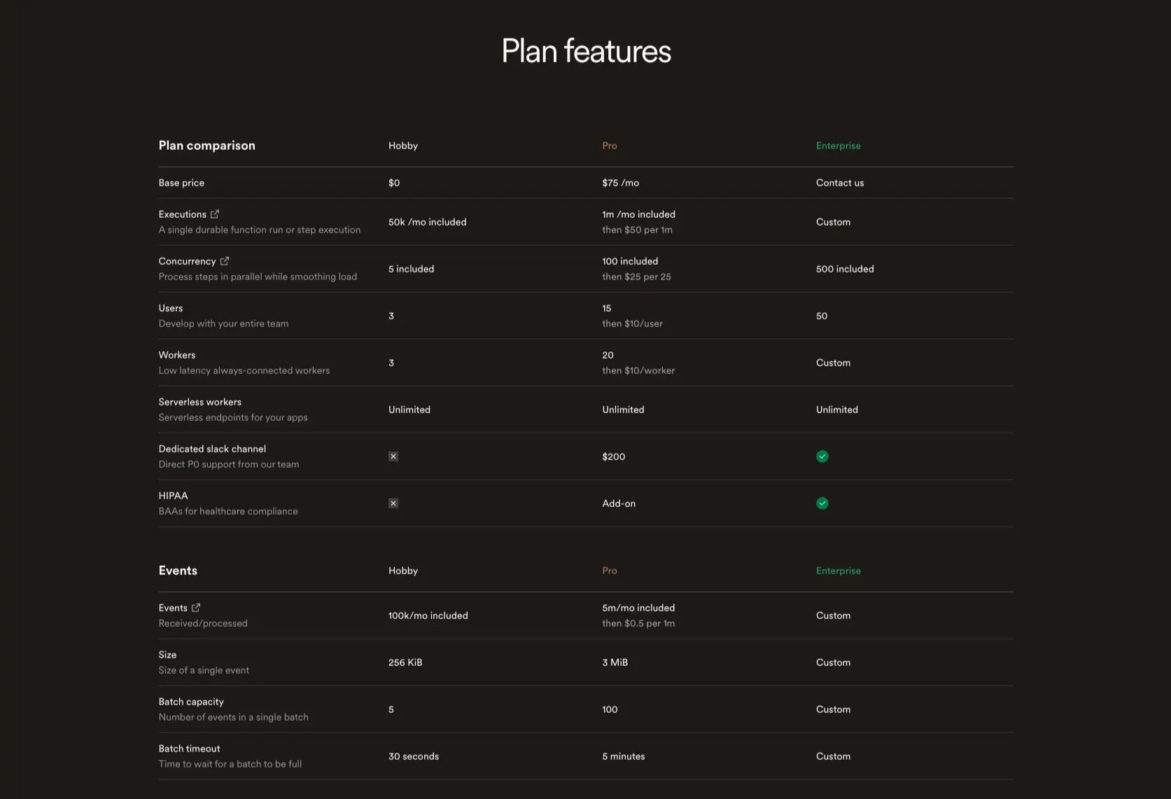
Sections stack vertically with no visible separators except geometric art transitions. Cards and panels use consistent internal padding, creating a modular rhythm. The pricing table compresses vertical space with tight row heights and minimal cell padding, while marketing sections expand with large headline margins and generous paragraph spacing. Horizontal centering relies on auto margins with explicit max-width constraints rather than full-bleed containers.
Visual language
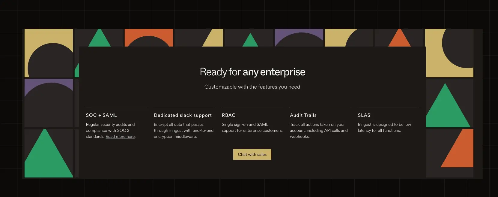
Geometric accent art is a distinctive element. Simple shapes—triangles, semicircles, arcs, diagonal hash lines—appear as section borders or background textures. These use the accent palette at full saturation: emerald green, burnt orange, mustard gold, and muted purple. The shapes are flat, unshaded, and arranged in grid-like patterns that suggest technical precision without literal diagramming.
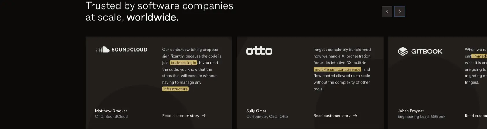
Photography and illustration are absent; the visual story is told through type, geometry, and surface. Customer logos appear in white or light gray on dark cards. Keyword highlights within testimonials use small gold-background pills behind single words, creating a scanning pattern that draws attention to technical terms.
Shadows are minimal and functional: a subtle 1px-2px elevation shadow for dropdowns and focused elements, never for decorative depth. Borders are hairline-thin, often single pixels, serving as structural dividers rather than decorative frames.
Components
Primary action button
- Anatomy: Text label with optional icon, no visible border
- Surface: Accent gold background with dark canvas text
- Typography: Label token, medium weight
- Shape: Full pill, 9999px radius
- Spacing: 0.5rem vertical, 1rem horizontal padding
- Composition: Inline with adjacent elements, or centered in CTA groups
Secondary action button
- Anatomy: Text label with 1px border
- Surface: Transparent background, subtle border
- Typography: Label token, medium weight
- Shape: Full pill, 9999px radius
- Spacing: 0.5rem vertical, 1rem horizontal padding
- Variants: Border color shifts to hairline gray for default, accent gold for hover
Feature card
- Anatomy: Container with optional icon, headline, description, and link
- Surface: Elevated dark surface, 1px subtle border
- Typography: Section display for headlines, body for descriptions, label for links
- Shape: 0.75rem corner radius
- Spacing: 2rem to 2.5rem internal padding
- Composition: Grid of 3-5 cards with equal gaps
Pricing table
- Anatomy: Column headers with tier names, row labels with feature descriptions, cell values with limits and pricing
- Surface: Canvas background, no card elevation
- Typography: Label for headers and row labels, body for values
- Shape: No radius, full-width rows
- Spacing: Tight vertical padding, generous horizontal gutters
- Composition: Sticky header with scrollable body on narrow viewports
- Variants: Tier names use accent colors—green for Enterprise, salmon for Pro, muted for Hobby
Customer testimonial card
- Anatomy: Logo, quote text with highlighted keywords, attribution, and link
- Surface: Dark surface with subtle border
- Typography: Body for quotes, label for attribution
- Shape: 0.75rem corner radius
- Spacing: 2rem internal padding
- Composition: Horizontal carousel with peeking adjacent cards
- Variants: Keyword highlights use gold background pills behind inline text
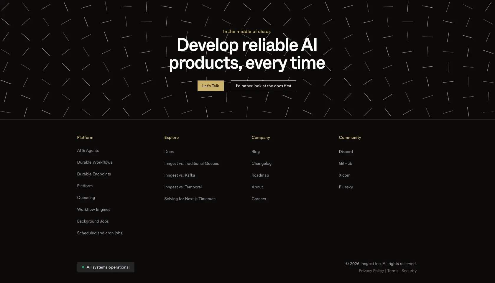
Footer CTA section
- Anatomy: Overline label, large display headline, button pair, geometric background
- Surface: Canvas with diagonal line pattern overlay
- Typography: Hero display for headline, label for buttons
- Shape: Full-width section, no border radius
- Composition: Centered text with horizontal button row, multi-column footer links below
Responsive behavior
The design is documented at desktop widths. At narrower viewports, the following adaptations should occur:
- Hero display scales down to section-display size
- Multi-column feature grids collapse to single column
- Pricing tables gain horizontal scroll with sticky first column
- Testimonial carousel shows single card with swipe navigation
- Footer link columns stack vertically
Breakpoints are not specified; implement standard ranges (768px, 1024px, 1280px) with fluid scaling between.
Practical implementation guidance
Preserve
- The warm dark palette with brown undertones; avoid pure black and cold grays
- Inktrap display type for headlines at 48px and above
- Geometric accent art as section transitions, not decorative backgrounds
- Gold accent for primary actions only, maintaining scarcity
- Full-pill buttons for all CTAs
Avoid
- Blue-tinted dark mode grays that clash with the warm palette
- Drop shadows for card elevation; rely on border and surface color
- Rounded corners larger than 12px except for pills
- Multiple accent colors in a single component
- Body text lighter than 16px for primary content
Recommended build order
- Establish canvas and surface color tokens with warm dark values
- Implement typography scale with ABC Whyte Inktrap for display, By Laurenz Brunner for body
- Build button components with pill shape and gold/transparent variants
- Create feature card with consistent padding and border treatment
- Implement pricing table with tight row spacing and tier color coding
- Add geometric art elements as SVG or CSS patterns at section boundaries
- Polish with keyword highlight pills and testimonial carousel
Accessibility
- Maintain 4.5:1 contrast for body text against all surfaces
- Use 3:1 minimum for large display text and UI components
- Ensure keyword highlight pills have sufficient contrast for the gold background
- Provide focus indicators that match the accent gold color
- Support reduced motion for geometric art animations if implemented
Scope note
This guide covers the marketing site homepage and pricing page as visible in desktop views. Mobile layouts, component hover and focus states, loading skeletons, form validation, and the authenticated product dashboard are not included. The documentation site and blog may extend this system with additional components. Measurements are exact where captured and practical adaptation targets where inferred from visual inspection.
Sites change, so a screenshot can differ from the guide.
Loading…Similar designs
This guide describes the public website and isn't an official inngest.com design system. Not affiliated with inngest.com.