Overview
Jace AI presents itself as an AI executive assistant through a design language that balances technical credibility with approachable warmth. The system rests on a near-black canvas that makes watercolor gradient illustrations and lavender accents feel luminous rather than decorative. Typography creates clear hierarchy: Gelica, a refined serif, handles display and editorial moments with classical authority, while Geist, a geometric sans, manages interface text and functional labels with crisp neutrality. The result is a reading experience that feels more editorial magazine than SaaS dashboard—appropriate for a product promising to handle the cognitive load of professional communication. Rounded panels, pill-shaped buttons, and generous whitespace keep the dark theme from feeling heavy, while dotted divider rules and small icon-callout rows add rhythm to long-form feature explanations.
Colors
The palette is built on a dark-mode foundation with warm neutral tints and selective pastel accents. The core principle is contrast without harshness: text rarely hits pure white, and surfaces layer through subtle luminance shifts rather than dramatic jumps.
| token | hex | use |
|---|---|---|
| canvas | #000000 | Page background, deepest layer |
| surface | #1C1C1C | Elevated panels, cards, footer CTA background |
| surface-elevated | #2D2D2D | Navigation pills, hover states, gradient endpoints |
| ink | #2D2D2D | Primary text on light backgrounds, body copy on cream panels |
| ink-secondary | #454545 | Secondary text, muted descriptions, border hairlines |
| ink-muted | #5D5D5D | Tertiary text, disabled states, fine print |
| text-primary | #F6F6F6 | Headlines on dark surfaces, primary inverted text |
| text-secondary | #D1D1D1 | Body text on dark surfaces, secondary inverted text |
| text-tertiary | #E7E7E7 | Subtle labels, metadata on dark backgrounds |
| action-primary | #FFFFFF | Primary button fill, high-emphasis actions |
| action-primary-text | #000000 | Text on primary buttons |
| action-secondary | #2D2D2D | Secondary button fill, ghost button borders |
| action-secondary-text | #F6F6F6 | Text on secondary buttons |
| accent-lavender | #D1C2F4 | Decorative highlights, avatar backgrounds, badge fills |
| accent-pink | #EDC2E7 | Gradient stops, decorative illustration tones |
| accent-yellow | #FFDC61 | Gradient stops, warning highlights, illustration warmth |
| border-subtle | #454545 | Dividers on dark surfaces, ghost button borders |
| border-light | #D1D1D1 | Dividers on light surfaces, input borders |
The dark canvas dominates the experience, with #000000 establishing immediate depth. Elevated surfaces use #1C1C1C for panels and #2D2D2D for interactive elements like navigation pills and gradient endpoints. Text on dark surfaces uses a stepped system: #F6F6F6 for headlines, #D1D1D1 for body, #E7E7E7 for fine labels. On the occasional light panel—seen in feature sections—#2D2D2D serves as primary ink with #454545 for secondary material. Pastel accents appear primarily in photography and illustration: lavender (#D1C2F4) tints avatar backdrops and UI chrome, while pink (#EDC2E7) and yellow (#FFDC61) blend in watercolor gradients that separate product screenshots from their dark surrounds.
Typography
Two families create the typographic system: Gelica for display and editorial voice, Geist for interface and functional text. Gelica carries the brand’s sophistication through its serif construction with restrained contrast; Geist delivers neutrality through geometric clarity with multiple weights.
| token | family | size | weight | leading | tracking | use |
|---|---|---|---|---|---|---|
| hero-display | Gelica | 5.5rem | 300 | 1 | normal | Homepage hero headline |
| section-display | Gelica | 3.5rem | 400 | 1.05 | normal | Section headlines, CTA panels |
| feature-headline | Gelica | 3rem | 400 | 1.1 | normal | Feature section titles |
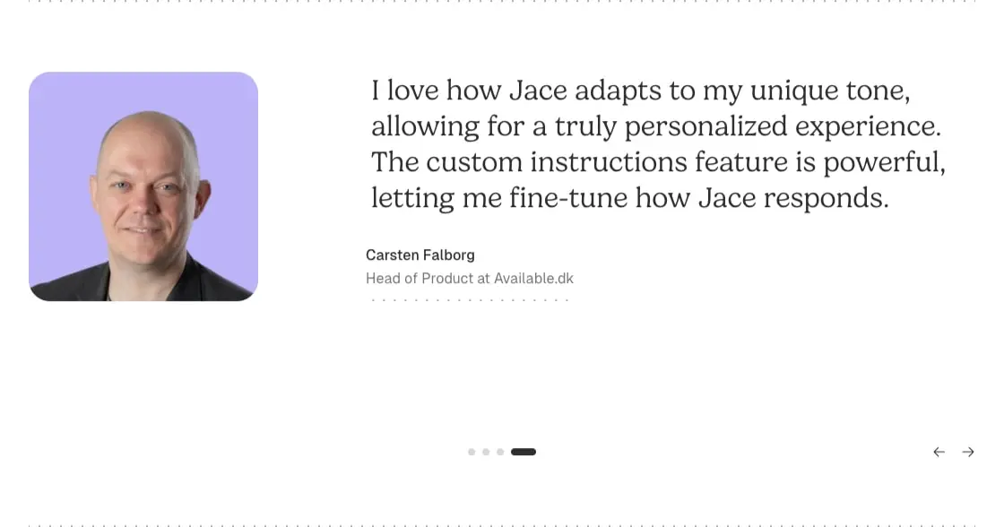
| testimonial-quote | Gelica | 2rem | 400 | 1.25 | normal | Customer testimonial body |
| body-large | Geist | 1.125rem | 300 | 1.55 | normal | Lead paragraphs, descriptions |
| body | Geist | 1rem | 400 | 1.5 | normal | Standard paragraphs, UI text |
| body-lead | Geist | 1rem | 400 | 1.625 | normal | Navigation links, looser reading |
| label | Geist | 0.875rem | 500 | 1.43 | normal | Buttons, badges, category labels |
| caption | Geist | 0.75rem | 500 | 1.33 | normal | Metadata, timestamps, legal |
| navigation | Geist | 0.75rem | 500 | 1.33 | normal | Top-bar nav, footer links |
Gelica appears at 88px (5.5rem) for the hero, scaling to 56px (3.5rem) for section headlines and 48px (3rem) for feature titles. Testimonials use 32px (2rem) for quoted body text. Geist anchors the system at 16px (1rem) with 24px line-height for standard reading; 18px (1.125rem) at weight 300 serves lead paragraphs with lighter presence. The 14px (0.875rem) weight-500 pairing handles all button and label needs, while 12px (0.75rem) weight-500 manages navigation and fine print. Line heights stay tight for display (1.0–1.1) and open for body (1.5–1.625). Letter spacing remains normal throughout; no tracked-out uppercase labels appear.
Geist is designed by Basementstudio Andrés Briganti Mateo Zaragoza and distributed by Basementstudio Vercel Andrés Briganti Guido Ferreyra Mateo Zaragoza. Gelica carries no supported attribution. Verify licensing for these families before production use.
Layout
The page uses a centered container system with generous horizontal margins that create breathing room around content. The main content area sits within 0px 32px padding and 0px 154px margins on standard sections, producing a narrow, editorial reading measure. Wider moments—such as the testimonial carousel—expand to 0px 294px margins, allowing quoted text to occupy more horizontal space. Feature sections alternate between full-bleed dark canvas and contained cream-colored panels with 1.5rem corner radius.
Vertical rhythm follows a clear sectional logic: hero areas receive 112px top padding, standard sections use 80px or 64px vertical padding, and compact interstitial areas use 32px or 16px. The footer CTA panel breaks this pattern with substantial internal padding (4rem typical) to create a moment of pause before the page conclusion.
Grid behavior in feature sections splits content asymmetrically: text blocks occupy roughly 40% width with left alignment, while product screenshots or illustrations fill the remaining space, often bleeding to the panel edge or sitting on watercolor gradient backgrounds. The testimonial section centers its quote and attribution, with pagination dots below and navigation arrows at the far right. Navigation sits at the top in a floating pill bar with 9999px radius, containing logo, links, and action buttons in a single horizontal row.
Visual language
The visual system distinguishes itself through three signature elements: watercolor gradient illustrations, dotted divider rules, and pill-shaped interactive surfaces.
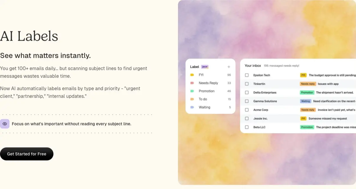
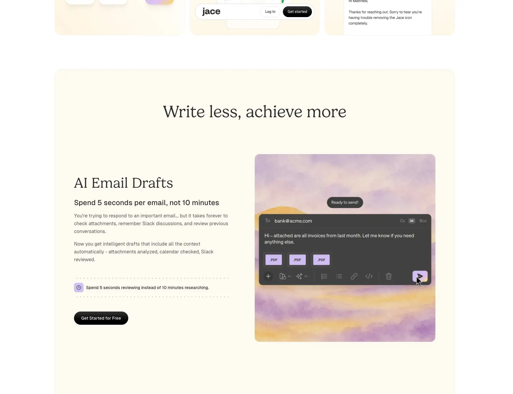
Watercolor gradients appear behind product screenshots and as section backgrounds, blending lavender, pink, and yellow tones in soft, atmospheric washes. These are photographic or generated assets rather than CSS gradients—visible in the AI Labels and AI Email Drafts sections where UI mockups float on purple-yellow cloud-like textures. The effect humanizes the technical product and creates visual separation between dark interface chrome and light content panels.
Dotted rules serve as section dividers and content separators. A radial-gradient(circle, rgba(45, 45, 45, 0.4) 1.5px, rgba(0, 0, 0, 0) 1.5px) pattern creates a horizontal line of discrete dots at 1.5px size with 40% opacity. These appear above and below feature lists, between testimonials and CTAs, and as subtle boundaries in the footer. The dot pattern replaces solid borders with something more delicate and editorial.
Pill shapes dominate interactive elements. Buttons, navigation containers, and avatar frames all use 9999px border radius for fully rounded caps. Even the primary CTA button in the hero uses this treatment rather than sharper corners. The consistency creates a soft, approachable interface language that counterbalances the dark severity of the canvas.
Iconography appears minimal and functional: small 16px symbols accompany feature list items (clock icons for time savings, eye icons for focus features), and social links in the footer use standard platform glyphs. No custom icon font is visible; symbols appear to be inline SVG or a lightweight system set.
Components
Navigation bar
- Anatomy: Logo wordmark left, text links center, “Log in” text button and “Get started” filled button right
- Surface: Transparent or
surface-elevatedpill container with9999pxradius - Typography:
navigationtoken for links,labeltoken for buttons - Shape: Full pill container with internal
0px 16pxpadding on links - Spacing: Floats over hero content with minimal vertical padding
Hero section
- Anatomy: Large display headline, supporting paragraph, primary CTA button, secondary text button with icon
- Surface: Full
canvasbackground - Typography:
hero-displayfor headline,body-largefor description,labelfor actions - Shape: No panel container; text sits directly on dark background
- Spacing:
112pxtop padding, generous bottom margin before next section
Feature section (light panel)
- Anatomy: Section label or eyebrow,
feature-headlinetitle, descriptive paragraph, dotted rule, icon-callout row, primary CTA button; paired with product screenshot or illustration - Surface:
surfaceor near-white (#F6F6F6-tinted) rounded panel with1.5remradius - Typography:
feature-headlinefor title,bodyfor description,labelfor CTA,bodyweight 500 for callout text - Shape:
rounded.panelfor container; buttons userounded.pill - Spacing:
112px 64pxinternal padding typical; text block offset with left padding in some variants - Composition: Asymmetric two-column with text left, visual right; visual often extends to panel edge or sits on watercolor gradient
Product screenshot frame
- Anatomy: Rounded container holding UI mockup with floating labels, badges, or status pills
- Surface: Dark interface chrome (
#2D2D2Dto#000000gradient) for email compose UI; light surface for inbox lists - Typography:
bodyandlabeltokens for mockup text - Shape:
rounded.panelfor outer frame; internal elements userounded.pill - Spacing: Generous internal padding; floats on watercolor gradient background
Testimonial carousel
- Anatomy: Portrait photo left, quote text right, attribution below quote, pagination dots centered, arrow navigation far right
- Surface: Transparent or light background; portrait sits on
accent-lavendersquare withrounded.panelcorners - Typography:
testimonial-quotefor body,bodyweight 500 for name,bodywith muted color for title - Shape:
rounded.panelfor avatar container; pagination dots are small pills - Spacing: Centered layout with
294pxside margins for wide measure
FAQ accordion
- Anatomy: Question text with expand/collapse chevron, answer text below
- Surface: Transparent or very subtle border
- Typography:
bodyweight 500 for questions,bodyfor answers - Shape: Full-width rows with bottom border or dotted rule separation
- Spacing:
32pxvertical padding per item;16pxgap between question and answer
CTA panel
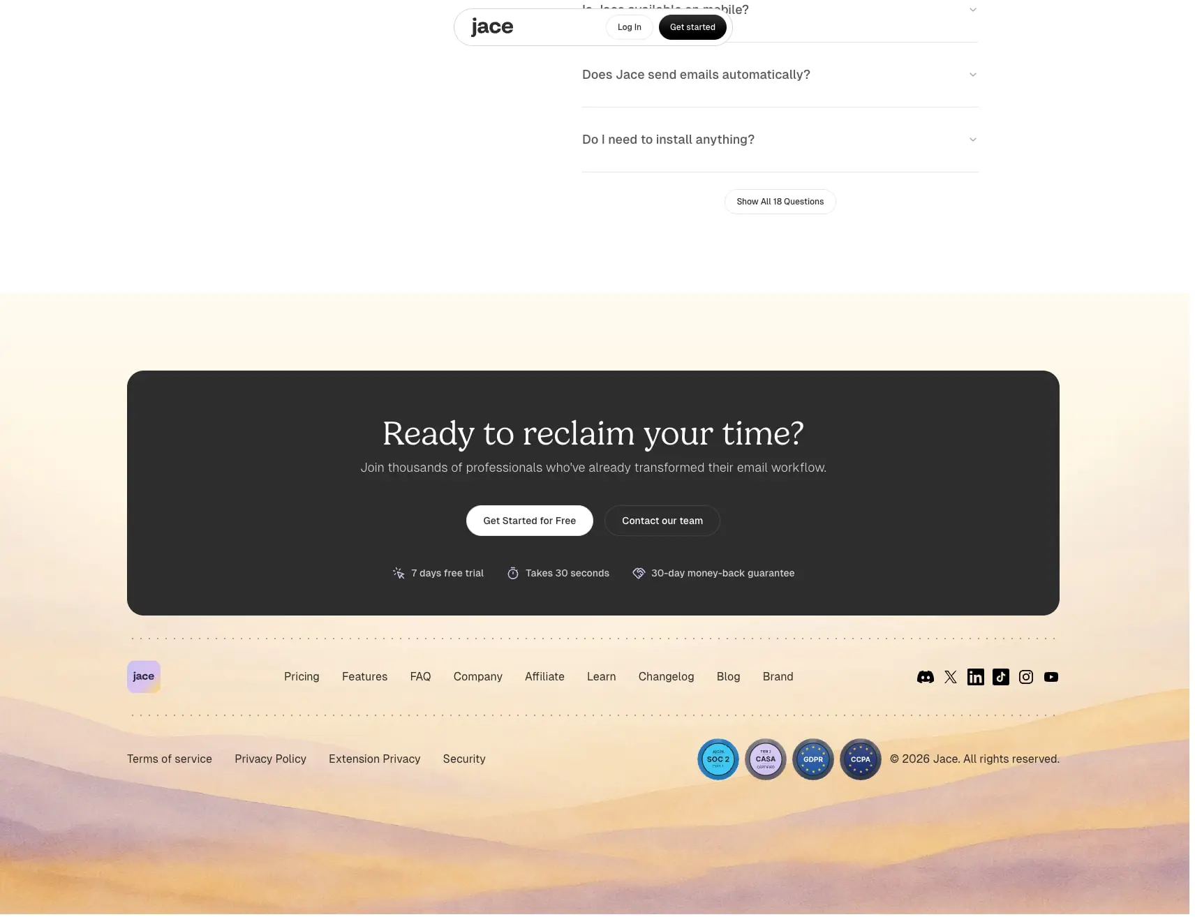
- Anatomy: Display headline, supporting text, two action buttons, trust badges with icons below
- Surface:
surfacedark rounded panel with1.5remradius - Typography:
section-displayfor headline,body-largefor text,labelfor buttons,captionfor trust badges - Shape:
rounded.panelcontainer; buttons userounded.pill - Spacing:
4reminternal padding; buttons centered with1remgap; trust badges in horizontal row with2remgap
Footer
- Anatomy: Logo, link columns, social icons, legal links, certification badges, copyright
- Surface: Watercolor gradient illustration at bottom edge; content on transparent or near-transparent layer
- Typography:
navigationfor links,captionfor legal - Shape: No panel; full-width with standard content margins
- Spacing: Dotted rule separates CTA from footer;
32pxvertical padding typical
Responsive behavior
The design is documented from desktop viewport widths. The narrow content measure (154px side margins) suggests the system was optimized for reading comfort at standard laptop widths. At narrower viewports, the asymmetric feature layouts should stack vertically: product screenshots would move above or below text blocks rather than sitting beside them. The testimonial carousel would likely collapse to a single centered column with the portrait above the quote. Navigation would compress to a hamburger menu or simplify to logo-plus-CTA. Font sizes should scale down proportionally: the hero-display at 88px would reduce to approximately 48px on tablet and 36px on mobile to maintain line-length viability. The section-display at 56px would become 40px and then 32px. Pill-shaped buttons maintain their radius at all sizes but increase touch targets to at least 44px height on mobile. Watercolor gradient backgrounds should remain visible but may crop differently; consider background-size: cover with centered focal points.
Practical implementation guidance
Preserve
- The two-family typographic hierarchy: Gelica for display, Geist for everything functional
- Pill-shaped buttons and navigation containers as the signature interactive language
- Watercolor gradient photography as section backgrounds behind product shots
- Dotted divider rules for editorial rhythm between content blocks
- The stepped text color system on dark surfaces (near-white → light gray → muted gray)
- Asymmetric feature layouts with generous whitespace
Avoid
- Sharp-cornered buttons or cards; the rounded language is integral to the brand warmth
- Pure white text on dark backgrounds; use
#F6F6F6or#D1D1D1to reduce eye strain - Solid horizontal rules where dotted patterns create the intended editorial feel
- Crowding product screenshots with text; let watercolor gradients provide visual breathing room
- Generic SaaS illustration styles; the watercolor treatment is distinctive
Recommended build order
- Establish dark canvas and surface color tokens with proper contrast ratios
- Implement Geist at 16px/24px as the body foundation with weight 400 and 500 variants
- Add Gelica display sizes: 88px hero, 56px section, 48px feature, 32px testimonial
- Build pill button component with primary (white fill, black text) and secondary (dark fill, light text) variants
- Create dotted divider as reusable component using the radial gradient pattern
- Implement feature section layout with asymmetric two-column and rounded panel container
- Add watercolor gradient background treatment for screenshot containers
- Build testimonial carousel with portrait-left, quote-right layout and pagination
- Construct FAQ accordion with expand/collapse behavior
- Assemble footer with gradient illustration, link columns, and certification badges
Accessibility
- Maintain minimum 4.5:1 contrast for body text; the
#D1D1D1on#000000pairing exceeds this - Ensure
#F6F6F6headlines on#1C1C1Csurfaces meet 3:1 for large text - Provide visible focus states for pill buttons; consider
2pxoutline offset withaccent-lavendercolor - Add
aria-expandedto FAQ accordion triggers and manage keyboard navigation between items - Testimonial carousel needs previous/next button labels and live region for quote changes
- Watercolor gradients behind text should maintain sufficient contrast; avoid placing body text directly on gradient areas
Scope note
This guide covers the Jace AI homepage including hero, feature sections, testimonial carousel, FAQ accordion, call-to-action panel, and footer. Pricing pages, authentication flows, and in-product interface chrome are not represented. Motion behavior for the testimonial carousel, FAQ expand/collapse transitions, and any scroll-triggered animations are not documented from still images.
Sites change, so a screenshot can differ from the guide.
Loading…Similar designs
This guide describes the public website and isn't an official jace.ai design system. Not affiliated with jace.ai.