Overview
Kraa.io presents a minimal, content-first workspace that prioritizes readability and calm focus. The interface alternates between a light mode with soft gray canvas backgrounds and a dark mode with near-black surfaces, letting users choose their preferred working environment. The visual system relies on generous whitespace, rounded corners, and a restrained accent palette centered on a soft purple. Editorial content receives special treatment through a serif display typeface, while all interface elements use a clean sans-serif for maximum legibility at small sizes. The overall impression is of a quiet, professional tool that stays out of the way of the content it presents.
Colors
The color system supports two distinct modes: a light mode for general workspace use and a dark mode for focused content viewing. Both modes share the same accent color to maintain brand consistency.
| token | value | use |
|---|---|---|
| canvas | #EDEDED | Light mode page background |
| canvas-dark | #000000 | Dark mode page background |
| surface | #FFFFFF | Cards, panels, dropdowns |
| surface-elevated | #F6F2FA | Elevated containers, accent-tinted surfaces |
| ink | #050208 | Primary text in light mode |
| ink-secondary | #080205 | Secondary text, labels |
| ink-muted | #D9D1E0 | Placeholder text, disabled states |
| accent | #7A3DDB | Primary action buttons, links, active states |
| accent-light | #D0B4F3 | Hover states, subtle highlights |
| accent-surface | #F5F0F9 | Button backgrounds, tinted containers |
| action-primary | #7A3DDB | Filled buttons, primary actions |
| action-primary-text | #FFFFFF | Text on filled primary buttons |
| danger | #E6A8A8 | Error states, destructive actions |
| border-subtle | #F3F4F6 | Dividers, hairline borders |
The light mode pairs canvas with ink for comfortable long-form reading. Dark mode inverts this relationship, placing near-white surface text on canvas-dark. The purple accent appears sparingly—primarily in invitation buttons, verification flows, and active user states—preventing it from overwhelming the calm neutral environment.
Typography
The type system uses three families: Inter for all interface and body text, Domine for large editorial headings, and Applesystem as a system-level fallback in certain contexts. Verify licensing for these families before production use. Domine is designed by Pablo Impallari, Rodrigo Fuenzalida, and Brenda Gallo.
| token | family | size | weight | leading | tracking | use |
|---|---|---|---|---|---|---|
| hero-display | Domine | 3.75rem | 400 | 1.13 | normal | Large editorial headings, article titles |
| section-display | Inter | 3.25rem | 400 | 1.25 | normal | Page-level headings, hero sections |
| body | Inter | 1rem | 400 | 1.5 | normal | Paragraphs, general content |
| body-large | Inter | 1.25rem | 400 | 1.4 | normal | Lead paragraphs, emphasized body |
| label | Inter | 0.875rem | 500 | 1.43 | normal | Buttons, form labels, navigation |
| caption | Inter | 0.75rem | 400 | 1.33 | normal | Timestamps, metadata, hints |
| navigation | Inter | 0.875rem | 400 | 1.43 | normal | Top bar, menu items, breadcrumbs |
The hero-display token uses Domine at 60px with a tight line height of 68px, creating a refined editorial presence for article titles. All other sizes use Inter, with the 16px body size serving as the foundation. The 14px label size appears frequently in buttons and compact UI elements, while the 20px and 28px sizes extend the scale for subheadings and section titles. Applesystem appears at 14px in certain fallback contexts within the interface.
Layout
The layout follows a spacious, left-aligned convention with substantial horizontal padding. Content containers use padding-left: 140px and padding-right: 20px, creating an asymmetric inset that pushes primary content toward the left third of the viewport while preserving breathing room on the right. This offset creates a distinctive editorial feel reminiscent of print layouts.
Vertical rhythm is established through consistent section spacing of 64px between major content blocks, with 80px used for more dramatic separations. Internal gaps of 8px appear between related elements, while 16px separates distinct components within a section.
Cards and floating panels typically appear in the upper-right quadrant, anchored near the user avatar. These panels use a fixed width with internal padding of 16px, creating self-contained islands of interaction above the canvas. The profile card, sharing dropdown, and verification flows all follow this positioning pattern.
Grid behavior is implicit rather than explicit—content flows in a single column with natural line breaks, avoiding rigid column structures in favor of typographic hierarchy and whitespace.
Visual language
The visual language emphasizes softness and approachability through consistently rounded corners. Buttons use 9px radius, cards and panels use 13px to 17px, and avatar images are fully circular. Even asymmetric shapes appear in the interface: some containers use compound radii like 12px 4px 4px 12px for pill-shaped tags with directional emphasis.
Shadows are minimal and functional. A subtle blue-tinted shadow (rgba(59, 130, 246, 0.5)) appears around focused inputs, providing accessibility feedback without visual weight. No heavy drop shadows elevate cards; instead, background color changes distinguish layers.
Iconography is simple and monochrome, matching the current text color. Small icons appear at 16px within buttons and list items, always paired with text labels. The user avatar serves as both identity marker and interactive trigger, positioned consistently in the top-right corner across all views.
The interface avoids borders as structural elements. When present, borders are 1px hairlines in subtle colors, often removed entirely in favor of background color differentiation.
Components
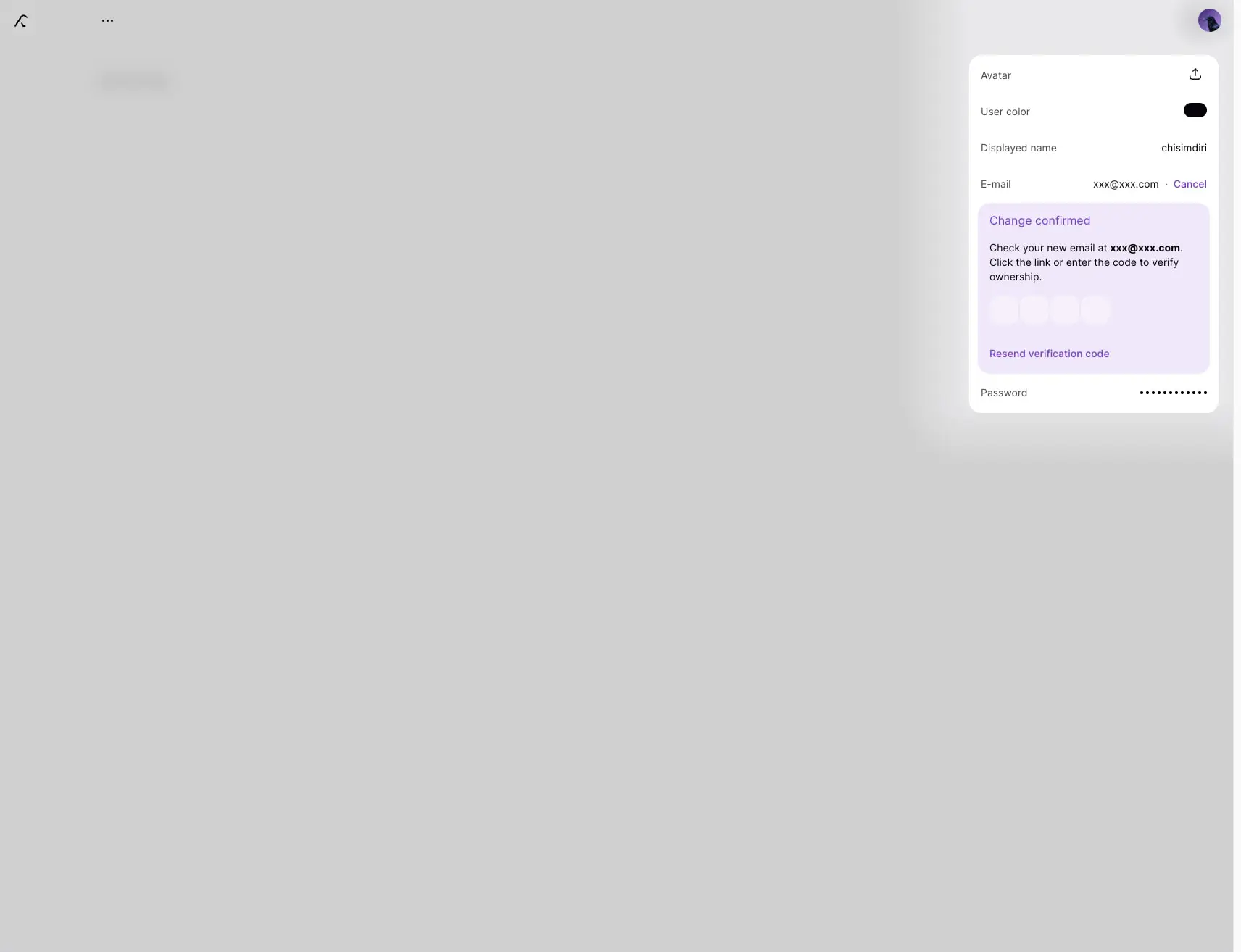
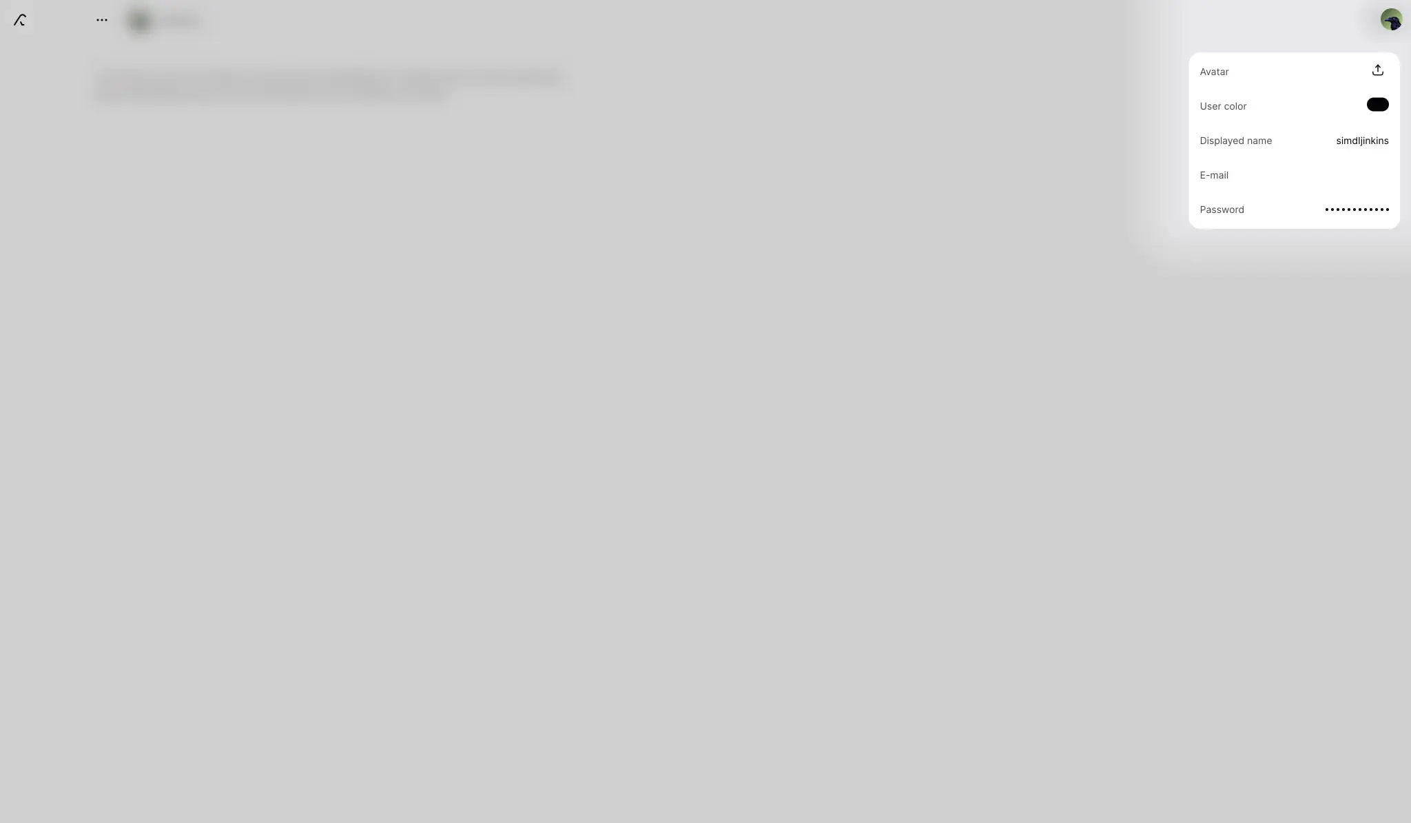
Profile Card
A floating panel for user account management, positioned in the upper right.
- Anatomy: Vertical stack of labeled rows (Avatar, User color, Displayed name, E-mail, Password) with action icons at right.
- Surface:
surfacebackground withrounded.panelcorners. - Typography:
labelfor row labels,bodyfor values. - Shape: 13px to 17px border radius, no border.
- Spacing: 16px internal padding, 8px between rows.
- Variants: Expanded state shows verification flow with code entry; collapsed state hides optional fields.
Verification Banner
An inline alert within the profile card for email confirmation.
- Anatomy: Tinted container with heading, instruction text, code input fields, and resend action.
- Surface:
accent-surfacebackground (#F5F0F9). - Typography:
labelinaccentfor heading,bodyfor instructions. - Shape: Inherits parent card radius.
- Composition: Four square input fields in a horizontal row, each 40px wide with 8px gaps.
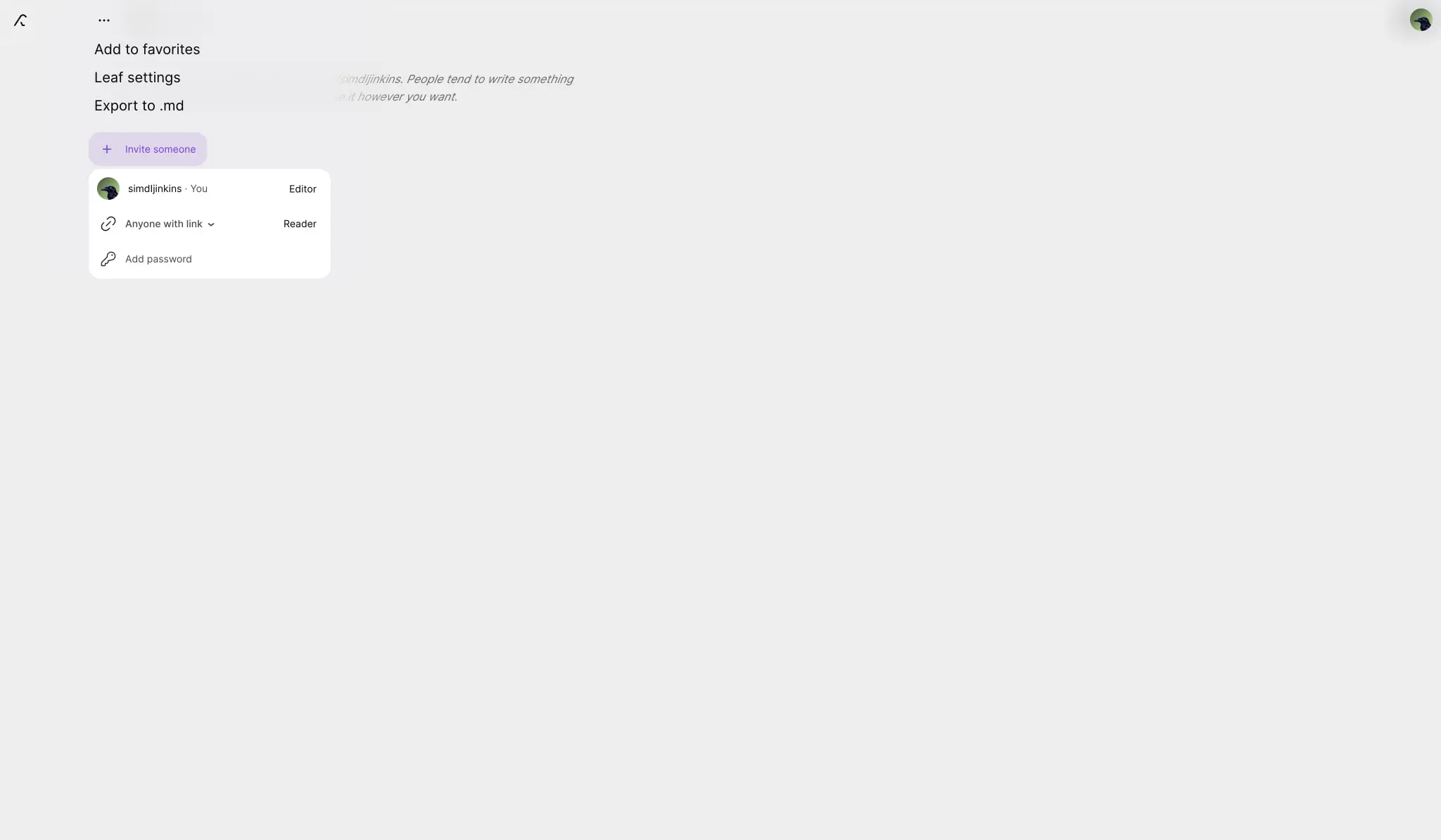
Invite Button
A compact action trigger for collaboration features.
- Anatomy: Icon prefix (plus sign) with text label.
- Surface:
accent-surfacebackground,accenttext. - Typography:
labelat 500 weight. - Shape:
rounded.button(9px), no border. - Spacing: 8px vertical, 12px horizontal padding; 4px gap between icon and text.
Permission Row
A list item showing user access levels in sharing contexts.
- Anatomy: Avatar thumbnail, user identifier, role badge, and optional dropdown.
- Surface:
surfacebackground withrounded.cardcorners. - Typography:
navigationfor names,captionfor role labels. - Shape: 13px radius, full-width within parent panel.
- Spacing: 12px to 16px horizontal padding, 14px vertical padding.
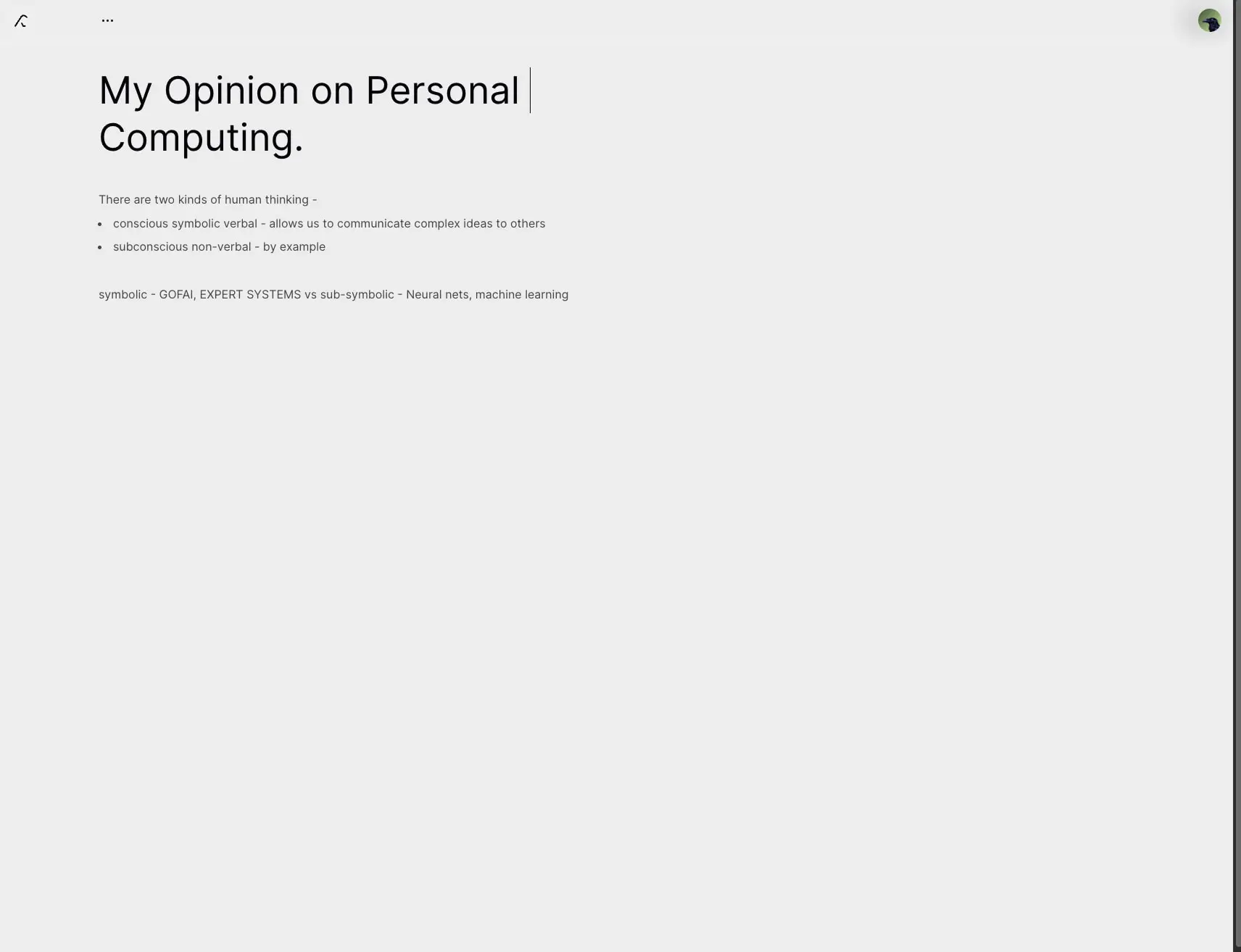
Article Heading
The primary title element for editorial content.
- Anatomy: Large serif text with optional cursor indicator for active editing.
- Surface: Transparent, inheriting
canvasorcanvas-dark. - Typography:
hero-displayinink(light mode) orsurface(dark mode). - Composition: Left-aligned with 140px inset, natural line wrapping, 8px margin to subsequent body text.
Body Content
Standard paragraph and list formatting for articles.
- Anatomy: Paragraphs, unordered lists with bullet markers, and inline text.
- Typography:
bodyat 16px with 24px line height,bodyfor list items with 16px left indent. - Spacing: 8px margin-top for paragraphs following headings, 4px margin-bottom for list items.
Responsive behavior
The 140px left padding suggests a desktop-first approach optimized for wide viewports. On narrower screens, this inset should reduce proportionally—likely to 20px or 40px—to preserve content width without excessive margins. The floating profile card should remain accessible but may shift to full-width overlay on mobile.
The type scale maintains fixed sizes rather than fluid scaling, so the 52px to 60px display headings will dominate smaller screens. Consider reducing hero-display to section-display sizes below 768px viewport width.
Dark mode toggling appears to be user-controlled rather than system-preference based, given the explicit contrast between pages. Ensure both modes are fully specified before implementation.
Practical implementation guidance
Preserve
- The asymmetric 140px left inset as a signature layout feature.
- The two-mode color system with full light and dark implementations.
- The Domine and Inter pairing for editorial versus interface text.
- The soft purple accent used sparingly for interactive emphasis.
- Generous 64px section spacing and rounded corner language throughout.
Avoid
- Heavy shadows or elevated card treatments; rely on color and spacing for depth.
- Sharp corners on interactive elements; maintain the 9px to 17px radius convention.
- Pure black text on white backgrounds; use the subtle warm blacks (
#050208) instead. - Borders as primary separators; prefer background color changes and whitespace.
Recommended build order
- Establish the color tokens for both light and dark modes.
- Implement the Inter type scale with body, label, and navigation sizes.
- Build the base layout with 140px left inset and 64px vertical sections.
- Create the profile card component with proper spacing and radius.
- Add the Domine hero-display for editorial headings.
- Implement the accent button and permission row patterns.
- Verify dark mode contrast and adjust as needed.
Accessibility
- Ensure the purple accent (
#7A3DDB) meets WCAG AA contrast against bothcanvasandsurfacebackgrounds. - The blue focus shadow should be visible and distinct from default browser outlines.
- Form inputs in verification flows need clear focus states and error messaging.
- Dark mode should maintain at least 4.5:1 contrast for all body text sizes.
Scope note
This guide covers the light-mode workspace, profile management panels, editorial content pages, and sharing interfaces visible in the captured images. Dark mode pages, motion behavior, mobile layouts, and additional interactive states such as loading or error conditions are not fully represented.
Sites change, so a screenshot can differ from the guide.
Loading…Similar designs
This guide describes the public website and isn't an official kraa.io design system. Not affiliated with kraa.io.