Overview
MaxiBestOf presents a curated design inspiration platform with an editorial, gallery-like sensibility. The visual system prioritizes clarity and restraint: a single geometric sans-serif type family handles every textual element, from navigation labels to pricing displays to body paragraphs. The interface relies on generous whitespace, subtle surface differentiation, and a near-monochrome palette punctuated by a single warm red accent. This creates a calm browsing environment where the showcased design work remains the focal point. The system balances functional density—dense link grids, feature lists, and category navigation—with breathing room through consistent padding rhythms and a limited color vocabulary. Every component feels intentionally understated, allowing the curated content to carry visual interest while the interface recedes into supportive scaffolding.
Colors
The color system is intentionally minimal, built on a grayscale foundation with one distinctive accent. Light surfaces dominate, with dark text providing strong contrast for readability. The accent red appears sparingly, reserved for promotional moments and interactive emphasis.
| token | hex | use |
|---|---|---|
| ink | #000000 | Primary text, headings, navigation labels |
| ink-secondary | #262626 | Body text, secondary headings, button labels |
| ink-tertiary | #8C8C8C | Muted links, footer navigation, disabled states |
| accent | #E1220F | Promotional headlines, primary action buttons, “New” badges, savings callouts |
| border | #EEEEEE | Card borders, dividers, hairline separators |
| surface | #F5F5F5 | Pricing card backgrounds, subtle container fills |
| canvas | #FFFFFF | Page background, modal cards, button fills |
The light mode is absolute: pure white canvas with black ink. No dark mode is visible in the captured pages. The accent red functions as the only warm color in the system, appearing in promotional contexts like the portrait-modal headline and pricing savings labels. Photographic content brings its own color, but the interface never competes with it. Grayscale photography and neutral backgrounds in the curated content align naturally with the system’s restraint.
Typography
Abc Diatype, designed by Johannes Breyer, Fabian Harb, Elias Hanzer, Renan Rosatti, and Erkin Karamemet for Dinamo, serves as the sole type family. It is a geometric sans-serif with clean construction and even color, suitable for both display and extended reading. The system uses a single weight (Regular, 400) for most text, with Medium (500) reserved for button labels and emphasis. Verify licensing for this family before production use.
| token | family | size | weight | leading | tracking | use |
|---|---|---|---|---|---|---|
| body | Abc Diatype | 1rem | 400 | 1.5 | normal | Default paragraphs, navigation items, list entries |
| body-large | Abc Diatype | 1.5rem | 400 | 1.5 | -0.018em | Promotional body, persuasive copy blocks |
| body-large-tight | Abc Diatype | 1.5rem | 400 | 1.333 | -0.018em | Section headings, card titles |
| label | Abc Diatype | 0.875rem | 400 | 1.429 | 0.01em | Footer links, metadata, small print |
| label-medium | Abc Diatype | 1rem | 500 | 1.5 | normal | Button labels, emphasized UI text |
| display-small | Abc Diatype | 1.25rem | 400 | 1.5 | normal | Price figures, plan names |
| price | Abc Diatype | 1.25rem | 400 | 1.5 | normal | Pricing amounts with slash-separated periods |
The type scale is compact, with only three distinct sizes carrying most of the interface: 16px for body and UI, 24px for section-level display, and 14px for supporting labels. Negative letter spacing on the 24px size tightens the texture for headings. The 20px size appears for price displays and secondary headings, bridging the gap between body and display. Line heights are generous, maintaining the airy, editorial quality of the page.
Layout
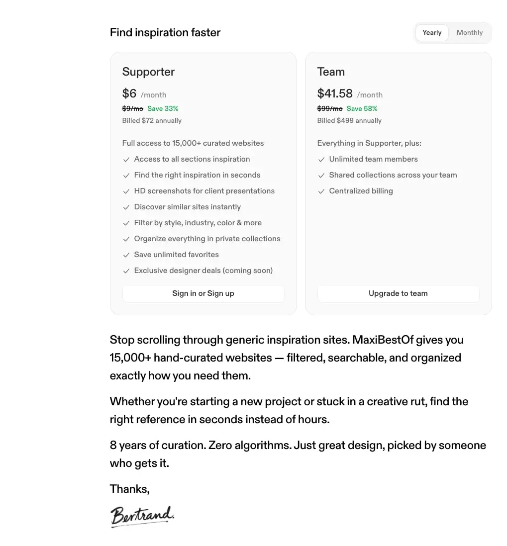
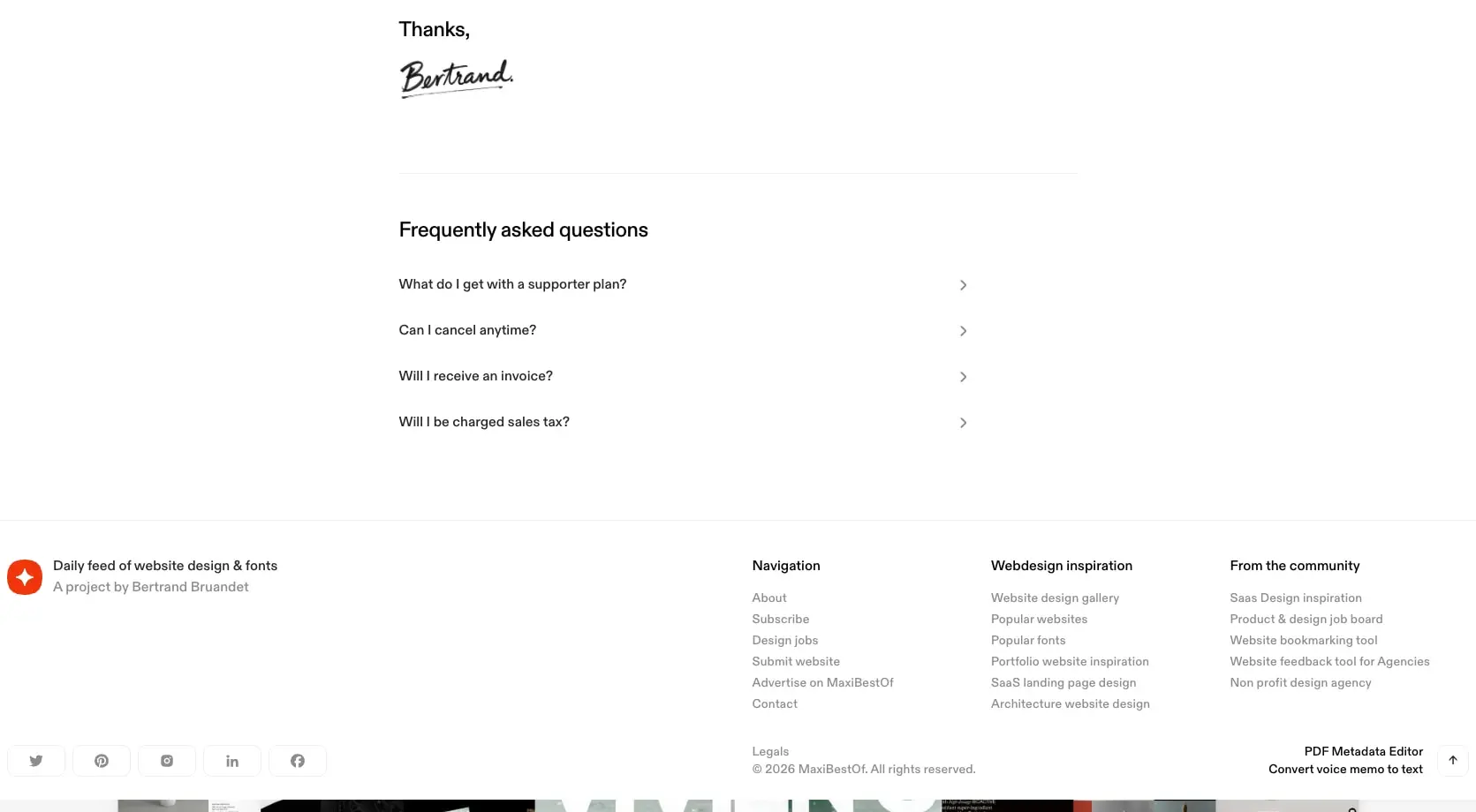
The layout follows a centered, single-column model with occasional two-column splits for structured content. Maximum content width is constrained, creating comfortable reading measure and visual focus. The pricing page demonstrates a clear two-column grid for plan comparison, while the footer expands into a four-column link grid.
Page-level spacing uses a 48px section rhythm, with 80px appearing above major dividers like the footer border. Internal component padding ranges from 12px for compact UI elements to 24px for card interiors. The navigation drawer uses 20px padding for touch-friendly tap targets, while pill-shaped buttons compress to 12px horizontal padding.
Grid gaps and margins follow a consistent 8px base, with multiples at 16px, 24px, 32px, and 48px. The pricing cards sit with 16px gap between them. List items in feature grids carry 8px bottom margin for clear separation without excessive space.
The header and navigation areas are not fully visible in the captured images, but the drawer overlay suggests a fixed or sticky trigger. Content flows vertically with no sidebar intrusion. The footer occupies full width with internal columnar organization.
Visual language
The visual character is editorial and gallery-like: confident whitespace, typographic hierarchy through size rather than weight, and a near-absence of decorative elements. Rounded corners appear on interactive elements and containers, but never excessively—10px for buttons, 15px for the navigation drawer, 20px for cards and modals. This creates a friendly but restrained personality.
Imagery plays a central role. The promotional modal shows a collage of portrait photographs with overlapping edges and a hand-drawn arrow, suggesting that photographic content can break from the grid when appropriate. The curated website thumbnails visible at the bottom of the navigation drawer image reinforce the platform’s purpose as a visual showcase.
Iconography is minimal and functional: chevrons for accordion expansion, social media icons in rounded square containers. The “New” badge uses the accent red in small text, inline with navigation labels rather than as a separate pill.
The signature element—a handwritten “Bertrand” mark—adds personal warmth to an otherwise systematic page, appearing below persuasive copy as an authorial stamp.
Components
Navigation drawer
- Anatomy: Header row with “Menu” label and close button, stacked primary navigation links, divider line, stacked utility links, generous empty space, bottom row of three social icon buttons
- Surface: White background with subtle shadow or overlay treatment
- Typography: Primary links use body-large-tight at 24px with negative tracking; utility links use body at 16px in ink-tertiary
- Shape: 15px top-corner radius, full-height panel
- Spacing: 20px padding on link items, 16px-24px-64px padding on list containers
- Composition: Single column, left-aligned text, close button top-right
- States: “New” badge inline with “Sections” in accent red
Pricing card
- Anatomy: Plan name, price with period suffix, strikethrough original price and savings percentage, billing note, feature list with checkmarks, action button
- Surface: Surface gray background with 1px border in border color, white canvas for action button
- Typography: Plan name in body-large-tight; price in display-small with period in ink-tertiary; features in body; savings in accent color
- Shape: 20px border radius
- Spacing: 24px internal padding; 16px gap between cards
- Composition: Two-column grid at desktop, stacked at narrower widths
- Variants: “Supporter” and “Team” tiers with differentiated feature lists
Promotional modal
- Anatomy: Rounded image container with portrait collage, accent headline, body copy, primary action button, secondary dismiss text
- Surface: White canvas card with shadow
- Typography: Headline in body at accent color; body in body; button in label-medium at white on accent
- Shape: 20px card radius; 10px button radius
- Spacing: 16px padding; comfortable vertical rhythm between elements
- Composition: Centered, narrow width, stacked vertically
Accordion list
- Anatomy: Question text with right-aligned chevron icon, expandable content area
- Surface: Transparent, full-width items
- Typography: Question in body
- Spacing: Generous vertical padding between items
- Composition: Full-width rows with icon at trailing edge
Footer
- Anatomy: Project attribution with logo mark, tagline, social icon row; multi-column link grid with category headers; legal row with copyright
- Surface: White with 1px top border in border color
- Typography: Category headers in body; links in label at ink-tertiary; legal in label
- Spacing: 48px top padding; 80px margin above border; columnar grid with consistent gaps
Toggle switch
- Anatomy: Two-option segmented control with “Yearly” and “Monthly” labels
- Surface: White background with border, active state in surface gray
- Typography: Label in body
- Shape: Pill-shaped container with individual option radii
Responsive behavior
The captured images suggest a mobile-first approach with clear breakpoint behavior. The navigation drawer is a mobile-pattern overlay, implying that desktop navigation may use a horizontal bar or persistent sidebar. Pricing cards shift from two-column grid to stacked single column on narrower viewports. Footer columns likely collapse to stacked sections on mobile, maintaining link groupings but losing horizontal arrangement.
The promotional modal appears centered and narrow, suggesting it maintains fixed width across breakpoints rather than going full-bleed. Touch targets in the drawer use 20px padding, appropriate for finger interaction, while desktop buttons compress to 12px horizontal padding.
When implementing, ensure the two-column pricing grid collapses at approximately tablet width, and that the footer link grid reflows to 2x2 or single column as viewport narrows. The navigation drawer should overlay with a scrim or push content, rather than replacing page content entirely.
Practical implementation guidance
Preserve
- The single-family typographic system; do not introduce secondary fonts for headings or UI
- Generous whitespace around sections; the 48px minimum section spacing is essential to the editorial feel
- The restrained accent usage; red should remain rare and meaningful
- The subtle surface differentiation between canvas and surface grays
- The handwritten signature as a personal, humanizing element
Avoid
- Heavy borders or shadows; the system uses 1px hairlines exclusively
- Multiple weights within running text; hierarchy comes from size and spacing, not bolding
- Decorative background patterns or gradients; the interface is intentionally flat
- Rounded corners larger than 20px; the system stops at modest rounding
Recommended build order
- Establish the type system with Abc Diatype at all specified sizes
- Implement the color tokens with pure whites, near-blacks, and the single accent red
- Build the navigation drawer as the primary mobile navigation pattern
- Create the pricing card component with its two-tier variant structure
- Implement the footer with its four-column grid and responsive collapse
- Add the promotional modal as an overlay pattern
- Polish with the toggle switch, accordion, and button variants
Accessibility
- Ensure the accent red (#E1220F) meets contrast requirements when used for text; it passes on white backgrounds for large text but may need darkening for small UI labels
- Maintain visible focus indicators on the minimal button styles; the ghost and secondary buttons may need explicit focus rings
- The navigation drawer should trap focus and provide escape-to-close behavior
- Price strikethroughs should not be the sole means of conveying discount information; the “Save X%” text provides redundant clarity
- Social icon buttons need accessible labels despite their visual-only presentation
Scope note
This guide covers the supporter page, pricing interface, promotional modal, and navigation drawer as visible in the captured images. The main feed page, website detail views, search functionality, and any authenticated states are not represented. Motion, loading states, and form validation patterns are not documented.
Sites change, so a screenshot can differ from the guide.
Loading…Similar designs

This guide describes the public website and isn't an official maxibestof.one design system. Not affiliated with maxibestof.one.