Overview
Mode Designs presents a sophisticated e-commerce experience built around premium mechanical keyboards and components. The visual system operates on a dark-first philosophy with deep forest greens and warm cream accents that evoke craftsmanship and precision. The design balances editorial elegance with functional clarity, using generous whitespace, refined typography, and meticulous attention to product presentation. Every interface element serves the core mission: helping enthusiasts configure and purchase high-end keyboard components with confidence and delight.
The system distinguishes itself through dramatic scale contrasts—oversized display type against delicate mono labels, expansive hero imagery against dense specification panels. Navigation remains restrained and persistent, while product configuration flows use progressive disclosure to manage complexity. The overall impression is of a boutique manufacturer that values both aesthetic refinement and technical precision.
Colors
The palette draws from natural, muted tones that suggest premium materials and careful craftsmanship. Dark greens dominate the interface, providing a distinctive alternative to conventional black or navy dark modes. Warm creams and soft golds appear as accents and in light-mode contexts.
| token | hex | use |
|---|---|---|
| ink | #1F2720 | Primary dark background, deep surfaces |
| ink-deep | #212E24 | Header background, elevated dark surfaces |
| ink-muted | #233F2A | Modal backgrounds, selected states, success indicators |
| surface | #302F2C | Card backgrounds on dark, subtle elevation |
| surface-warm | #4A4845 | Borders, dividers, disabled states |
| surface-light | #6B6861 | Muted text on dark, secondary information |
| text-primary | #DBD4C7 | Primary text on dark backgrounds |
| text-secondary | #979286 | Secondary text, prices, specifications |
| text-muted | #B8B2A2 | Placeholder text, inactive labels |
| canvas | #F6F0E3 | Light mode background, sticky bar, buttons |
| canvas-pure | #FDF9F2 | Pure light background, modal overlays |
| accent | #FFBB65 | Highlight actions, warnings, warm emphasis |
| accent-warm | #503720 | Dark warm accent, error states, sold-out indicators |
| border | #4A4845 | Standard borders on dark backgrounds |
| border-subtle | #302F2C | Very subtle borders, option selectors |
| border-light | #DBD4C7 | Borders on light backgrounds, card outlines |
| success | #233F2A | Positive states, available stock |
| error | #503720 | Negative states, sold out, errors |
The dark green system creates an immersive, premium atmosphere that differentiates Mode from typical electronics retailers. Light mode appears selectively for collection grids and product cards, where the cream canvas (#F6F0E3) provides warmth and readability. The accent gold (#FFBB65) appears sparingly for high-priority actions and highlights. Text hierarchy relies on opacity and warmth rather than pure white, with primary text at #DBD4C7 offering reduced eye strain against deep greens.
Typography
The type system pairs an elegant serif display face with a clean neo-grotesque body font and a precise mono for technical details. This three-way contrast establishes clear information hierarchy while reinforcing the brand’s position between craftsmanship and technology.
| token | family | size | weight | leading | tracking | use |
|---|---|---|---|---|---|---|
| hero-display | Ivyora | 10rem | 300 | 1 | -0.0175em | Collection page headings, massive display |
| section-display | Ivyora | 5rem | 300 | 1.1 | -0.015em | Section headings, homepage hero |
| product-title | Ivyora | 4rem | 300 | 1.15 | -0.0125em | Product page titles |
| heading-large | Ivyora | 3.5rem | 400 | 1.25 | -0.005em | Feature headings, large subsections |
| heading-medium | Ivyora | 2rem | 400 | 1.14 | -0.0075em | Configuration section titles |
| body | Ivyora | 1rem | 400 | 1.6 | normal | Primary body text, descriptions |
| body-small | Ivyora | 0.75rem | 400 | 1.33 | normal | Compact descriptions, captions |
| label | PP Neue Montreal Mono | 0.75rem | 400 | 1.6 | -0.0217em | Technical specs, metadata, prices |
| label-small | PP Neue Montreal Mono | 0.75rem | 400 | 1.33 | -0.0233em | Compact labels, inline metadata |
| navigation | System | 1rem | 400 | 1 | 0.01em | Primary navigation links |
| button | PP Mondwest | 1rem | 500 | 1.5 | -0.025em | Button labels, action text |
Ivyora serves as the primary typeface across all display and body contexts, with its light weight (300) used dramatically at large sizes for headings and regular (400) for body copy. PP Mondwest appears exclusively for button and action elements, bringing a slightly more expressive character to interactive components. PP Neue Montreal Mono handles all technical information—specifications, prices, configuration details—establishing a clear distinction between editorial and functional content. System fonts supplement navigation at a standard 16px size. System-Uiserif is detected in the captured pages as a system font variant but is not assigned a distinct role in this system.
Verify licensing for these families before production use. Ivyora and the PP typefaces are commercially licensed through Pangram Pangram Foundry.
Layout
The layout system employs a generous maximum content width with substantial horizontal margins, creating an editorial, magazine-like presentation. Content sits within a 960px effective width (margin: 0 308px at standard viewport), allowing extensive whitespace that emphasizes product imagery and typography.
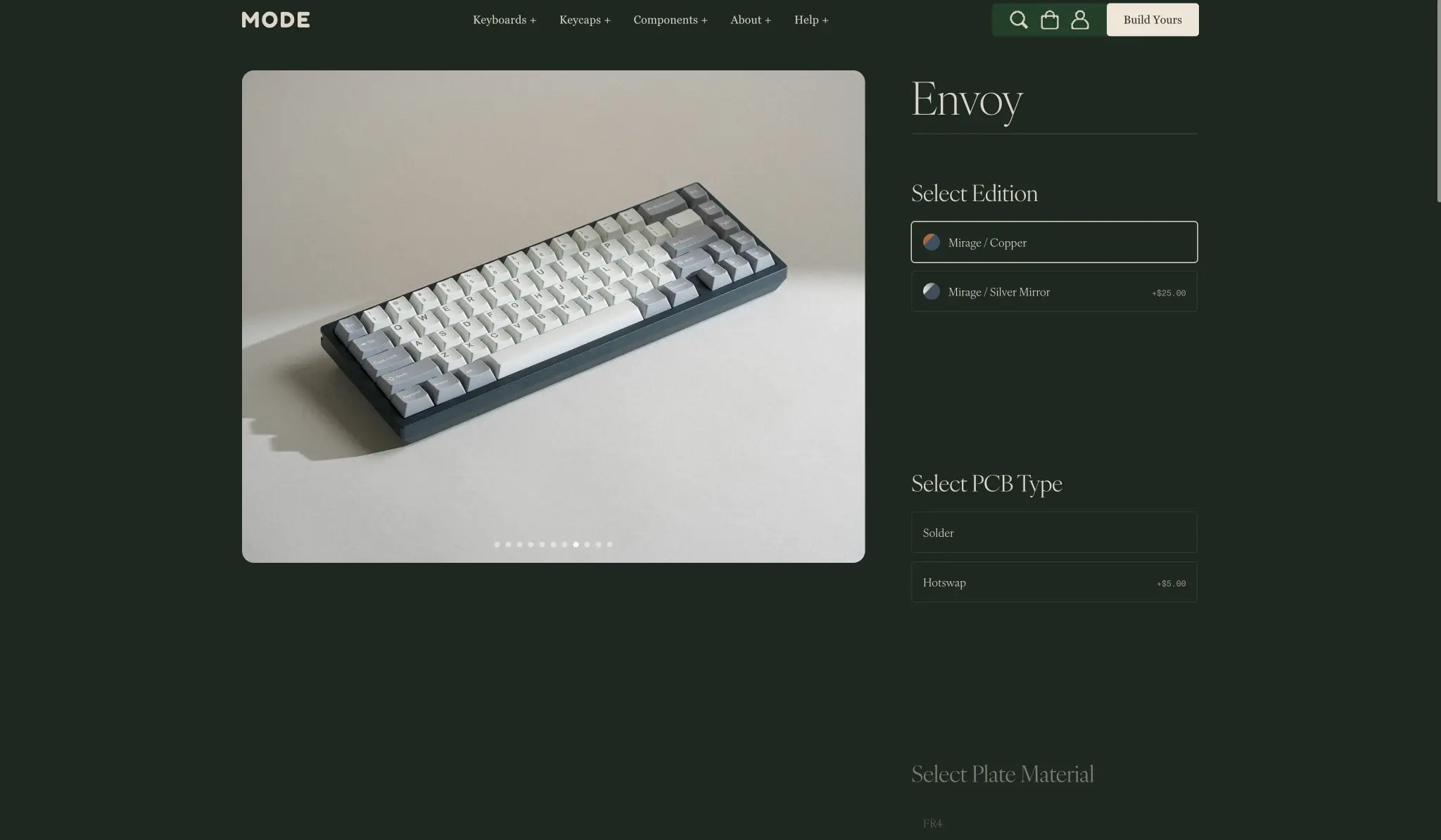
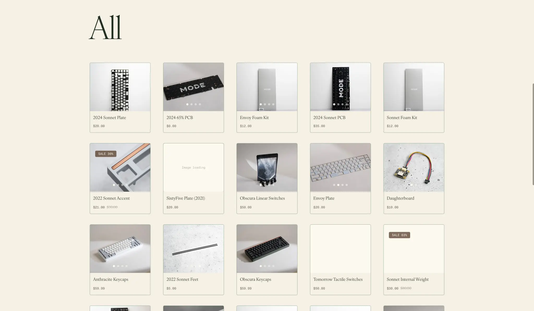
The grid system uses flexible columns with consistent gutters. Collection pages display five product cards per row with 1.5rem gaps. Product configuration pages use a two-column split: large imagery occupies roughly 60% width while options stack in the remaining 40%. The sticky configuration bar spans full width at the viewport bottom, floating above content with rounded corners and subtle shadow.
Section spacing follows an 8px base unit with major sections separated by 10rem (160px) vertical padding. Content within sections uses 1.5rem gaps between related elements. The header maintains fixed height at 4rem with horizontal padding of 2.5rem.
Responsive behavior should maintain the two-column product layout on tablet, stacking to single column on mobile with imagery above options. Collection grids should reduce to three columns on tablet and two on mobile. The sticky bar remains fixed across all breakpoints.
Visual language
The visual language communicates precision craftsmanship through restrained elegance. Imagery dominates—large, well-lit product photography against neutral backgrounds with subtle shadows that suggest physical presence. The photography style is consistent: soft directional lighting, minimal props, emphasis on material textures and build quality.
Interface elements favor subtlety over decoration. Borders are hairline-thin (0.5px) and low-contrast. Rounded corners are modest (approximately 7px) rather than aggressively soft. Shadows are minimal and diffuse, used primarily for elevation indicators like the sticky bar and modals.
The dark green palette creates an immersive environment that makes product imagery pop while reducing eye strain during extended browsing sessions. Light mode surfaces appear as deliberate contrasts—cream cards against dark backgrounds, or full light pages for collection browsing.
Motion and interaction should follow the system’s restrained character: subtle opacity transitions for hover states, smooth height animations for expanding options, and gentle fades for modal appearances. No aggressive transforms or bouncy physics.
Components
Header
- Anatomy: Logo left, navigation center, utility icons and primary action right
- Surface: Background color
{colors.ink-deep}, full width, fixed position - Typography: Navigation links use
{typography.navigation}, logo uses{typography.button}at larger size - Spacing: Height 4rem, horizontal padding 2.5rem, navigation links padded 0 1rem
- Composition: Flex row, space-between alignment, vertically centered items
- States: Navigation links show opacity reduction on hover; active section may show subtle underline
Product Card
- Anatomy: Product image (aspect-ratio maintained), title below, price below title
- Surface: Background
{colors.canvas}, border 0.5px solid{colors.border-light}, border-radius{rounded.card} - Typography: Title uses
{typography.body}, price uses{typography.label}in{colors.text-secondary} - Spacing: Padding 1rem, internal gap 0.5rem between elements
- Composition: Vertical stack, image fills width with object-fit cover
- Variants: Sale items show original price struck through with accent color; some cards show “SALE” badge in top-left corner with
{colors.accent-warm}background and{colors.canvas}text
Option Selector
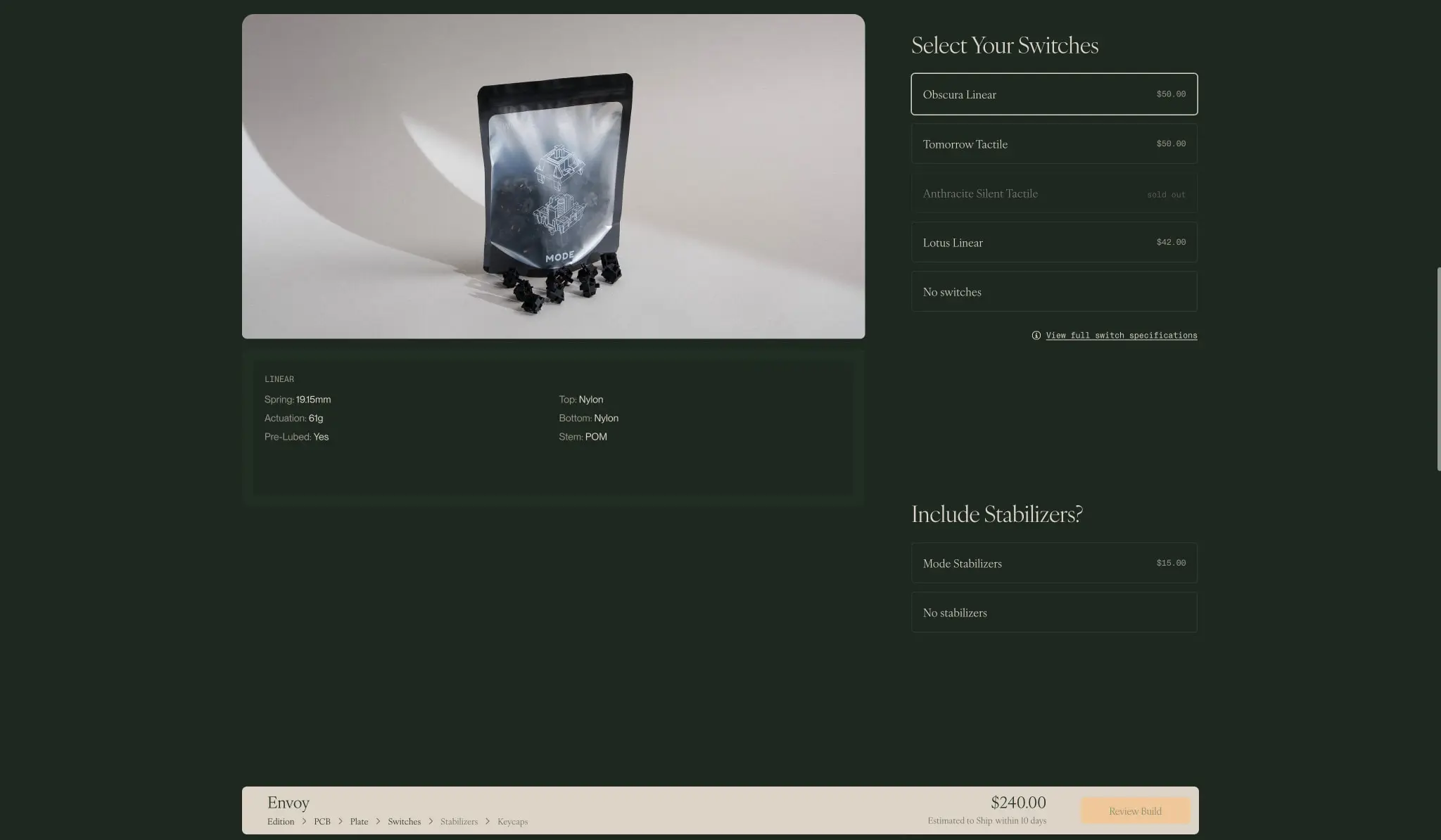
- Anatomy: Radio-style selection with label left, price/spec right, optional icon or swatch
- Surface: Background
{colors.ink-deep}, border 0.5px solid{colors.border-subtle}, border-radius{rounded.input} - Typography: Label uses
{typography.body}, price uses{typography.label}aligned right - Spacing: Padding 1rem, full width within parent column
- States: Default shows subtle border; selected state shows
{colors.text-primary}border and slightly lighter background{colors.ink-muted}; disabled/sold-out shows reduced opacity with “sold out” label in{colors.text-muted} - Composition: Flex row, space-between, vertically centered
Sticky Configuration Bar
- Anatomy: Product name left, breadcrumb trail below name, price center-right, primary action button far right
- Surface: Background
{colors.canvas}, border-radius{rounded.panel}, subtle top shadow - Typography: Product name uses
{typography.heading-medium}, breadcrumb uses{typography.label-small}in{colors.text-secondary}, price uses{typography.body}, button uses{typography.button} - Spacing: Padding 0.75rem 2.5rem, positioned fixed at viewport bottom with margin from edges
- Composition: Flex row, space-between, vertically centered
Specification Panel
- Anatomy: Two-column grid of label-value pairs
- Surface: Background
{colors.ink}, border-radius{rounded.panel}, padding 1.5rem - Typography: Labels and values both use
{typography.label}in{colors.text-secondary}; key terms like material types may use{colors.text-primary} - Composition: CSS grid, two columns, row gap 0.75rem
Modal / Cart Empty State
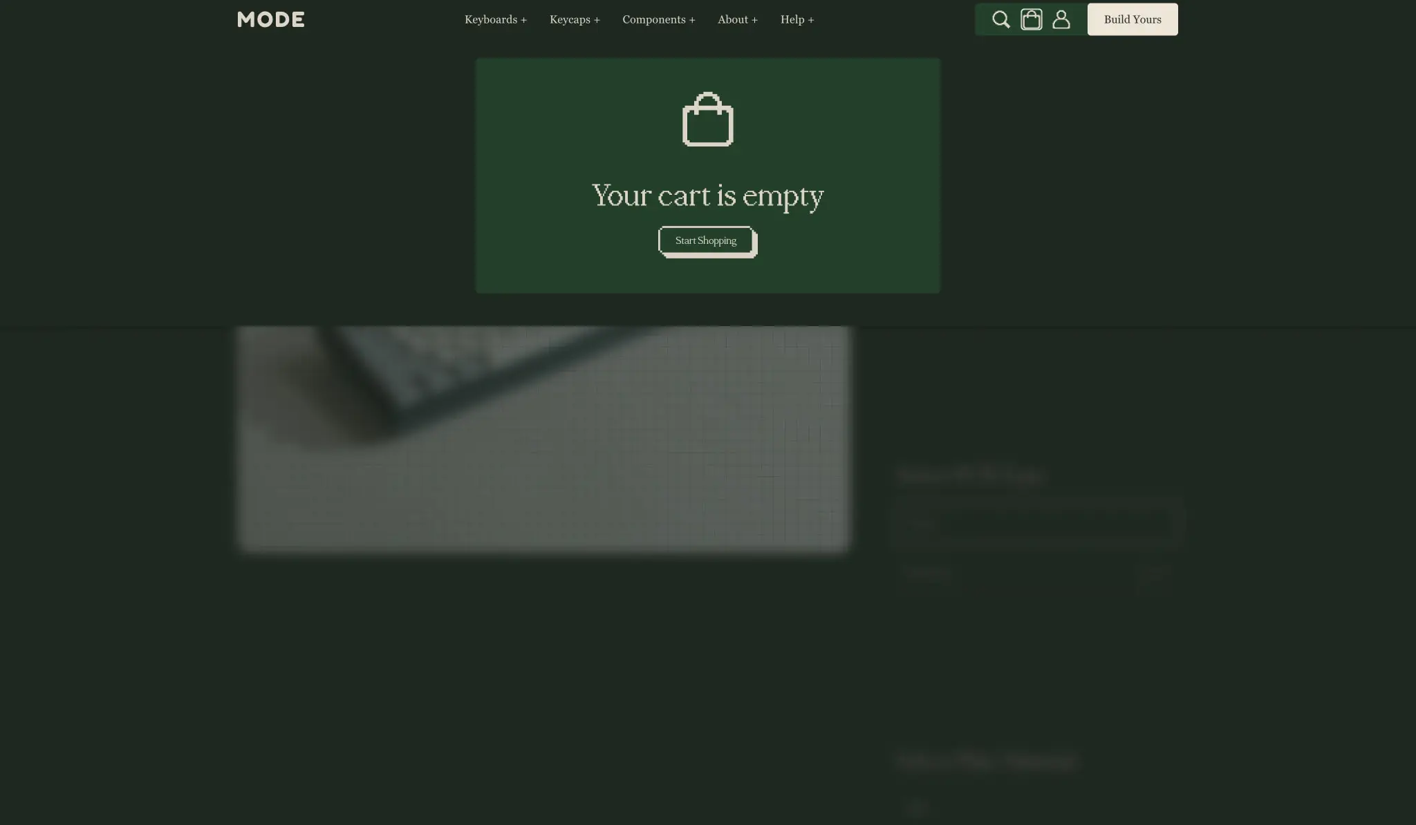
- Anatomy: Centered icon, heading, description, action button
- Surface: Background
{colors.ink-muted}, border-radius{rounded.panel}, padding 3rem - Typography: Heading uses
{typography.heading-medium}, body uses{typography.body}, button uses{typography.button} - Overlay: Semi-transparent dark backdrop covering full viewport
- Composition: Centered flex column, gap 1.5rem between elements
Primary Button
- Anatomy: Text label, optional icon
- Surface: Background
{colors.canvas}, color{colors.ink}, border-radius{rounded.button} - Typography:
{typography.button} - Spacing: Padding 1rem 1.75rem
- States: Hover shows slight background darkening; active shows pressed state
Accent Button
- Anatomy: Text label
- Surface: Background
{colors.accent}, color{colors.ink-deep}, border-radius{rounded.button} - Typography:
{typography.button} - Spacing: Padding 0.75rem 2.5rem
- Use: High-priority actions, add to cart, proceed to checkout
Responsive behavior
The design prioritizes desktop experience given the complex product configuration interfaces. At standard viewport, the two-column product layout provides ample space for large imagery and stacked options. Tablet breakpoints should maintain this structure with reduced margins and slightly smaller type. Mobile requires single-column stacking with imagery above options, and the sticky bar should remain fixed but may simplify to show only price and action.
Collection grids adapt from five columns to three at tablet (approximately 1024px) and two at mobile (approximately 640px). The massive display type for collection headings should scale down proportionally, maintaining impact without overflow.
Navigation collapses to a hamburger menu on mobile, with the “Build Yours” primary action remaining visible. Modal overlays should become full-screen on mobile to maximize usable space.
Practical implementation guidance
Preserve
- The dramatic scale contrast between display type and body text
- Dark green as the default background color for immersive product experiences
- The three-typeface hierarchy: Ivyora for editorial, PP Mondwest for actions, PP Neue Montreal Mono for technical data
- Generous whitespace and editorial margins (308px side margins at desktop)
- Subtle 0.5px borders for definition without heaviness
- The sticky configuration bar pattern for complex product builders
- Warm cream (#F6F0E3) as the light-mode surface, not pure white
Avoid
- Pure black backgrounds—the deep greens are essential to the brand character
- Heavy drop shadows or aggressive elevation effects
- Rounded corners larger than 7px on any element
- Saturated colors outside the defined accent gold
- Dense information layouts that compromise the editorial feel
- Generic e-commerce patterns like star ratings, review counts, or urgency messaging
Recommended Build Order
- Establish color tokens and dark/light mode switching capability
- Implement Ivyora at all sizes with proper weight distribution (300 for display, 400 for body)
- Build the header with navigation and utility actions
- Create the product card component for collection grids
- Develop the two-column product page layout with image gallery
- Implement option selectors with selected/disabled states
- Build the sticky configuration bar with price calculation
- Add modal system for cart, empty states, and confirmations
- Implement responsive breakpoints for tablet and mobile
Accessibility
- Ensure text-primary (#DBD4C7) against ink-deep (#212E24) meets WCAG AA contrast (4.5:1 for body, 3:1 for large text)
- Provide visible focus indicators on all interactive elements, using accent color or inverted borders
- Maintain keyboard navigability through option selectors and configuration steps
- Use semantic heading hierarchy despite visual size variations
- Ensure touch targets meet minimum 44px for mobile option selectors
- Provide alternative text for all product imagery with descriptive content
Scope note
This guide covers the desktop e-commerce experience for product browsing, configuration, and cart management across the homepage, collection grids, and product detail pages. Mobile layouts, checkout flow, account pages, search functionality, and animation specifications are not represented in the captured pages. Measurements are derived from the exact values provided in the captured styles.
Sites change, so a screenshot can differ from the guide.
Loading…Similar designs
This guide describes the public website and isn't an official modedesigns.com design system. Not affiliated with modedesigns.com.