Overview
Mux presents a developer-focused video infrastructure platform through a visual system that balances technical credibility with approachable clarity. The design employs a dual-mode color strategy: expansive light surfaces for product explanation and dense dark surfaces for navigation and conversion moments. The interface architecture prioritizes information hierarchy through scale contrast rather than decorative elements, using a distinctive display typeface for headlines against a clean geometric sans-serif for all functional text. The pricing experience demonstrates the system’s core logic: modular cards arranged in rigorous grids, expandable accordions for technical detail, and high-energy accent colors reserved for calls-to-action. The overall impression is of a tool built by engineers for engineers—precise, uncluttered, and confident in its material choices.
Colors
The Mux palette operates in two primary modes: a light mode for content and product explanation, and a dark mode for navigation, footer, and conversion surfaces. The light mode builds from an off-white canvas with warm gray undertones, while the dark mode uses a near-black charcoal that avoids the harshness of pure black. Accent colors are deployed with surgical precision.
| token | value | use |
|---|---|---|
| ink | #000000 | Primary text on light surfaces, button fills |
| canvas | #F4F6F4 | Page background, pricing card surfaces |
| surface | #FFFFFF | Content panels, accordion backgrounds |
| surface-inverse | #242628 | Footer, dark navigation bands |
| muted | #828C97 | Secondary text, captions, disabled states |
| border | #ADB9C6 | Card outlines, dividers, accordion borders |
| border-inverse | #565E67 | Subtle borders on dark surfaces |
| accent-green | #00BE43 | Primary CTA buttons, status indicators |
| accent-green-bright | #1BE349 | Hover states, active highlights |
| accent-blue | #16A6FF | Interactive elements, links, video UI |
| accent-orange | #FF6100 | Warnings, promotional badges |
| accent-yellow | #FFB200 | High-visibility conversion bands |
| accent-gold | #BD8209 | Muted warm accent for special labels |
| warm-gray | #D0D2C8 | Structural borders, hairline dividers |
| warm-gray-light | #E2E4DD | Subtle background variation |
The light mode dominates product and pricing pages, where the off-white canvas and pure white panels create breathable space for technical content. Dark mode appears in the footer and in conversion bands, where the charcoal surface provides visual weight and signals the end of a content journey. Accent colors follow a strict hierarchy: green for primary actions and positive states, blue for interactive and informational elements, yellow for high-attention promotional surfaces, and orange for alerts. The warm grays prevent the system from feeling sterile, adding subtle tonal variation to borders and structural elements without competing with content.
Typography
Mux employs three font families with distinct roles: Rotonto for display headlines, Aeonik for all body and interface text, and Jet Brains Mono for code-related labels and technical annotations. The system creates hierarchy through dramatic scale jumps rather than weight variation alone.
| token | family | size | weight | leading | tracking | use |
|---|---|---|---|---|---|---|
| hero-display | Rotonto | 4.125rem | 400 | 1.15 | 0.02em | Page headlines, hero statements |
| section-display | Rotonto | 3.125rem | 400 | 1.2 | 0.02em | Section headers, CTA banners |
| heading-large | Aeonik | 2rem | 700 | 1.15 | normal | Card titles, accordion headers |
| heading-medium | Aeonik | 1.3125rem | 700 | 1.15 | normal | Feature names, pricing tiers |
| body | Aeonik | 1rem | 400 | 1.5 | normal | Paragraphs, descriptions |
| body-large | Aeonik | 1.125rem | 400 | 1.5 | 0.02em | Lead paragraphs, explanations |
| body-small | Aeonik | 0.875rem | 400 | 1.5 | 0.02em | Captions, metadata, footnotes |
| label | Aeonik | 1rem | 700 | 2 | 0.02em | Category labels, footer headings |
| label-mono | Jet Brains Mono | 0.875rem | 400 | 1.2 | normal | Code labels, technical tags |
| label-mono-small | Jet Brains Mono | 0.75rem | 400 | 1.2 | normal | Inline code, status text |
| navigation | Aeonik | 1rem | 400 | 1.5 | normal | Menu items, footer links |
Rotonto serves as the brand’s voice—geometric, slightly mechanical, with distinctive letterforms that signal technical sophistication without sacrificing readability at display sizes. Aeonik handles all functional text with clean neutrality; its Bold weight is reserved for headings and interactive labels, while Regular carries body content. Jet Brains Mono appears sparingly, marking technical content and creating contrast with the sans-serif families. The 0.02em letter spacing on display and label sizes adds optical refinement, preventing tight setting at large scales.
Aeonik was designed by Mark Bloom and Joe Leadbeater of Co Type Foundry. Jet Brains Mono was designed by Philipp Nurullin and Konstantin Bulenkov of Jet Brains. Verify licensing for these families before production use.
Layout
The Mux layout system is built on a strict grid with generous horizontal padding and modular vertical rhythm. Content containers center within the viewport with consistent side margins, while internal components align to a sub-grid that accommodates both single-column narrative flow and multi-column pricing structures.
The page architecture follows a predictable vertical sequence: navigation bar, hero or section header, content blocks with alternating background treatments, a high-energy conversion band, and a comprehensive footer. Horizontal padding scales with container width, maintaining 3.5rem minimum gutters that expand to 7rem in wider viewports. Vertical section spacing uses 5.25rem as the base unit, creating clear separation between content topics without excessive whitespace.
The pricing page demonstrates the grid’s flexibility: three-column card layouts at the top level collapse to single columns for detailed accordion content, while maintaining consistent internal padding of 3.5rem. The conversion band breaks the content rhythm with a full-bleed accent background, using a centered pill-shaped container that narrows the visual focus to a single action. The footer expands to a five-column link grid on dark surfaces, with consistent 2rem row spacing between link groups.
Border treatment reinforces the grid logic: 1px solid borders in warm gray or muted tones separate cards and sections, with negative margin values (-0.5px to -1px) creating hairline overlaps that prevent double-width borders between adjacent elements. This technique appears throughout card grids and accordion stacks.
Visual language
The Mux visual language communicates technical competence through restraint and precision. Geometric forms dominate: perfect circles for quality tier icons, rounded rectangles for cards and buttons, and sharp 0px radius for structural dividers. The system avoids decorative gradients and shadows, relying instead on color blocking and border definition to create depth and hierarchy.
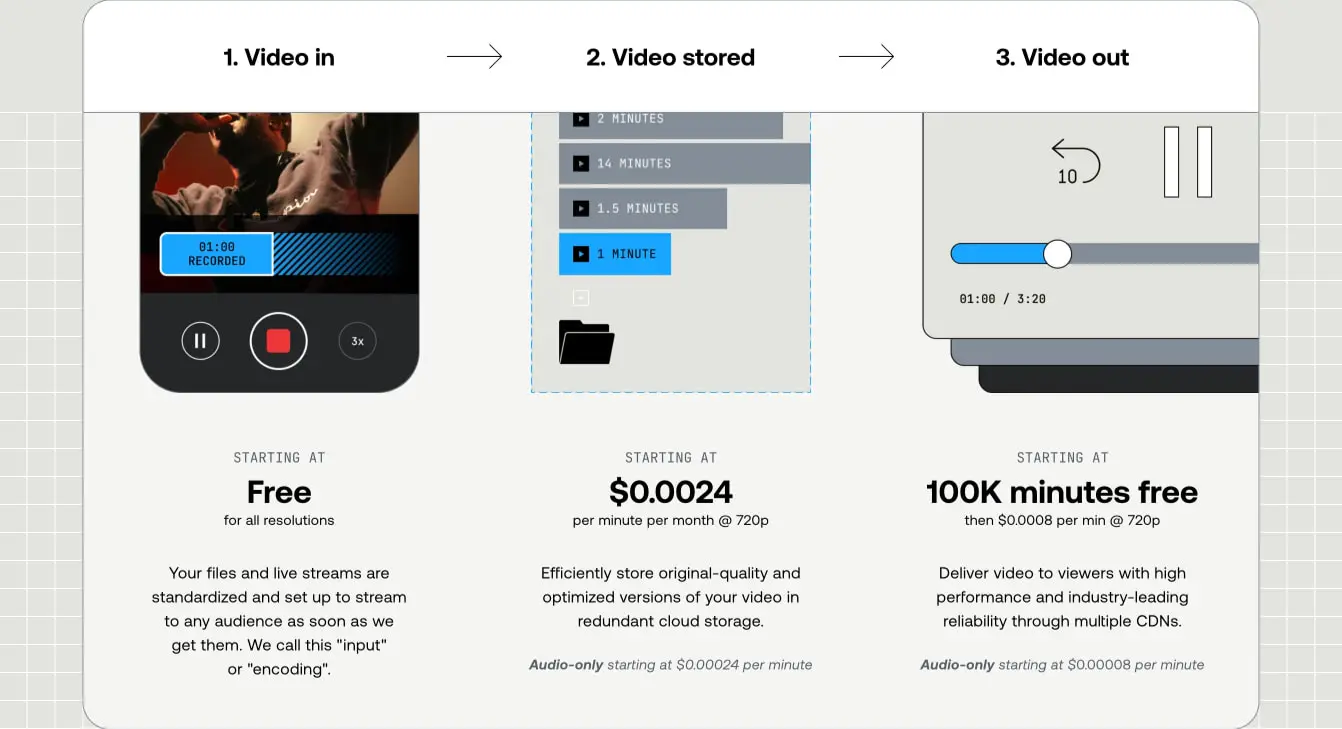
Iconography follows a line-art convention with consistent stroke weights, appearing in black on light surfaces and white on dark. The video pipeline diagram on the pricing page exemplifies the illustrative approach: simplified device and interface representations in flat color blocks, communicating process without visual noise. Quality tier icons use segmented circles—partial fills that suggest measurement or gradation—reinforcing the technical theme through abstract geometry.
Photography and imagery are treated as functional elements rather than atmospheric decoration. The video pipeline uses device mockups and interface fragments to literalize the service offering. Color photography, when present, is contained within bounded frames and overlaid with interface elements, suggesting the platform’s role as infrastructure beneath content.
The accent color strategy creates moments of high energy within an otherwise restrained palette. The yellow conversion band and green CTA buttons function as visual accelerants, drawing attention through saturation contrast against muted surroundings. These accents are always paired with dark or black text, maintaining accessibility and avoiding the washed-out effect of light-on-bright combinations.
Components
Pricing card
The pricing card presents service tiers in a modular grid format. Each card contains an illustrative header, a price display, and descriptive text on a light gray canvas background.
- Anatomy: Illustration area, category label, price figure, unit descriptor, explanatory paragraph, optional audio-only note
- Surface: Background
{colors.canvas}, no border or 1px{colors.border}on adjacent sides - Typography: Category label uses
{typography.label}in uppercase with wide tracking; price figure uses{typography.heading-large}; body uses{typography.body} - Shape: 0px border radius for standalone cards, 1.75rem when presented as grouped panels
- Spacing: Internal padding of 3.5rem top and sides, 5.25rem bottom; 1.75rem between price and description
- Composition: Vertically stacked, center-aligned text; illustration occupies top 40% of card height
Accordion panel
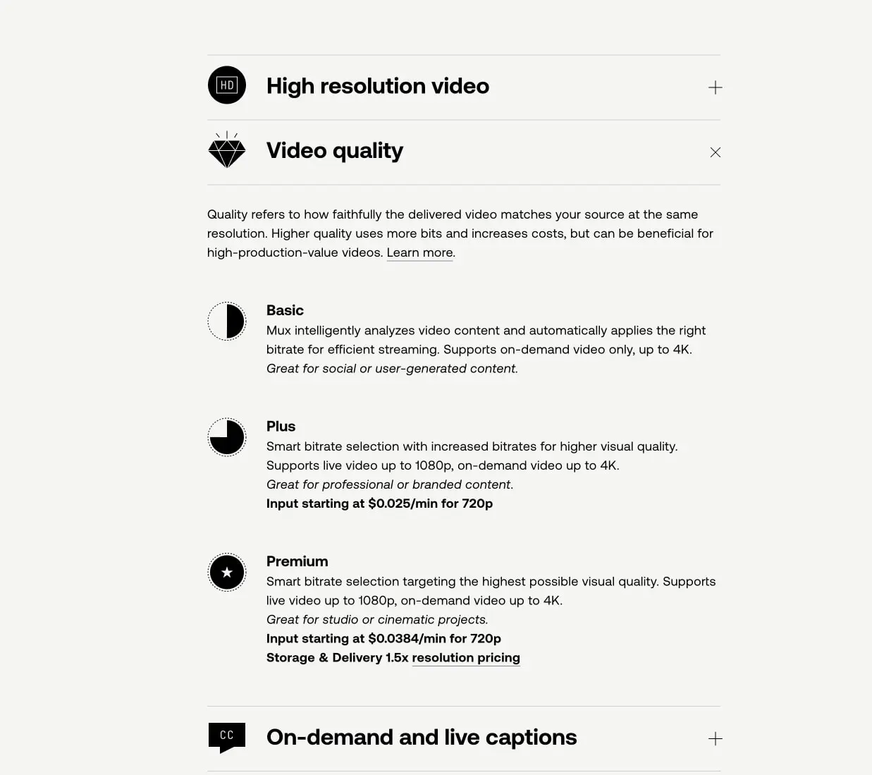
Accordion panels organize detailed technical specifications into expandable sections, conserving vertical space while maintaining information availability.
- Anatomy: Header row with icon, title, and toggle indicator; expandable content area with tier descriptions
- Surface: Background
{colors.surface}, 1px bottom border in{colors.border} - Typography: Header uses
{typography.heading-large}; content body uses{typography.body-large}; tier names use{typography.heading-medium} - Shape: 0px border radius; full-bleed horizontal borders
- Spacing: 3.5rem vertical padding in header; 2rem between tier items in expanded state
- Composition: Icon and title left-aligned, toggle indicator right-aligned; content indented to align with title text
- Variants: Collapsed state shows plus indicator; expanded state shows close indicator and reveals tier details with circular quality icons
Conversion band
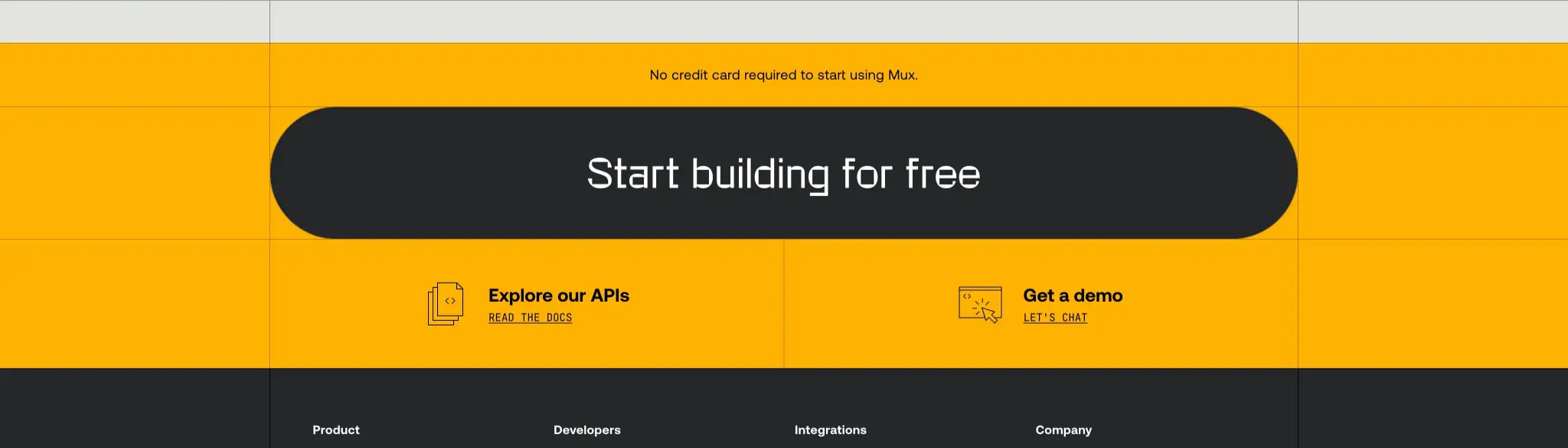
The conversion band interrupts content flow with a high-energy call-to-action on an accent background.
- Anatomy: Background band, centered headline, pill-shaped action container, secondary link grid
- Surface: Background
{colors.accent-yellow}or{colors.accent-green}; action container{colors.surface-inverse} - Typography: Headline uses
{typography.section-display}in white on dark container; secondary links use{typography.body} - Shape: Full-bleed band; action container uses 7rem border radius (pill shape)
- Spacing: 5.25rem vertical padding in band; 3.5rem internal padding in action container
- Composition: Centered single column for headline; two-column link grid below with icon-text pairs
Footer
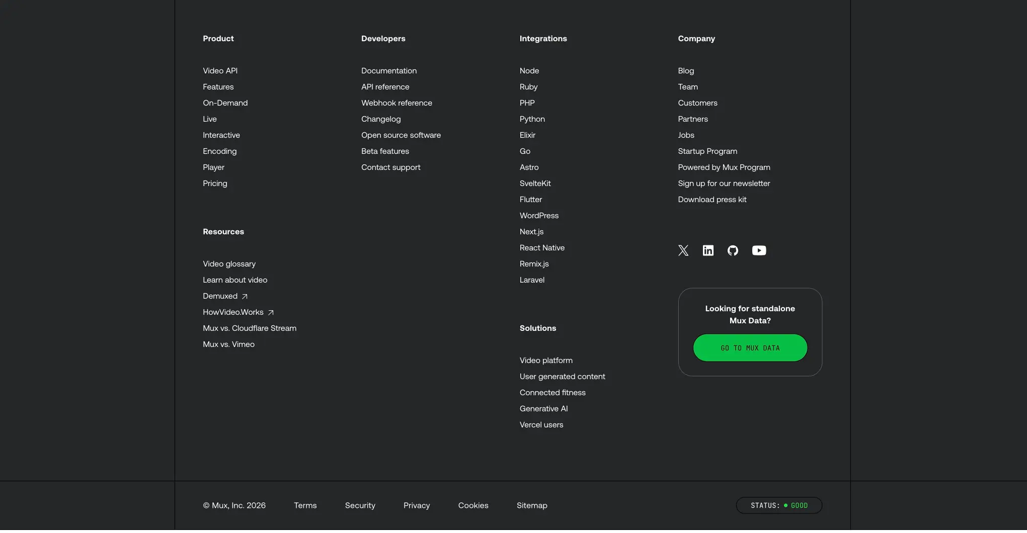
The footer provides comprehensive navigation on a dark surface, organized by audience and function.
- Anatomy: Multi-column link grid, social icon row, legal bar with status indicator
- Surface: Background
{colors.surface-inverse}, text{colors.surface} - Typography: Column headings use
{typography.label}; links use{typography.navigation}; legal text uses{typography.body-small} - Shape: 0px border radius; 1px top border in
{colors.border-inverse}optional - Spacing: 5.25rem top padding, 6rem bottom padding; 2rem between column heading and first link, 1rem between links
- Composition: Four primary columns for Product, Developers, Integrations, Company; additional Resources and Solutions columns; social icons and standalone CTA in right area
Primary button
Primary buttons use the accent green with monospace label treatment, signaling technical action.
- Anatomy: Text label with optional icon
- Surface: Background
{colors.accent-green}, text{colors.ink} - Typography:
{typography.label-mono}in uppercase - Shape: Pill shape via 9999px border radius
- Spacing: 0.875rem vertical padding, 1.75rem horizontal padding
- Variants: Default green fill; inverse variant with dark fill and light text for dark surfaces
Responsive behavior
The visible surfaces show a desktop-optimized layout with fixed-width containers and multi-column grids. The pricing card grid, visible at three columns, should stack to single column on narrower viewports with maintained internal padding. The footer link grid, currently at five columns, should reflow to two columns on tablet and single column on mobile, with column headings becoming accordion triggers if space-constrained.
The conversion band’s pill-shaped container should expand to near-full-width on mobile, preserving its rounded character while maximizing touch target area. Accordion panels require no structural change across breakpoints, though icon and text scaling should reduce proportionally to maintain comfortable tap targets.
Typography should scale down by approximately 15% on tablet and 25% on mobile, with display sizes receiving the largest reduction to preserve readable line lengths. The hero display at 4.125rem may reduce to 2.5rem on mobile while maintaining the Rotonto family for brand recognition.
Practical implementation guidance
Preserve
- The strict dual-mode color system: light for content, dark for navigation and conversion
- Rotonto for all display headlines; its geometric character is central to brand recognition
- The 1px border grid system with negative margin overlap technique
- Monospace labels for all primary actions, creating technical authenticity
- Circular quality tier icons with segmented fill patterns
- Generous horizontal padding (minimum 3.5rem) even at narrow viewports
Avoid
- Adding drop shadows to cards or panels; the system relies on flat color and border definition
- Using accent colors for large background areas except in designated conversion bands
- Mixing dark mode elements into light content sections; maintain mode boundaries
- Reducing border contrast below 1px solid; the hairline aesthetic requires visibility
- Substituting generic sans-serif for Aeonik in body text; the weight and spacing are calibrated
Recommended build order
- Establish the dual-mode color tokens and CSS custom properties for light/dark switching
- Implement the type scale with web font loading for Rotonto, Aeonik, and Jet Brains Mono
- Build the grid system with container queries for the pricing card layout
- Create the accordion component with animated height transitions
- Implement the footer as a multi-column CSS grid with responsive reflow
- Add the conversion band with its pill container and accent background
- Polish with the 1px border overlap technique and precise spacing tokens
Accessibility
- Ensure all accent color combinations meet WCAG AA contrast; the green-on-black and white-on-charcoal pairings appear compliant, but verify yellow band text
- Provide focus indicators that respect the 1px border aesthetic, perhaps using 2px outline offset
- Maintain keyboard operability for accordion toggles with visible focus states
- Use semantic heading hierarchy: Rotonto headlines as h1/h2, Aeonik headings as h3/h4
- Ensure the monospace button labels remain readable at small sizes; consider 16px minimum for touch targets
Scope note
This guide covers the pricing page and footer surfaces of mux.com, including the video pipeline explanation, quality tier accordion, conversion band, and comprehensive footer navigation. The homepage hero, documentation pages, and dashboard interface are not represented in the captured pages. Motion behavior, mobile breakpoints, form validation states, and the video player component are not documented here. Measurements are derived from the exact values in the captured interface data.
Sites change, so a screenshot can differ from the guide.
Loading…Similar designs
This guide describes the public website and isn't an official mux.com design system. Not affiliated with mux.com.