Overview
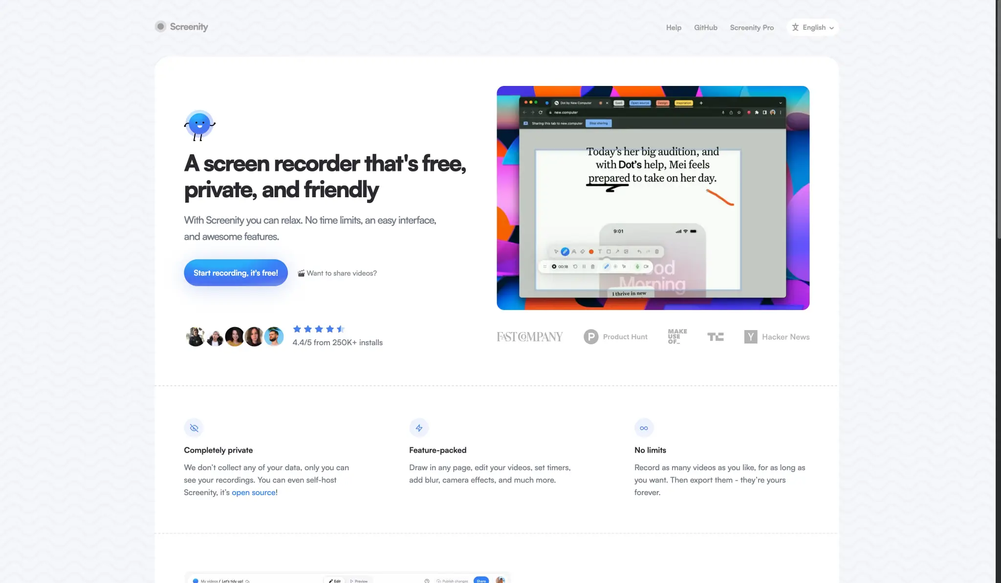
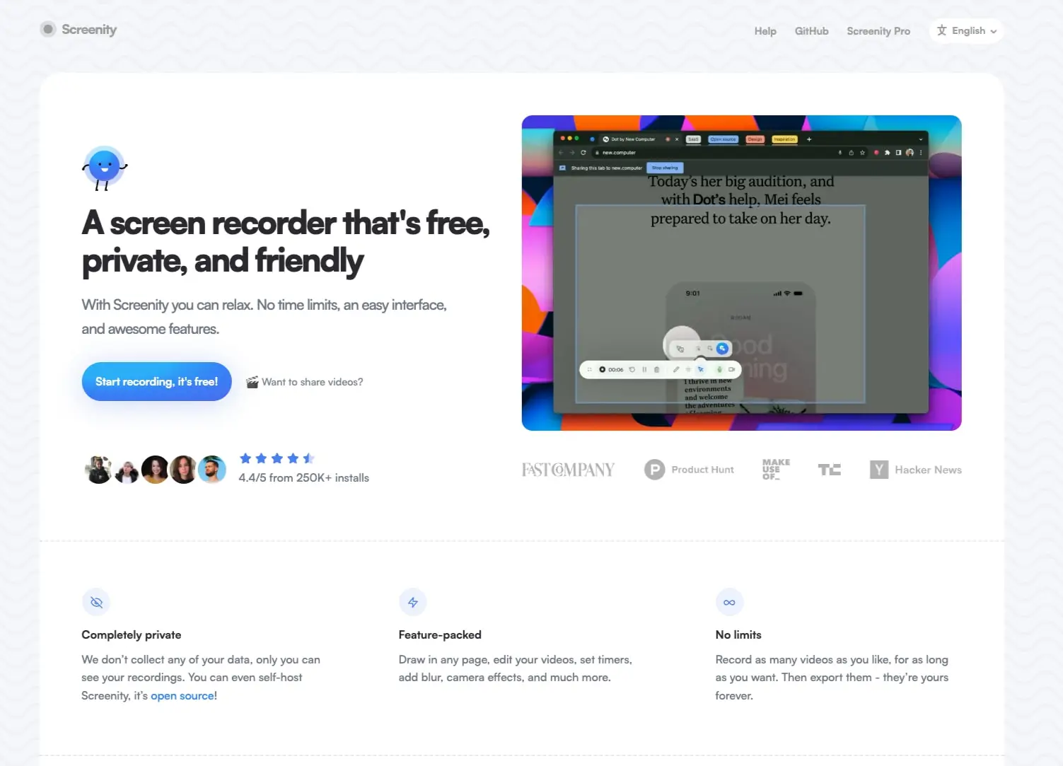
Screenity’s landing page presents a screen recorder tool through a visual language that balances technical credibility with approachable warmth. The design centers on a soft off-white canvas punctuated by a distinctive geometric wave pattern, creating a friendly backdrop that avoids sterile minimalism. Large, confident headlines in a tight-weight sans serif establish immediate clarity, while a vibrant blue gradient system provides energetic calls to action. The page structure follows a classic conversion funnel: hero with product demonstration, social proof, feature differentiation, premium upgrade path, and community engagement. Every section maintains generous breathing room, with rounded corners on cards and buttons reinforcing the “friendly” positioning. The overall impression is of a tool made by humans for humans—polished but not corporate, capable but not intimidating.
Colors
The color system operates on a principle of calm neutrality with strategic energy injection. The base environment is warm and understated, allowing product screenshots and the blue gradient to carry visual interest.
| token | value | use |
|---|---|---|
| action | #2BAEF8 | Primary interactive elements, gradient start, icon accents |
| action-gradient-end | #7B9AEA | Gradient endpoints, hover states, secondary highlights |
| ink | #29292F | Primary text, headings, strong emphasis |
| muted-ink | #6E7684 | Body text, descriptions, secondary content, footer links |
| canvas | #F6F7FB | Page background, patterned surface behind content |
| surface | #FFFFFF | Content cards, panels, input fields, elevated containers |
| border | #E8E8E8 | Subtle dividers, card outlines, input borders |
| border-subtle | #9D9D9D | Disabled or tertiary borders, decorative lines |
| link | #0000EE | Inline hyperlinks within body text |
The signature gradient runs from #2BAEF8 through #3582F6 and #486DEF to #7B9AEA, creating a sky-to-lavender progression used on the primary call-to-action button. This gradient appears as a radial burst, giving the button a dimensional, almost luminous quality. Dark surfaces use #000000 for high-contrast moments like the “Get Screenity Pro” pill button. The background pattern employs a very light gray geometric motif that reads as texture rather than color, keeping the canvas feeling active without competing for attention.
Typography
The typographic system relies entirely on Satoshi, a geometric sans serif from the Indian Type Foundry designed by Deni Anggara. The family delivers clarity at all scales with a contemporary, slightly rounded character that supports the friendly brand positioning.
| token | family | size | weight | leading | tracking | use |
|---|---|---|---|---|---|---|
| hero-display | Satoshi | 2.9rem | 700 | 1.15 | -0.05em | Main hero headline, page title |
| section-display | Satoshi | 2rem | 700 | 1.2 | -0.03em | Section headings, feature titles |
| body-large | Satoshi | 1.3rem | 400 | 1.6 | -0.03em | Hero description, introductory paragraphs |
| body | Satoshi | 1rem | 400 | 1.6 | normal | General content, feature descriptions, FAQ answers |
| label | Satoshi | 0.9rem | 700 | 1.4 | -0.02em | Navigation, buttons, tags, small headings |
| navigation | Satoshi | 1rem | 400 | 1 | normal | Header links, footer links |
The display sizes employ tight negative tracking for a modern, confident stance. Body text maintains generous line height for readability. Weight distinctions are clear: Bold (700) for headlines and calls to action, Medium (400) for body and supporting text. The 16px base size provides accessible readability without feeling oversized. Verify licensing for Satoshi through Indian Type Foundry before production use.
Layout
The page employs a centered, contained layout with a maximum content width that creates comfortable reading margins on large screens. The geometric wave pattern fills the viewport edges, framing a clean white content area.
Grid and containment: Content lives within a centered container with substantial horizontal padding (60px on desktop), creating a generous moat between text and the patterned edge. The hero section uses an asymmetric two-column arrangement: text and actions on the left, product screenshot on the right.
Section rhythm: Vertical spacing between major sections measures 60px to 120px, creating clear territorial separation without excessive distance. Internal section padding typically runs 60px top, with bottom padding varying by content needs.
Responsive structure: The three-column feature grid (Completely private, Feature-packed, No limits) collapses to single column on narrower viewports. The FAQ accordion switches from two-column to stacked. The hero’s side-by-side layout inverts to vertical stacking with the screenshot preceding or following text depending on priority.
Navigation: A fixed or sticky header contains the logo mark, text links (Help, GitHub, Screenity Pro), and a language selector. The header maintains minimal height with generous tap targets.
Visual language
Pattern and texture: The most distinctive visual element is the subtle geometric wave pattern tiling the page background. This repeating motif of soft peaks and valleys in very light gray on off-white creates ambient visual interest without demanding attention. It suggests movement and fluidity appropriate to a video tool while remaining strictly decorative.
Imagery treatment: Product screenshots receive rounded corners (30px) and appear to float with subtle shadow, suggesting depth. The hero screenshot shows the actual recording interface in context, demonstrating the tool rather than abstracting it. Social proof uses small circular avatar clusters overlapping slightly to suggest community density.
Iconography: Feature icons use simple line drawings in circular containers with light blue tints—an eye for privacy, a lightning bolt for features, an infinity symbol for unlimited use. These read quickly at small sizes and reinforce the approachable tone.
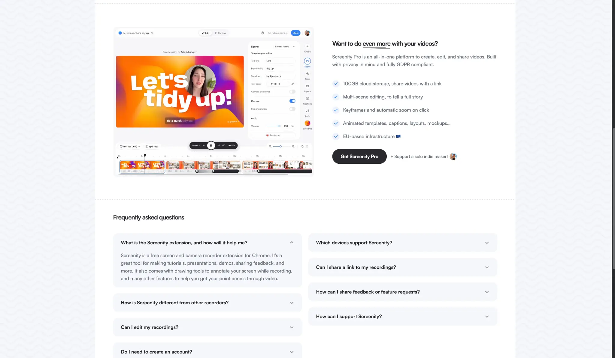
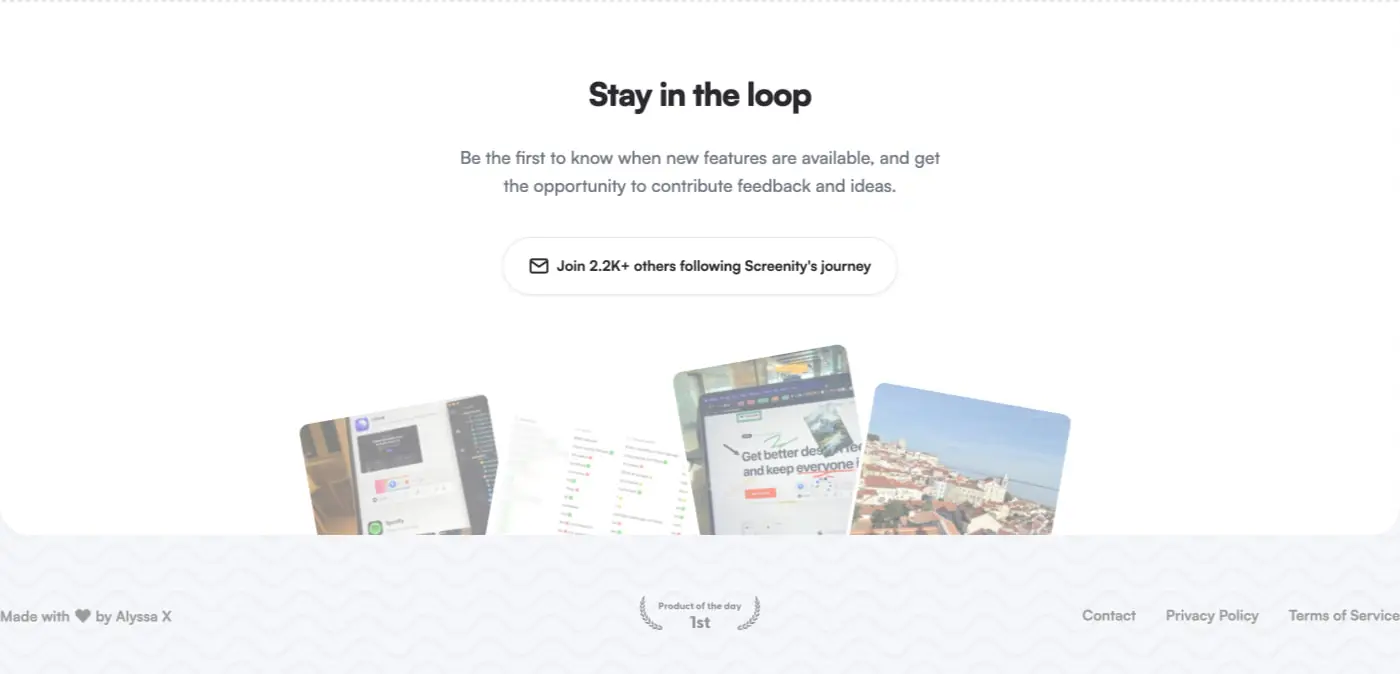
Decorative elements: Star ratings use filled and half-filled blue stars. Checkmarks in the Pro feature list use the same action blue. The “Product of the day 1st” laurel badge in the footer adds credibility through recognized third-party validation.
Components
Primary action button
- Anatomy: Text label with optional leading icon, contained within a rounded pill shape
- Surface: Radial gradient from #2BAEF8 through #3582F6, #486DEF to #7B9AEA
- Typography:
{typography.label}, white text (#FFFFFF) - Shape: 30px border radius, full pill when width is content-driven
- Spacing: 0px 20px horizontal padding, 55px line height for generous vertical target
- Composition: Often paired with secondary text link or social proof immediately below
Secondary action button (dark)
- Anatomy: Text label within solid dark container
- Surface: #000000 background
- Typography:
{typography.label}, white text - Shape: 15px border radius, more compact than primary
- Spacing: 14px 28px padding
- States: Used for “Get Screenity Pro” and similar high-commitment actions
Feature card
- Anatomy: Icon in tinted circle, bold heading, descriptive paragraph
- Surface: Transparent or white, no visible border
- Typography: Heading uses
{typography.label}in ink, body uses{typography.body}in muted-ink - Spacing: Icon sits 10px above heading, 12px gap to body text, 16px bottom margin on description
- Composition: Three cards in equal-width grid with 60px between columns
FAQ accordion
- Anatomy: Question text with expand/collapse chevron icon, expandable answer area
- Surface: White card with subtle shadow or border, 30px radius
- Typography: Question uses
{typography.label}in ink, answer uses{typography.body}in muted-ink - Spacing: 20px internal padding, 20px vertical gap between items
- Composition: Two-column masonry layout on desktop, single column on mobile
Email capture input
- Anatomy: Mail icon, placeholder text, contained input field
- Surface: White background, subtle border
- Typography:
{typography.body}in muted-ink - Shape: Full pill (999px radius)
- Spacing: 18px 26px padding for comfortable entry
Social proof cluster
- Anatomy: Overlapping circular avatars, star rating, install count text
- Surface: Avatars have slight border or shadow for separation
- Typography:
{typography.body}in muted-ink for count text - Composition: Horizontal row with 12px gaps, positioned below primary CTA
Responsive behavior
The layout adapts through progressive simplification rather than dramatic restructuring. At the primary breakpoint, the hero’s two-column layout stacks vertically with the product screenshot occupying full width. The three feature cards collapse to a single column with increased vertical spacing to maintain rhythm. The FAQ accordion’s two-column grid becomes a single stream.
Navigation condenses to a hamburger menu or simplified link set, though the exact mobile treatment is not visible in captured pages. The geometric background pattern scales to maintain its subtle presence without becoming visually dense on smaller screens. Font sizes reduce proportionally, with hero-display scaling to approximately 2rem on narrow viewports to prevent overflow.
Touch targets maintain minimum 44px height throughout. The primary gradient button and dark secondary button both expand to full width on mobile when appearing alone, or maintain side-by-side arrangement when paired.
Practical implementation guidance
Preserve
- The distinctive geometric wave background pattern; it is central to brand recognition
- The tight negative tracking on display headings; this creates the modern, confident tone
- The radial gradient on the primary button; flat color loses the dimensional energy
- The generous whitespace around sections; crowding destroys the approachable feeling
- The exact Satoshi family; substitutions with different geometric sans serifs will shift the personality
Avoid
- Replacing the gradient with solid blue; the progression is a signature element
- Using pure white (#FFFFFF) as the page background; the warm off-white (#F6F7FB) is intentional
- Sharp corners on interactive elements; the rounded language is consistent throughout
- Multiple font families; the single-family system is a deliberate restraint
- Dark mode without careful recalibration; the light, airy quality is fundamental
Recommended build order
- Establish the canvas background with geometric pattern tiling
- Implement Satoshi at 16px base with the full type scale
- Build the hero section with gradient button and screenshot placement
- Create the feature grid with icon circles and text rhythm
- Add the Pro upgrade section with dark button and checklist
- Implement FAQ accordion with expand/collapse behavior
- Finish with newsletter capture and footer
Accessibility
- Ensure the gradient button meets contrast requirements; the light blue (#2BAEF8) on white may need adjustment for text legibility
- Provide focus indicators that match the rounded shape language
- Maintain logical heading hierarchy from h1 through h4
- Add aria-expanded to FAQ accordion items
- Consider reduced-motion preferences for any scroll-triggered animations
Scope note
This guide covers the desktop landing page experience for Screenity’s marketing site. Mobile layouts, component hover states, form validation, and any dashboard or application interfaces are not represented in the captured pages. The geometric background pattern’s exact SVG or generation method is not specified.
Sites change, so a screenshot can differ from the guide.
Loading…Similar designs
This guide describes the public website and isn't an official screenity.io design system. Not affiliated with screenity.io.