Overview
TASTE is a food and cooking editorial platform with a sophisticated, magazine-like visual system. The design balances high-contrast structural elements—prominent black bars and rules—with warm, inviting content areas. The overall impression is refined and authoritative, using classical serif typography for editorial voice while employing clean sans-serif labels for wayfinding and metadata. Photography takes center stage with full-bleed hero images, while recipe content is organized into scannable, numbered steps with clear ingredient lists. The system favors restraint over decoration: thin horizontal rules separate sections, circular thumbnails provide visual rhythm, and generous whitespace lets content breathe. Dark surfaces appear primarily in recipe metadata bars and footer areas, creating dramatic contrast against the predominantly light canvas.
Colors
The palette is intentionally restrained, built on a stark black-and-white foundation with a single warm accent. This creates editorial authority while allowing food photography to dominate the visual experience.
| token | value | use |
|---|---|---|
| ink | #000000 | Primary text, hero bars, step markers, primary borders, footer backgrounds |
| canvas | #ffffff | Page background, card surfaces, text on dark bars, ingredient list background |
| muted-ink | #222222 | Secondary text, body copy at large sizes, subtle depth variation |
| surface | #f5f5f0 | Warm off-white for ingredient quantity column, subtle section alternation |
| accent | #c9a96e | Social share icons, metadata labels on black bars, decorative emphasis |
| border | #e5e5e0 | Hairline rules between list items, section dividers, subtle separation |
The color logic follows a clear hierarchy: black establishes structure and authority, white provides clean reading surfaces, and the warm gold accent appears only in functional metadata contexts and social sharing. The surface token introduces slight warmth for ingredient measurement columns, preventing clinical sterility without competing with photography. No gradient or shadow tokens are present in the visible system; depth is achieved through flat color blocking and rule-based separation.
Typography
The type system pairs an elegant serif family for editorial voice with a geometric sans-serif for structural labels and navigation. This creates clear hierarchy between reading content and wayfinding elements.
| token | family | size | weight | leading | tracking | use |
|---|---|---|---|---|---|---|
| hero-display | Domaine-Not Licensed For Desktop Use | 3.5rem | 400 | 1.1 | -0.01em | Recipe titles, major page headlines |
| section-display | Domaine-Not Licensed For Desktop Use | 2.5rem | 400 | 1.15 | -0.01em | Section headers, feature titles |
| body | Domaine-Not Licensed For Desktop Use | 1rem | 400 | 1.6 | 0 | Recipe descriptions, article paragraphs |
| body-small | Domaine-Not Licensed For Desktop Use | 0.875rem | 400 | 1.5 | 0 | Ingredient names, captions |
| label | GT Eesti | 0.75rem | 700 | 1.2 | 0.08em | Section headers, metadata labels, VIEW ALL |
| navigation | GT Eesti | 0.875rem | 400 | 1.2 | 0.06em | Primary navigation, breadcrumbs |
| byline | Domaine-Not Licensed For Desktop Use | 0.75rem | 400 | 1.3 | 0.02em | Author attribution, dates |
The font families present in the source are Domain-200, Domain-Bold, Domain-Italic 200, Domain-Italic Regular, Domaine-Not Licensed For Desktop Use, GT Eesti-Bold, GT Eesti-Regular, Gteestipro-Bold, Gteestipro-Regular, Tusar-Bold, and Tusardeco-Italic Bold. The serif families Domain-200, Domain-Italic 200, Domain-Italic Regular, and Domaine-Not Licensed For Desktop Use serve the editorial voice across display and body contexts. GT Eesti provides structural clarity through all-caps, tracked labels. Tusar-Bold and Tusardeco-Italic Bold appear in the font sources but their visible roles are not established in the captured surfaces. Verify licensing for these families before production use. The Domaine-Not Licensed For Desktop Use family is attributed to Kris Sowersby.
Layout
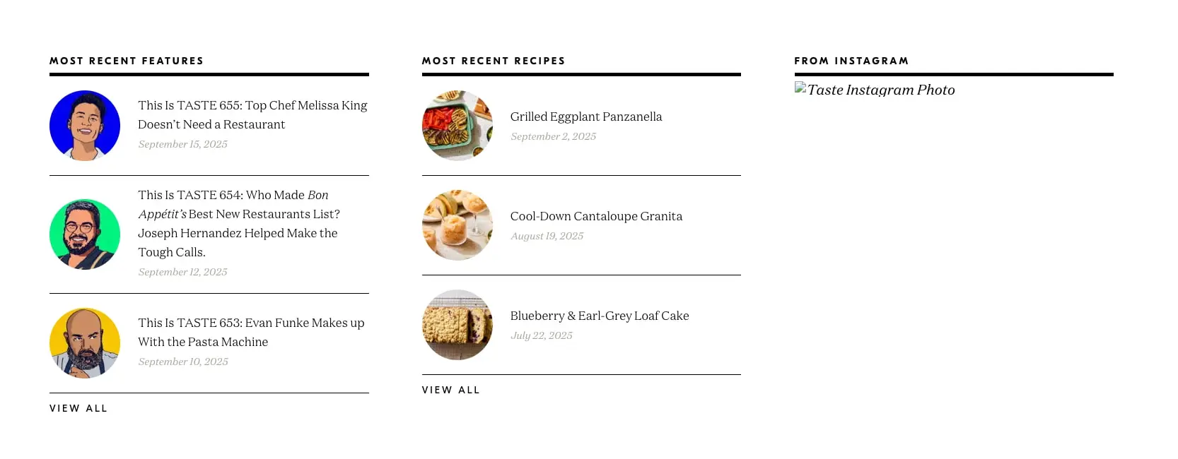
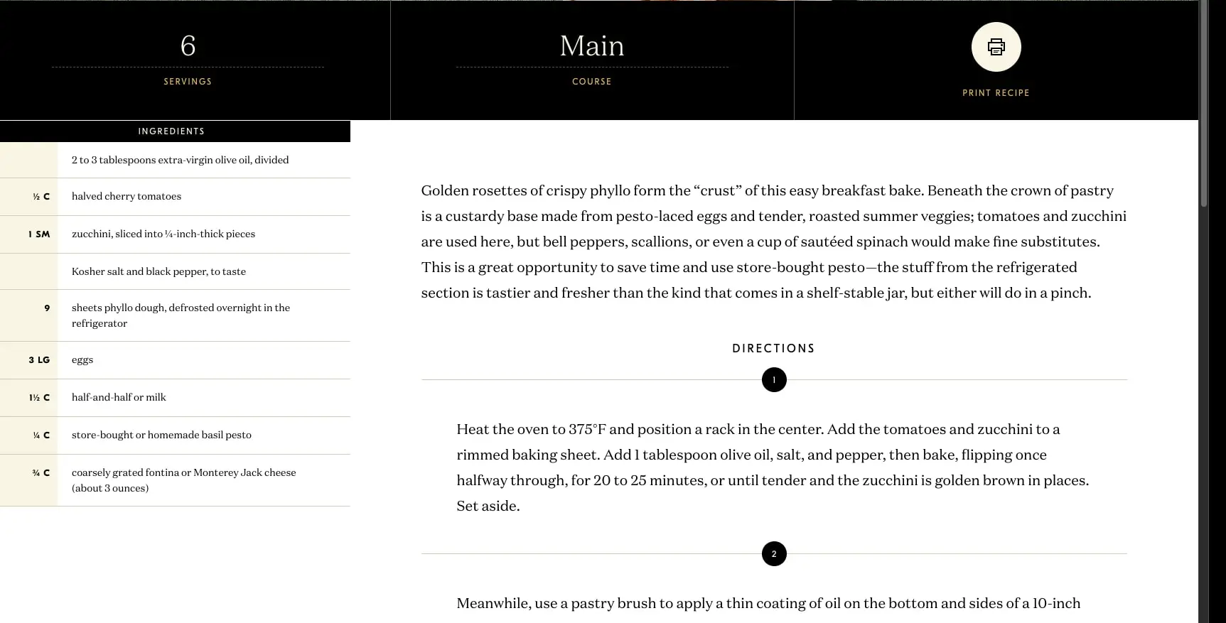
The layout system uses a centered, contained approach for editorial content with full-bleed exceptions for photography and dark structural bars. The homepage organizes content into a three-column grid of equal-width sections, each with independent scrolling lists. Recipe pages employ a split layout: a narrow left column for ingredients and a wider right column for directions and narrative content.
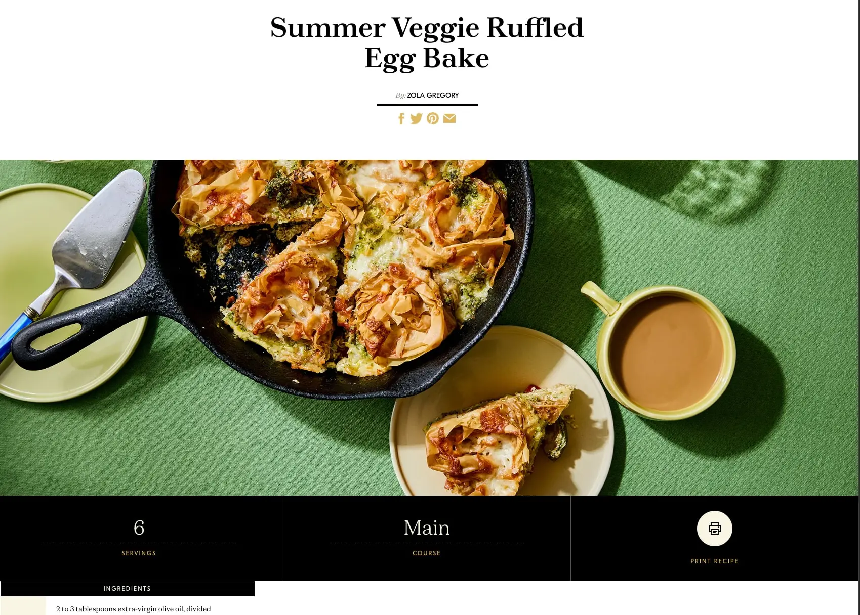
Content containers appear to max out around 1200px with comfortable side margins. The recipe hero image spans the full viewport width, with a black metadata bar immediately below containing three equal columns for servings, course, and print action. This bar creates a strong horizontal anchor point.
Vertical rhythm is established through consistent section spacing of 5rem and component spacing of 1.5rem. List items within sections receive 1rem vertical padding with thin bottom borders. The ingredient list uses a two-column internal structure: a narrow warm-tinted column for measurements and a wider white column for ingredient names.
Grid gaps between homepage columns appear to be 2rem, allowing content to feel connected but distinct. Circular thumbnails in lists are sized at approximately 80px diameter, creating a consistent visual module across features and recipes.
Visual language
The visual language draws from classic food magazines and contemporary editorial websites. The most distinctive element is the interplay between severe black structural bars and warm, approachable content. Recipe pages feature dramatic full-bleed photography that dominates the viewport, with the title and byline floating in generous white space above.
Circular thumbnails create visual rhythm in list views, contrasting with the rectilinear grid. These appear as perfect circles with no border, letting the photography edge define the shape. The section header pattern—small all-caps label above a thick black horizontal rule—repeats across contexts, creating recognizable wayfinding.
Iconography is minimal and functional: a simple printer icon in a cream circle for recipe printing, social platform icons in the accent gold. No decorative illustration or pattern work is visible. The system relies on typography weight, tracking, and case changes to create visual interest rather than graphic ornament.
Photography treatment favors natural light, slightly desaturated colors, and abundant negative space in the surrounding styling—visible in the green linen backdrop of the egg bake hero. This restraint lets the food remain the emotional center.
Components
Recipe Hero
- Anatomy: Full-bleed photograph, centered serif title, byline with author name, horizontal rule, social share icon row, black metadata bar
- Surface: White background above image, black bar below
- Typography: Title uses
{typography.hero-display}, byline uses{typography.byline}with italic “By:” prefix - Shape: No border radius on image; metadata bar is full-width rectangle
- Spacing: Generous padding above title (approximately 3rem), compact social row below rule
- Composition: Centered text alignment over image; metadata bar splits into three equal columns
Recipe Metadata Bar
- Anatomy: Three equal columns containing numeric value, dotted rule, and label; print button with icon circle
- Surface: Black background (
{colors.ink}), cream/white text and icon - Typography: Large number in serif, label in
{typography.label}with accent color - Shape: Full-width bar, approximately 120px tall; print icon in 48px cream circle
- Composition: Servings and course left-aligned in their columns, print button right-aligned
Ingredient List
- Anatomy: Tab header, rows with quantity column and ingredient column
- Surface: White background, warm tint (
{colors.surface}) for quantity column - Typography: Quantities in bold sans-serif, ingredients in
{typography.body-small} - Shape: Full-width rows with thin bottom borders (
{colors.border}) - Spacing: Comfortable row height with 0.75rem vertical padding
Numbered Direction Step
- Anatomy: Step number in filled circle, horizontal rule, paragraph text
- Surface: White background, black circle marker
- Typography: Number in white on black, text in
{typography.body} - Shape: 32px black circle, centered over rule
- Composition: Number floats centered above rule, text left-aligned below
Article List Item
- Anatomy: Circular thumbnail, title, date
- Surface: White background, no card elevation
- Typography: Title in
{typography.body}, date in italic{typography.body-small}in muted tone - Shape: 80px circular thumbnail
- Spacing: 1.5rem vertical padding, thin bottom border
Section Header
- Anatomy: All-caps label, thick horizontal rule below
- Surface: White background
- Typography:
{typography.label}in black - Shape: Rule is 3px thick, full column width
- Composition: Tight spacing between label and rule
Responsive behavior
The three-column homepage layout should stack to single column on narrow viewports, with section headers remaining full-width. Recipe pages should maintain the split ingredient-directions layout on tablet but may collapse to single column on mobile, with the ingredient list appearing above directions. The full-bleed hero image should scale proportionally, maintaining its aspect ratio rather than cropping critically.
The black metadata bar should remain three-column on desktop but could stack vertically on mobile, with each metric on its own row. Print functionality should remain accessible at all sizes. Circular thumbnails in lists should reduce to approximately 60px on mobile while maintaining their aspect ratio.
Typography should scale down proportionally: hero-display may reduce to 2.5rem on tablet and 2rem on mobile to prevent excessive line breaks. The generous whitespace above recipe titles should compress to 1.5rem on mobile.
Practical implementation guidance
Preserve
- The stark black-and-white contrast with single warm accent; this is the system’s signature
- Circular thumbnail treatment without borders or shadows
- Thick horizontal rules beneath section headers
- Full-bleed photography with natural, slightly desaturated styling
- The two-column ingredient list with warm-tinted measurement column
- Centered recipe titles with italic byline prefix
Avoid
- Adding background colors to article cards; the flat white surface is intentional
- Using the accent color for large areas; reserve it for small functional elements
- Introducing box shadows or elevation effects; the system is flat
- Replacing the serif display type with sans-serif; the editorial character depends on Domaine-Not Licensed For Desktop Use
Recommended Build Order
- Establish the type scale with Domaine-Not Licensed For Desktop Use and GT Eesti loaded
- Build the section header pattern as a reusable component
- Implement the article list item with circular thumbnail
- Create the recipe hero with full-bleed image and metadata bar
- Develop the ingredient list with two-column structure
- Add numbered direction steps with circle markers
- Compose the three-column homepage layout
Accessibility
- Ensure the black metadata bar meets contrast requirements (white and gold on black should be verified)
- Provide print functionality as a button, not just an icon
- Use semantic heading hierarchy: h1 for recipe titles, h2 for section headers
- Add alt text to all food photography describing the dish and presentation
- Ensure circular thumbnails have sufficient touch targets on mobile (minimum 44px)
- The ingredient quantity column should not be the sole carrier of information; screen readers should hear complete ingredient lines
Scope note
This guide covers the homepage listing layout and recipe detail page surfaces visible in the captured images. Navigation behavior, search functionality, subscription flows, and mobile-specific adaptations are not represented. Footer content beyond the newsletter input is partially visible but not fully documented. The font families Domain-200, Domain-Italic 200, Domain-Italic Regular, and Tusardeco-Italic Bold are present in sources but their specific visible applications are not confirmed in the captured surfaces. Measurements are practical adaptation targets derived from visual inspection.
Sites change, so a screenshot can differ from the guide.
Loading…Similar designs
This guide describes the public website and isn't an official tastecooking.com design system. Not affiliated with tastecooking.com.