Overview
Tentree’s design system embodies an earth-first philosophy through restrained, nature-inspired visual choices. The interface balances warm neutrality with deep forest greens, creating a calm, trustworthy shopping environment that reinforces the brand’s environmental mission. Rounded typographic forms echo organic shapes found in nature, while generous whitespace and photography-forward layouts let product imagery and environmental storytelling take center stage. The system serves a dual purpose: functional e-commerce navigation and emotional connection to reforestation impact. Every surface decision—from the soft cream canvas to the deliberate use of dark green promotional panels—supports the narrative that purchasing here contributes to planetary restoration. The overall impression is approachable premium: not austere luxury, but considered quality rooted in purpose.
Colors
The color strategy centers on warmth and organic restraint. The palette avoids stark pure whites and blacks in favor of tones that feel naturally aged and environmentally grounded.
| token | value | use |
|---|---|---|
| canvas | #F5F3EF | Primary page background; warm off-white with subtle cream undertone |
| ink | #1E1E1E | Primary text; near-black with softened warmth |
| muted-ink | #4A4A4A | Secondary text, captions, footer links, legal copy |
| action | #4A5D4E | Primary buttons, promotional panels, CTA backgrounds |
| action-hover | #3D4F41 | Darker forest green for button hover states |
| surface-light | #FFFFFF | Input fields, elevated cards, badge backgrounds |
| border | #D4D0C8 | Input borders, dividers, subtle separators |
| forest-deep | #2F3D32 | Footer promotional panels, impact counter banner |
| warm-accent | #8B6914 | Sale pricing, promotional highlights |
The light mode dominates all visible surfaces. Dark green panels appear strategically as contained promotional moments—virtual forest signup, tree-planting subscription, and the scrolling impact counter—creating rhythm through value contrast rather than color variety. Photography carries the full chromatic range: verdant landscapes, warm skin tones, and muted apparel colors sit naturally against the neutral interface. No dark mode is visible in the captured pages. The warm-accent gold-amber appears sparingly for transactional emphasis, particularly struck-through original prices and percentage savings.
Typography
Two font families create a clear hierarchy: Rforesta Medium supplies editorial display voice with distinctive rounded serifs, while Merlo Neue Round handles all functional and body text with soft geometric clarity. The rounded terminals throughout both families reinforce the brand’s organic, approachable character.
| token | family | size | weight | leading | tracking | use |
|---|---|---|---|---|---|---|
| hero-display | Reforesta Medium | 2.5rem | 500 | 1.1 | -0.01em | Homepage mission headlines, major section titles |
| section-display | Reforesta Medium | 2rem | 500 | 1.15 | -0.01em | Category headers, carousel titles |
| body | Merlo Neue Round | 1rem | 400 | 1.6 | 0 | Paragraphs, descriptions, form labels |
| body-small | Merlo Neue Round | 0.875rem | 400 | 1.5 | 0 | Product names, footer links, support text |
| label | Merlo Neue Round | 0.75rem | 400 | 1.4 | 0.05em | Buttons, tags, uppercase metadata |
| navigation | Merlo Neue Round | 0.875rem | 400 | 1.4 | 0.02em | Header links, category tabs |
| price | Merlo Neue Round | 0.875rem | 400 | 1.4 | 0 | Current pricing |
| price-sale | Merlo Neue Round | 0.875rem | 400 | 1.4 | 0 | Original pricing, struck through |
Reforesta Medium was designed by Kacper Zagajewski for Tentree. Merlo Neue Round carries no attributed designer in the captured pages. Verify licensing for these families before production use.
Layout
The page structure follows a centered, contained model with generous breathing room. Maximum content width appears to sit around 1200px, with full-bleed sections reserved for photography carousels and the impact counter banner. Vertical rhythm is established through consistent section spacing of 5rem, creating clear separation between functional zones without excessive distance.
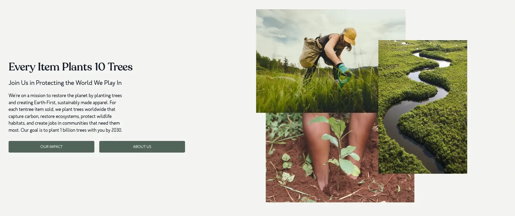
The hero mission section employs an asymmetric two-column composition: left-aligned text block occupying roughly 40% of width, with a layered photography collage occupying the right 55%. This collage technique—three overlapping images with slight offset and varied scale—creates depth and editorial interest without animation.
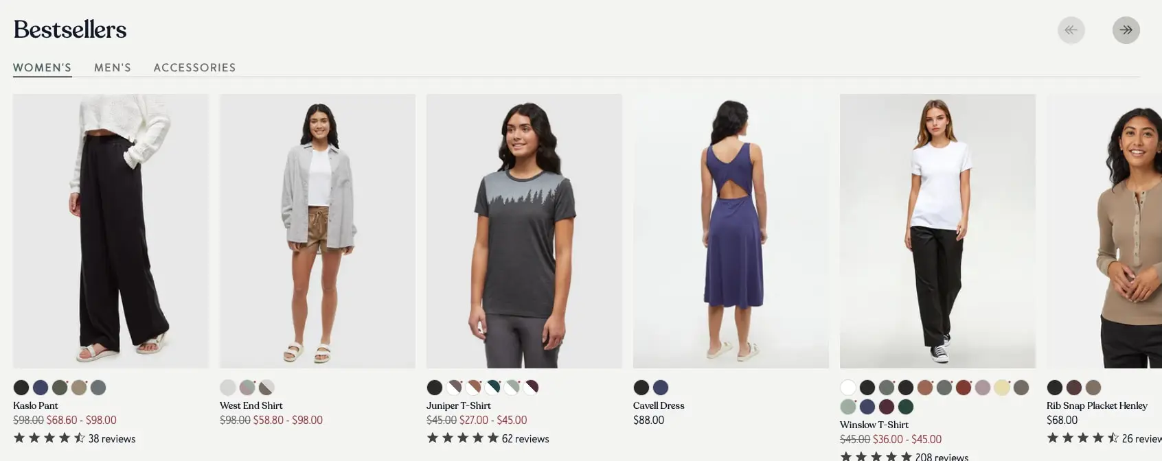
Product grids use horizontal scrolling carousels with partial peek of next items, encouraging exploration. Each carousel contains navigation arrows positioned at the section title line, right-aligned. Category cards maintain uniform 3:4 portrait aspect ratios with bottom-aligned text overlays.
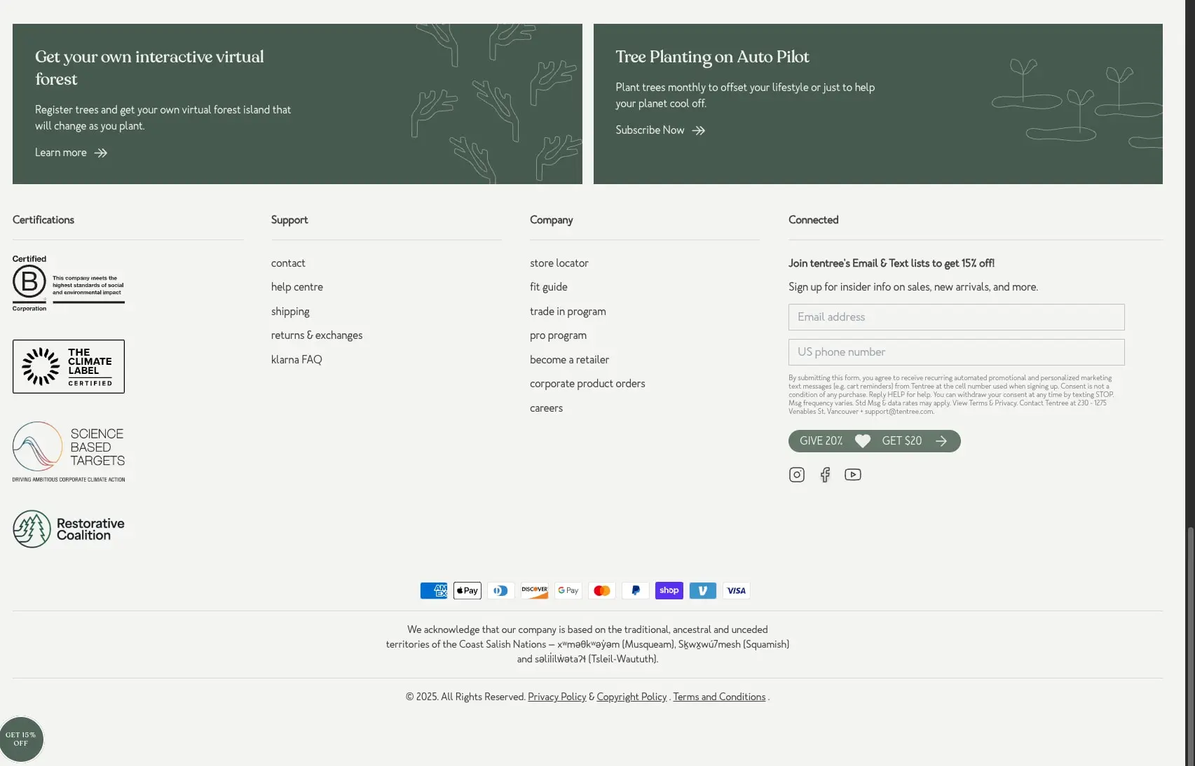
The footer expands to a four-column layout: certifications (narrow), support links, company links, and connected/email signup (widest). Below this, a centered payment trust row and full-width legal acknowledgment sit on hairline separators. A persistent circular promotional badge floats bottom-left, overlaying content.
Visual language
Photography treatment leans documentary and lifestyle: natural light, outdoor settings, candid poses. Models appear in authentic environments—forests, riversides, rocky terrain—rather than studio isolation. This environmental context reinforces product utility and brand mission simultaneously. The image collage technique in the hero section layers three photographs with soft edges, creating a scrapbook or editorial spread quality.
Line iconography appears delicate and hand-drawn in style, particularly the tree and forest illustrations in promotional panels. These white line drawings on dark green backgrounds feel illustrative rather than geometric, matching the organic typographic voice.
The scrolling impact counter at page bottom uses a ticker-style repetition: large numerals for trees planted, separated by uppercase label pairs. This creates ambient motion and social proof without requiring interaction.
Color swatches on product cards appear as small circular dots, clustered horizontally beneath each image. Star ratings use filled and partial-fill icons with review counts in muted text.
Components
Primary button
- Anatomy: Text label with optional arrow icon, centered within rectangular container
- Surface: Solid forest green background (#4A5D4E) with white text
- Typography: Uppercase label token, 0.75rem with 0.05em tracking
- Shape: 0.25rem corner radius, generous horizontal padding (2rem)
- Spacing: 0.75rem vertical padding
- Composition: Often paired in button groups with 1rem gap between siblings
- Variants: Two identical buttons appear side by side in hero (“OUR IMPACT”, “ABOUT US”); arrow-linked variant in footer panels (“Learn more →”, “Subscribe Now →”)
Product card
- Anatomy: Product image (square or 4:5), color swatch row, product name, price block, star rating with review count
- Surface: Transparent background on canvas; image sits directly without border
- Typography: Product name in body-small, current price in price token, original price struck through in warm-accent
- Shape: No visible card border or shadow; image corners appear unrounded
- Spacing: 1.5rem gap between cards in carousel
- Composition: Vertical stack with consistent alignment; color swatches left-aligned beneath image
- Variants: Some cards show sale pricing with struck-through original; review presence varies
Category card
- Anatomy: Full-bleed lifestyle photograph with bottom-left text label and arrow icon
- Surface: Image fills container; text overlays directly without scrim
- Typography: Body-small in ink, sentence case category name
- Shape: 0.25rem corner radius on container
- Composition: Text positioned bottom-left with right-arrow icon; cards scroll horizontally with partial next-card visible
- Variants: Men’s and women’s categories alternate; some show single category, others combined (“Women’s Joggers, Pants & Leggings”)
Email capture form
- Anatomy: Stacked inputs for email and phone number, legal disclaimer, referral button, social icons
- Surface: Input fields use white background with warm gray border (#D4D0C8)
- Typography: Placeholder text in muted-ink body-small; legal copy in smaller muted text
- Shape: 0.25rem input radius
- Spacing: 0.75rem between stacked inputs
- Composition: Right-aligned in footer grid; referral button (“GIVE 20% ♥ GET $20 →”) uses pill shape with dark green background
Footer promotional panel
- Anatomy: Dark green rectangle with headline, description, and arrow-link; decorative line illustration
- Surface: Deep forest green (#2F3D32) with white text
- Typography: Headline in section-display or hero-display; body description in white body-small
- Shape: 0.5rem corner radius
- Composition: Two panels side by side with 1.5rem gap; illustrations positioned right side with low opacity
- Variants: Left panel promotes virtual forest; right panel promotes subscription program
Impact counter banner
- Anatomy: Repeating pattern of large numeral, uppercase label pair
- Surface: Full-bleed deep forest green (#2F3D32)
- Typography: Numerals in large display size (approximately 2.5rem), labels in uppercase label token
- Shape: Full width, no radius
- Composition: Horizontal scroll or ticker; items evenly spaced with generous horizontal padding
Responsive behavior
The desktop layout visible in images suggests a breakpoint above 1024px where the asymmetric hero and four-column footer function as designed. Below this, the hero would likely stack to single column with photography collage above or below text. The product carousel would maintain horizontal scroll on tablet, potentially converting to fewer visible cards. Footer columns would collapse to two-column then single-column stack.
The category carousel’s partial-peek technique suggests touch-friendly horizontal scrolling persists across viewports. Button groups in hero should stack vertically on narrow screens, maintaining full-width buttons with consistent gap.
No mobile-specific navigation pattern is visible in captured images. Implementation should consider a collapsible menu for viewport widths below 768px, with the rounded typographic voice maintained in mobile header treatments.
Practical implementation guidance
Preserve
- The warm cream canvas (#F5F3EF) rather than pure white; this tonal choice distinguishes the brand significantly
- Rounded typographic voice through both font families; avoid substituting with sharp geometric alternates
- Photography-first hierarchy where images carry more visual weight than containers
- Two-tone green strategy: medium action green for buttons, deeper forest green for panels and banners
- Editorial image collage technique with overlapping, offset photographs
Avoid
- Pure black (#000000) for text; the softened ink (#1E1E1E) maintains warmth
- Heavy card shadows or borders; the system relies on whitespace and photography separation
- Sharp-cornered buttons or inputs; the 0.25rem radius is consistent and intentional
- Cluttered product cards; current pricing, original pricing, and reviews should remain scannable
Recommended build order
- Establish canvas background and typography scale with hero-display and body tokens
- Implement primary button with exact padding and uppercase treatment
- Build product card structure: image, swatches, text, rating
- Create dark green promotional panel component with illustration positioning
- Assemble footer grid with email form and certification column
- Add category carousel with horizontal scroll and partial-peek behavior
- Implement impact counter banner as final atmospheric element
Accessibility
- Ensure 4.5:1 contrast ratio for all body text; the muted-ink on canvas pairing may need verification at smaller sizes
- Dark green buttons with white text meet contrast requirements; verify hover state (#3D4F41) maintains compliance
- Provide visible focus indicators that respect the rounded aesthetic
- Add aria-labels to carousel navigation arrows
- Consider reduced-motion preference for impact counter ticker
Scope note
This guide covers the tentree.com homepage visible in captured images: hero mission section, product and category carousels, footer with promotional panels, email capture, and impact counter. Product detail pages, checkout flow, account interfaces, and mobile navigation are not represented. Measurements are practical adaptation targets derived from visual inspection.

Sites change, so a screenshot can differ from the guide.
Loading…Similar designs
This guide describes the public website and isn't an official tentree.com design system. Not affiliated with tentree.com.