Overview
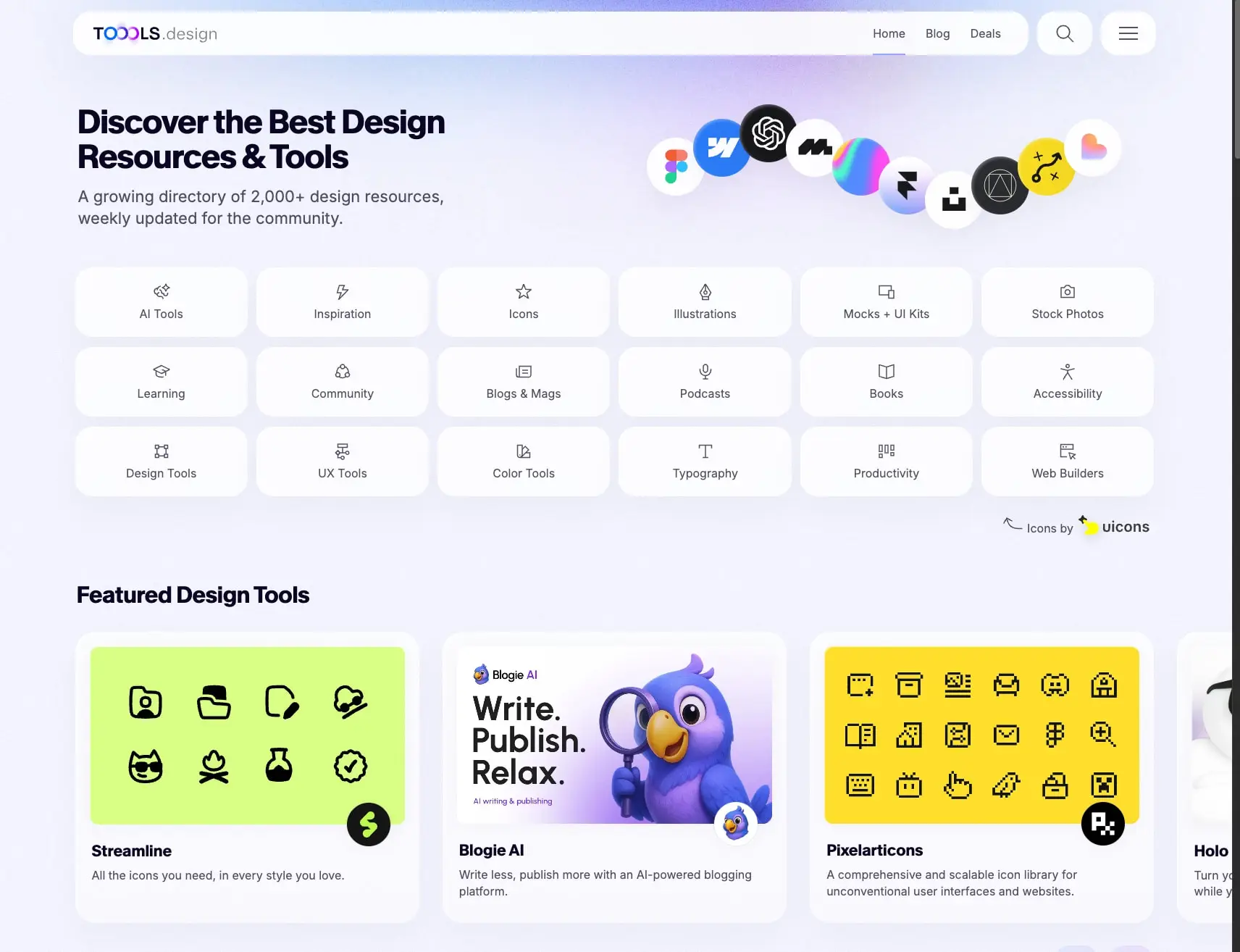
TOOOLS.design presents a design resources directory built on a light, ethereal visual foundation. The system pairs soft lavender-to-white gradient backgrounds with crisp white cards that appear to float through subtle glassmorphic shadow treatments. An expressive extra-bold grotesque display typeface anchors headlines with personality, while Inter provides neutral, highly readable body text. The overall impression is clean and contemporary—organized without feeling clinical, with enough warmth and rounded softness to feel approachable to creative professionals browsing tools and resources.
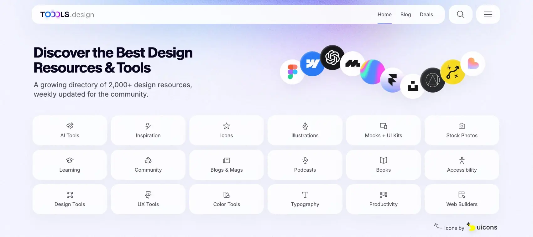
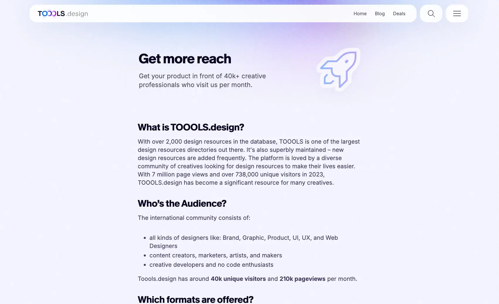
The homepage organizes content through a dense grid of category cards, each containing a simple icon and label, followed by a horizontally scrolling carousel of featured design tools with colorful thumbnail imagery. The sponsorship page shifts to a more editorial rhythm with generous whitespace, section headings, and bullet lists. Throughout, the design maintains consistent elevation language: cards lift through inset white highlights paired with diffuse outer shadows, creating a subtle dimensional quality against the gradient canvas.
Colors
The palette is intentionally restrained, relying on a near-white canvas with deep navy ink and a single bright blue accent. Most visual interest comes from photography and tool icons rather than interface color.
| token | value | use |
|---|---|---|
| canvas | #F3F4FD |
Page background, soft lavender-tinted base |
| surface | #FFFFFF |
Cards, navigation bar, primary buttons |
| surface-raised | #FBFAFF |
Slightly warmed white for gradient endpoints and elevated surfaces |
| ink | #0A0523 |
Primary text, headings, body copy |
| ink-secondary | #160D3D |
Strong emphasis, bold text in lists |
| muted | #ABAAB2 |
Secondary text, subtle borders |
| accent | #006AFF |
Links, active states, bright blue highlights |
| shadow-ink | #0A0523 |
Shadow color reference for opacity-based elevations |
The background gradient shifts subtly across the viewport, moving from cooler lavender tones toward warm white, creating atmospheric depth without competing with content. Cards and interactive surfaces remain pure white to maximize contrast and readability. The deep navy ink (#0A0523) carries a slight purple undertone that harmonizes with the canvas, distinguishing it from pure black. The single accent blue appears sparingly—primarily in active navigation states and link text—keeping the interface feeling clean while providing clear interactive affordance.
Shadow colors derive from the ink token at very low opacity, ensuring environmental consistency: outer shadows use rgba(10, 5, 35, 0.03) while inset highlights use rgba(255, 255, 255, 0.66).
Typography
Two font families create a clear hierarchy: Kmr Melange Grotesk for display headlines and Inter for all body, label, and navigation text. The grotesque’s extra-bold weight and tight tracking give headlines a confident, contemporary character that suits a design-focused audience.
| token | family | size | weight | leading | tracking | use |
|---|---|---|---|---|---|---|
| hero-display | Kmr Melange Grotesk | 2.875rem | 700 | 1.05 | -0.02em | Homepage hero, page titles |
| section-display | Kmr Melange Grotesk | 2rem | 700 | 1 | -0.01em | Section headings, sponsorship page |
| card-title | Kmr Melange Grotesk | 1.375rem | 700 | 1.2 | 0em | Featured tool card names |
| body-large | Inter | 1.375rem | 400 | 1.4 | 0em | Hero descriptions, lead paragraphs |
| body | Inter | 1rem | 400 | 1.4 | 0em | General body text, navigation |
| body-medium | Inter | 1.25rem | 400 | 1.4 | 0em | Sponsorship page body, list items |
| label | Inter | 1rem | 700 | 1.4 | 0em | Category card labels, button text |
| navigation | Inter | 1rem | 400 | 1.4 | 0em | Top nav links, footer links |
Kmr Melange Grotesk appears in Extra Bold (700) exclusively for headlines, with negative letter-spacing that tightens as size increases. Inter serves at 400 Regular for body and 700 Bold for labels and emphasis. The sponsorship page introduces a slightly larger 1.25rem body size for improved readability in longer editorial passages.
Kmr Melange Grotesk is designed by Michael Clasen and distributed by Kimera. Verify licensing for these families before production use.
Layout
The layout follows a centered content model with generous horizontal padding and substantial vertical breathing room between sections. The navigation bar spans nearly the full viewport width with rounded capsule corners, floating above the gradient background.
Container and spacing scale:
| token | value | use |
|---|---|---|
| unit | 0.125rem | Base grid unit |
| section | 9.5rem | Vertical space between major sections |
| content-gap | 2.5rem | Space between related content blocks |
| card-padding | 1.25rem | Internal card padding |
| grid-gap | 1rem | Gap between grid items |
The homepage hero section places the headline and description on the left, balanced by a floating cluster of circular tool icons on the right. Below, the category grid uses a six-column layout with consistent 1rem gaps. The featured tools section transitions to a horizontal scroll or carousel, with cards sized to show partial off-screen content and encourage exploration.
The sponsorship page compresses to a narrower reading column, approximately 640px effective width, with left-aligned headings and generous top padding (152px) before the first heading. This creates a more editorial, document-like experience compared to the dense homepage grid.
Navigation elements use a floating bar with 20px 104.92px 0px padding—substantial horizontal margins that keep content centered while allowing the bar to feel expansive. Cards and buttons share a consistent rounding vocabulary: 24px for standard cards, 12px for smaller thumbnail containers, and 72px for pill-shaped accent buttons.
Visual language
The visual language centers on softness and elevation through light. Every major surface is white, lifted from the gradient canvas by a consistent shadow system that combines diffuse outer shadows with bright inset highlights. This creates a glassmorphic quality—cards feel like frosted panels floating in space.
Shadow system:
- Primary elevation:
rgba(255, 255, 255, 0.66) 1.5px 1.5px 1.5px 0px inset, rgba(10, 5, 35, 0.03) 0px 30px 60px 0px - Secondary elevation:
rgba(10, 5, 35, 0) 0px 0px 0px 0px, rgba(10, 5, 35, 0.03) 0px 20px 40px 0px, rgba(255, 255, 255, 0.66) 1.5px 1.5px 1.5px 0px inset - Navigation:
rgba(10, 5, 35, 0.03) 0px 2px 20px 0px, rgba(171, 170, 178, 0.2) 0px 0px 0px 1px
The inset white highlight is critical to the effect—it suggests a light source from above and gives edges a subtle luminous quality. Without it, cards would appear flat; with it, they gain dimensional presence.
Imagery throughout is colorful and varied—tool icons, product screenshots, and brand marks appear in circular frames or rounded rectangles, often with vibrant gradients or solid brand colors. The homepage hero features a scattered constellation of these icons, overlapping slightly and casting soft shadows, creating visual energy that contrasts with the orderly grid below.
Icons are simple line drawings, approximately 24px, centered above category labels. The overall aesthetic balances creative vibrancy (through photography and brand colors) with systematic restraint (through typography, spacing, and consistent card treatment).
Components
Navigation bar
- Anatomy: Logo left, text links center-right (Home, Blog, Deals), search icon, hamburger menu
- Surface: White background with subtle border and soft shadow
- Shape: Large pill radius (60px), full-width with horizontal margins
- Typography: Navigation token, Inter Regular 1rem
- Spacing: 20px top padding, ~105px horizontal padding
- Composition: Flex row, space-between alignment, vertically centered items
Category card
- Anatomy: Icon centered above label text
- Surface: White with glassmorphic shadow (primary elevation)
- Shape: 24px border radius
- Typography: Label token, Inter Bold 1rem, ink color
- Spacing: 20px vertical padding, centered content
- Composition: Grid cell, 1:1 aspect ratio approximately, icon ~24px above label
- States: Hover likely elevates shadow; active may shift to accent color
Featured tool card
- Anatomy: Colorful thumbnail image top, title below, description beneath title
- Surface: White with secondary elevation shadow
- Shape: 24px border radius, thumbnail has 12px internal radius
- Typography: Card-title for name, body for description
- Spacing: 20px padding, 32px bottom padding for extended cards
- Composition: Vertical stack, image fills top portion, text below with left alignment
- Variants: Some cards show gradient overlays on thumbnails; Streamline card uses lime green background with black icons; Blogie AI shows 3D illustration; Pixelarticons uses yellow with pixel icons
Primary button
- Anatomy: Text label only, no icon
- Surface: White with glassmorphic shadow
- Shape: 24px border radius
- Typography: Label token, Inter Bold
- Spacing: 0px 14px horizontal padding
- Composition: Inline or grouped
Accent pill button
- Anatomy: Text label, sometimes with icon
- Surface: Accent blue (
#006AFF) background - Shape: 72px border radius (full pill)
- Typography: Label token, white text
- Composition: Used for prominent calls-to-action
Search and menu icons
- Surface: Transparent or white circular background
- Shape: Circular touch targets
- Composition: Grouped right in navigation bar
Responsive behavior
The system appears optimized for desktop viewing with substantial horizontal padding and multi-column grids. At narrower viewports, the six-column category grid should collapse to three or two columns, maintaining card aspect ratios and touch targets. The featured tools carousel likely scrolls horizontally with snap points on mobile.
The navigation bar’s full-width pill shape may transition to a more compact treatment on small screens, potentially hiding text links behind the hamburger menu while preserving search access. Hero text should stack above the floating icon cluster rather than sitting side-by-side.
Typography scales down proportionally: hero-display at 2.875rem may reduce to 2rem on tablet and 1.5rem on mobile. Body-large at 1.375rem can hold at 1.125rem for improved mobile readability. Maintain the 1rem minimum for body and label tokens to ensure accessibility.
The sponsorship page’s narrow reading column should expand to comfortable mobile margins (16-24px) while preserving the editorial hierarchy of headings, paragraphs, and lists.
Practical implementation guidance
Preserve
- The glassmorphic shadow pairing: always combine inset white highlights with diffuse outer shadows
- The two-typeface hierarchy: grotesque for headlines, Inter for everything else
- The soft gradient background—never use flat white as the page canvas
- Rounded corners throughout; sharp corners break the visual language
- Generous whitespace in editorial pages; density in directory grids
Avoid
- Pure black text—the navy ink (
#0A0523) is essential to the palette’s warmth - Heavy borders; rely on shadow elevation for separation
- Multiple accent colors; the single blue keeps the system coherent
- Flat cards without the inset highlight shadow
- Cluttered hero sections; the floating icon cluster needs breathing room
Recommended build order
- Establish gradient canvas and base typography scale
- Build navigation bar with shadow and pill shape
- Implement category card grid with glassmorphic shadows
- Add featured tool cards with image thumbnails
- Refine responsive breakpoints for grid collapse
- Polish shadow system consistency across all elevated surfaces
Accessibility
- Ensure gradient backgrounds maintain sufficient contrast with white cards
- Verify that ink text on white surfaces meets WCAG AA standards (the deep navy should pass)
- Provide focus states that complement the shadow system, likely using the accent blue outline
- Maintain 44px minimum touch targets for all interactive elements
- Consider
prefers-reduced-motionfor any carousel or scroll animations - Ensure the floating icon cluster in the hero does not create visual distraction for users with cognitive accessibility needs
Scope note
This guide covers the homepage directory view and sponsorship page as visible in the captured images. Mobile layouts, dark mode, loading states, form interactions, and search result pages are not represented. The footer, additional interior pages, and any authentication flows fall outside the current scope. Measurements derive from the desktop interface at the captured resolution.
Sites change, so a screenshot can differ from the guide.
Loading…Similar designs
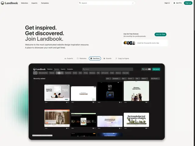
This guide describes the public website and isn't an official toools.design design system. Not affiliated with toools.design.