Overview
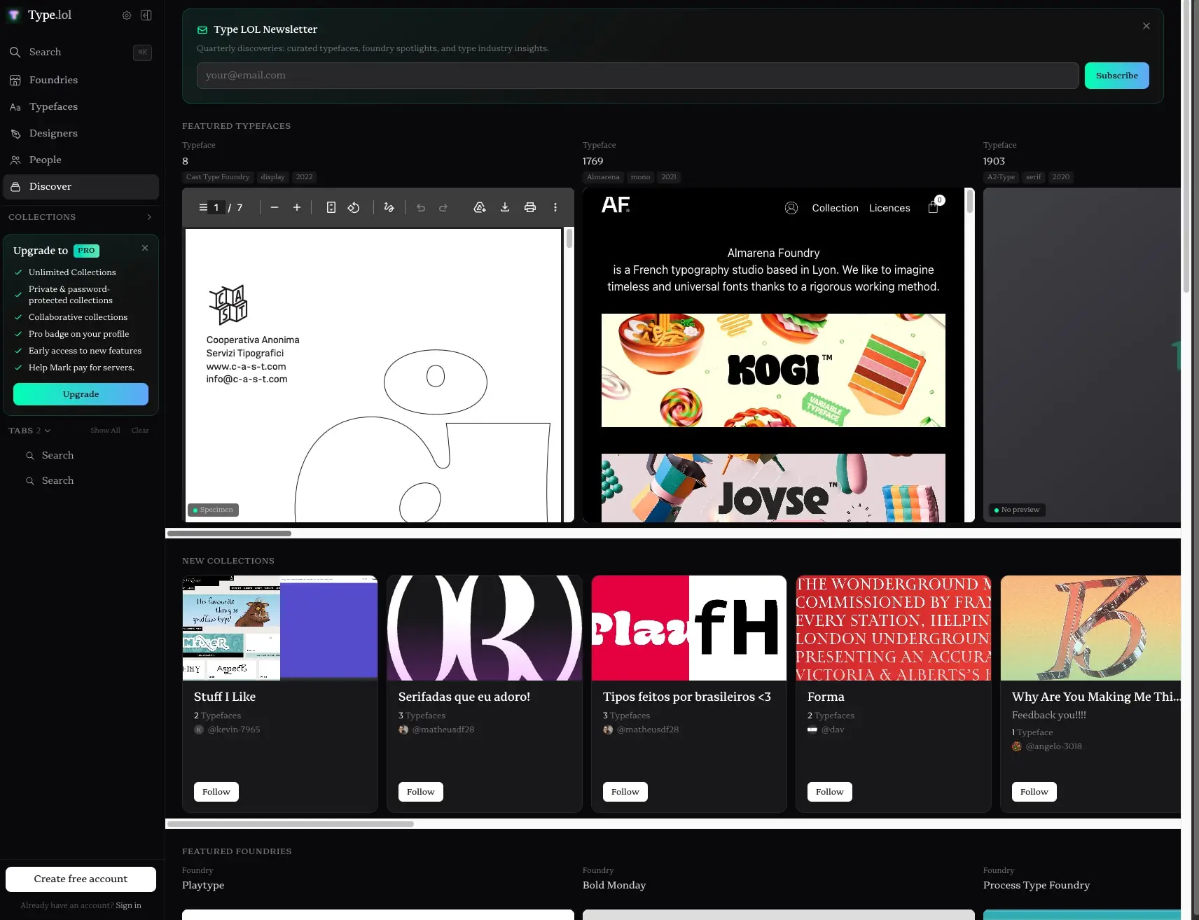
Type.lol is an independent type foundry index built around a dark, immersive browsing experience. The interface divides into a persistent left sidebar for navigation and a main content area for discovering typefaces, collections, and foundries. The visual system relies on near-black surfaces with subtle elevation changes, a single serif typeface for all text, and vibrant gradient accents that appear on primary actions and decorative borders. The design prioritizes large specimen previews, letting typography speak for itself against the restrained background. Content density varies from sparse grid layouts to dense horizontal scrolling galleries, with consistent spacing and rounded corners unifying the components.
Colors
The palette is built on a dark foundation with carefully placed accent colors that draw attention to interactive elements without overwhelming the content.
| token | value | use |
|---|---|---|
| canvas | #09090B | Page background, deepest surface |
| surface | #111111 | Primary card and panel backgrounds |
| surface-elevated | #18181B | Active states, elevated sidebar items |
| surface-gradient-start | #3F3F46 | Card gradient backgrounds, preview areas |
| surface-gradient-end | #27272A | Card gradient backgrounds, preview areas |
| ink | #FFFFFF | Primary text, headings, active labels |
| ink-muted | #A1A1AA | Secondary text, descriptions, metadata |
| ink-dim | #71717A | Tertiary text, disabled states, placeholders |
| ink-faint | #52525B | Subtle borders, dividers in dark contexts |
| accent-primary | #00FFB3 | Primary action gradient start, key highlights |
| accent-secondary | #60A5FA | Primary action gradient end, secondary highlights |
| accent-cyan | #00BCD4 | Decorative gradient accents on cards |
| accent-purple | #8B5CF6 | Decorative gradient accents on cards |
| accent-magenta | #E040FB | Decorative gradient accents on cards |
| accent-red | #EF4444 | Decorative gradient accents on cards |
| accent-blue | #3B82F6 | Decorative gradient accents on cards |
| border-subtle | #D4D4D8 | Sidebar dividers, subtle panel borders |
| border-accent | #00FFB3 | Typeface card borders, active indicators |
| border-white | #FFFFFF | Foundry card borders, prominent outlines |
The dark mode is intrinsic and non-optional. Surfaces progress from canvas through surface to surface-elevated, creating depth without strong shadows. The surface-gradient-start and surface-gradient-end values form a subtle diagonal gradient used on empty preview states and card backgrounds, shifting from a medium gray (#3F3F46) to a darker gray (#27272A) in oklab color space. The accent colors appear primarily as gradients—linear transitions from accent-primary to accent-secondary on buttons, and subtle top-fading gradients in cyan, magenta, red, purple, and blue on typeface preview cards. These colored gradients sit at low opacity (roughly 27%) and fade to transparent, adding atmosphere without competing with the specimen content. White and near-white borders provide crisp definition on selected or featured items.
Typography
The typographic system uses a single variable serif family, Gorp Serif Vf, designed by Mark Johnson and distributed by Trash Type. A system monospace face appears only for small code-like labels. Verify licensing for these families before production use.
| token | family | size | weight | leading | tracking | use |
|---|---|---|---|---|---|---|
| hero-display | Gorp Serif Vf | 3.75rem | 700 | 1 | normal | Large decorative numerals, hero moments |
| section-heading | Gorp Serif Vf | 1.25rem | 700 | 1.4 | normal | Card titles, collection names |
| body | Gorp Serif Vf | 1rem | 400 | 1.5 | normal | Primary content, descriptions, navigation |
| body-small | Gorp Serif Vf | 0.875rem | 400 | 1.43 | normal | Secondary content, links, foundry names |
| label | Gorp Serif Vf | 0.75rem | 600 | 1.33 | 0.05em | Category labels, uppercase tags, section headers |
| caption | Gorp Serif Vf | 0.6875rem | 400 | 1.5 | normal | Metadata, counts, small descriptions |
| micro | Gorp Serif Vf | 0.625rem | 700 | 1.5 | 0.05em | Badges, status indicators, tiny labels |
| navigation | Gorp Serif Vf | 1rem | 400 | 1.5 | normal | Sidebar menu items, top-level links |
| code | System-Uimonospace | 0.6875rem | 400 | 1.5 | normal | Technical labels, monospace annotations |
The typeface renders at Extra Light weight by default, with Medium and Semibold used for interactive labels and Bold reserved for display numerals and emphasis. Letter spacing remains normal throughout except for label and micro tokens, which use slight positive tracking for optical clarity at small sizes. Line heights are generous for readability at the dark background’s low luminance.
Layout
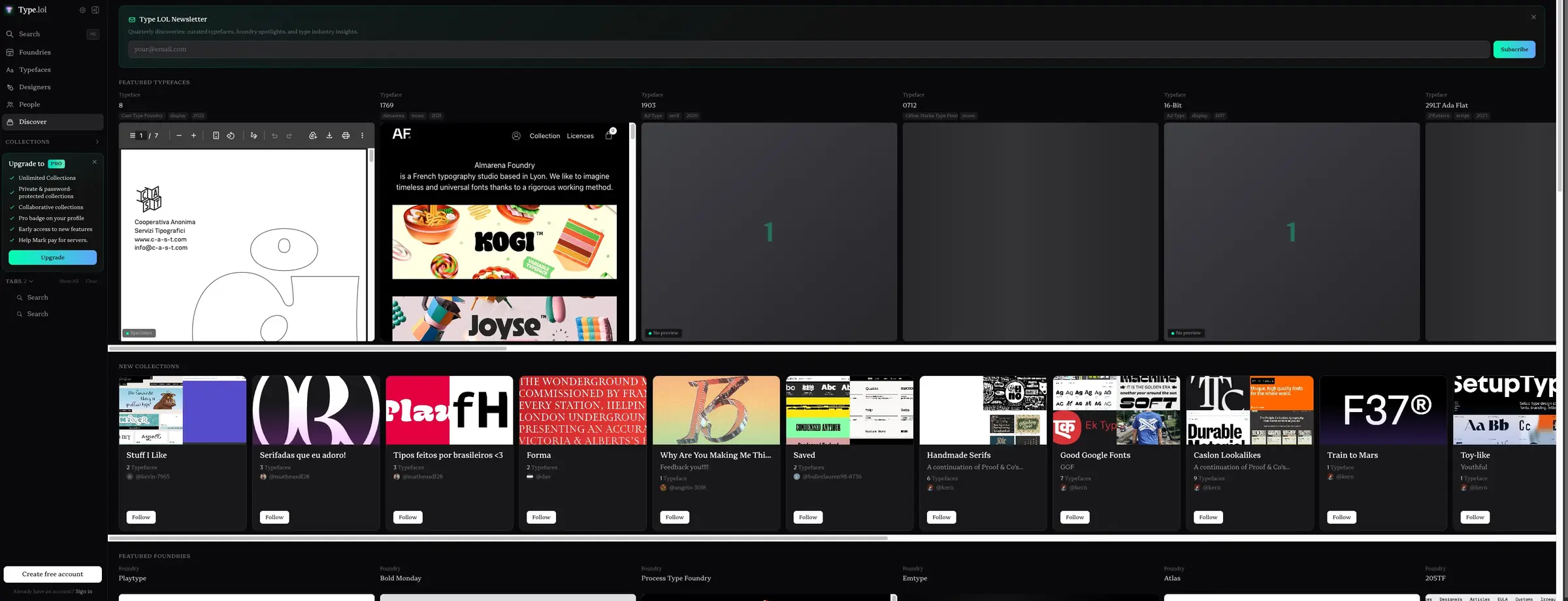
The interface follows a two-column layout with a fixed left sidebar and a scrollable main content area. The sidebar occupies approximately 240 pixels and contains the site identity, primary navigation, collections section, and upgrade promotion. The main area fills the remaining viewport width and organizes content into horizontal scrolling galleries and vertical grids.
Horizontal sections like Featured Typefaces and New Collections use overflow scrolling with cards arranged in a single row. Each card maintains consistent internal padding and rounded corners. Vertical spacing between sections uses 1.5rem to 2rem gaps, creating clear grouping without heavy dividers.
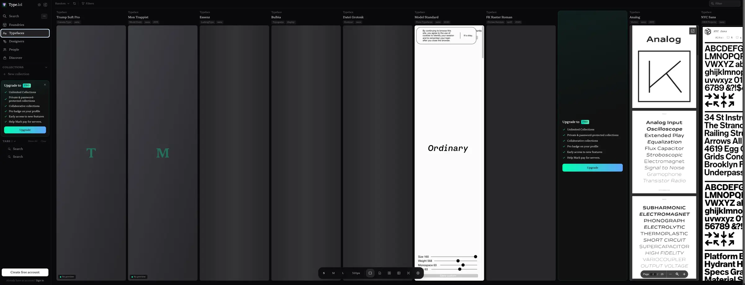
The typeface browsing grid shows a denser layout with multiple columns of specimen previews. A type tester panel can overlay or sit adjacent to the grid, providing interactive controls for size, weight, and other variable font axes. This panel uses the same surface background with an accent border to distinguish it from the content grid.
Content padding in the main area typically uses 1.5rem horizontal gutters. Cards internally pad at 1.25rem. The sidebar uses tighter spacing, with 0.75rem vertical padding on items and 0.5rem to 0.75rem horizontal padding.
Visual language
The visual character is restrained and editorial, letting the type specimens provide the color and personality. The dark canvas creates a gallery-like atmosphere where white and light gray text recedes just enough to frame the content. Rounded corners appear universally—cards, buttons, inputs, and panels all share the same soft geometry, with pills and circular badges using full border radius.
Gradients serve as the primary decorative language beyond the dark surfaces. Action buttons carry a full left-to-right gradient from mint green to sky blue. Typeface preview cards feature subtle top-originating color washes in cyan, magenta, red, purple, or blue that fade to transparent over the first sixty percent of the card height. These gradients appear at low opacity, adding depth and variety without obscuring the specimen imagery.
Borders are used sparingly but precisely. One-pixel white or accent borders define selected cards and featured foundries. The sidebar uses a subtle top border on its upgrade panel. Shadows are minimal—a soft dark shadow appears on elevated panels, but most depth comes from surface color variation rather than drop shadows.
Imagery within cards shows actual type specimens: large letterforms, pangrams, and foundry promotional graphics. These images retain their original colors and compositions, creating vibrant moments against the dark interface.
Components
Sidebar Navigation
- Anatomy: Stacked vertical list with icon-text pairs, section headers, and nested groups
- Surface: Transparent background on canvas, with active items using surface-elevated
- Typography: Navigation token for items, label token for section headers
- Shape: No border radius on the sidebar itself; individual items use button radius
- Spacing: 0.75rem vertical padding on items, 1rem between sections
- Composition: Fixed position, full viewport height, scrollable internally
Newsletter Banner
- Anatomy: Dismissible banner with heading, description, email input, and subscribe button
- Surface: Surface background with optional accent border
- Typography: Body for description, label for heading, body-small for input placeholder
- Shape: Panel border radius
- Spacing: 0.75rem to 1rem internal padding
- Composition: Full-width within main area, sits above content grids
Typeface Card
- Anatomy: Preview area, title, foundry name, year tags, and action buttons
- Surface: Surface background with gradient preview area
- Typography: Section-heading for typeface name, body-small for foundry, caption for metadata, label for category tags
- Shape: Card border radius, with optional accent border on featured items
- Spacing: 1.25rem internal padding
- Composition: Fixed aspect ratio preview with content below; horizontal scroll in galleries
Type Tester Panel
- Anatomy: Large preview text, variable axis sliders, size and weight controls
- Surface: Surface background with accent border
- Typography: Hero-display for preview text at adjustable sizes
- Shape: Panel border radius
- Spacing: 1.25rem padding
- Composition: Can overlay grid or sit as sidebar; contains interactive controls
Collection Card
- Anatomy: Thumbnail grid, title, typeface count, author, follow button
- Surface: Surface background
- Typography: Section-heading for title, caption for count and author
- Shape: Card border radius
- Spacing: 1.25rem padding
- Composition: Thumbnail area shows 2-4 specimen previews in a mini grid
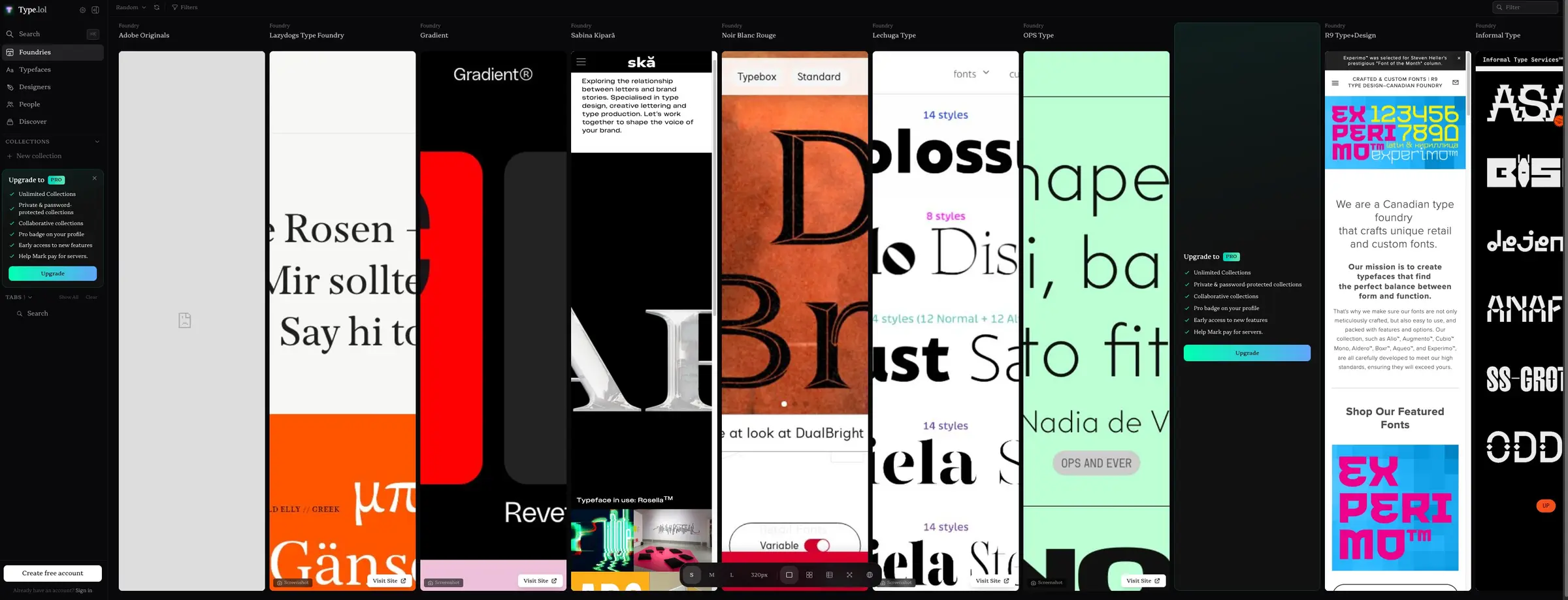
Foundry Showcase Card
- Anatomy: Large specimen screenshot, foundry name, visit site link
- Surface: Surface background with white border on featured items
- Typography: Body-small for foundry name, label for category
- Shape: Card border radius
- Spacing: 1.25rem padding
- Composition: Full-bleed specimen image with overlaid text controls
Action Button
- Anatomy: Text label with optional icon
- Surface: Full gradient from accent-primary to accent-secondary
- Typography: Label token, Semibold weight
- Shape: Button border radius
- Spacing: 0.5rem vertical, 0.625rem horizontal padding
- Variants: Default gradient, white variant for follow actions
Tag
- Anatomy: Text label in a compact container
- Surface: Surface-elevated background
- Typography: Caption token
- Shape: Tag border radius
- Spacing: 0.125rem vertical, 0.5rem horizontal padding
Responsive behavior
The two-panel layout likely collapses to a single column on smaller viewports, with the sidebar becoming a collapsible drawer or hamburger menu. The horizontal scrolling galleries should maintain their scroll behavior but may show fewer cards simultaneously. Type tester panels should stack above or below the grid rather than sitting side by side. Touch targets for buttons and sliders should expand to at least 44 pixels on mobile devices. Font sizes may reduce slightly, with hero-display scaling down to preserve layout integrity without horizontal overflow.
Practical implementation guidance
Preserve
- The single serif typeface throughout all UI text; do not introduce additional font families
- The dark canvas as the default and only color scheme
- The mint-to-blue gradient on primary actions as a distinctive brand signature
- The consistent 0.75rem border radius on cards and panels
- The low-opacity colored gradients on typeface preview cards
- The generous line heights for readability against dark backgrounds
Avoid
- Light or white backgrounds that would destroy the gallery atmosphere
- Sharp corners on interactive elements; maintain the soft rounded aesthetic
- Multiple font families in the UI; keep Gorp Serif Vf as the sole voice
- Heavy drop shadows; rely on surface color variation for depth
- Saturated accent colors at full opacity outside of the defined gradient uses
Recommended Build Order
- Establish the dark canvas and surface color tokens
- Implement the sidebar with navigation items and active states
- Build the typeface card component with gradient preview area
- Create the horizontal scrolling gallery container
- Add the newsletter banner with input and gradient button
- Implement the type tester panel with variable controls
- Build collection and foundry card variants
- Polish with tag, badge, and micro components
Accessibility
- Ensure all text meets WCAG AA contrast ratios against the dark surfaces; the ink-muted and ink-dim tokens should be checked for small text compliance
- Provide visible focus indicators on all interactive elements, using the accent border color
- Make the type tester controls keyboard accessible with clear value announcements
- Include skip navigation for the sidebar on screen reader flows
- Ensure horizontal scrolling galleries can be operated with keyboard alone
Scope note
This guide covers the homepage, typeface browsing grid, and foundry showcase surfaces visible in the captured images. Mobile layouts, user profile pages, checkout flows, and animation specifications are not included. The type tester panel’s full interactive behavior and variable font axis ranges are partially visible but not completely documented. Measurements are exact values from the captured interface records.
Sites change, so a screenshot can differ from the guide.
Loading…Similar designs

This guide describes the public website and isn't an official type.lol design system. Not affiliated with type.lol.