Overview
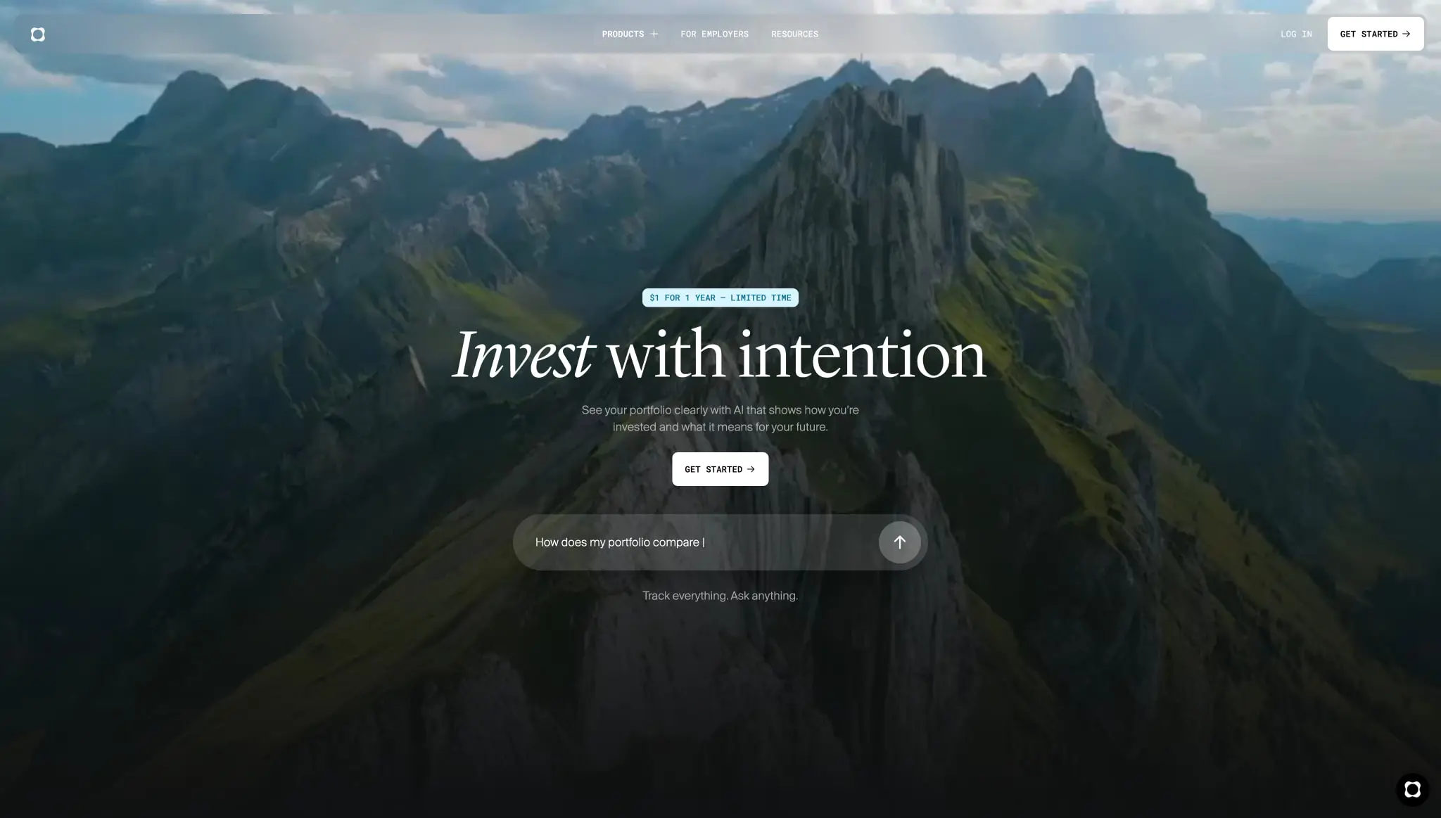
Origin Financial presents a premium, confidence-inspiring visual system built on absolute darkness and editorial refinement. The design language centers on a near-black canvas that allows financial data, photography, and accent gradients to command full attention. The interface avoids decorative noise in favor of generous whitespace, precise typography, and cinematic imagery that suggests stability and long-term vision.
The system pairs a classical serif display face with a clean neo-grotesque sans-serif and a technical monospace, creating a hierarchy that feels both editorial and engineered. Components are minimal and rounded, with subtle surface elevations distinguishing interactive elements from the deep background. Color is used strategically: the core experience is monochromatic, while blue gradients signal forward-looking features like forecasting, and teal accents highlight positive financial movement.
Colors
| token | value | use |
|---|---|---|
| canvas | #000000 | Primary page background, deepest layer |
| canvas-elevated | #0F1011 | Slightly lifted dark surfaces, gradient endpoints |
| surface | #131313 | Card backgrounds, input fields, elevated panels |
| surface-warm | #2B2B2C | Secondary card surfaces, dashboard modules |
| border-subtle | #2E2E2E | Hairline dividers, inactive borders |
| ink-primary | #FFFFFF | Primary headings, active text, button fills |
| ink-secondary | #FAFAFA | Display text at reduced opacity, secondary headings |
| ink-muted | #CACACA | Supporting body text, captions, disabled states |
| accent-teal | #017494 | Positive indicators, growth metrics, success states |
| accent-blue | #195F97 | Mid-tone gradient stops, feature accents |
| accent-sky | #408AC1 | Gradient endpoints, chart elements, interactive highlights |
| accent-light | #90B8F0 | Soft blue tints, hover states, focus rings |
| accent-pale | #D7F5FF | Lightest blue tint, badge backgrounds, promotional tags |
| gradient-hero-start | #0F1011 | Hero gradient bottom anchor |
| gradient-hero-end | #262727 | Hero gradient top fade |
| gradient-forecast-start | #0F1011 | Forecast section gradient origin |
| gradient-forecast-mid | #131D27 | Forecast gradient transition |
| gradient-forecast-accent | #1A4788 | Forecast gradient deep blue |
| gradient-forecast-end | #408AC1 | Forecast gradient sky blue terminus |
The color system operates in three modes. The default dark mode uses pure black and near-black surfaces with white and off-white text for maximum contrast and reduced eye strain during data-heavy sessions. A photographic mode overlays the same dark gradients on full-bleed imagery, allowing landscape photography to show through while maintaining text legibility. The accent mode introduces blue gradients for forward-looking features like forecasting and planning tools, creating visual distinction without breaking the dark-mode continuity. Teal appears only for positive financial indicators, keeping semantic color minimal and meaningful.
Typography
| token | family | size | weight | leading | tracking | use |
|---|---|---|---|---|---|---|
| hero-display | Lyon App | 6rem | 300 | 0.9 | normal | Homepage hero headlines, full-bleed sections |
| section-display | Lyon App | 5rem | 300 | 1 | normal | Interior page headlines, product feature headers |
| feature-heading | Lyon App | 2.375rem | 300 | 0.9 | normal | Card titles, module headers, sub-section leads |
| body | Suisse Intl | 1rem | 400 | 1.5 | normal | Primary body copy, navigation, form labels |
| body-light | Suisse Intl | 1rem | 300 | 1.5 | normal | Descriptive paragraphs, supporting copy |
| body-large | Suisse Intl | 1.125rem | 300 | 1.5 | normal | Lead paragraphs, introductory text |
| label | Roboto Mono | 0.75rem | 500 | 2 | normal | Buttons, badges, tags, navigation labels |
| label-tight | Roboto Mono | 0.6875rem | 400 | 1.4 | 0.125em | Data labels, timestamps, metadata |
| caption | Suisse Intl | 0.75rem | 300 | 1.5 | normal | Fine print, legal copy, disclaimers |
Lyon App, designed by Kai Bernau and distributed by Commercial Classics Inc, serves as the editorial display face. Its light weight and classical proportions convey sophistication and trustworthiness appropriate for financial services. The italic variant is used for emphasis within headlines, creating a humanistic contrast to the upright roman. Suisse Intl, from Swiss Typefaces, handles all functional text in Book and Light weights. Its clean geometry and extensive family provide consistency across body copy, navigation, and interface elements. Roboto Mono, designed by Google, supplies technical labels and data annotations with its monospaced rhythm, reinforcing the platform’s analytical credibility.
Verify licensing for these families before production use.
Layout
The layout system is built on a centered content model with generous horizontal margins and substantial vertical breathing room. The base spacing unit is 0.125rem, allowing for fine-grained control while maintaining a systematic scale.
Page sections use 6.25rem vertical padding to create clear rhythmic separation between content blocks. Content is constrained to a maximum readable width of approximately 37rem for text-heavy sections, while feature demonstrations and data visualizations expand toward wider margins. Horizontal page gutters are consistently 2rem.
The grid is implicit rather than explicit: elements center within the viewport or align to comfortable reading measures. Dashboard-style components stack vertically with 1.25rem internal padding and subtle surface elevation. Feature cards on dark backgrounds use rounded rectangles with 2rem corner radii, creating soft containers that float above the canvas.
Navigation occupies a fixed position at the viewport top, using a frosted glass treatment with backdrop blur over the underlying content. The header contains a logo mark, primary navigation links in monospace labels, and utility actions aligned to the right edge. A promotional badge or tagline may appear below the navigation on key pages, centered above the main headline.
Hero sections employ full-bleed photography with gradient overlays that darken toward the bottom, ensuring centered white typography remains legible. The composition places the headline in the upper-middle portion of the viewport, with supporting copy and calls-to-action stacked below at comfortable reading distance.
Visual language
The visual language balances editorial sophistication with technical precision. Photography is cinematic and naturalistic—mountain landscapes, atmospheric vistas—suggesting longevity, stability, and aspiration. These images are treated with dark gradient overlays that preserve their emotional impact while establishing a functional surface for interface elements.
Typography drives the personality. The large serif display creates an immediate impression of established credibility, while the monospace labels add a layer of contemporary fintech precision. The sans-serif body bridges these two registers, keeping the experience readable and modern.
Surface treatments are minimal. Rather than heavy shadows or borders, the system relies on subtle background color shifts and generous spacing to define hierarchy. Cards and panels use slightly elevated dark surfaces against the pure black canvas. Interactive elements like input fields and buttons use rounded forms that feel approachable without being playful.
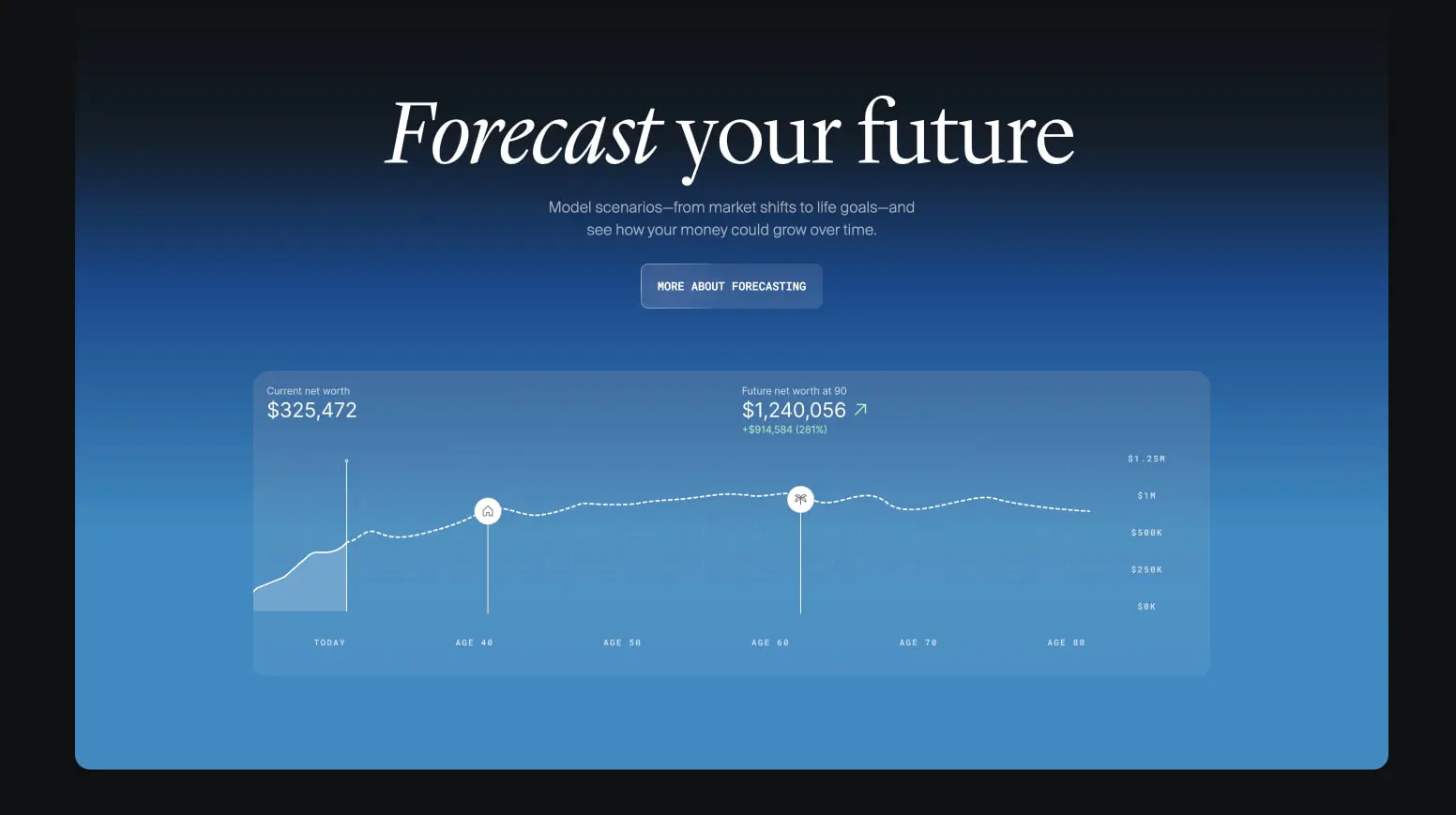
Motion and depth are implied through gradient transitions. Blue gradients sweep from deep navy to sky blue in forecasting sections, suggesting horizon and forward movement. Dark gradients on photography create depth by pulling the interface forward from the image plane. The overall effect is immersive and focused, directing attention to financial data and calls-to-action without visual competition.
Components
Navigation bar
- Anatomy: Logo mark, primary link group, utility actions group
- Surface: Semi-transparent dark background with backdrop blur, approximately 80% opacity of canvas-elevated
- Typography: Primary links use
{typography.label}in uppercase; utility actions use{typography.label}or{typography.body} - Shape: Full-width bar, no border radius
- Spacing: Compact vertical padding with horizontal page gutters; internal spacing of 2rem between link groups
- Composition: Logo left-aligned, primary links centered, utility actions right-aligned
- Variants: Transparent over hero imagery; solid over dark content sections
Hero section
- Anatomy: Optional promotional badge, display headline, supporting paragraph, primary call-to-action, optional secondary input or search element
- Surface: Full-bleed photography with linear gradient overlay from transparent to canvas-elevated
- Typography: Headline uses
{typography.hero-display}with italic emphasis on key words; supporting copy uses{typography.body-light}in ink-muted - Shape: Full viewport width, variable height based on content
- Spacing: Generous top padding to clear navigation; centered content with constrained maximum width
- Composition: All elements center-aligned; vertical stack with 1.5rem gaps between text elements
Primary button
- Anatomy: Text label with optional arrow icon
- Surface: Solid ink-primary background with canvas text color
- Typography:
{typography.label}in uppercase - Shape: 0.5rem border radius, compact padding
- Spacing: 0.75rem horizontal padding, 0.625rem vertical padding
- Variants: May include right-pointing arrow for external or forward actions
Secondary button
- Anatomy: Text label only
- Surface: Transparent background with subtle border
- Typography:
{typography.label}in uppercase - Shape: 0.5rem border radius
- Spacing: Similar compact padding to primary button
Input pill
- Anatomy: Leading icon, placeholder or active text, trailing action icon
- Surface: Surface background color, full border radius
- Typography:
{typography.body}in ink-primary - Shape: 9999px border radius for full pill appearance
- Spacing: Comfortable internal padding, approximately 1.25rem horizontal
- Composition: Horizontally centered in section, often below headline
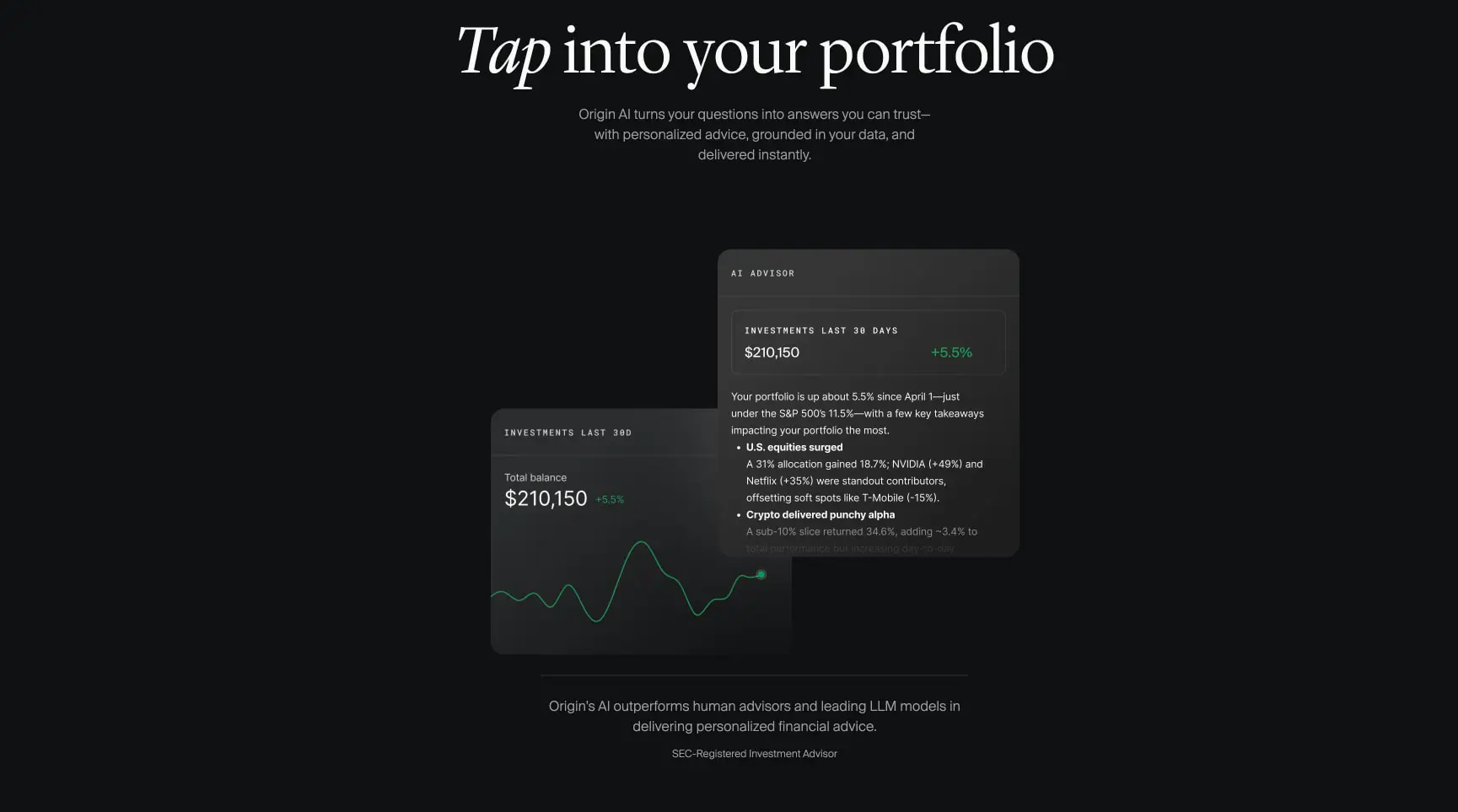
Feature card
- Anatomy: Optional label, heading, body copy, visual or data element
- Surface: Surface-warm background with 2rem border radius
- Typography: Heading uses
{typography.feature-heading}; labels use{typography.label-tight}in uppercase with letter spacing - Shape: 2rem rounded rectangle
- Spacing: 1.25rem internal padding
- Composition: May stack vertically or arrange in asymmetric pairs with offset positioning
Data panel
- Anatomy: Metric label, primary value, change indicator, supporting visualization
- Surface: Surface background with 1rem border radius
- Typography: Values use
{typography.body-large}or larger; labels use{typography.label-tight} - Shape: 1rem rounded rectangle
- Spacing: 1.25rem internal padding
- Composition: Metrics aligned left; change indicators in accent-teal for positive values
Forecast panel
- Anatomy: Section headline, description, action button, data visualization card
- Surface: Full-width gradient background from gradient-forecast-start through gradient-forecast-mid to gradient-forecast-end
- Typography: Headline uses
{typography.section-display}; description uses{typography.body-light} - Shape: Large rounded container, 1rem border radius
- Spacing: 6.25rem vertical padding; internal visualization card with 1.25rem padding
- Composition: Centered text above; wide visualization card below with metric annotations
Responsive behavior
The design prioritizes desktop presentation with a centered content model that adapts gracefully to narrower viewports. The maximum content width of 37rem ensures comfortable reading across screen sizes. On narrower viewports, horizontal page gutters of 2rem maintain consistent edge spacing.
The hero display typography at 6rem should scale down proportionally to avoid overflow, likely reducing to 4rem or 3rem on tablet and mobile widths. Section display at 5rem follows a similar reduction path. Feature headings at 2.375rem may remain stable or reduce slightly.
Navigation collapses to a compact menu on smaller screens, preserving the frosted glass treatment. The centered link group moves behind a menu trigger, with utility actions remaining accessible.
Feature cards that offset asymmetrically on desktop should stack vertically on mobile, maintaining their internal padding and border radius. Data panels expand to full width within the page gutters.
The forecasting visualization requires careful handling: the chart and annotations should remain legible, potentially switching to a simplified view or horizontal scroll on narrow viewports.
Practical implementation guidance
Preserve
- The absolute black canvas as the foundation; any deviation lightens the premium tone
- The three-typeface hierarchy: serif for display, sans-serif for function, monospace for labels
- Generous vertical spacing between sections; the rhythm is as important as the components
- Italic emphasis within serif headlines for humanistic warmth
- The frosted navigation treatment over imagery
- Blue gradient sections as the sole color break from the dark mode
Avoid
- Adding decorative shadows or borders; rely on surface color and spacing instead
- Introducing additional accent colors beyond teal for positive indicators and blue for forward-looking features
- Reducing the display type sizes below readable thresholds on desktop
- Using the serif face for body copy or functional text
- Crowding the hero section with multiple calls-to-action
Recommended build order
- Establish the black canvas and base typography scale
- Implement the navigation with frosted glass treatment
- Build the hero section with gradient overlay and centered content
- Create the button and input pill components
- Develop feature cards with surface-warm backgrounds
- Implement the forecasting section with blue gradient and data visualization
- Add dashboard-style data panels for product pages
- Refine responsive scaling and navigation collapse
Accessibility
- Ensure white text on black backgrounds meets WCAG AAA contrast ratios; the current values do
- Provide visible focus states on interactive elements, using accent-light for focus rings
- Maintain keyboard navigability through the pill inputs and button actions
- Add aria-labels to icon-only buttons and navigation triggers
- Consider a reduced-motion preference for the gradient backgrounds
- Ensure chart visualizations have text alternatives or data tables for screen readers
Scope note
This guide covers the homepage and product page surfaces visible in the captured images, including hero sections, feature demonstrations, data panels, and navigation. Mobile layouts, form validation states, loading skeletons, error pages, and account dashboard interfaces are not represented. Motion design, including gradient animations and scroll-triggered transitions, is not documented. Measurements are derived from the exact values recorded in the captured styles.

Sites change, so a screenshot can differ from the guide.
Loading…Similar designs

This guide describes the public website and isn't an official useorigin.com design system. Not affiliated with useorigin.com.