Overview
The Vitest website presents a developer-tool identity built on extreme contrast: near-black surfaces against bright white typography, punctuated by electric green and cyan accents. The visual system communicates speed and technical precision through a disciplined dark-mode palette, a distinctive display typeface with tight negative tracking, and structured grid layouts that organize dense technical information into scannable feature cards. The homepage moves from an assertive hero statement through a sponsor ecosystem to a detailed capability grid, maintaining visual coherence through consistent border treatments, monospace code styling, and a restrained elevation system that keeps all elements flat against the dark canvas.
Colors
The color system is built for dark-mode readability with a small, purposeful palette. Every token serves a specific interface role.
| token | value | use |
|---|---|---|
| canvas | #16171D |
Primary page background, card surfaces |
| surface | #000000 |
Deepest background layer, code block backgrounds |
| surface-elevated | #2E2E32 |
Inline code backgrounds, subtle elevation |
| ink | #FFFFFF |
Primary text, headings, navigation |
| muted-ink | #867E8E |
Secondary descriptions, footer labels, inactive states |
| accent-green | #22FF73 |
Primary action borders, success states, terminal highlights |
| accent-cyan | #32F3E9 |
Secondary accent, 0xc reference, link highlights |
| accent-purple | #B39AFF |
Tertiary accent, Vite code references |
| border | #3B3440 |
Card borders, grid dividers, section separators |
| border-subtle | #2E2E32 |
Hairline dividers within dense layouts |
The interface operates in a single dark mode. The near-black canvas (#16171D) avoids pure black harshness while maintaining the depth expected of developer tools. White ink provides maximum contrast for readability. The three accent colors—green, cyan, and purple—appear sparingly: green defines the primary call-to-action outline, cyan marks specific technical references, and purple highlights framework names in code contexts. No light mode variant is present in the visible system.
Typography
Three font families create a clear hierarchy: Apk Protocol for display and navigation, Inter for body text and UI elements, and Kh Teka Mono for code and technical annotations.
| token | family | size | weight | leading | tracking | use |
|---|---|---|---|---|---|---|
| hero-display | Apk Protocol | 3.75rem | 500 | 1.12 | -0.05em | Hero headlines |
| section-display | Apk Protocol | 3rem | 500 | 1 | -0.025em | Section headlines, CTA banner |
| feature-heading | Apk Protocol | 2.5rem | 500 | 1.33 | -0.025em | Feature card titles |
| body-large | Inter | 1.125rem | 400 | 1.56 | normal | Hero descriptions, feature body |
| body | Inter | 1rem | 400 | 1.4 | normal | Navigation, buttons, general UI |
| label | Inter | 0.875rem | 400 | 1 | normal | Sponsor tier labels, small metadata |
| navigation | Apk Protocol | 1rem | 400 | 1.5 | normal | Nav links, brand-adjacent UI |
| code | Kh Teka Mono | 1rem | 400 | 1.5 | normal | Inline code, terminal output |
| code-small | Kh Teka Mono | 0.75rem | 400 | 1.33 | 0.025em | Small labels, status badges |
Apk Protocol, designed by Autograph Peter Korsman and supplied by Maël Bächtold for APK Type, carries the brand voice with its medium weight and tightly tracked negative spacing. Kh Teka Mono, from Kurppa Hosk (designers Jakob Ekelund and Wille Larsson) and supplied by Kh Type, provides the technical monospace voice. Inter serves as the neutral workhorse for readable body text. Verify licensing for these families before production use.
Layout
The layout system relies on a centered content column with generous horizontal margins and consistent vertical section spacing. The base spacing unit is 0.125rem (2px), from which all measurements derive.
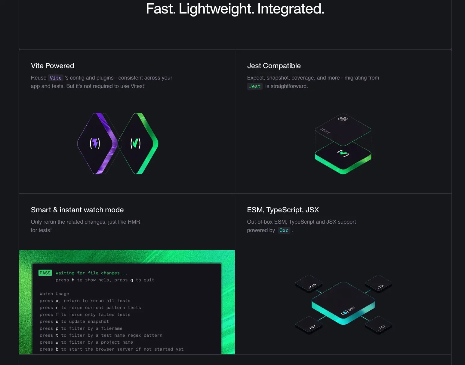
Content containers center with max-width constraints and horizontal padding of 2.5rem (40px). Major sections separate with 7.5rem (120px) vertical padding. The feature grid uses a two-column layout with 1px borders between cells, creating a subtle quilted effect where each card sits as a distinct bordered region against the continuous canvas background.
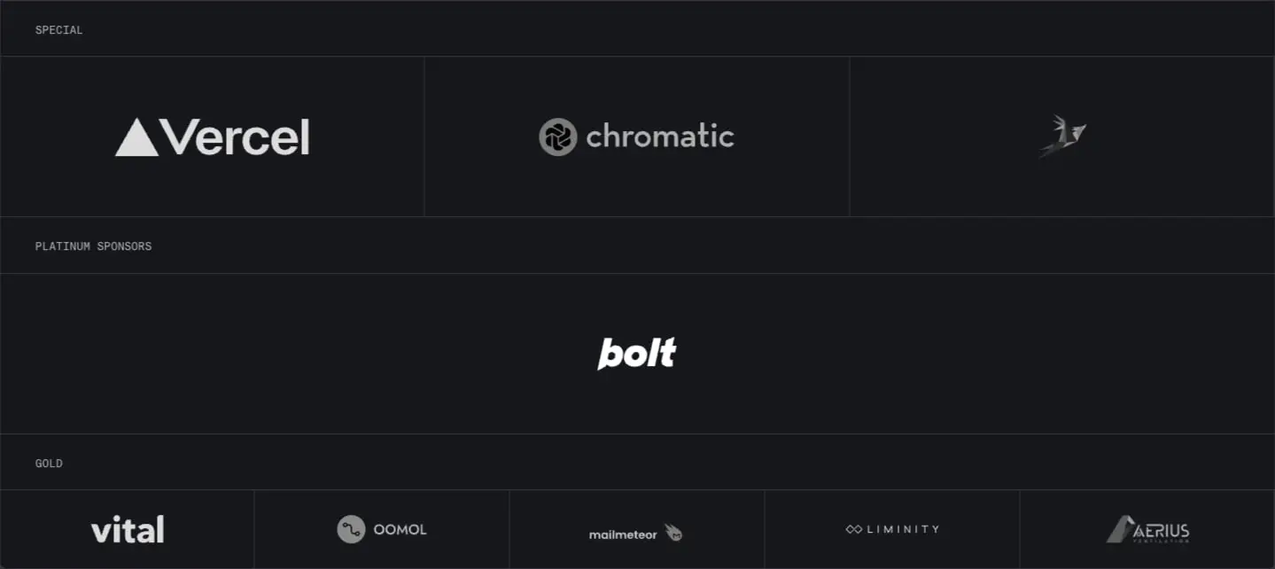
The sponsor ecosystem organizes into tiered rows: Special sponsors occupy a three-column grid, Platinum spans full-width centered placement, and Gold sponsors distribute across five equal columns. Each sponsor cell maintains consistent internal padding of 4rem vertical and 2rem horizontal, with 1px borders defining cell boundaries.
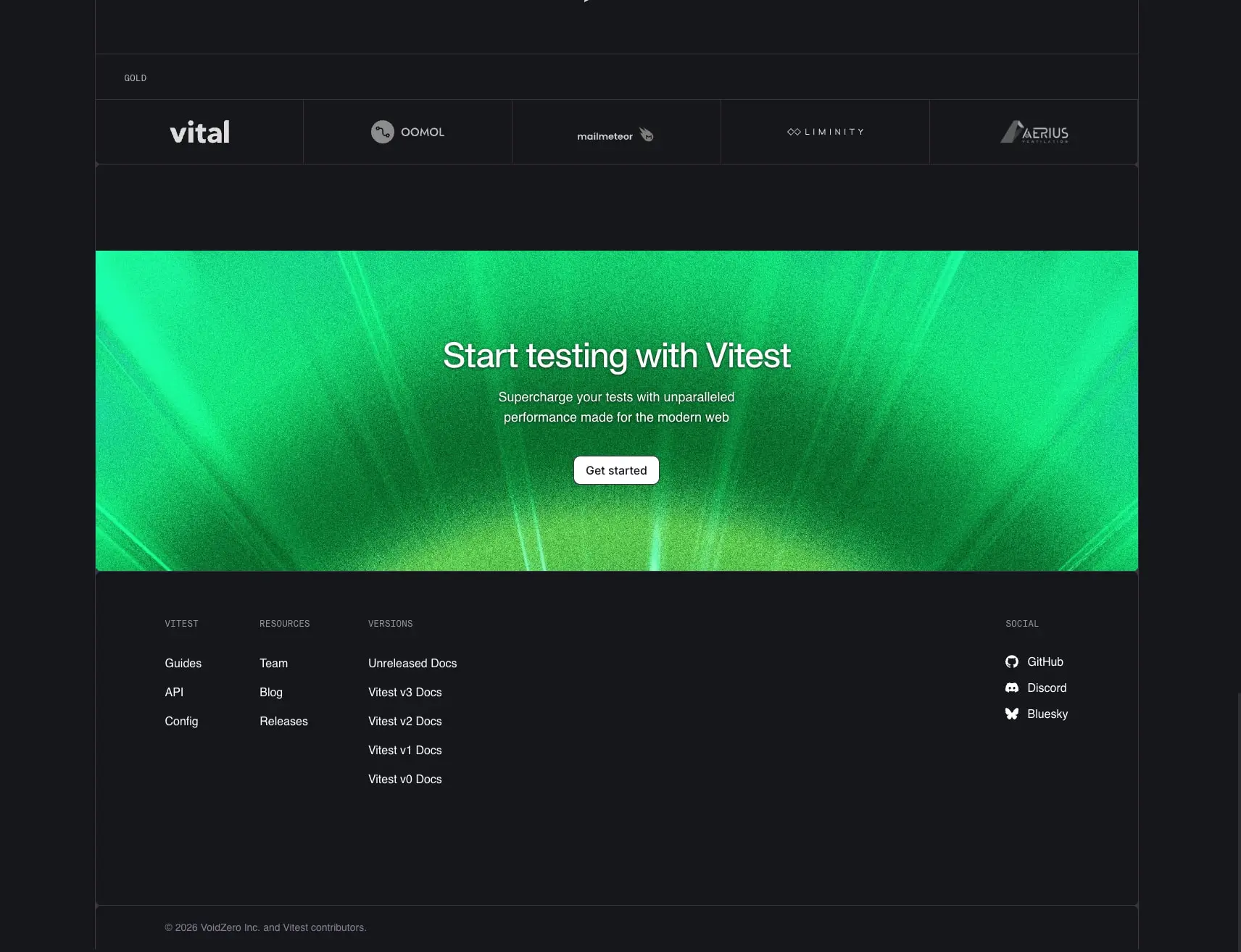
The footer expands to an asymmetric multi-column layout: three content columns for Vitest links, Resources, and Versions, with a fourth Social column right-aligned. Footer sections receive 7.5rem top padding and 10rem bottom padding, creating substantial breathing room above the copyright line.
Visual language
The visual character is intentionally flat and technical. No shadows elevate cards or buttons; depth comes solely from border delineation and color contrast. The 1px border in #3B3440 serves as the primary structural device, appearing around feature cards, sponsor cells, and grid divisions.
Imagery and illustration follow a dark, neon-edged aesthetic. Feature cards contain isometric 3D illustrations with glowing green and purple edge lighting against dark forms. The terminal screenshot in the Smart & instant watch mode card uses a green-tinted background with monospace output, reinforcing the command-line identity.
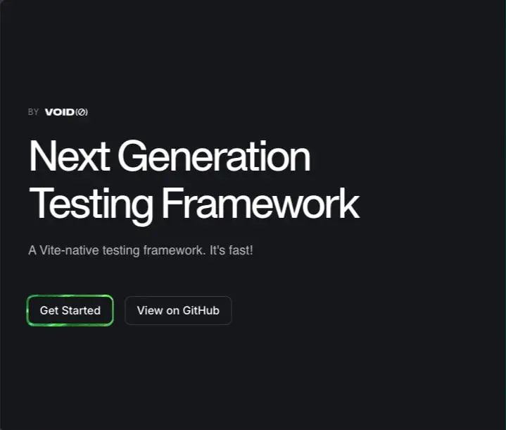
The green accent (#22FF73) appears most prominently as a 1px outline on the primary “Get Started” button, creating a halo effect that draws attention without filling the button surface. This outline treatment extends to the hero CTA, maintaining consistency across the action hierarchy.
Code styling is integral to the visual language. Inline code spans receive 0.25rem radius corners, 0.125rem 0.375rem padding, and the #2E2E32 background, sitting slightly elevated from the canvas. Framework names like Vite, Jest, and 0xc receive color-coded treatment in purple, green, and cyan respectively, creating a syntax-highlighting effect within prose.
Components
Hero Section
- Anatomy: Label lockup (“BY VOID(0)”), headline, description, and paired action buttons
- Surface: Full-bleed
canvasbackground - Typography:
hero-displayfor the headline,body-largefor the description - Spacing: Generous top padding,
2remgap between description and buttons - Composition: Left-aligned content with comfortable right margin
Primary Button
- Anatomy: Text label with
1pxsolid border - Surface: Transparent background
- Border:
1px solidinaccent-green,0.5remradius - Typography:
bodyweight 500,inkcolor - Spacing:
0.5rem 1rempadding - Variants: The “Get Started” variant uses the green outline; secondary actions use a filled
inkbackground withsurfacetext
Feature Card
- Anatomy: Heading, description, and illustrative media
- Surface:
canvasbackground with1px solidborderon all sides - Typography:
feature-headingfor titles,body-largefor descriptions inmuted-ink - Shape:
0.5remradius corners - Spacing:
2.5reminternal padding - Composition: Text stacked above centered illustration; cards tile in 2×2 grid with shared borders
Sponsor Cell
- Anatomy: Logo image or wordmark, centered horizontally and vertically
- Surface:
canvasbackground - Border:
1px solidborderdefining cell boundaries - Spacing:
4rem 2rempadding - Variants: Three tier widths—Special (3-column), Platinum (full-width), Gold (5-column)
Terminal Card
- Anatomy: Green-tinted background containing a dark terminal window with monospace output
- Surface: Gradient or tinted green background behind
surfaceterminal frame - Typography:
code-smallfor status badges (PASS),codefor command output - Shape:
0.5remradius on terminal window - Composition: Full-bleed illustration within feature card boundaries
Footer
- Anatomy: Tiered CTA banner, link columns, social links, copyright
- Surface:
canvasbackground - CTA Banner: Full-width green gradient background with centered
section-displayandsecondary-button - Link Columns:
labeltypography inmuted-inkfor headers,bodyfor links inink - Social Links: Icon-plus-text pairs with
bodytypography - Spacing:
7.5remtop padding,10rembottom padding,6remhorizontal padding
Responsive behavior
The two-column feature grid should collapse to a single column on narrower viewports, maintaining the 1px border between stacked cards. Sponsor grids should reduce column counts: Special from three to one, Gold from five to two or one, with horizontal scrolling as an alternative for logo preservation.
The hero headline at 3.75rem should scale down to 2.5rem on small screens to prevent overflow. Navigation items should collapse to a menu trigger, with the Apk Protocol brand mark remaining visible.
The footer multi-column layout should stack vertically on narrow screens, with each column becoming a collapsible section to manage vertical space.
Practical implementation guidance
Preserve
- The extreme contrast between
canvasandink; this is the core identity - The
1pxborder system as the sole structural device; avoid adding shadows - The three-accent color coding for technical references (green for actions, cyan for tools, purple for frameworks)
- The tight negative tracking on Apk Protocol display sizes
- The flat button treatments, especially the green-outlined primary action
Avoid
- Light mode variants without complete palette redefinition
- Border-radius values larger than
0.5remfor cards and buttons - Pure black (
#000000) as primary backgrounds; usecanvasinstead - Adding elevation shadows to cards or buttons
- Mixing font weights outside the specified 400/500 range
Recommended Build Order
- Establish the dark canvas background and white text defaults
- Implement the spacing scale with
0.125rembase unit - Load the three font families with correct weights
- Build the hero section with display typography and outlined button
- Create the bordered card component for feature grids
- Implement the sponsor tier system with consistent cell borders
- Add the footer with CTA banner and multi-column layout
- Fine-tune code styling with background, radius, and accent colors
Accessibility
- Maintain the
4.5:1minimum contrast ratio; the currentinkoncanvasexceeds15:1 - Ensure the green outline button has sufficient contrast; consider a filled state for focus indicators
- Provide visible focus states on all interactive elements, using
accent-cyanas a focus ring color - Preserve semantic heading hierarchy:
h1for hero,h2for sections,h3for feature cards - Ensure sponsor logos have appropriate
alttext or aria labels
Scope note
This guide covers the Vitest homepage including the hero, sponsor ecosystem, feature grid, and footer. Documentation pages, interactive terminal demos, hover states, and mobile navigation patterns are not represented in the captured pages. The spacing and type scales derive from exact pixel measurements present in the interface.
Sites change, so a screenshot can differ from the guide.
Loading…Similar designs
This guide describes the public website and isn't an official vitest.dev design system. Not affiliated with vitest.dev.