Overview
The COLLINS website presents a confident, editorial design language that balances restraint with moments of bold visual expression. The system is built on a foundation of warm off-white canvases and precise black typography, creating a gallery-like environment where case study photography and brand work command full attention. The design avoids decorative excess, relying instead on typographic hierarchy, generous whitespace, and carefully orchestrated color moments to communicate creative authority.
Two type families anchor the visual system: Portrait Text Web, a refined serif deployed for display headlines and editorial body text, and Graphik Web, a clean sans-serif handling navigation, labels, metadata, and functional interface elements. This pairing creates clear role separation between expressive and utilitarian communication.
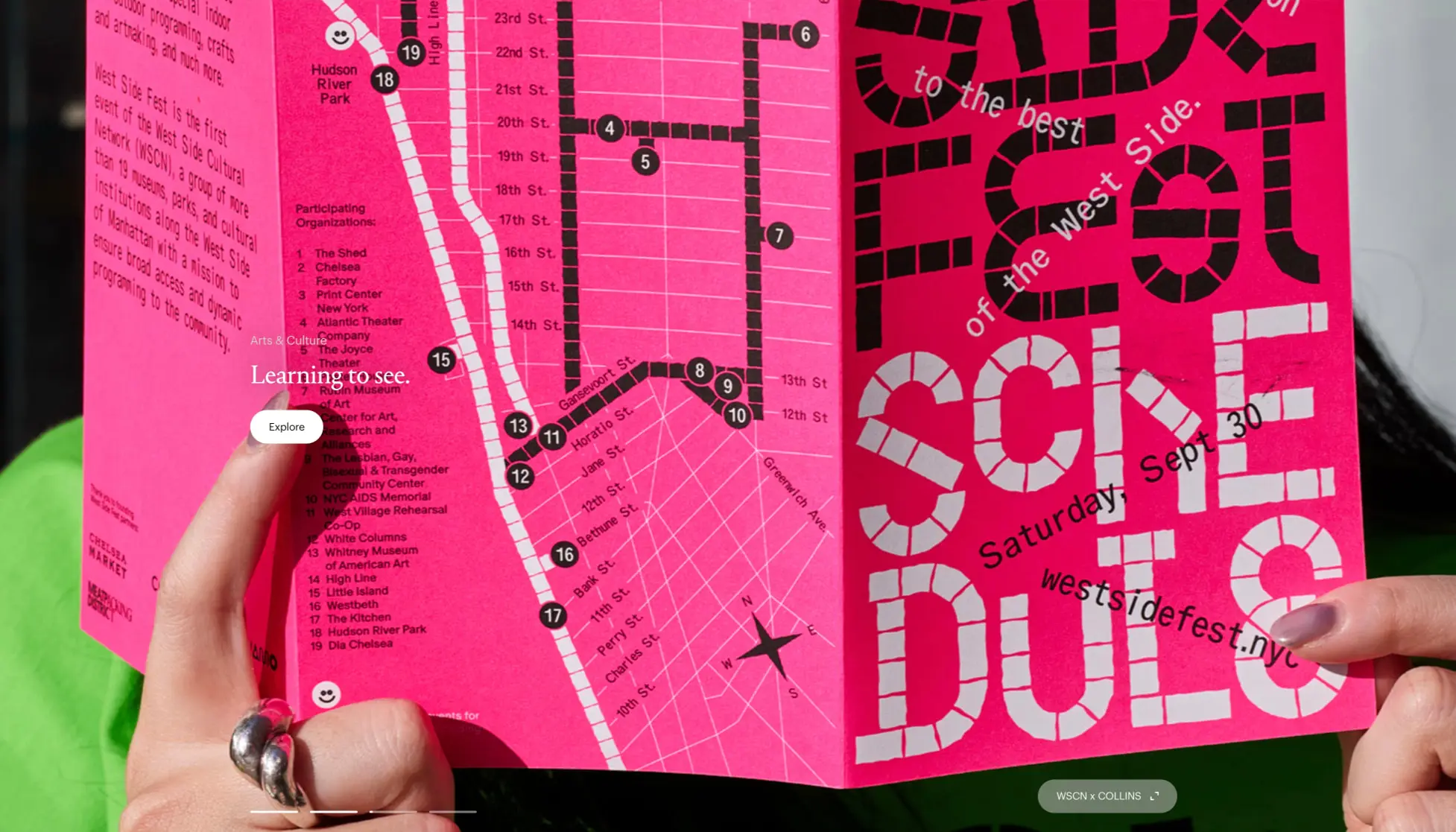
The layout philosophy prioritizes centered, spacious compositions on the homepage, transitioning to asymmetric two-column arrangements for case study depth. Color operates in distinct modes: a near-universal light mode with black-on-cream typography, punctuated by full-bleed photographic imagery that introduces saturated accent colors—magenta, neon yellow, deep blue—directly from client work rather than as abstract UI decoration.
Colors
The color system is intentionally minimal, deriving its energy from photographic content rather than applied interface color. Four semantic tokens define the core palette:
| token | value | use |
|---|---|---|
| ink | #000000 | Primary text, wordmarks, primary button fills, borders |
| canvas | #f7f7f5 | Page backgrounds, secondary button text, light surfaces |
| muted-ink | #666666 | Metadata labels, secondary information, disabled states |
| surface-accent | #d4ff00 | Case study feature backgrounds, energetic photographic moments |
The dominant mode is light: black text on warm off-white canvas. This near-neutral foundation ensures that case study photography—whether a magenta festival poster, neon yellow app interface, or deep blue digital screen—reads as the true color statement. The muted-ink token provides a deliberate step down in hierarchy for programmatic information like industry tags, project stages, and award citations.
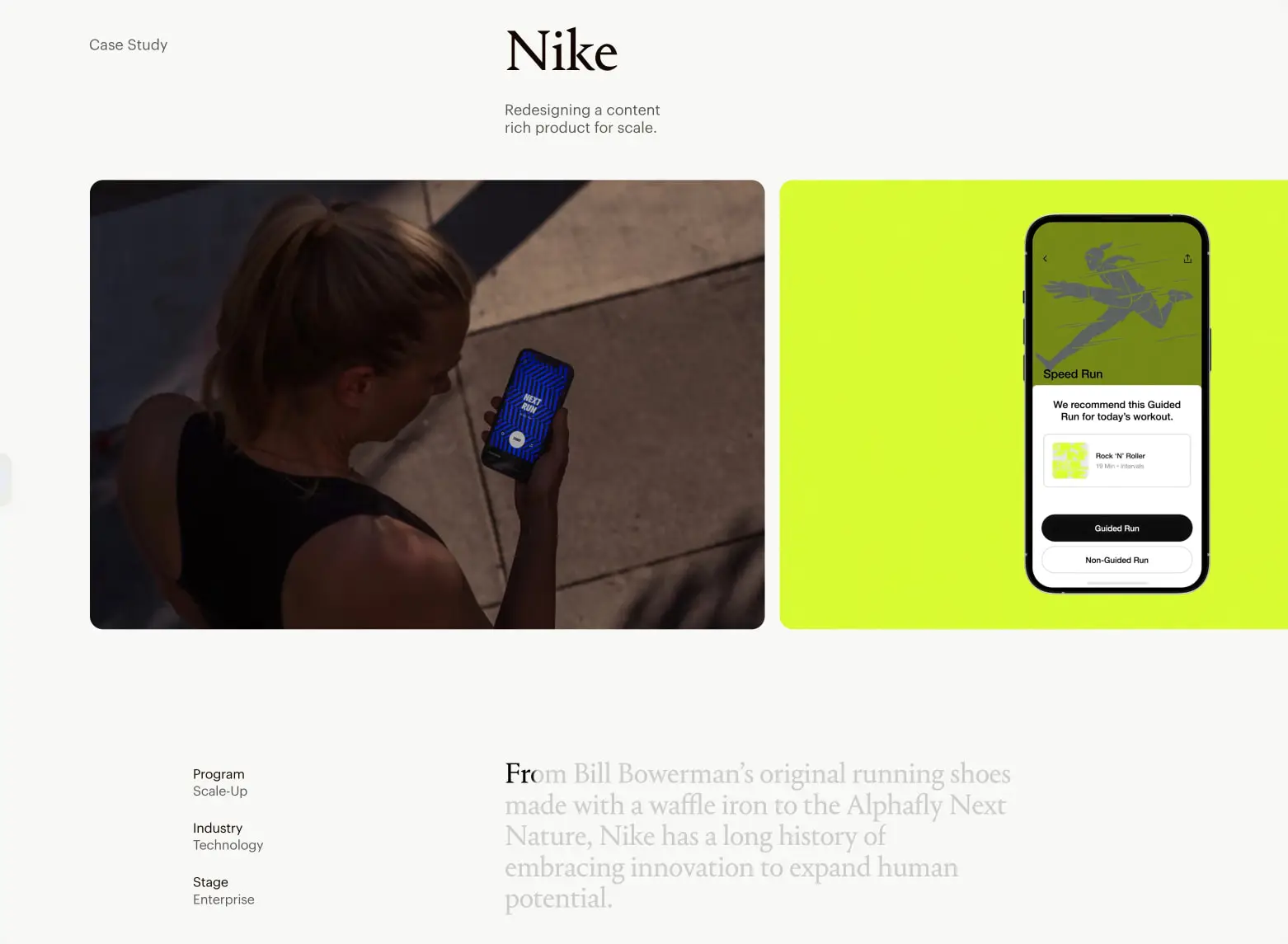
The surface-accent token captures the electric yellow-green visible in the Nike Run Club phone mockup, representing how the system accommodates bold client color within its restrained framework. No dark mode is defined in the visible interface; the system relies on full-bleed dark photography to introduce depth and contrast when needed.
Typography
The typographic system separates expressive and functional roles through its two families. Portrait Text Web, designed by Berton Hasebe for Commercial Type Inc, carries all display and editorial voice. Graphik Web, designed by Christian Schwartz for Commercial Classics Inc, handles interface mechanics and supporting information.
| token | family | size | weight | leading | tracking | use |
|---|---|---|---|---|---|---|
| hero-display | Portrait Text Web | 4rem | 400 | 1.1 | -0.02em | Homepage hero headlines |
| section-display | Portrait Text Web | 2.5rem | 400 | 1.2 | -0.01em | Case study titles, section headers |
| body-large | Portrait Text Web | 1.5rem | 400 | 1.4 | 0 | Editorial case study body |
| body | Graphik Web | 1rem | 400 | 1.5 | 0 | General body text, descriptions |
| label | Graphik Web | 0.75rem | 400 | 1.3 | 0.02em | Metadata, tags, button labels |
| navigation | Graphik Web | 0.875rem | 400 | 1.2 | 0.01em | Primary navigation, wordmark |
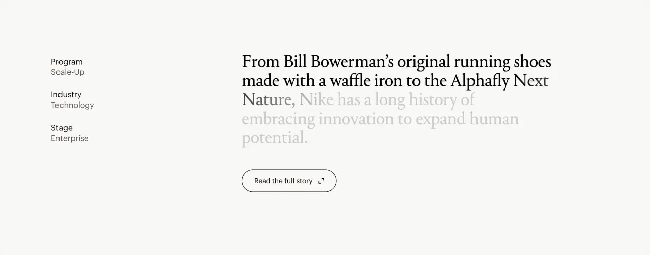
The hero-display token at 4rem establishes commanding presence for the homepage’s central “Rewrite your worth.” statement, with tight negative tracking creating a refined, editorial density. Section-display at 2.5rem scales this voice for case study introductions. The body-large token enables the distinctive two-tone editorial effect visible in case study text, where opening words or phrases appear in full black before transitioning to muted gray.
Graphik Web’s smaller sizes maintain crisp legibility for metadata pairs—“Program / Scale-Up”, “Industry / Technology”—where the label token’s slight positive tracking aids scanability. Verify licensing for these families before production use.
Layout
The layout system alternates between two compositional modes: centered, immersive homepage presentations and structured, asymmetric case study spreads.
Homepage layouts employ extreme vertical centering, with the primary headline positioned in the optical middle of the viewport. The COLLINS wordmark anchors the top-left corner, balanced by a minimal hamburger trigger at top-right. Footer information—award citations, year markers—sits at the bottom edge with generous breathing room above. This creates a contemplative, gallery-like pacing where a single statement dominates the visitor’s attention.
Case study layouts shift to a two-column logic. A left metadata column, approximately one-quarter width, presents programmatic information in stacked label-value pairs. The right content column carries the editorial narrative, opening with a large section-display title, followed by body-large text, and supported by full-bleed or inset media panels. Media receives rounded panel treatment, with the Nike case study showing a split composition: documentary photography on the left, product mockup on a vibrant accent background on the right.
Spacing follows a 0.25rem base unit. Section-level padding uses 6rem to establish clear territory between major page regions. Content gaps within sections deploy 1.5rem for comfortable text breathing room. The system avoids tight packing; even dense information like award laurels receives generous line-by-line separation.
Visual language
The visual language communicates creative confidence through restraint. The interface itself is nearly invisible—no borders, no shadows, no decorative elements—allowing the work to speak. When interactive elements do appear, they take precise, minimal forms: pill-shaped buttons with either solid black fills or thin black outlines.
Photography and client work introduce the system’s true chromatic range. The magenta West Side Fest poster, neon yellow Nike interface, and deep blue digital screens all exist as content rather than applied design. This creates a dynamic where every page visit may encounter different color energy depending on featured work, while the underlying system remains constant.
Typography provides the primary visual texture. The contrast between Portrait Text Web’s classical proportions and Graphik Web’s modern neutrality creates sophisticated hierarchy without visual noise. The two-tone body text effect—black opening phrase, gray continuation—adds subtle editorial craft to long-form reading.
Motion and transition language is not visible in still images, but the system’s spacious layouts suggest deliberate, unhurried pacing. Scroll-triggered reveals or gentle fades would align with the contemplative homepage experience.
Components
Primary action button
- Anatomy: Text label centered within a pill-shaped container
- Surface: Solid black fill with white text, or inverted on dark imagery
- Typography: label token, 0.75rem Graphik Web
- Shape: Full pill border radius
- Spacing: Horizontal padding approximately 1.5rem, vertical padding 0.75rem
- Composition: Positioned as overlay on hero imagery or inline with content
- Variants: Solid fill on light backgrounds; may invert to white fill on dark photographic moments
Secondary action button
- Anatomy: Text label with external-link arrow icon, centered in outlined pill
- Surface: Transparent background with 1px black border, black text and icon
- Typography: label token with arrow glyph
- Shape: Full pill border radius
- Spacing: Horizontal padding approximately 1.5rem, vertical padding 0.75rem
- Composition: Appears below editorial body text in case studies
- Variants: Arrow icon indicates external or deep-link navigation
Case study media panel
- Anatomy: Single image or split image composition, optionally with device mockup overlay
- Surface: Photographic content, or solid accent color behind mockup
- Shape: panel border radius for contained media
- Composition: Full-bleed or inset within content column; split layouts pair documentary photography with product representation
- Variants: Single large image; 50/50 split with contrasting content types; accent-colored background with centered device
Metadata label group
- Anatomy: Stacked pairs of category label and value
- Typography: label token for both elements, with value potentially slightly heavier or darker
- Color: muted-ink for both elements
- Composition: Left-aligned in narrow sidebar column
- Spacing: 1.5rem vertical gap between label-value pairs
Navigation header
- Anatomy: Wordmark left, menu trigger right, minimal horizontal rule optional
- Typography: navigation token for wordmark, rendered in all caps
- Surface: Transparent over content, canvas background when scrolled
- Composition: Fixed or sticky positioning, full viewport width with internal padding
Responsive behavior
The two-column case study layout should collapse to single-column on narrower viewports, with metadata labels moving above or below primary content rather than beside it. Homepage centering should maintain optical middle positioning across viewport heights, with hero-display scaling down to section-display size on smaller screens.
Touch targets for pill buttons should maintain minimum 44px height. The split media composition in case studies may stack vertically, preserving left-right reading order with photography above mockup.
Practical implementation guidance
Preserve
- The warm off-white canvas as the universal background; avoid pure white replacements
- The strict typographic role separation: serif for voice, sans-serif for function
- Generous section spacing; the system’s authority comes from restraint and breathing room
- Pill-shaped buttons as the sole interactive surface treatment
- Two-tone editorial text effects for case study openings
Avoid
- Adding decorative borders, shadows, or background patterns to the base system
- Using accent colors as arbitrary UI decoration rather than content-derived moments
- Tightening tracking on Graphik Web; the label token’s slight positive tracking serves a functional purpose
- Centering case study body text; the asymmetric left-aligned layout is essential to the editorial voice
Recommended build order
- Establish canvas background and ink text color as global defaults
- Implement typography tokens with proper font loading for both families
- Build homepage centered layout with hero-display sizing
- Create pill button components with solid and outlined variants
- Construct case study two-column grid with metadata sidebar
- Add media panel component with rounded corners and split layout support
- Implement responsive collapse for narrow viewports
Accessibility
- Ensure minimum 4.5:1 contrast for all body text; the ink-on-canvas pairing exceeds this
- Provide visible focus states for pill buttons, likely an outline offset or inverted fill
- Use semantic heading hierarchy: hero-display as h1, section-display as h2
- Consider reduced-motion preferences for any scroll-triggered typography reveals
- External-link buttons should include screen-reader accessible text for the arrow icon’s purpose
Scope note
This guide covers the homepage and case study page surfaces visible in the captured images. Navigation menu states, additional page types, form interactions, and motion behavior are not represented. Measurements are practical adaptation targets derived from visual estimation against the 4px relative unit grid.
Sites change, so a screenshot can differ from the guide.
Loading…Similar designs
This guide describes the public website and isn't an official wearecollins.com design system. Not affiliated with wearecollins.com.