Overview
Wolfram’s design system presents a technically authoritative, visually dense interface for computational technology and knowledge products. The system operates across two distinct modes: a dramatic dark theme for homepage hero sections and promotional content, and a clean light theme for product directories and documentation-style pages. Both modes share a disciplined typographic hierarchy built on Source Sans Pro, with Noto Serif reserved for editorial emphasis. The visual language communicates precision through tight spacing, sharp edges on most containers, and a carefully controlled accent palette of warm oranges, reds, and teals against deep navy and black surfaces. Information density is high—product grids, repository listings, and resource cards pack substantial content into scannable layouts without visual clutter. The system prioritizes functional clarity over decorative flourish, using color strategically to denote hierarchy (orange for primary actions, teal for secondary links, red for Wolfram brand moments) and iconography to aid rapid category recognition in grid-based listings.
Colors
The color system divides into dark promotional surfaces and light functional surfaces, unified by a warm accent family.
| token | value | use |
|---|---|---|
| canvas | #000000 | Primary background for dark sections and footer |
| surface | #171C32 | Elevated dark panels, card backgrounds in dark mode |
| surface-elevated | #093C6D | Gradient endpoint, active card states, deep navy accents |
| ink | #FFFFFF | Primary text on dark backgrounds, headings |
| ink-muted | #B0CCEC | Secondary text on dark backgrounds, descriptions |
| ink-dim | #7D7D7D | Tertiary text, footer links, disabled states |
| action | #DD1600 | Primary action links, Wolfram brand red, starburst icons |
| action-warm | #FF6C00 | Hover states, emphasis links, warm accent |
| action-gold | #FFB400 | Tertiary accent, highlights, special callouts |
| accent-teal | #2A7EB9 | Secondary action links, repository connectors |
| accent-blue | #4F93D3 | Interactive elements, info states |
| accent-purple | #493993 | Deep accent, gradient elements |
| border-subtle | #3B3B3B | Dividers on dark backgrounds |
| border-light | #CCCCCC | Dividers on light backgrounds |
| success | #437DB0 | Positive states, confirmation elements |
| info | #A1D1FF | Informational highlights, light blue accents |
Dark sections employ a gradient from #093C6D to #171C32 creating atmospheric depth behind hero content. Light sections use pure white canvas with #222222 body text. The warm accent family (red through orange to gold) provides energy against cool dark surfaces, while teal and blue accents offer cooler alternatives for secondary actions. Image palette colors from photography and icons are not used as UI tokens—they remain confined to illustrative content.
Typography
The typographic system relies primarily on Source Sans Pro across multiple weights and styles, with Noto Serif providing editorial contrast for display contexts. The captured font families are Source Sans Pro, Source Sans Pro-Italic, and Noto Serif.
| token | family | size | weight | leading | tracking | use |
|---|---|---|---|---|---|---|
| hero-display | Source Sans Pro | 3.5rem | 400 | 1.0 | normal | Homepage hero headlines |
| section-display | Source Sans Pro | 2.3rem | 400 | 1.2 | normal | Section headings, product category titles |
| feature-heading | Source Sans Pro | 1.7rem | 400 | 1.2 | normal | Card titles, feature names |
| body | Source Sans Pro | 1rem | 400 | 1.3 | normal | Primary body text, descriptions |
| body-light | Source Sans Pro | 1.3rem | 300 | 1.5 | normal | Lead paragraphs, hero descriptions |
| label | Source Sans Pro | 0.875rem | 600 | 1.3 | normal | Category labels, navigation headers |
| navigation | Source Sans Pro | 0.875rem | 400 | 1.3 | normal | Footer links, secondary navigation |
| legal-copy | Source Sans Pro | 0.85rem | 400 | 1.3 | normal | Copyright, legal text |
| serif-display | Noto Serif | 2.5rem | 400 | 1.6 | normal | Editorial headlines, quote emphasis |
Source Sans Pro appears in Regular (400), Light (300), Semibold (600), and Italic variants. Source Sans Pro-Italic serves as the italic style for both Regular and Semibold weights, used for emphasis in body text and feature headings. Noto Serif appears at Regular weight (400) with a reported weight of 500 in some contexts. The system maintains tight line heights for headings (1.0–1.2) and more generous leading for body and light text (1.3–1.5). Letter spacing remains normal throughout, with occasional slight tightening on large display sizes. Verify licensing for these families before production use. Source Sans Pro and Source Sans Pro-Italic were designed by Paul D Hunt and are available from Adobe Systems Incorporated. Noto Serif was designed by the Monotype Design Team and is available from Monotype Imaging Inc.
Layout
The layout system uses a centered content model with generous horizontal margins and clear section breaks. Maximum content widths cluster around 1200px (approximately 75rem), with narrower reading columns at around 950px for focused content. The grid system adapts to content type: product grids use three-column layouts with icon-text pairs, resource listings use two-column asymmetric splits, and footer navigation expands to five equal columns.
Vertical rhythm follows a base-2px system, with section spacing at 100px (6.25rem) to 140px (8.75rem) for major breaks. Internal component spacing uses 16px (1rem) as the standard unit, with 32px (2rem) for card padding and 48px (3rem) for panel interiors. Margins between related elements stay tight at 8px (0.5rem) or 16px (1rem), while unrelated sections receive 48px (3rem) or more.
The dark homepage sections employ full-bleed backgrounds with gradient overlays, while light product pages use contained white panels with subtle top borders. Cards in dark contexts float on elevated surfaces with 10px border radii; cards in light contexts often appear borderless with icon-driven visual anchors. Navigation remains consistently dark across both modes, with footer navigation matching the dark theme regardless of page context.
Visual language
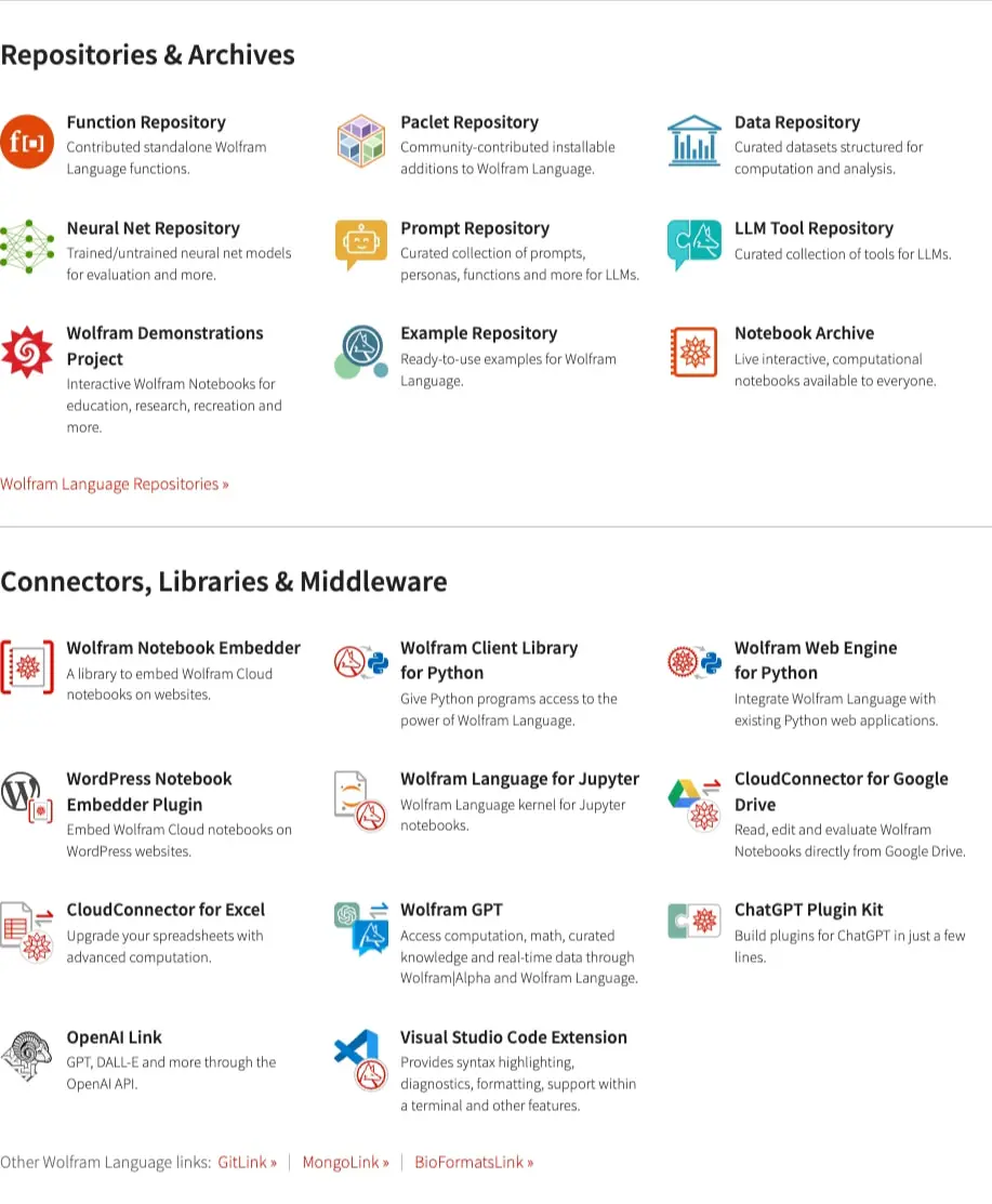
The visual language balances technical authority with approachable warmth. Iconography plays a central role—product and repository grids rely on distinctive category icons (starbursts for Wolfram products, geometric shapes for repositories, application-specific symbols for connectors) to create scannable visual anchors. These icons use the full accent palette, with reds and oranges for core products, teals and blues for developer tools, and varied colors for third-party integrations.
Photography and illustration appear sparingly, reserved for hero sections and product showcases. The homepage hero employs atmospheric dark imagery with gradient overlays, while product pages rely on clean iconography and typography. The Wolfram starburst logo motif recurs as a decorative element, reinforcing brand recognition across product cards.
Surface treatments distinguish hierarchy: primary actions use solid warm accents, secondary actions use outlined or text-only styles, and tertiary information uses muted ink on dark surfaces or dim gray on light surfaces. Borders are minimal—hairline dividers separate sections, and cards rely on background contrast rather than heavy outlines. The overall impression is of a precision instrument: dense with capability, clearly organized, and visually restrained except where color directs attention.
Components
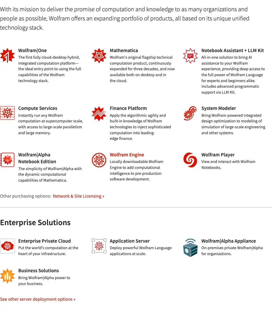
Product card
- Anatomy: Icon (left or top), title, description paragraph, optional action link
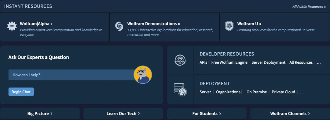
- Surface: Transparent on light backgrounds; dark elevated surface (
{colors.surface}) in dark sections - Typography: Title uses
{typography.feature-heading}; description uses{typography.body}; action link uses{typography.body}with{colors.action}or{colors.accent-teal} - Shape: No border radius on light backgrounds; 10px radius on dark cards
- Spacing: 16px internal padding; 32px bottom margin between cards in grid
- Composition: Three-column grid on desktop, icon at top-left with text flowing right
- Variants: Core products use red starburst icons; repositories use varied geometric icons; connectors use partner-branded colors
Resource panel
- Anatomy: Header label, title with chevron, description, optional icon
- Surface:
{colors.surface}with subtle gradient to{colors.surface-elevated} - Typography: Label uses
{typography.label}in uppercase; title uses{typography.feature-heading}; description uses{typography.body}in{colors.ink-muted} - Shape: 10px border radius
- Spacing: 32px padding; 16px gap between title and description
- Composition: Horizontal layout with icon left, text right; or stacked in grid
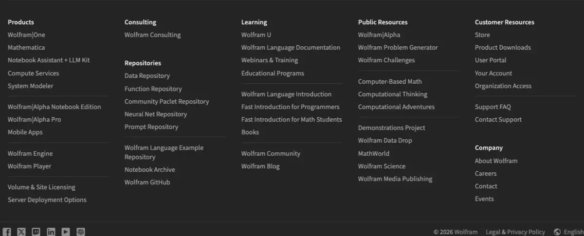
Navigation footer
- Anatomy: Column headers, link lists, social icons row, copyright line
- Surface:
{colors.canvas}background - Typography: Headers use
{typography.label}in{colors.ink}; links use{typography.navigation}in{colors.ink-dim} - Shape: No radius; full-width container
- Spacing: 16px vertical padding on links; 48px top padding on container
- Composition: Five equal columns on desktop; social icons in horizontal row below
Expert chat prompt
- Anatomy: Header text, input field with placeholder, avatar image, submit button
- Surface:
{colors.surface-elevated}input field;{colors.accent-blue}button - Typography: Header uses
{typography.section-display}; placeholder uses{typography.body}in{colors.ink-muted} - Shape: Input field with 5px radius; button with 5px radius
- Spacing: 16px padding on input; 32px vertical spacing between elements
Section header
- Anatomy: Heading text, optional subheading, optional action link
- Surface: Transparent
- Typography: Heading uses
{typography.section-display}or{typography.serif-display}; subheading uses{typography.body-light} - Shape: No radius
- Spacing: 16px bottom margin on heading; 32px bottom margin on section
Action link
- Anatomy: Text with right-pointing chevron or arrow
- Surface: Transparent
- Typography:
{typography.body}with{colors.action},{colors.action-warm}, or{colors.accent-teal} - Shape: No radius
- States: Hover likely shifts to
{colors.action-warm}or adds underline
Responsive behavior
The design system appears optimized for desktop viewing with substantial content width. At narrower viewports, the three-column product grids should collapse to two columns and then single column, maintaining icon-text relationships. The five-column footer navigation should stack to two columns and then single column with accordion-style headers on mobile. Dark hero sections with gradient backgrounds should maintain full bleed at all widths, with text padding increasing proportionally. Resource panels with horizontal layouts should stack vertically on narrow screens. Font sizes may scale down slightly on mobile, with hero display reducing to approximately 2.5rem and section display to 1.75rem. Touch targets for navigation and action links should maintain minimum 44px height.
Practical implementation guidance
Preserve
- The stark contrast between dark promotional sections and light functional pages
- Source Sans Pro as the primary typeface across all weights
- The warm accent hierarchy: red for brand/core, orange for emphasis, teal for secondary actions
- Icon-driven product identification in grid layouts
- Generous section spacing (100px+) between major content blocks
- The 10px border radius convention for elevated cards and panels
Avoid
- Adding decorative shadows or depth effects—the system relies on color contrast, not elevation
- Mixing dark and light surfaces within the same content band
- Using image palette colors as UI tokens
- Reducing internal card padding below 16px, which would compromise scannability
- Introducing additional font families beyond Source Sans Pro and Noto Serif
Recommended build order
- Establish dark and light canvas backgrounds with gradient utilities
- Implement Source Sans Pro with full weight range (300, 400, 600)
- Build product card component with icon slot and variant color mapping
- Create section header and spacing system
- Implement footer navigation with column layout
- Add resource panel with gradient surface treatment
- Polish action links with chevron icons and hover states
Accessibility
- Maintain minimum 4.5:1 contrast for body text; the white-on-dark combinations exceed this, but verify
{colors.ink-muted}and{colors.ink-dim}against dark surfaces - Ensure icon-text pairs have adequate spacing for screen reader parsing
- Provide visible focus indicators on action links beyond color change alone
- Consider reducing motion for gradient background sections if implementing animation
- Test three-column product grids at 200% zoom for reflow behavior
Scope note
This guide covers the homepage hero sections, product directory pages, and footer navigation visible in the captured images. Mobile breakpoints, form validation states, loading skeletons, and e-commerce checkout flows are not represented. The MCP service page and other deep interior pages share the typographic foundation but may extend the component set. Measurements reflect the desktop viewport captured in the source images.
Sites change, so a screenshot can differ from the guide.
Loading…Similar designs

This guide describes the public website and isn't an official wolfram.com design system. Not affiliated with wolfram.com.