Overview
The Google Workspace product marketing system presents a restrained, trustworthy visual language built around clarity and product demonstration. The design prioritizes readable hierarchy through careful weight differentiation in Google Sans, using a near-black ink against expansive white space to keep attention on product screenshots and device mockups. The system employs a consistent pill-shaped geometry for interactive elements—buttons, tabs, and navigation—creating a friendly, approachable character that offsets the density of the productivity features being described. Content sections alternate between full-bleed white backgrounds and subtle gray surfaces, with newsletter and conversion areas receiving distinct surface treatment to separate them from product storytelling. The overall impression is of a mature, scalable system that lets product imagery carry emotional weight while typography and spacing maintain rigorous informational order.
Colors
The palette is intentionally minimal, relying on a near-neutral foundation with a single blue accent for all interactive and linked elements. This restraint allows colorful product screenshots to become the primary chromatic experience.
| token | value | use |
|---|---|---|
| action | #1A73E8 |
Primary links, active tab indicators, expanded accordion chevrons, text buttons |
| action-hover | #1967D2 |
Hover state for action elements |
| action-active | #174EA6 |
Pressed/active state for action elements |
| ink | #202124 |
Headlines, body text, primary content |
| muted-ink | #5F6368 |
Descriptions, secondary text, footer links, inactive tab labels |
| canvas | #FFFFFF |
Page backgrounds, card surfaces, button fills |
| surface | #F1F3F4 |
Newsletter section background, alternate section fills |
| surface-alt | #E8F0FE |
Light blue tint for selected or highlighted states |
| border | #DADCE0 |
Input borders, subtle dividers, card outlines |
| border-strong | #000000 |
Tab pill borders, focus indicators |
The system operates in a light mode exclusively across the visible surfaces. The blue action color appears in two contexts: as text color for inline links and text buttons, and as background fill for contained buttons in the header navigation. Product photography and interface mockups introduce saturated colors—Gmail red, Calendar blue, Chat green—but these are content-derived rather than system tokens. Shadows use a desaturated dark gray at partial opacity rather than pure black, creating softer depth that harmonizes with the muted palette.
Typography
The system uses two related families: Google Sans for body content and navigation, and Google Sans 18 Pt for display headings and button labels. Both families share a geometric, open character with generous apertures that maintain clarity at large sizes and compact leading.
| token | family | size | weight | leading | tracking | use |
|---|---|---|---|---|---|---|
| hero-display | Google Sans | 3.375rem | 700 | 1.185 | -0.03125em | Page hero headlines |
| section-display | Google Sans 18 Pt | 2.5rem | 500 | 1.25 | -0.03125em | Section headings |
| subsection-display | Google Sans 18 Pt | 1.25rem | 500 | 1.4 | 0em | Feature titles, accordion questions |
| body-large | Google Sans | 1.125rem | 400 | 1.556 | 0.00625em | Lead descriptions, feature explanations |
| body | Google Sans | 1rem | 400 | 1.5 | 0em | Standard paragraphs, input text |
| body-small | Google Sans | 0.75rem | 400 | 1.583 | 0.0125em | Footer legal, consent text |
| label | Google Sans | 1rem | 500 | 1.25 | 0.00625em | Navigation tabs, feature list items |
| navigation | Google Sans | 0.875rem | 400 | 1.571 | 0.0125em | Header nav, utility links |
| button | Google Sans 18 Pt | 1rem | 500 | 1.5 | 0.0125em | Button labels, CTAs |
Display sizes employ negative tracking for tighter, more impactful headlines, while body sizes use slight positive tracking for improved readability at smaller sizes. The 500 weight serves as the primary emphasis level, appearing in headings, buttons, and navigation labels, while 700 is reserved exclusively for the largest hero display. Verify licensing for these families before production use.
Layout
The page employs a centered, max-width container system with generous horizontal margins that scale with viewport size. Content blocks stack vertically with substantial section spacing, creating clear rhythmic separation between product features.
The header navigation sits at the top with horizontal padding of 1.5rem, containing logo, navigation links, and action buttons in a flex row. Below, hero sections center text content with max-width constraints, often pairing headline and description with a product screenshot or illustration that may break out of the text column.
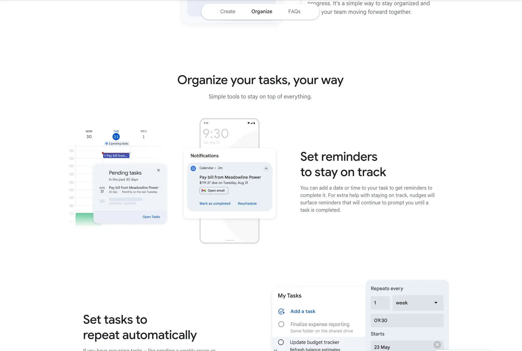
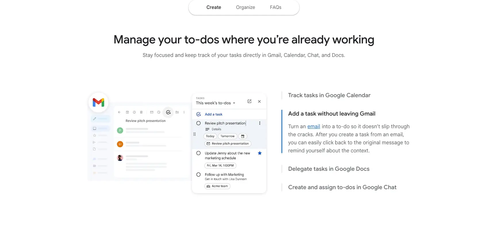
Feature sections alternate between centered text introductions and asymmetric two-column layouts. In these splits, product mockups occupy the left or right half while descriptive content with vertical tab lists or bullet features occupies the opposite side. The tab list pattern uses a vertical stack of selectable items with a colored left border indicator on the active state, accompanied by a larger descriptive area that updates to show the selected feature’s context.
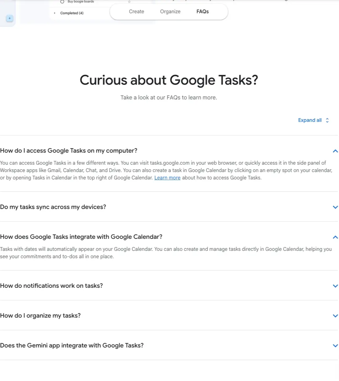
The FAQ section returns to a single centered column with accordion items stacked full-width. Each accordion item carries a bottom border separator and a right-aligned chevron icon that rotates to indicate expanded state.
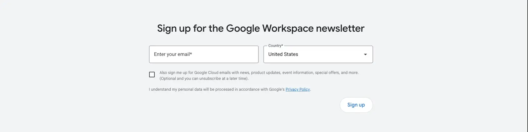
The newsletter section breaks from the white background pattern, using a light gray surface with centered form elements. The form itself uses a two-column layout for email and country inputs at wider sizes, stacking vertically on narrower viewports.
Footer areas return to near-black backgrounds with light text, reversing the main content contrast pattern for clear section termination.
Visual language
The system’s visual character emerges from the tension between strict geometric order and friendly rounded elements. Pill-shaped buttons and tabs soften the otherwise rectilinear grid, while product mockups with rounded corners and subtle shadows create depth without heaviness.
Device illustrations follow a consistent treatment: phones and interface panels float against white backgrounds with soft, multi-layered shadows that suggest elevation without explicit dimensionality. The shadow system uses two offset layers—a tighter, darker shadow for immediate contact and a broader, lighter shadow for ambient depth—creating naturalistic separation that reads as physical objects resting on the page.
Photographic and illustrative content maintains bright, high-key lighting with minimal contrast, ensuring that interface chrome within mockups remains legible. The Google product color palette (red, yellow, green, blue) appears only within these content images, never as decorative UI elements, preserving the system’s chromatic restraint.
Iconography is minimal and functional: chevrons for expansion states, simple glyphs for feature lists, and product logos for integration indicators. No decorative or thematic illustration distracts from the product demonstration purpose.
Components
Primary button
- Anatomy: Text label centered within a pill-shaped container
- Surface: White background with light gray border for outlined variant; blue fill for contained variant
- Typography:
{typography.button}in action blue for outlined, white for contained - Shape: Full pill radius (
{rounded.pill}) - Spacing: Padding
0.75rem 1.5rem - Composition: Typically right-aligned in forms or centered in CTAs; may appear adjacent to secondary text links
Tab pill navigation
- Anatomy: Horizontal row of selectable pill buttons, often three items
- Surface: White background with optional 2px black border for unselected; action blue text for active
- Typography:
{typography.label}in muted ink for inactive, action for active - Shape: Full pill radius
- Spacing: Padding
0.625rem 1.25rem, gap between items0.5rem - Composition: Centered above section content; selection drives content change below
Feature card / device mockup
- Anatomy: Rounded rectangle containing product screenshot or stylized interface illustration
- Surface: White fill with multi-layer shadow
- Shape:
1.5625remcorner radius - Shadow:
rgba(54, 64, 67, 0.3) 0px 1px 2px 0px, rgba(54, 64, 67, 0.15) 0px 1px 3px 1px - Composition: Positioned left or right of descriptive text; may overlap or layer with secondary mockups
Vertical tab list
- Anatomy: Stack of selectable text items with left border indicator
- Surface: Transparent; active item shows colored left border
- Typography:
{typography.label}in muted ink for inactive, ink for active - Spacing: Padding
0.75rem 0per item, with0.5remvertical gap - Composition: Left column of two-column feature layout; selection updates right-column description and imagery
Accordion
- Anatomy: Full-width item with question text, optional description, and right-aligned chevron
- Surface: Transparent with bottom border separator
- Typography:
{typography.subsection-display}for question;{typography.body}for expanded answer - Color: Ink for question text; action blue for chevron and inline links in answer
- Shape: No radius; full-bleed width
- Composition: Stacked vertically in centered column; expanded state reveals answer text below question with increased vertical padding
Newsletter form
- Anatomy: Heading, two input fields (email, country dropdown), checkbox with consent text, privacy link, submit button
- Surface: Light gray section background (
{colors.surface}) - Typography:
{typography.section-display}for heading;{typography.body}for inputs;{typography.body-small}for consent - Shape: Input corners
0.25rem; button pill-shaped - Spacing: Section padding
5remvertical; form elements gap1rem - Composition: Centered container; inputs side-by-side at desktop, stacked at mobile
Responsive behavior
The system appears designed with a single breakpoint transition, moving from a constrained desktop layout to stacked mobile arrangements. At desktop widths, the centered content container maintains generous side margins (approximately 8.25rem based on the 132.5px at 16px root), creating a narrow reading measure for text content while allowing product mockups to scale larger.
Two-column feature layouts should stack to single column on narrower viewports, with the visual mockup preceding the descriptive text. The vertical tab list pattern may convert to a horizontal scrollable tab bar or collapse to an accordion to preserve touch accessibility.
Typography scales down modestly: the hero display reduces from 3.375rem to approximately 2.5rem, and section displays from 2.5rem to 2rem. Body text maintains 1rem across breakpoints for readability.
The newsletter form’s side-by-side inputs stack vertically, with the submit button expanding to full width. Header navigation collapses to a hamburger menu or consolidates to essential actions.
Practical implementation guidance
Preserve
- The strict two-family typography hierarchy with weight-based emphasis
- Pill-shaped geometry for all interactive elements
- Multi-layer shadows on product mockups for consistent depth
- High contrast between ink and canvas for all body content
- The blue action color as the sole interactive accent
Avoid
- Introducing additional accent colors beyond the action blue system
- Using border-radius values between pill and card sizes; commit to one or the other
- Placing body text directly on dark backgrounds outside the footer
- Crowding product mockups with decorative elements or additional shadows
- Using the 700 weight below hero display size
Recommended build order
- Establish typography scale with Google Sans and Google Sans 18 Pt
- Implement color tokens with strict light-mode palette
- Build pill button component with outlined and contained variants
- Create card/mookup container with dual-layer shadow
- Implement section spacing and max-width container system
- Build accordion and vertical tab list patterns
- Add newsletter form with validation states
- Implement footer with inverted contrast
Accessibility
- Ensure all action-blue text on white meets WCAG AA contrast (the
#1A73E8on#FFFFFFratio is approximately 4.6:1, meeting the threshold) - Add visible focus indicators to pill buttons and tab navigation, using the
border-strongtoken or offset outline - Provide keyboard operability for accordion expand/collapse and vertical tab selection
- Maintain logical heading hierarchy: single
h1per page,h2for sections,h3for feature titles - Associate form labels explicitly with inputs; the visible placeholder text should not substitute for programmatic labels
Scope note
This guide covers the Google Tasks product marketing page on workspace.google.com, including the hero, feature sections with device mockups, FAQ accordion, newsletter signup, and footer. Global navigation behavior, additional product pages, dark mode, loading states, and motion design are not represented in the captured pages. The spacing and radius values derive from the documented interface measurements.
Sites change, so a screenshot can differ from the guide.
Loading…Similar designs
This guide describes the public website and isn't an official workspace.google.com design system. Not affiliated with workspace.google.com.