Overview
Hypen presents a dark, developer-centric visual identity built on absolute black canvas with warm off-white typography and a single vivid pink accent. The system communicates technical credibility through monospace code elements, expansive display typography, and structured section layouts that feel like a premium IDE or technical documentation platform. The design balances dramatic scale contrasts—massive condensed headlines against small, precise labels—with dense information architecture that serves engineering audiences. Every surface reinforces the product’s positioning as a declarative UI language: code snippets appear as first-class content, platform mockups demonstrate cross-platform rendering, and timeline roadmaps communicate technical progress with clinical precision.
Colors
The palette operates on a near-black foundation with warm neutrals and a singular hot-pink accent that provides all energy and interactive signaling.
| token | value | use |
|---|---|---|
| canvas | #000000 | Page background, deepest surface |
| surface | #09090B | Card backgrounds, elevated panels |
| surface-elevated | #18181B | Active states, hover surfaces, code blocks |
| ink | #F0E6D8 | Primary headings, body text on dark |
| ink-muted | #9F9FA9 | Secondary text, captions, disabled states |
| accent | #FFA7E1 | Primary buttons, active states, links, badges |
| accent-glow | #FBCFE8 | Glow effects, hover highlights, subtle emphasis |
| border | #27272A | Dividers, section separators, card outlines |
| border-subtle | #3F3F46 | Inner borders, inactive states |
| code-keyword | #C586C0 | Syntax highlighting for reserved words |
| code-string | #CE9178 | Syntax highlighting for string literals |
| code-function | #51A2FF | Syntax highlighting for function names |
| code-comment | #71717B | Syntax highlighting for comments |
| success | #05DF72 | Positive states, completion indicators |
The warm off-white ink avoids the clinical harshness of pure white against black, while the pink accent is saturated enough to function as the sole attention mechanism. No gradients appear in the interface; all depth comes from solid color layers and subtle glow shadows. The code palette extends the dark theme convention established by popular editor themes, making the documentation feel native to developer workflows.
Typography
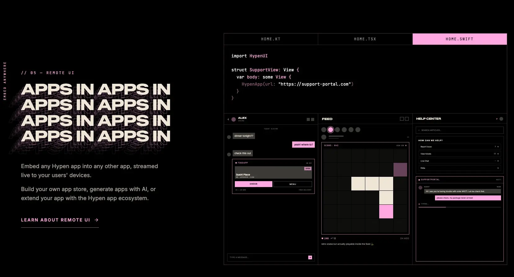
The system draws on multiple families for distinct roles. Zalando Sans Expanded anchors monumental headlines with extreme width and tight negative tracking. Inter carries all interface text with neutral readability. Jet Brains Mono provides technical authority for code blocks, labels, and timestamps. Anton appears in decorative graphic treatments at large sizes, such as the stacked “APPS” repetition visible in feature imagery, but is not used for functional interface text. Menlo surfaces in code contexts alongside Jet Brains Mono, particularly for syntax-highlighted spans within terminal-style outputs. Ques appears in select graphic text elements at display sizes with distinctive letterforms. Applesystem and System-Uisansserif appear in fallback stacks for system-level rendering where custom fonts are not loaded. Verify licensing for these families before production use.
| token | family | size | weight | leading | tracking | use |
|---|---|---|---|---|---|---|
| hero-display | Zalando Sans Expanded | 5rem | 800 | 0.95 | -0.025em | Page titles, major section headers |
| section-display | Zalando Sans Expanded | 3.75rem | 800 | 0.9 | -0.025em | Section headlines, feature titles |
| feature-headline | Zalando Sans Expanded | 2.5rem | 800 | 1.2 | -0.031em | Subsection headers, card titles |
| body | Inter | 1rem | 400 | 1.5 | 0em | Paragraphs, descriptions, navigation |
| body-large | Inter | 1.125rem | 400 | 1.625 | 0em | Lead paragraphs, feature descriptions |
| label | Jet Brains Mono | 0.75rem | 400 | 1.333 | 0.25em | Version badges, category labels, timestamps |
| code | Jet Brains Mono | 0.875rem | 400 | 1.625 | 0em | Code blocks, inline syntax, file paths |
| navigation | Inter | 0.875rem | 600 | 1.429 | 0.15em | Nav links, buttons, CTAs |
| button | Inter | 0.875rem | 600 | 1.429 | 0.15em | Button labels with uppercase treatment |
Layout
The page structure follows a full-width, edge-to-edge pattern with consistent horizontal padding and generous vertical section spacing.
Sections stack vertically with 112px top and bottom padding, creating clear breathing room between content areas. Internal content containers use 40px horizontal padding on desktop, narrowing to 16px on smaller viewports. The maximum content width is not explicitly constrained in the visible layout; text blocks appear to flow within their grid cells rather than hitting a hard maximum.
A two-column asymmetric grid dominates feature sections: left column carries the massive display headline and descriptive text, right column presents code examples, platform mockups, or interactive demonstrations. The ratio appears roughly 45/55 or 50/50 depending on content density.
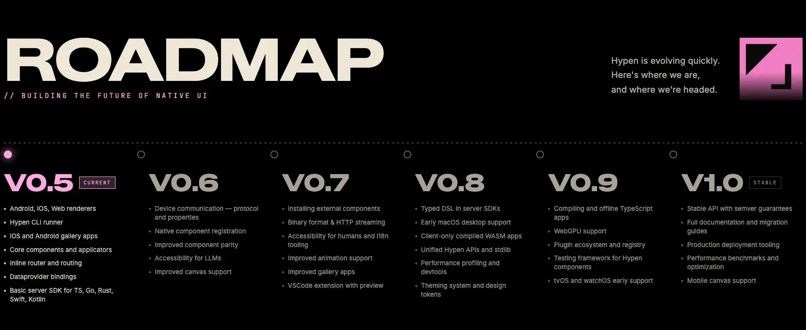
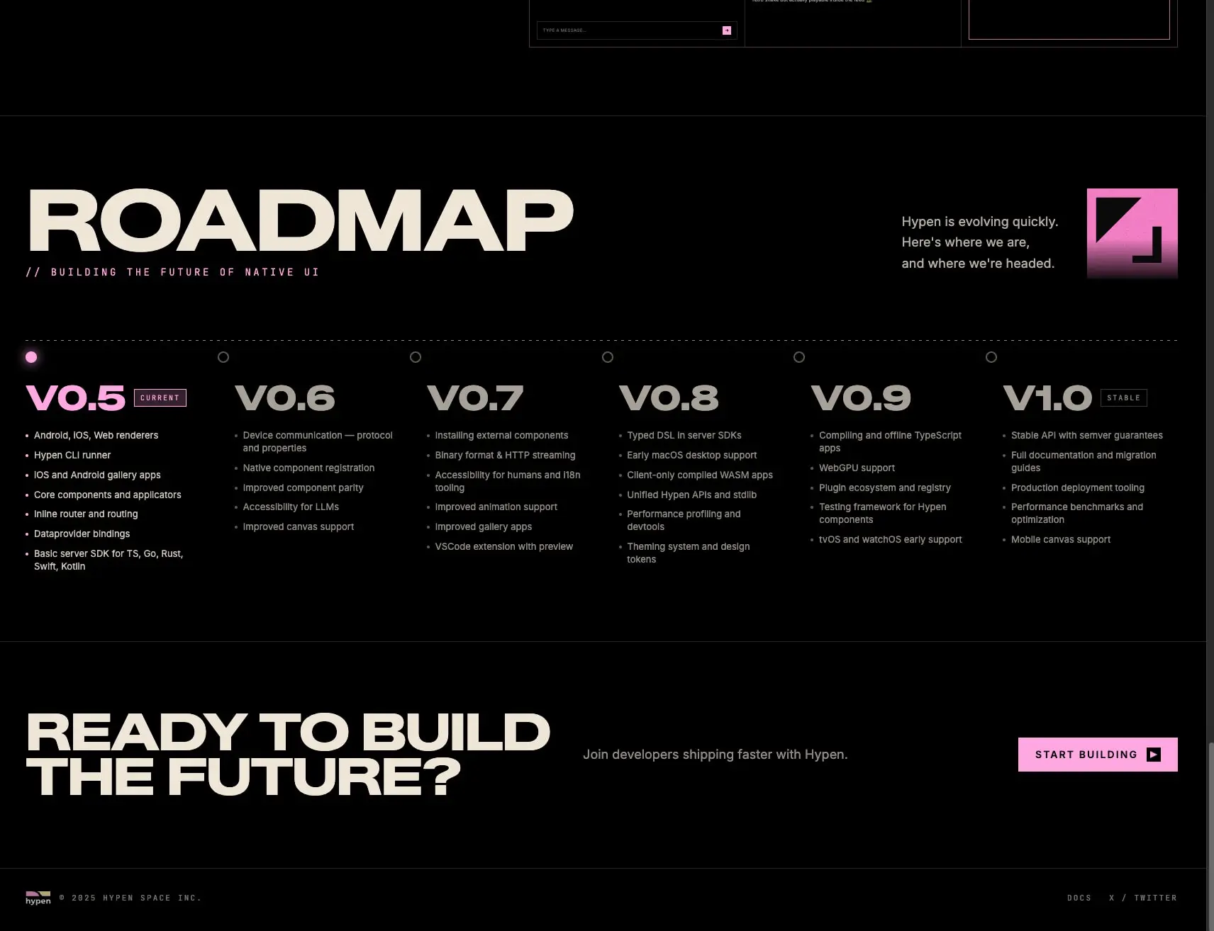
The roadmap section introduces a horizontal timeline layout with six equidistant columns, each topped by a version label and filled with bullet-point feature lists. A dotted connector line runs across the top, with the current version marked by a filled pink circle and others by empty circles.
Vertical rhythm is established through consistent 56px gaps between major content blocks within sections, and 24px between related elements like headlines and body text.
Visual language
The aesthetic merges brutalist scale with developer-tool precision. Headlines are enormous, often spanning multiple lines with aggressive line-height compression, while supporting text remains small and measured. The black canvas absorbs light, making the pink accent appear to emit it—an effect reinforced by subtle glow shadows on interactive elements and platform mockups.
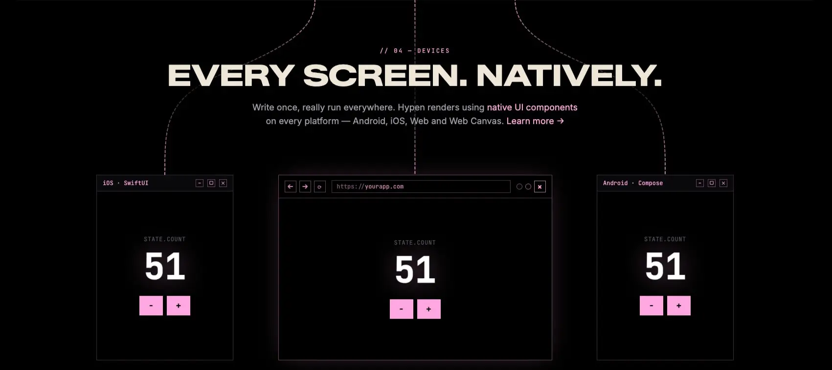
Decorative elements include thin dashed lines that connect visual concepts, small circular progress indicators, and monospace labels that prefix sections with numeric identifiers like // 04 — DEVICES. These conventions borrow from code comments and version control, reinforcing the technical product positioning.
Platform mockups are rendered as framed windows with title bars, window controls, and internal content that demonstrates actual UI output. This “screenshot of code producing UI” pattern appears repeatedly, making abstract capabilities tangible.
The pink accent is used sparingly but decisively: primary buttons, active timeline markers, current version labels, link hover states, and subtle glow effects. No other saturated colors compete for attention.
Components
Primary button
- Anatomy: Text label with optional trailing arrow icon
- Surface: Solid
accentbackground withcanvastext - Typography:
{typography.button}in uppercase with wide tracking - Shape:
4pxborder radius - Spacing:
12pxvertical padding,24pxhorizontal padding - Composition: Inline-flex with
12pxgap between text and icon - States: Default shows solid fill; hover likely intensifies via shadow
Secondary button / text link
- Anatomy: Text with underline or arrow indicator
- Surface: Transparent with
inktext - Typography:
{typography.navigation}with uppercase treatment - Shape: No background, optional bottom border
- Spacing:
24pxhorizontal padding in navigation context - Composition: Inline with
12pxgap to icon
Version badge
- Anatomy: Monospace label in small caps
- Surface:
surface-elevatedbackground withaccentborder - Typography:
{typography.label}at10pxwith2pxletter-spacing - Shape:
4pxborder radius - Spacing:
4pxvertical,8pxhorizontal padding - Variants: “CURRENT” and “STABLE” labels appear in roadmap
Platform mockup
- Anatomy: Window chrome with title bar, traffic lights/controls, content area
- Surface:
surfacebackground withborderoutline - Typography: Title bar uses
{typography.label}for platform name - Shape:
14pxborder radius on outer frame - Spacing:
24pxinternal padding - Shadow:
0 0 20px -10px rgba(255, 167, 225, 0.12)for subtle glow - Composition: Centered content demonstrating actual UI output
Code block / editor tab
- Anatomy: Tab bar with file names, active tab highlight, code content area
- Surface:
surfacebackground, active tab usesaccentbackground - Typography:
{typography.code}with syntax highlighting colors - Shape:
14pxborder radius on container - Spacing:
24pxpadding,8pxtab padding - Composition: Tabs arranged horizontally with
1pxdividers
Roadmap timeline
- Anatomy: Horizontal dotted connector, version circles, version columns
- Surface: Transparent, circles are
accentfill orborderstroke - Typography: Version numbers in
{typography.section-display}, feature lists in{typography.body}at13px - Shape: Circles are
60pxdiameter with14pxborder - Spacing: Columns distributed evenly with
40pxtop gap to connector - Composition: Six-column grid with bullet-point lists beneath each version
Section header
- Anatomy: Optional comment-style prefix, massive headline, body text
- Surface: Transparent on
canvas - Typography: Prefix in
{typography.label}, headline in{typography.hero-display}or{typography.section-display} - Spacing:
56pxgap between prefix and headline,24pxbetween headline and body
Responsive behavior
The visible desktop layout suggests a breakpoint strategy where the two-column feature sections stack vertically on narrower viewports, with the visual demonstration moving below the text description. The roadmap timeline, which shows six columns on desktop, would likely transform into a horizontal scroll or accordion on smaller screens, or reduce visible columns.
Typography scales down proportionally: the 80px hero display would reduce to 60px and then 48px as viewport narrows. The 40px horizontal padding reduces to 16px on mobile, maintaining readable margins without excessive whitespace.
Platform mockups would stack vertically rather than appearing side-by-side. Navigation would collapse to a hamburger menu or simplify to essential links.
Practical implementation guidance
Preserve
- The absolute black canvas as the foundation; any deviation to dark gray weakens the dramatic contrast
- The single pink accent discipline; resist adding secondary accent colors
- The massive scale contrast between display headlines and body text
- Monospace labels for technical metadata and section numbering
- The warm off-white ink rather than pure white for reduced eye strain
- Subtle glow shadows on interactive elements and mockups
Avoid
- Gradients or complex background patterns that compete with content
- Rounded corners larger than
14pxon containers; the system prefers near-rectangular precision - Multiple accent colors; the pink carries all interactive and emphasis weight
- Pure white text on black; the warm tint is intentional
- Decorative imagery without technical purpose; all visuals should demonstrate capability
Recommended build order
- Establish the black canvas and warm ink text foundation
- Implement Zalando Sans Expanded at display sizes with tight tracking
- Add Inter for all body and navigation text
- Introduce Jet Brains Mono for code and label contexts
- Build the primary button with pink fill and uppercase label
- Create the platform mockup component with window chrome and glow shadow
- Implement the two-column feature section layout
- Add the roadmap timeline with version columns and connector line
- Refine syntax highlighting colors in code blocks
Accessibility
- Ensure the pink accent on black meets minimum contrast ratios for interactive elements; the
accentagainstcanvascombination should be verified - Provide focus indicators that extend beyond color alone, such as outline offsets on buttons and links
- Maintain readable line lengths in body text even when containers are wide; consider
max-widthconstraints for paragraphs - Ensure code blocks support horizontal scrolling and avoid text truncation
- Add
prefers-reduced-motionsupport for any scroll-triggered animations or glow pulsing
Scope note
This guide covers the marketing homepage surface including hero, feature sections, roadmap timeline, and footer. Documentation pages, interactive playgrounds, and authenticated dashboard interfaces are not represented. Motion behavior, mobile breakpoints, and form validation states are not visible in the captured pages. Measurements are derived from the exact values in the captured styles.
Sites change, so a screenshot can differ from the guide.
Loading…Similar designs

This guide describes the public website and isn't an official hypen.space design system. Not affiliated with hypen.space.