Overview
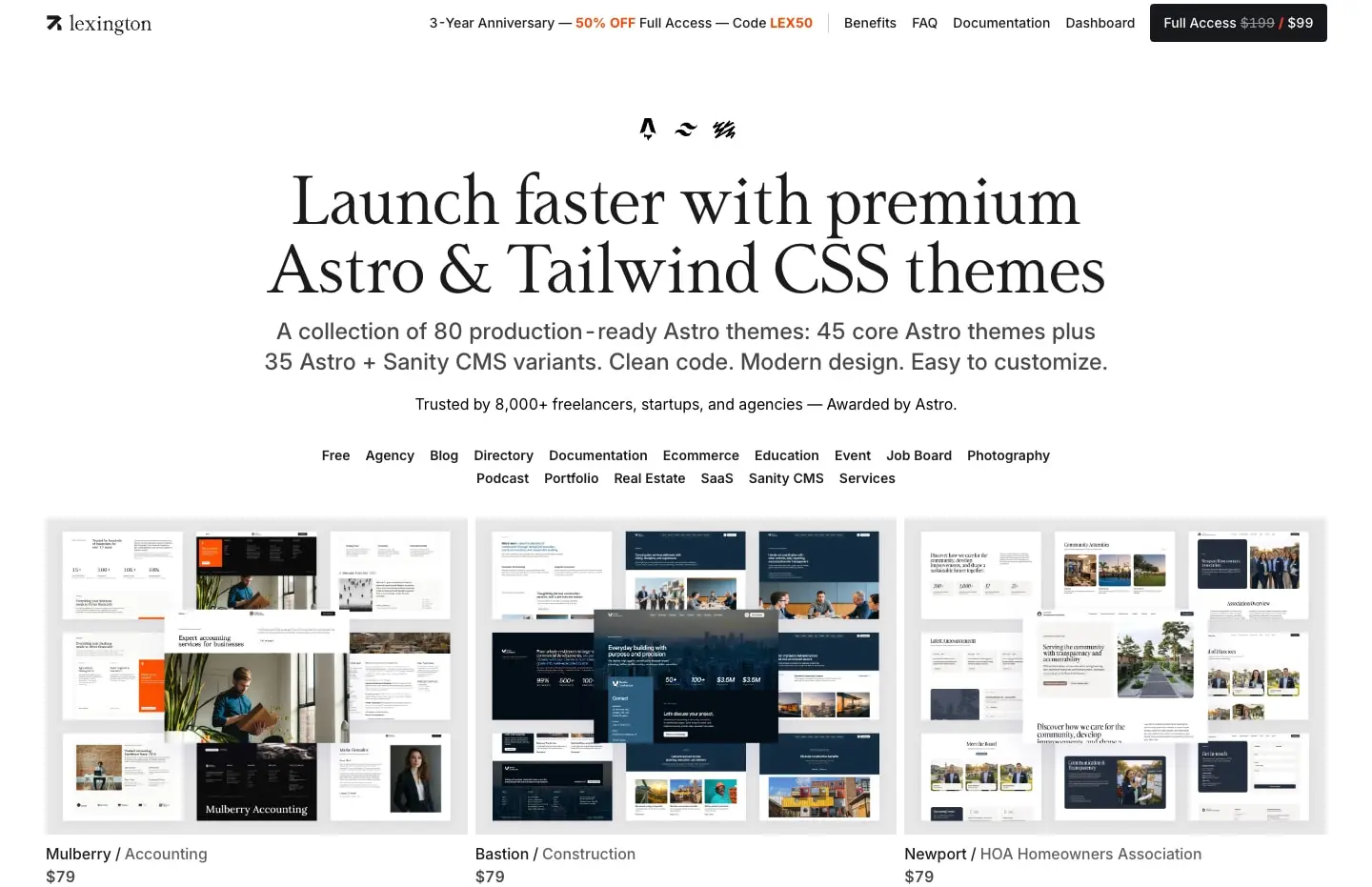
Lexington Themes presents itself as a curated marketplace for premium Astro and Tailwind CSS website templates. The visual system is deliberately restrained: a near-white canvas dominates, allowing the colorful theme previews to become the true content. The design language bridges classical editorial sensibility with modern developer-tool aesthetics. Large serif display type from Lt Remark commands attention in headlines and template names, while Inter handles all interface text with quiet efficiency. The overall impression is one of confidence through restraint—generous margins, careful hierarchy, and a refusal to compete visually with the products being sold. Navigation stays minimal and persistent, with promotional messaging integrated directly into the top bar rather than through intrusive banners. Every element serves the core goal: presenting templates as polished, professional, and immediately desirable.
Colors
The palette is intentionally austere, built around near-black typography on pure white grounds with subtle warm-gray intermediates. Color exists primarily to create hierarchy and state, not decoration.
| token | value | use |
|---|---|---|
| ink | #000000 | Primary text, logo, active navigation, primary buttons |
| ink-secondary | #17181B | Button backgrounds, emphasis surfaces |
| ink-tertiary | #1B1B1B | Deep accents, hover states |
| muted-ink | #494949 | Secondary body text, descriptions, captions |
| muted-ink-light | #616161 | Tertiary information, disabled states, metadata |
| border | #E7E7E7 | Hairline dividers, card outlines, section separators |
| surface | #F3F3F3 | Subtle backgrounds, inactive tags, secondary buttons |
| surface-hover | #F5F5F5 | Hover backgrounds for list items, subtle elevation |
| canvas | #FFFFFF | Page background, card surfaces, input fields |
| action | #17181B | Primary button fill, CTA backgrounds |
| action-text | #FFFFFF | Text on dark buttons, inverted navigation items |
The system operates in a single light mode. Dark surfaces appear only in buttons and occasional promotional badges. Template preview images introduce their own color worlds—deep teals, warm oranges, architectural grays— but these remain contained within product photography and screenshots, never bleeding into the interface chrome. The warm cast of the muted grays prevents the palette from feeling sterile while maintaining the cleanliness essential for a marketplace context.
Typography
Four families appear in the captured sources: Lt Remark and Lt Remark-Italic provide editorial personality in display settings; Inter handles every functional text need with Swiss clarity; Geist and Inter Tight are present in the font inventory without visible deployment in the captured interfaces.
| token | family | size | weight | leading | tracking | use |
|---|---|---|---|---|---|---|
| hero-display | Lt Remark | 4.5rem | 400 | 1 | -0.02em | Homepage hero headlines, major page titles |
| section-display | Lt Remark | 3.75rem | 400 | 1 | -0.025em | Section headers, template detail names |
| accent-display | Lt Remark | 6rem | 400 | 1 | -0.05em | Special emphasis, italic variants, decorative numerals |
| body-large | Inter | 1.125rem | 500 | 1.556 | -0.025em | Lead paragraphs, template descriptions |
| body | Inter | 1rem | 400 | 1.5 | normal | Default paragraphs, navigation, general content |
| body-small | Inter | 0.875rem | 400 | 1.429 | normal | Metadata, captions, secondary descriptions |
| label | Inter | 0.75rem | 600 | 1.333 | normal | Tags, badges, button labels, category pills |
| navigation | Inter | 0.875rem | 500 | 1.429 | normal | Top bar links, sidebar navigation |
| button | Inter | 0.875rem | 500 | 1.429 | normal | CTA buttons, form actions |
Lt Remark, designed by Daniel Lyons of Lyons Type, brings a contemporary serif warmth with tight tracking that feels intentional rather than default. Its italic variant, Lt Remark-Italic, appears for expressive moments, adding personality without breaking the systematic feel. Inter, designed by Rasmus Andersson, serves as the workhorse at multiple weights—Regular for body, Medium for emphasis, Semibold for labels and active states. Geist, from Basement Studio, and Inter Tight, a narrower variant of Inter, are available in the type inventory but not visibly deployed in the captured interfaces. The type scale snaps to a 2px relative unit, with display sizes at 48px, 60px, 72px, and 96px providing clear hierarchical steps. Verify licensing for these families before production use.
Layout
The layout system relies on generous fixed-width containers with substantial horizontal padding, creating a gallery-like presentation that keeps content centered and breathable.
The top navigation bar spans full width with internal horizontal padding of 3rem, containing the Lexington wordmark left-aligned and utility links right-aligned. A promotional banner sits inline with navigation, separated by a subtle vertical divider. The main content area uses a maximum-width container centered with auto margins, typically around 82.5rem, with 3rem horizontal padding that creates consistent side gutters.
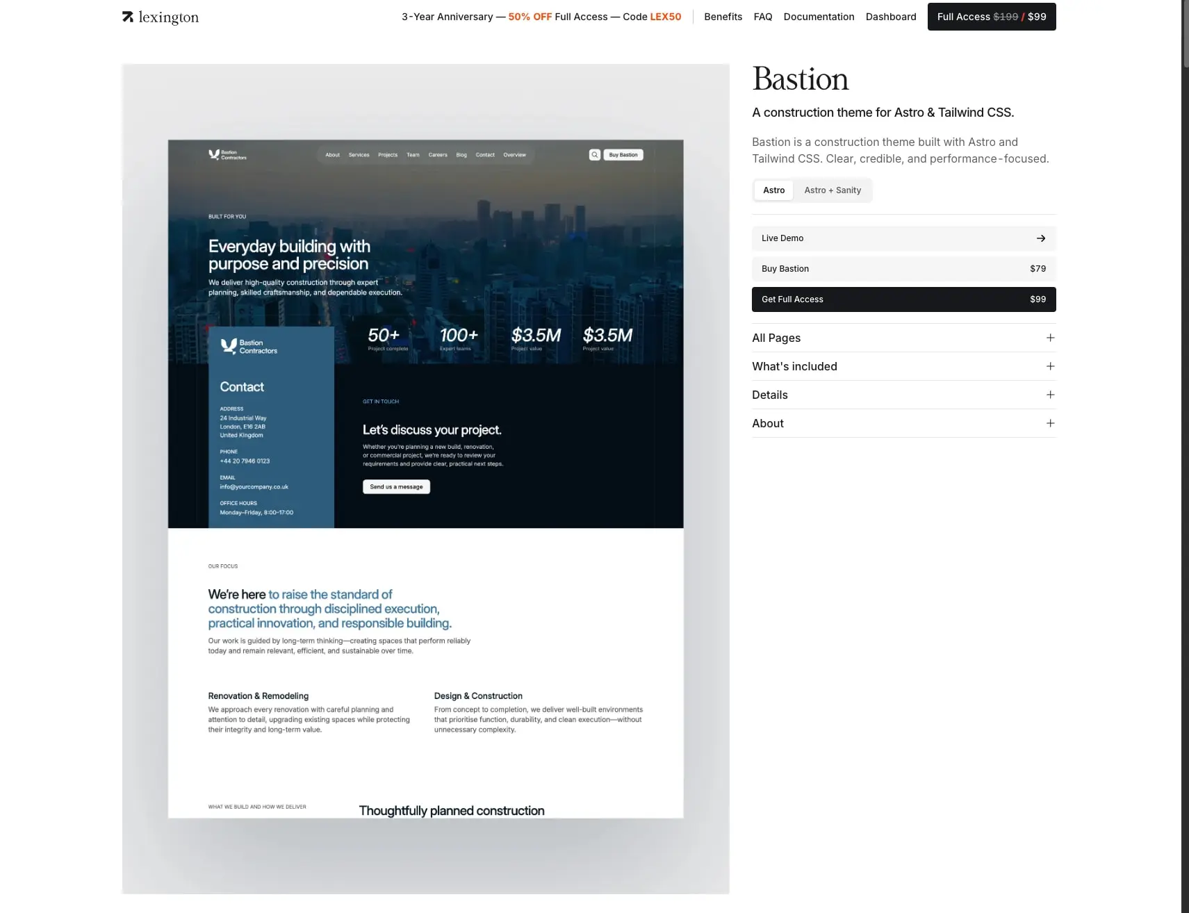
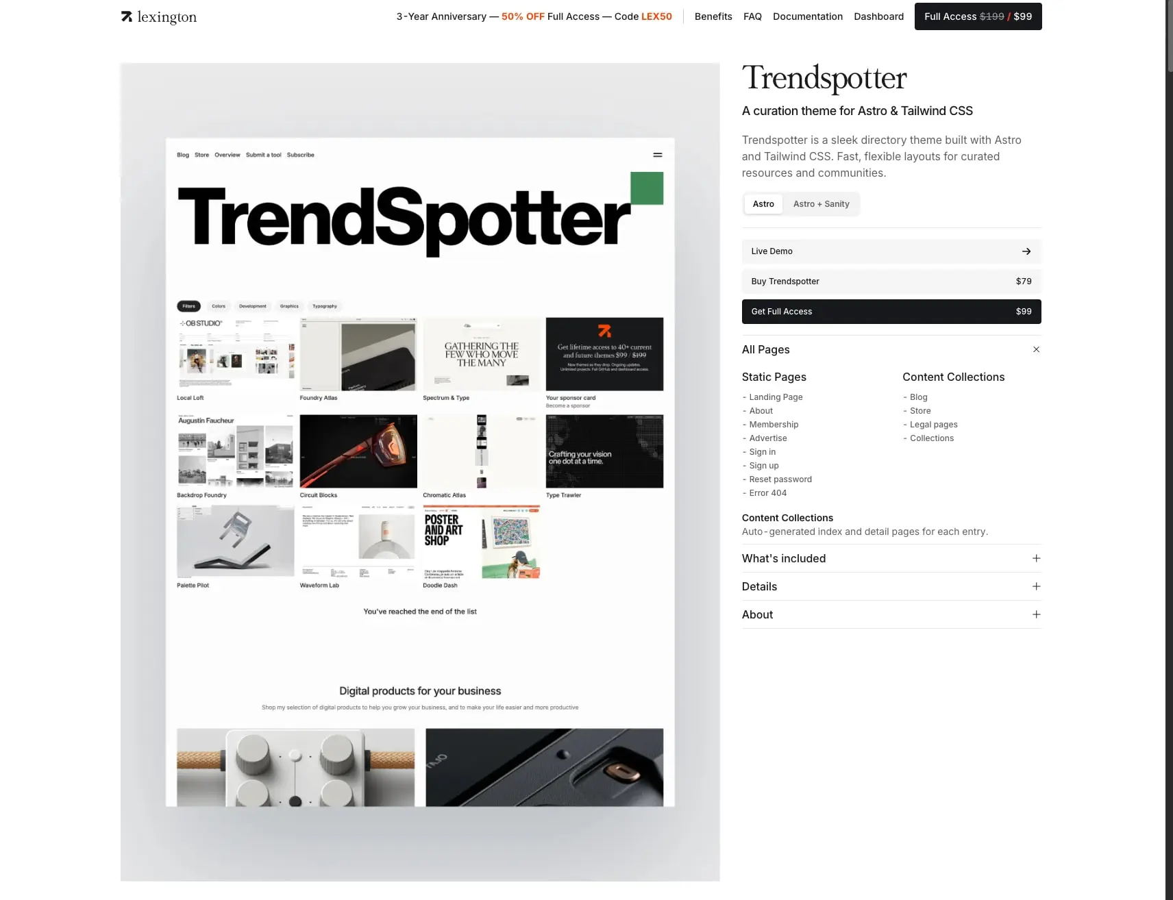
Template detail pages employ an asymmetric two-column layout: a large preview area occupying roughly 60% width shows theme screenshots at substantial scale, while a narrower sidebar contains metadata, pricing, and actions. This sidebar stacks vertically with clear section breaks marked by horizontal rules.
The homepage hero centers all content with a maximum-width reading column for the headline and subhead, followed by a horizontal scroll or wrap of category filter pills, then a grid of template cards. Grid gaps remain generous—typically 1.5rem to 2rem—preventing visual crowding.
Vertical rhythm follows a base of 0.125rem, with section spacing at 6rem and 8rem creating dramatic pauses between content groups. Internal component spacing uses 1rem and 1.5rem increments for comfortable but not loose packing.
Visual language
The visual character is defined by contrast: classical typography against modern minimalism, warm humanist details within rigid geometric structure. Rounded corners are restrained—4px for buttons and interactive elements, 8px for larger cards and containers—never overwhelming the rectilinear precision of the overall system.
Shadows appear sparingly. A subtle ambient shadow lifts buttons slightly: rgba(0, 0, 0, 0.1) 0px 1px 3px 0px, rgba(0, 0, 0, 0.1) 0px 1px 2px -1px. This creates just enough depth for affordance without the heavy elevation common in material design systems.
Borders function as hairline dividers at 1px, typically in the warm gray #E7E7E7. They separate list items, define accordion boundaries, and create the subtle container edges on sidebar elements. No border-radius appears on structural dividers.
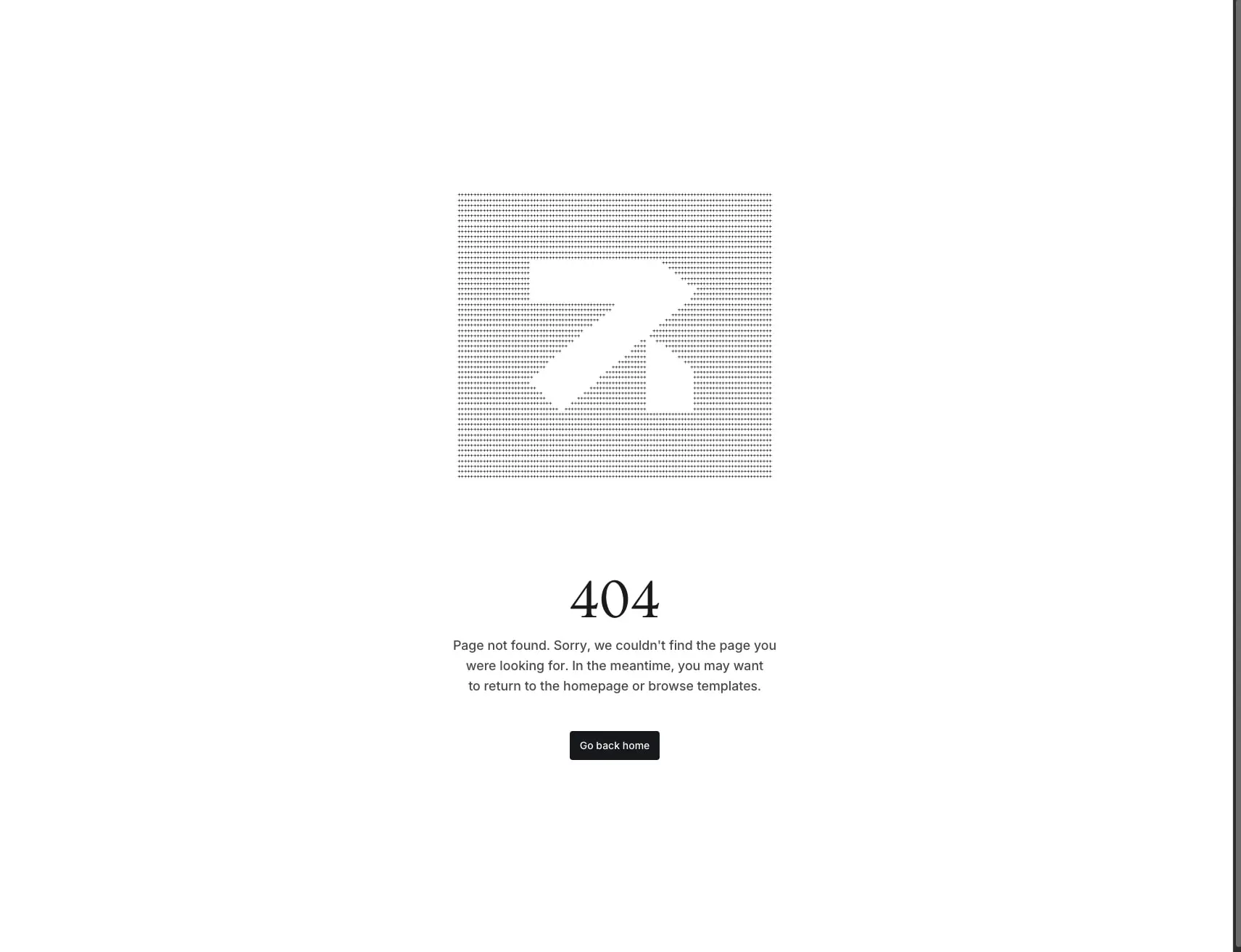
The Lexington logo—a stylized arrow or paper plane mark—appears in halftone dot pattern on error pages, translating brand identity into a textural, almost print-like treatment that breaks the otherwise flat digital surface. This suggests a design philosophy that values craft and tactile reference even within screen-based presentation.
Template preview cards use consistent aspect ratios with screenshots presented against light gray backgrounds that match the site surface, creating seamless integration between product and container.
Components
Navigation bar
- Anatomy: Full-width bar containing logo mark with wordmark, inline promotional text with highlighted discount code, primary navigation links, and a prominent CTA button.
- Surface:
{colors.canvas}background,{colors.ink}text, with promotional text in standard weight and discount code in accent styling. - Typography:
{typography.navigation}for links,{typography.label}for the promotional badge. - Spacing: 3rem horizontal padding, 0.5rem vertical padding on links.
- Composition: Flex row with space-between alignment; logo left, links center-right, CTA far right.
Template preview card
- Anatomy: Container with theme screenshot, template name, category tag, and price.
- Surface:
{colors.canvas}background, no border or subtle border on hover. - Typography: Template name in
{typography.section-display}at reduced size or{typography.body-large}depending on context; metadata in{typography.body-small}. - Shape:
{rounded.medium}border-radius on container corners. - Spacing: Generous internal padding, typically 1.5rem, with 2rem gap between cards in grid.
- Composition: Vertical stack with screenshot dominant, text below left-aligned.
Sidebar action panel
- Anatomy: Stacked vertical sections containing template name, description, technology tags, primary and secondary action buttons, and expandable detail accordions.
- Surface:
{colors.canvas}background with 1px top borders in{colors.border}separating sections. - Typography: Template name in
{typography.section-display}, description in{typography.body-large}, tags in{typography.label}, buttons in{typography.button}. - Shape:
{rounded.small}border-radius on buttons and tags. - Spacing: 1rem vertical padding between sections, 0.75rem horizontal padding on tags, 0.875rem vertical and 1rem horizontal on buttons.
- Variants: Primary action as dark filled button (
{colors.action}background,{colors.action-text}text); secondary actions as light filled or outlined buttons.
Category filter pill
- Anatomy: Rounded rectangular button containing category name.
- Surface: Default transparent or
{colors.surface}; active state with filled{colors.action}background and{colors.action-text}text. - Typography:
{typography.label}or{typography.navigation}depending on prominence. - Shape:
{rounded.small}border-radius, creating soft rectangle rather than full pill. - Spacing: Compact horizontal padding, typically 0.875rem, with tight vertical padding.
- Composition: Horizontal scroll or wrap container on homepage; inline in navigation contexts.
Accordion section
- Anatomy: Header row with section title and expand/collapse indicator, collapsible content area.
- Surface: Transparent with 1px top border in
{colors.border}. - Typography: Title in
{typography.body}weight 500; content in{typography.body}. - Spacing: 1rem vertical padding on header, content padding matching container rhythm.
- Composition: Full-width within sidebar, stacked vertically with adjacent accordions.
Primary button
- Anatomy: Rectangular button with text label, optional icon.
- Surface:
{colors.action}background,{colors.action-text}text. - Typography:
{typography.button}. - Shape:
{rounded.small}border-radius. - Spacing: 0.875rem vertical padding, 1rem horizontal padding.
- Variants: Default filled state; potential ghost or outline variant with
{colors.ink}border and text on light background.
Responsive behavior
The design maintains its generous proportions at desktop widths, with the two-column template detail layout likely stacking to single column on narrower viewports. The homepage grid of template cards should reflow from three columns to two, then to single column, maintaining card proportions and internal spacing. Category filter pills may scroll horizontally on mobile rather than wrapping, preserving the single-row visual rhythm of the hero section.
Navigation collapses to a simplified presentation, potentially with promotional banner hidden or truncated to prioritize core links. The sidebar on template pages becomes a stacked section below the preview rather than beside it. Font sizes may scale down modestly—hero display from 4.5rem toward 3rem—to maintain line breaks and readability without excessive reflow.
Touch targets maintain minimum 44px height for all interactive elements. Button padding increases slightly on mobile to accommodate finger interaction. The generous base spacing of 1rem and 1.5rem provides adequate breathing room even at reduced viewport widths.
Practical implementation guidance
Preserve
- The stark white canvas with near-black typography; this high contrast is central to the brand’s premium positioning.
- Lt Remark for all display headlines; the serif personality distinguishes Lexington from generic SaaS marketplaces.
- Generous section spacing of 6rem to 8rem; the breathing room signals quality and prevents visual fatigue.
- Subtle 1px borders in warm gray for structural separation rather than heavy shadows or background color shifts.
- The asymmetric template detail layout with dominant preview and narrow metadata sidebar.
Avoid
- Adding background colors or gradients behind content sections; the flat white system is intentionally austere.
- Using Lt Remark for body text or UI labels; reserve it for display sizes above 3rem.
- Heavy drop shadows on cards or containers; the single subtle shadow on buttons is sufficient.
- Crowding template cards; maintain at least 1.5rem gaps even in dense grids.
- Decorative elements that compete with template screenshots; the products must remain visually primary.
Recommended build order
- Establish the typographic system with Lt Remark and Inter loaded at all required weights.
- Implement the base layout container with max-width, centered alignment, and 3rem horizontal padding.
- Build the navigation bar with logo, promotional inline text, and CTA button.
- Create the homepage hero with centered headline, subhead, and category filter row.
- Develop the template card component with consistent image aspect ratio and metadata stacking.
- Construct the template detail page with two-column layout, sidebar action panel, and accordion sections.
- Add the 404 page with halftone logo treatment as a signature brand moment.
Accessibility
- Maintain the 4.5:1 contrast ratio between
{colors.ink}and{colors.canvas}for all body text. - Ensure promotional banner content remains readable without relying solely on color emphasis for the discount code.
- Provide visible focus indicators on all interactive elements, using the existing 4px border-radius shape with an offset ring.
- Use semantic heading hierarchy: single h1 per page, with Lt Remark display sizes mapping to appropriate levels.
- Preserve adequate touch targets on mobile for all buttons, links, and filter pills.
Scope note
This guide covers the homepage, template detail pages, and error page surfaces visible in the captured images. Pricing tables, checkout flows, dashboard interfaces, and documentation pages are not represented. Footer behavior and mobile navigation patterns require additional reference. The spacing and type scales reflect exact values from the captured interface measurements.
Sites change, so a screenshot can differ from the guide.
Loading…Similar designs
This guide describes the public website and isn't an official lexingtonthemes.com design system. Not affiliated with lexingtonthemes.com.